sfomspphl
-
Posts
705 -
Joined
-
Last visited
-
Days Won
10
2 Followers


sfomspphl's Achievements
News Director (7/8)
519
Reputation
-
Clever, just can’t unsee the oxymoron of “Local” 10 “World” News The network evening newscasts are heavy on feature style human interest reporting, curious how their ABC World News audience will respond to this version
-
Yeah that is a cool effect, taking cues and probably tech from the Depth Wall on ESPN.
-
Had the same thought... The legacy of GMA pre Times Square was feeling suburban. The original living room set. I get having the NY skyline in the set itself, making it central to the open feels like it's a local NY show. The set itself is a beautiful upgrade, feels like a Soho loft which I guess is the concept they're going for, though almost feels like when you first move in and the furniture hasn't arrived. It could use more furniture and elements to break up the cavern and have cozier feeling shot options. Home base is great - warm, professional, not distracting. They've become more like the layout the Today show used for decades - news desk, NY centric. When Time Square started the two living room chairs were home base, and evolved to be a desk sometime before Charlie left.
-
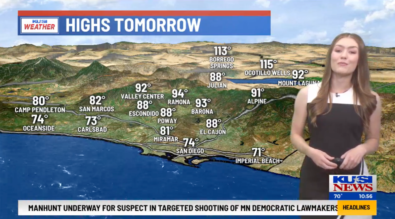
Last week KSWB Fox 5 moved into the KUSI building, and... KUSI got new graphics and after nearly 30 years dropped Gari's The One and Only. Not sure what the new package is, other that it sounds like pretty much every other generic package these days. De emphasizing the Good Morning San Diego branding - no longer featured in the bug. No more AccuWeather. And fewer cities in the forecast highs/lows section - gone from it is Rancho Santa Fe, home to the McKinnons. Graphics are still skewed to an older audience - big type, but less 3D.


-
Here is the remake of the close. Nice alternative, hits a lot of the sentimental tone of the original that remakes often miss, at least for the first 3/4ths of it. When you get to the lead up to the close where the original had prominent strings and a crescendo into a horn floursh this version feels a little thin, almost like a mixdown that deleted those tracks. Feedback on the Youtube comments is pretty positive. Hope they keep the original open and close on Fridays or something like that. The opens/bumpers in the demo are a little generic sounding to me, not as distinct with the signatures as the originals or this remake of the close. I suppose mgmt wanted some updates and as far as that goes could have been a lot worse. But hope there are some more distinctly melodic cuts that get used.
-
Looks like some odd filtering on that studio render. If I imagine how those materials look in real life it’s warm woods. And a lot less cluttered. More inviting and professional. Refreshing from the sensory overload of their prior studios.
-
Yes pretty flat graphics but I give them credit for using a talent open. The “in action” shots work well.
-
Discovered composers & publishers of music themes
sfomspphl replied to promoguy98's topic in News Music & Voiceovers
Cool, what was the story / process / inspiration that got you to that arrangement? Pretty iconic, nailed the newsy urgency and authority with some ebbs and flows. I remember it being used for many years. -
Discovered composers & publishers of music themes
sfomspphl replied to promoguy98's topic in News Music & Voiceovers
Earl we'd love to hear your stories - the inspiration behind and creation of the music to the facts of how it evolved. Coincidentally, RIP Stan Atkinson who passed this weekend. The music you made was of the highest caliber to match his style of broadcasting. -
Discovered composers & publishers of music themes
sfomspphl replied to promoguy98's topic in News Music & Voiceovers
Welcome Earl, was this one for KCRA your baby? The brassy Stan Atkinson “we have news for you…next” intro march. Your name sounds familiar from trying to lookup the author info for “Where the News Comes First” themes. -
KUSI says GMSD is the “most watched” local news. Probably some cume over the long broadcast. They found a sizable loyal niche for that product and anchor team. On the evening they show 4 shots with the desk showing. 10pm they tend to lead the ratings.
-
They picked a nice skyline shot behind the desk and yes the rest is barren. Not using the set design techniques to create layers and depth.
-
No network affiliation...and near 50% share of all daypart viewers in the demo is damn impressive.
-
On the 11 he mentioned the screen behind the giant 7 in the weather center is meant to show the current outside weather (not a live shot but a representation) Wonder if they automated that or someone needs to manually select in which case take bets how long the feature lasts. I guess Clickspring doing both the prior and current set explains keeping elements like the big Accuweather repeater when the weather anchor is speaking from the main desk.
-
Discovered composers & publishers of music themes
sfomspphl replied to promoguy98's topic in News Music & Voiceovers
I thought that was Nonstop or 615 Not my favorite because it displaced the Ray Ellis retro theme…although funny that one originally aired 82-85 and less than 10 years later resurrected then updated as “retro”