

Journalist
-
Posts
670 -
Joined
-
Last visited
-
Days Won
21
Content Type
Profiles
Forums
Articles
Posts posted by Journalist
-
-
3 hours ago, mrschimpf said:
For some reason, the Eyemark is all over the place with its positioning in that bottom right-hand corner depending on news/sports/live/primetime presentations, unlike NBC, Fox, and ABC where news and primetime DOGs are pretty steady and the network affiliate can get their bug lined up perfectly with the network DOG. CBS has about four-five different positions for the Eyemark in a broadcast day.
I have noticed that as well... isn't the CBS eye added way earlier in the production workflow compared to the likes of NBC and ABC? Like, I have a hard time believing that the eye was added by a single master control point when its situated in slightly different locations in almost every program.
-
 1
1
-
-
11 hours ago, 24994J said:
Except that's not what WTOL ultimately used. When the graphics debuted, they merely stripped down the old logo to fit the new look.
I was comparing our reactions. They're the same.
-
2
-
-
Oh joy, this is just like WTOL all over again.
-
2
-
-
1 hour ago, ABC 7 Denver said:
Being the broadcast junkie that I am, one ends up not only finding love with TV stations, but also radio stations (and for me, the latter came first). Well, I discovered an interesting little footnote: TMStudios is an E.W. Scripps company. TM was owned by Jones Media Group (then known as JonesTM). Jones was purchased by Triton (and renamed TM Studios), Triton Radio Networks (now Triton Digital) in 2008. Triton was purchased by Scripps in 2018. Ergo, why are the Scripps stations using Stephen Arnold Music when they have their own composers in-house?
Huh? Wasn't TM folded under what we know today as Westwood One though?
-
6 hours ago, channel2 said:
Armin hardly EVER acknowledges local TV...
Well yeah.
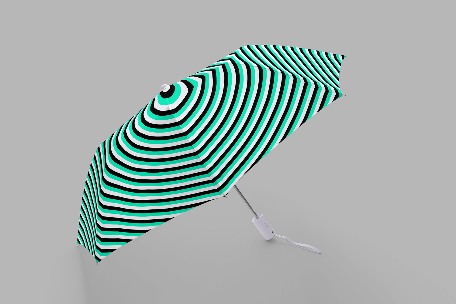
It was professionally designed. It has a purpose. It wasn't trying to appeal to the lower common denominator. I mean, you can't convince me you don't want this umbrella.
It wasn't trying to one-up their competitors with another flashy Hothaus pack, or whatever Linear Drift is doing with the | | | | | | | 's and > > > > > > > 's.
This works.
This is what TV stations should be striving for if they want to have a cohesive brand, not only on television but online. Armin nailed it at the end with the following:
QuoteOverall, this is solid work and if it doesn’t feel like a local TV station identity — which it doesn’t (and that's a compliment) — that’s not the identity’s fault but local TV stations’ fault that have, for decades, had such crappy branding.
...and it's true. Local TV stations generally have awful branding led with some people with zero understanding about the visual arts medium, yet this community is still adamant with sticking with the status quo.
And yet people (not specifically you @channel2) wonder why he doesn't talk about local television, while WTSP has proven they are capable of producing gems like this one.
-
4
-
-
15 hours ago, Spring Rubber said:
Have we reached the point where all graphics are so flat and generic that there's no creativity anymore? I
No. You can still be creative while expressing today's design languages. Having 3D elements doesn't make it a guarantee that it'll be "creative" if one doesn't understand how its supposed to work with the design.
-
9
-
 1
1
-
-
23 hours ago, newstime said:
Remember when they had those beautiful Renderon graphics?? This looks really sad compared to those.
*taps pinned message*
On 2/27/2020 at 12:20 AM, ABC 7 Denver said:Worst voice over!
The execution was off-key in terms of its pacing (to illustrate: "...and the world"), but otherwise it's stylistically in line with the prevalent "friendlier" tone seen on many local newscast domestic and abroad. I mentioned this on Discord, but Josh Goodman's voice work for WBNS in 2016 is a good example of this idea.
-
1
-
-
What... wow. What do I even say?
There's no doubt that this package was a downgrade. But I wasn't expecting it to be this bad. Like, poor man's NBC bad.
Literally nothing in this new package makes sense. The italics, the angularity, the gradients - everything - there's no depth or consistency. The animations are so out-right comical, it always make you question, why?
We shouldn't have ended up here with all of that accumulation from the previous two packs. It's like they stepped two decades back in sports presentation. At this rate I'm honestly worried if NBC and Fox brought back the stereotypical design trends of the early 2000's that they've fought for so long to ditch.
This... this is bad news.
-
1
-
-
-
5 hours ago, TheRolyPoly said:
First NBC Boston and Telemundo Boston, next NBC 10 Boston and Telemundo Nueva Inglaterra, now what next?
NBC NewsChannel 10. We've come full circle.

-
1
-
-
25 minutes ago, TVLurker said:
newsnet is a joke..
B-but it has crash zooms!
-
 2
2
-
.png) 1
1
-
-
4 hours ago, ns8401 said:
That KABC lower third doesn’t need the arrest and victims condition to both be on it. That’s a station issue not really a graphic issue. Somebody doesn’t know how to work within space limitations.
Pretty much. KABC's lower third can line wrap accordingly, so human error was most likely the culprit.
-
4 hours ago, kfc513 said:
From everything I've seen of this look so far, it's way too boring for me to handle.
Made it better.

My point: the package is fine. One could argue it's a bit rough around the edges (why the speech bubble?), but otherwise it's fairly inoffensive. If this forum expanded their horizons beyond domestic borders (pop quiz, we don't and here's why), they could've known the core elements of this package are essentially in line with general design trends around the world.-
4
-
1
-
12
-
 2
2
-
-
Calling news music packages "production music" and saying television design "peaked" because we don't like it is exactly the level headed analysis I would expect from TVNT.
-
6
-
1
-
-
On 9/26/2019 at 2:47 PM, ED2 said:
Why waste that time on paid programming or last night’s news
Probably to incentive people to subscribe to pay-TV with the sole purpose of watching CP24. Bell's whole "artificially inflating its value by moving key programs to pay television" schick is still alive and well; after all, it took them around six years to simulcast the MMVAs on CTV before it got the axe, and the CFL is still exclusive to TSN despite being on free to air television for 65 years.
-
8 hours ago, ED2 said:
Viewers watching CTV Vancouver will see a majority of Your Morning (2.5 hours) starting at 3 AM PT, with the last half hour being pre-empted for CTVML Vancouver at 5:30 AM PT.
2 hours and 30 minutes of national news in addition to their 3 hours and 30 minutes of local news?

A "flagship" in a "flagship market" could only dream of those numbers.
-
11 hours ago, TSSZNews said:
The messaging is definitely MUCH stronger on those spots--I get a real CCO vibe from them.
3 hours ago, NEOMatrix said:It's actually not bad, tbh. Clean and simple.
3 hours ago, Action Newsroom said:Looks slick, fresh and nicely made. I hope the package is utilized very well.
1 hour ago, ttvn2000 said:I appreciate the custom graphics package because now, they are “practicing what they’re preaching” in terms of developing a new and unique product.
It's almost as if WKYC's visual identity didn't revolve around.... a logo.Big if true.
-
3
-
1
-
-
On 11/27/2018 at 1:18 AM, Journalist said:
Woohoo! We're back on Invision!
Question though: Will a dark theme be also addressed?

It has been 296 days since we've last seen a dark theme on TVNT. Any update on implementing one, @Weeters?
-
On 9/6/2019 at 10:47 PM, ttvn2000 said:
I want to like this - as it is definitely “on trend” in terms of a flat design.
Move over, | | | | | | | | | s,> > > > > > > > > is the new trendy thing in town.
-
5
-
1
-
-
1 hour ago, ED2 said:
No, the current graphics package remains. Only the news logos were updated/replaced with the one above.
I've documented the changes on the TVNT Discord server - it appears they are just updating the logos for the most part. Some graphical elements, such as CFTO's Community Calendar, now CTV Our Community, and the aforementioned promo graphics (chryons and all), were completely redone with new graphics. Their news app was also overhauled too.
On 4/6/2019 at 3:46 PM, Viper550 said:CBC seems to be undergoing a rebrand with a new wordmark (is that Gotham? The sports department seemed to have been favouring Gotham since the 2015 Pan-Am Games). CBC Sports had updated its logo, I saw a promo for CBC News with a similar style logo, and some of their regional social media outlets have been using it too
Also noted in the TVNT Discord server:

"The roll out is...quite slow. The new CBC standardized logos were quietly introduced in the middle of the Fall 2017 season... and it was only used for internal documents concerning the CBC TV network. Fast forward a year later, the TV network began using it in promos, and the Sports division formally opted in afterwards.
Either way, a new look for the CBC is looong over due. The corp was using the same logo structure for almost two decades now."On 4/6/2019 at 3:46 PM, Viper550 said:They had phased in new local graphics based on the CBC News Network refresh. But could something based on The National's current design work well locally?
Looking at the visual motifs, it appears The National's chyrons are a part of the current CBCNN/local refreshed graphics, so there will not be a refresh anytime soon.
On 4/6/2019 at 3:46 PM, Viper550 said:Oddly enough this new Sports logo reminds me a lot of their red/blue logo from the 90's.
Home of the Champions.

-
2
-
-
4 minutes ago, CircleSeven said:
Someone screengrabbed their TV. And the bug is their old logo with the new Tegna graphic.
Let's hope it stays that way.
Crisis averted.
-
1
-
-
Oh my god.
Please.
For the love of god, that cannot be their new logo.
-
1
-
-
Typical TSN... skipping over an entire generation of BottomLine.

-
1
-
-
On 3/13/2019 at 10:45 PM, Viper550 said:
Eurosport unveiled its logo for its 2020 Olympics coverage
Let's just say they went in a very different direction over NBC.
I actually love Eurosport's ambitious design strategies based around unique cultural niches, like manga in 2020 and K-pop in 2018. This is going to be so good - cannot wait!!
Shepherd Smith to join CNBC; Launch a new evening show
in US Cable News
Posted
It isn't necessarily of "national significance", but it is a story that directly targets the emotional appeal of what you'll typically see in local news... now in a national package like NewsNation. Remember, Nexstar's NewsNation is developed to be a national newscast with local interests and these local stories directly play into that idea given the context and the audience of the program.
NewsNation isn't going to be the place to find hard news and analysis about America's debt for 3 hours straight, but you will see softer stories that highlight the unique regional fabric of the United States without the whole "doom & gloom" fare and could be of interest to a national audience, despite not being immediately relevant to your area.
Let me copy-paste my post from the Discord server that explained my point that, besides journalistic directions, NewsNation shouldn't be compared 1-to-1 to Smith's program, which focuses on general national subjects like politics and the economy. I also delved into "day one" reactions from some members as well: