


KCActionNews
-
Posts
12 -
Joined
-
Last visited
Content Type
Profiles
Forums
Articles
Posts posted by KCActionNews
-
-
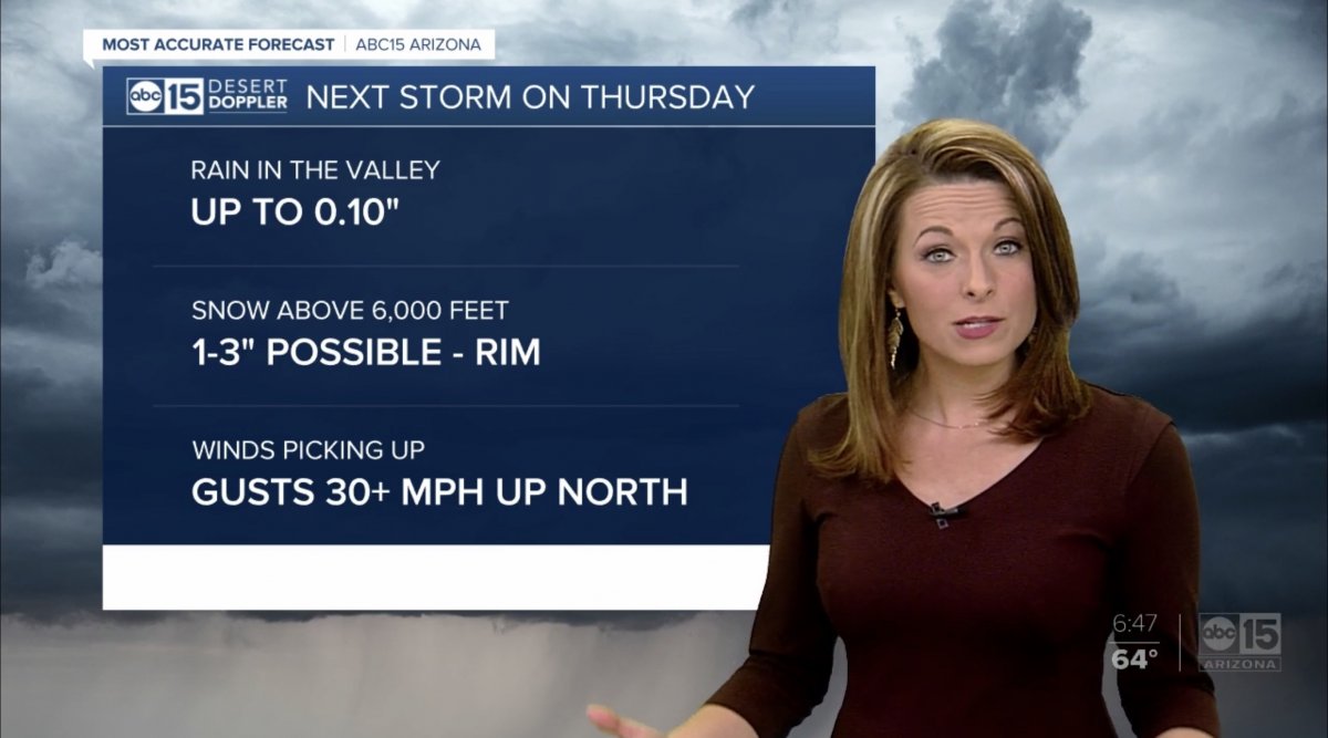
We have a winner...ABC 15 launched in Phoenix


-
On 1/3/2020 at 5:46 PM, ABC 7 Denver said:
It was during the Scripps slate. Has anyone in Indy heard the same signature in the Scripps slate?
Newscasts end with a copyright graphic. I’m sure every station was given the new music version for the 2020 copyright
On 1/2/2020 at 9:31 PM, MarkBRollins88_v2 said:Seems like we haven’t had a station roll out the new graphics in a while. Anyone know when/who might be next? Is there a timeline for when all of the stations will have the package?
Look for the Florida push to continue with West Palm going next. There’s pressure for the person in charge to get more large markets on, so Phoenix, Denver and Detroit will be going in the next few weeks, plus some more smaller market stations. The rollout has been very bumpy with many stations frustrated with the Cincinnati corp team in charge. That caused more of a slowdown than the holiday schedules.
On 1/4/2020 at 11:37 AM, MidwestTV said:Hold up. The Now is still a thing? I thought it was killed.
It still exists for stations who want to use less resources on a newscast (it can be used with no local inserts), but its not locked into being a 4pm only show now.
-
 2
2
-
 3
3
-
-
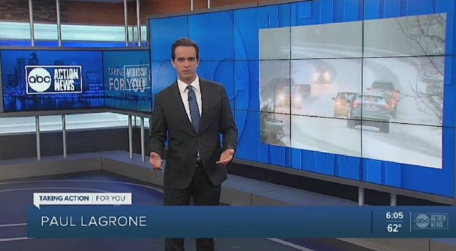
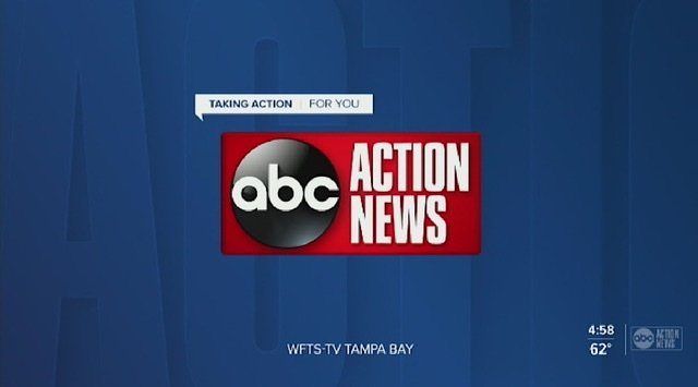
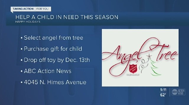
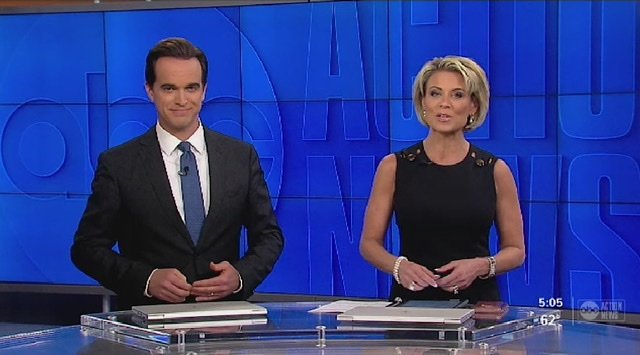
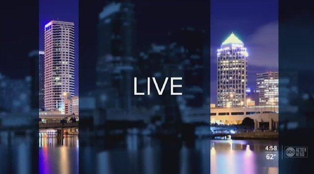
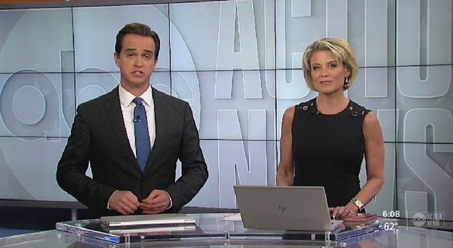
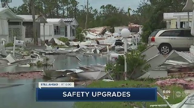
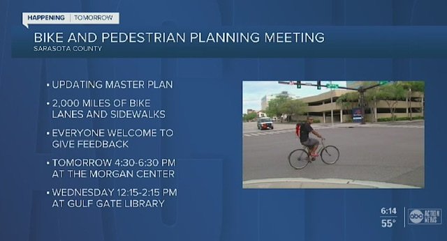
Just got these screen caps sent. Looks like Tampa was next on the list. My opinion hasn’t changed so no need for me to rehash. I’ll just leave these here for your enjoyment. Lol
-
Word is that the rollout is a mess. A graphics change was supposed to happen by late summer and there is only one small market going into December. Look for the next targets to either be more small markets so they can say they have launched on a higher number of stations or a launch of Florida markets. They seem to like to work the florida stations together. I wonder if there will be fallout at the graphics hub after this?
I’m still not warming up to it. Going flat and simple was the trend 3-4 years ago. They are late to that party. Just putting a station logo in background is amateur. Someone else on here summed it up best, it looks like a PowerPoint presentation page was put on TV. I was really hoping Scripps would come out of the gate with a look that would set them apart and have some artistic elements to make you notice. This is so bland. Maybe at least some texture or shades of blue so something stands out. An accent color? But not gold lol
-
3
-
-
There is no alternate package. All stations will be very basic. Very blue. I like the idea of a clean look, but this is so far off the mark. Thin, small fonts that are difficult to read. Slow, limited movement. There just isn’t anything artistic about it to stand out and know this is a Scripps station. At least TEGNA has some texture and movement around their flat graphics. I just expected better from Scripps.
-
.png) 1
1
-


Scripps Graphics 2019
in Graphics
Posted · Edited by KCActionNews
This isn’t true. They may be lower on the rollout list, but Scripps is not going to support multiple packages with their hub. The GM can complain all he wants, but there are much bigger stations with much more revenue streams that don’t like the new look and at the end of the day, they are going blue. :). PIX would be the only station where there could be a “wait and see”