


-
Posts
132 -
Joined
-
Last visited
-
Days Won
5
Content Type
Profiles
Forums
Articles
Posts posted by Horizon
-
-
On 6/27/2023 at 2:06 PM, Horizon said:
Give it a few weeks, as I think that source said. The changes started yesterday, and they're slowly going back to the old one. I think they're recreating it from scratch, or finding the files to help do it from.
Well, I guess it's been 2 to 3 weeks since the rumored reverting to the old CNN look. I guess it's safe to say I was wrong, and so was the original "source" who spark my thinking.
My apologies.-
 4
4
-
-
On 6/26/2023 at 9:52 AM, Geoffrey said:
So definitely not the "back to the old style" that Dylan Byers reported but more of a hybrid adjusting the new design.

Give it a few weeks, as I think that source said. The changes started yesterday, and they're slowly going back to the old one. I think they're recreating it from scratch, or finding the files to help do it from.
-
2
-
-
4 hours ago, squiggy said:
Here's the same shot cropped for a phone.
.thumb.png.c0f6d482dc8465138d903382e0cba57f.png)
Yea. You can see how it fits well for the digital aspects. People have got to understand that some viewers are not watching newscasts on TV. They are watching on Snapchat, Instagram. The media companies are changing to adopt to it and remain relavent. That's why they had to do what they did, from having the simple two Ns, to having a simple l3rd. They're trying to have a digital focus, while seeing how it looks on the big screen. And they did it good to me.
I only have two negatives. They didn't use the simple two Ns more than I thought they would. And, they could've incorporate real time graphics, like a data of locations and time zones of it, local news there, etc. Basically like what ABC O&Os are gonna start doing in a minute.
They could've done more. But for the way it is, it's a good product.
-
8
-
 1
1
-
-


-
4
-
1
-
-
2 minutes ago, 13 Eyewitness News said:
I think the ticker is real, but it's strange that you'd put a ticker in the open and not have it during the broadcast where you could actual read it. Which ABC O&O station would you say have a better graphics package? KTRK?
I mean, they still do use it in the morning newscast, but I get your point.
As for the question, of course the new graphics Trumps all the others. But, and this may be controversial, WABC. It's nice and simple, uses a good amount of red white and blue. But the issue is when they want to make a graphic for something, sometimes I feel like they're inconsistent with the theme of it.
Hopefully that's not the case when they get the new look.
-
 1
1
-
-
1 hour ago, noggi said:
I'm not sure I need a fake ticker and time/temp, but hey - props for trying something new.
Fake? I don't know why would you think that. Based on my observation, that is a real ticker real time and temp, and even has weather as well....talk about that small station concept of bring weather in the news first before the news.
If it would've been fake, the time wouldn't say 6:59, and towards the end of the intro say 7:00 on the 7pm streaming intro.
-
On 6/8/2023 at 4:10 PM, Horizon said:
Of course, the bad side of it is people are losing their jobs. The good side of it is there's gonna be new people to make sure that the graphics stick along with the guidelines for all stations without anyone doing anything weird that would catch folks eyes here, like messing up the fonts, logos, headline graphics that don't match the theme of it, etc.
Maybe if the folks that were fired would've been trained, and do it right, there wouldn't be any need for that.
I know that my recent opinion has drawn controversy. So let me say, my opinion has nothing to do with the facts.
Of course, the facts are they cut the jobs to save money and streamline the graphics department. My opinion was, what I believe, this may lead to how it may affect how viewers will notice it as the graphics will be better as a result. And how I wish some would've stayed and helped out in that aspect.
Hopefully I cleared up my comments. Sorry for the confusion. But at the same time, I don't blame y'all for even letting me know what the facts are already.
-
20 hours ago, noggi said:
CBS just laid off a ton of design staffers at the O&O level and announced the creation of a centralized design unit. They recently hired someone from outside CBS to be a vp/station group design.
A ton of very talented local art directors, designers, and Chyron folks got kicked to the curb today with no notice.
Rumor has it the creative services producers are next on the chopping block.
Of course, the bad side of it is people are losing their jobs. The good side of it is there's gonna be new people to make sure that the graphics stick along with the guidelines for all stations without anyone doing anything weird that would catch folks eyes here, like messing up the fonts, logos, headline graphics that don't match the theme of it, etc.
Maybe if the folks that were fired would've been trained, and do it right, there wouldn't be any need for that.
-
6
-
-
The newscast intro for CBS News Miami captured at 4pm on their streaming channel.
This is the first station to use the full CBS intro, and not just shorten it.
For the 5pm Newscast, which airs both streaming and linear, they used a very short intro after the headlines teaser.
-
8
-
2
-
2
-
-
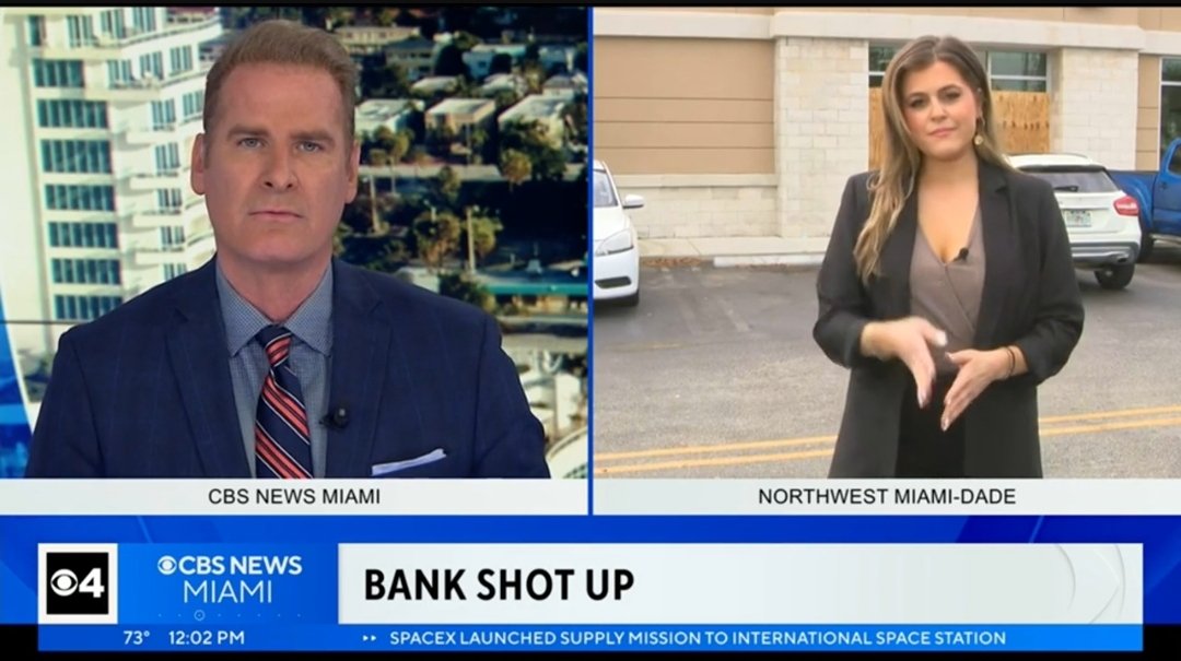
CBS News Miami is next. They've just launched their new graphics package at noon Wednesday.

As for the logo, as you can tell, they kept the channel number as part of the rebrand maybe because the logo is iconic.
Oh wait, what's this?
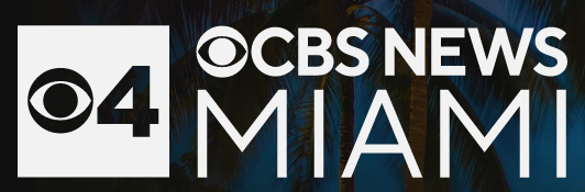
They got rid of the wave from the previous logo. Maybe because they wanted to keep it as minimalistic as possible?
Well, it seems like that was on purpose. Or if it was by accident, they can always add it later.
-
1
-
-
9 hours ago, CircleWXYZ said:
I like WWJ’s news opening. They aren’t flashy and it’s reflective on the serious tone CBS is going for. I think KCAL/KCBS is way too flashy. KPIX is too.
Well, CBS designed the entire intro, which has portions that all three stations are using. And it's up to the stations to pick cuts from the long version to shorten it down.
Seek to 0:45 for the full intro.
-
3
-
-
15 minutes ago, NYNewsCoverage said:
I believe this has been airing for a few months now; but I haven't been able to catch the broadcast. I wonder if they still use the WLNY bug on the TV airing or just the CBS News New York bug. It seems like they started this in response to the 9pm being taken away from local control ( and I think they were streaming 7-8am anyways).
My bad for not knowing that they aired the newscast for months. I don't live in NY anymore, and I shared this from the Discord.
-
7 minutes ago, nycnewsjunkie said:
They’ve been doing this for several months now; the promo is the only thing that’s new.
Oh, my bad. I don't live there anymore, and I shared this from the Discord.
-
2
-
-
For the first time since 2014, CBS News New York is bringing live morning news back to its sister station WLNY that'll air at 7am.
The station' previous incarnation, "Live from The Couch," aired from 2012 to 2014. It had a different premise, which was offering a bit of news, and a lot of interviews, and light-hearted segments. Obviously, this one is going to have complete news. -
For the first time since 2014, CBS News New York is bringing live morning news back to its sister station WLNY that'll air at 7am.
The station' previous incarnation, "Live from The Couch," aired from 2012 to 2014. It had a different premise, which was offering a bit of news, and a lot of interviews, and light-hearted segments. Obviously, this one is going to have complete news.
**CORRECTION:** Updating this to note that WCBS has been airing morning news on WLNY for months now, and that they're now promoting it. -
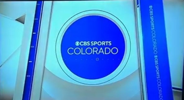
Well, CBS Sports has went local. At least in Colorado so far.
-
3
-
-
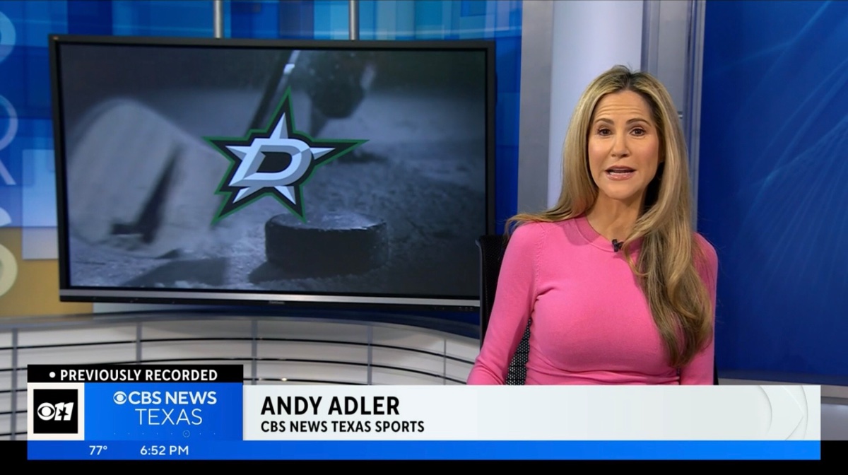
As stated previously, with the rebrand, stations can opt-in with keeping their channel logos as a symbol, or switch to call letters due to research and viewership feedback.
Therefore as CBS Texas debuted last week, they've kept the channel logo as a symbol.
“Based on that research and a little bit of gut we know that’s something that resonates. I think it was a no-brainer that while you’re trying to make a position around CBS New Texas, that it remained.”
https://www.The Other Site.com/2023/02/28/cbs-news-texas-rebranding-ktvt/
-
53 minutes ago, Georgie56 said:
The streaming bug has been corrected.

Another note too. "CBS News Texas Sports"???
Long name for a local sports division. When CBS was developing this entire local strategy as part of the national rebrand, didn't they thought of a division combining CBS Sports and the locals that cover it? Or....just simply asking stations to brand sports coverage based on it?
SB: Nice to see Andy Adler from her (W)PIX 11 days.
-
1
-
1
-
-
According to someone on the Discord server, the regular linear station has the CBS News bug blue, while streaming is white. What is Texas doing right now??
Get your graphics in order.
-
2
-
1
-
-
Sorry for being nitpicky, but they didn't even align the CBS News logo right. Some portions of the graphics aren't aligned right either.
-
2
-
1
-
-
2 hours ago, iron_lion said:
SB: Why does Jodi bounce around networks so frequently? She's a stong enough talent to put down roots at a station.
I think a question that pairs well is does she even work for any network, or a station? Or does she work on TV at all? Haven't heard or seen her name in years. Maybe because I stream-only too much. But still.
Update: I knew on Wikipedia it states that she did infomercials for Westmore Beauty Body Coverage in May 2020. But right after I made the original post, I researched and saw that she's at Clarity Media Group working as a Communications Specialist since June 2013. But if anyone knows if she made any other appearances after her "Live From the Couch" WLNY days, let me know. -
NewsNation has TV apps for Roku, Fire TV, Apple TV, and Samsung.
The app is the first to be developed using Haystack Technology. It's based on the Haystack news app that offers live, and playlist-based videos. It has the weather, stocks, news and more in a cable news styled ticker at the bottom of the screen. But NewsNation didn't want to use that portion of the features.
A thing to note is that NewsNation videos are on the Haystack app itself. And both UIs are literally the same, minus the colors, splash screen, etc. So why would NN partner with Haystack instead of developing it themselves? Maybe they were too lazy in getting developers themselves.
-
Simple takeway: PIX 11 has been pushing potential since moving away from its funky Jodi Applegate era, but just need to apply themselves.
-
2
-
-
4 weeks ago, DIRECTV took off Newsmax over a carriage dispute. And they're still talking about it today. And I didn't even remember it till I tuned into the channel.....from The Roku Channel, which they will ethier remove themselves from or make a clip, replay, whatever channel Newsmax will make out of it in the coming months.
Meanwhile, ABC News Live was removed on the Roku Channel. Not a peep.
"But these are two different channels, and two different services." Okay....still. Anyway, make your own judgment.
.png.d84cd6e8b306744e7a7f851fbe0513d3.png)


The Channel 6 Action News Thread
in Philadelphia News
Posted
He started yesterday (Wednesday), and his first story was on drug abuse.