


13 Eyewitness News
-
Posts
36 -
Joined
-
Last visited
Content Type
Profiles
Forums
Articles
Posts posted by 13 Eyewitness News
-
-
On 7/28/2023 at 10:52 PM, 24994J said:
With all due respect, you sure use a ton of words to say the same damn things, over and over.
Just copying KTRK's new writing style of endless repetition.
") "Only on ABC13, ABC13's [name here] is live with the story," and "As we come on the air, we got breaking news...more breaking news...this breaking news is just in..." (Even when some of those stories broke 5+ hours ago, and everyone knows you are on the air. Someone has to hate that kind of writing as much as I do.) But in all honesty, of course I'm repeating the same things over and over, because every time I watch I keep see the same mistakes happen. I know people from that station used to seek out criticism, so that they could learn from their mistakes. So I figure if someone at KTRK still does, he/she will know that how many Eyewitness News viewers feel ad nauseam. I tuned into 4 primetime broadcasts at random times last week and within the first minute of turning Ch 13 on, they made at least one mistake each time. I also sometimes forget that I said something here before, because I've told the station some of it at one point or another, and posted other bits of criticism in other places. Sorry.
"Only on ABC13, ABC13's [name here] is live with the story," and "As we come on the air, we got breaking news...more breaking news...this breaking news is just in..." (Even when some of those stories broke 5+ hours ago, and everyone knows you are on the air. Someone has to hate that kind of writing as much as I do.) But in all honesty, of course I'm repeating the same things over and over, because every time I watch I keep see the same mistakes happen. I know people from that station used to seek out criticism, so that they could learn from their mistakes. So I figure if someone at KTRK still does, he/she will know that how many Eyewitness News viewers feel ad nauseam. I tuned into 4 primetime broadcasts at random times last week and within the first minute of turning Ch 13 on, they made at least one mistake each time. I also sometimes forget that I said something here before, because I've told the station some of it at one point or another, and posted other bits of criticism in other places. Sorry.
And I'm not sure I understand this idea of standardized graphics anymore, because what KTRK has now is a hodge-podge of what they had before mixed with the lists, forecasts, the simple icons, font, and three dot, thinner banners from WLS. They still have same unique high and low pressure icons, which you guys hate, unique color tables for enhanced satellite, radar, etc, the 4-TowerCam view with current conditions, the same flow lines, some full length banners like before, the same current conditions on the banner (expect a lot smaller) and in 3D (the same size as before), the same transitions, and as well the same way weather alerts pop out under the top banner on radar and the banner still changes from blue to red like before. Pretty much everything on the left hand side of the video wall is the same and augmented reality still looks the same. On the other hand, they removed one of the station's colors, red, from nearly everything. For some reason, the satellite picture in the background of Mega Doppler 13 and FutureTrack is a lot darker than before, and doesn't have the same level of contrast between the background and everything else. They even got rid of the Mega Doppler logo, which doesn't make sense since the station spent a pretty penny on that radar. So, yeah, even though I don't like it, the package at WLS is much better done in that it was clearly designed for them and everything seems to be an appropriate size, while what's at KTRK looks like a rushed copy-and-paste job with changes that don't make sense which make things a lot less legible.
-
 1
1
-
.png) 3
3
-
 1
1
-
-
On 7/24/2023 at 9:45 PM, sfomspphl said:
Details add up. Turn on a WPVI 11pm newscast these days and it feels more polished than the network nightly news.
That how I used to feel about KTRK's 6&10pm broadcasts up they started making bad decisions like the elimination of 13 Undercover, whatever or whoever made their former news director Dave Strickland to quit, and of course, pushing Dave Ward out. Strickland was the best ND that station ever had. He lived, breathed, and bleed Eyewitness News when he was there. Reading things like this, really gets me:
"They don't let you in the building and they said they were busy and would call me back and never heard from them. Marvin [Zindler] would be ashamed of them." --Google Review, a few hours agoOn 7/25/2023 at 11:36 AM, RaleighTVBOI1 said:It's about consistency that why ABC O&O WTVD is number #1. Because if that we use tools like the data tracker, the crime spoter, and talk and focus on issues like crime in Downtown Raleigh and Durham. We also split coverage between the 2 areas unlike the competition. It's about listening, and going in-depth and that what maybe sister-station, KTRK is missing there still ratings leader of course Houston’s Best Station imo but while yes KPRC is giving them and run for their money, they are trying. I think the group-wide package might be a dumpster fire if there is no input.
KTRK used to have "CrimeTracker-13", and just like Action 13, 13 Undercover, and 13's HealthCheck, got rid of that too. The "Safety Tracker" thing is such a rudimentary version of what they had 15 years ago, in part because it only covers one county, and because they rarely ever use it on air.
On 7/25/2023 at 5:28 PM, JosiahCubed said:All I can say about the new O&O package now that we've seen the full package on WLS is... I don't really like the look of the graphics. It's too cluttered for a (somewhat) simple package. Very few packages have successfully shown the 3D look with simple gradients (both the current CBS O&O look and NBC O&O look). The only thing I can give the look credit for is the time, temperature, and current weather conditions ticker in the opens.
I have to concur. The lower thirds have too many movements during live reports. And what's up with using 2D logos, but having 3D graphics? To warp it up, boy if you wanted proof that one size doesn't fit all, just look how tiny many of the fonts on the new weather graphics at KTRK. People have been complaining that they literally can't see some of it because it was designed for a greenscreen, not a full-body video wall. Giant spaces for the weatherman to stand are still there, though they don't need them, so everything is pushed into one corner in some graphics and proves less info than before. I am so disheartened to see that ABC OTV doesn't even care enough to put out a product that people can read on smaller screens or for people who don't have perfect vision, and that has a forecast that so busy, harder to understand, see and remember. None of the sky images looked anything like those pictures would have led you to believe (very dark brownish-looking pictures vs a pretty much clear partly cloudy blue sky with a tiny bit of haze). No question, what they had before was better.

-
1
-
1
-
-
3 hours ago, sfomspphl said:
Not quite over 50 years. I think you'd like this old article from 1974...KPRC was top dog then, KHOU was a few years earlier with Ron Stone and was unabashedly cheap
https://www.texasmonthly.com/arts-entertainment/houston-tv-ratings-war/
Great article! Yeah, I was off by a couple years.
How ironic, because KHOU still has the reputation for being cheap, especially ever since Tenga bought the station. I was going to say "Some things never change," but I swear that was in old line in one KTRK's promos that said they were number one for decades! Dave Ward, and as the article noted, Marvin Zindler's Action 13 helped that station make that station what it was. For those that don't know, Dave was the reason Channel 13 hired Marvin, and Marvin is the reason why fighting-for-the-little-guy became a thing on TV news. Shortly thereafter, they became number one in this market for around 25-30 straight. They used to care so much about presentation and content, but boy have things have changed now. If I remember correctly, Eyewitness News Tonight (at 10pm) finished third place in the November(?) sweeps a year or two ago. That's where they started before Dave and Marvin--last place.
From the article:
QuoteKHOU’s production gaffes became instant fodder for cocktail jokes. Getting film stories of the day’s news on the air is a complex job, requiring about twenty professionals, each doing his job flawlessly. At times, key members of the engineering and production staff at KHOU had been employed no more than two weeks. High school kids ran highly complex equipment because management would not spend the money for professionals.
LOL! Someone literately said that KTRK needs better reporters because their new ones like what you'd find in a "high school film class." How many people does it take to spell "Eyewitness News" correctly? Well, it depends on who is working. Is it "Eyewitrness News", "Eyewiness News", or "Eyewtiness News" today? Someone put up a "BACK TO SCHOOL" tab on the lower-third for a warehouse fire, and never took the chyron off the screen for the entire live shot. They make so many mistakes now that it makes me sad to watch a broadcast that used to be nearly perfect.
-
1
-
-
On 7/22/2023 at 3:46 PM, Weeters said:
People love to claim on here that viewers will switch away from Channel X in droves because they adopted the Tegna music, or because the weather graphics aren't "weathery" enough, and are almost always proven wrong.
It's not even worth my time to rebut the absurd claims being made.
Tenga finishes last place in our market most of the time, so they don't have as much to lose here. But KTRK-TV has already lost viewers for a lot of other reasons than graphics. In the May 2022 sweeps, KPRC Ch 2 became the #1 station in the market for the very first time in over 5 decades. That's the very same station that has been trying to copy Channel 13 for that very same 50-year period. When you loose to an imitator, you've must have stopped being an innovator.
-
 1
1
-
1
-
-
1 hour ago, gsrecaps said:
ABC13 in Houston has gotten the new weather graphics on the air.
I saw it on air, and it's worse than I thought it would be. It is easier to read these graphics when they show this package on the greenscreen at WLS than on 13's weather screen. But regardless of where you show it, the fonts are still smaller on most graphics. The 10-forecast is much, much harder to read on this screen than the 7-day on a greenscreen.
This is taken from their website, and hopefully, will post as the same size. It's TINY. I thought the 7-day looked bad, this is so much worse because everything is too small and too spread out. WLS' version looks a lot better than this.
-
1
-
-
On 7/15/2023 at 9:04 PM, 24994J said:
Please don't encourage people to call newsrooms, even if you're not serious. Frankly, I suggest you lose that number, as well. Nobody should be calling a newsroom line (what was posted above was a public NEWS tipline), whether publicly-advertised or not, for any trivial shit, like weather graphics.
Channel 13 used to welcome people calling their newsroom for comments, complaints, and criticisms. I really do care about Channel 13, but like many Eyewitness News viewers in Houston, feel betrayed by a station that stopped caring about us. I just want to say that that station probably gets more hate mail/negative comments these days than any other Owned station. You probably won't believe the kind of hate they've gotten recently. A few days ago, someone just told them that they should "dig" Channel 13's "grave". A year ago this month, which marked the 15-year anniversary of Marvin Zinder's death, someone else said that KTRK has desecrated the legacy of Zindler and Eyewitness News. He went on to say something like this: When there are more people in need of help than ever, you help fewer people than ever. I believe the viewer noted that Action 13 only helped one person in all of June and July of last year, or something like that. Sadly, it's pretty much the same this year too. You don't know how much it breaks my heart to see a station I grew up with be trashed like that, and even more so for Channel 13 to not listen and understand that the viewer was right.
(They used to have a number used to just go to the newsroom, and there was a different number for the breaking news tipline. They replaced it with just that one phone number.)
On 7/15/2023 at 9:04 PM, 24994J said:If you don't like it. Don't watch. It's that simple.
Well, a lot of people in this market will turn off Channel 13 for good if they downgrade their graphics. They have already gotten dozens of complaints telling them such, and it hasn't even happened yet. I'm am sorry to cause a stir, but the people who made this package--and the people who are pushing it--should want to hear all feedback: good, bad, and ugly. That's the only way you can improve. I know Tracy Butler at WLS was nice enough to give many complaints to Vivid Zero, but the company hasn't listened to any of the constructive criticism. Good for her for caring. Again, I'm sorry. Maybe now you'll better understand where I'm coming from.
-
1
-
-
That was just one small point I was making, and you ignored every other one: The bigger point was that a graphic at GMA couldn't even fit triple digits, their high pressure symbol doesn't have arrows around it, but it has a useless circle around it, and there is no word "HOT" or red color gradient on the graphic, it doesn't say "heat dome" or anything else. Thus, it's a poorly done graphic I'd expect to see from a small market station in the middle of nowhere, not ABC News. It's too basic. You don't need a red H. You need something, anything at all, that conveys that it will be hot. Why don't you call the Eyewitness Newsroom at [redacted] and ask why they have a red high pressure symbol? They aren't going to tell you it was for the fun of it. Some other stations just take the H symbol away and put the words HOT or HEAT DOME in place of the H symbol. That's enough arguing over that.
Just to let you know, I've spoken to some current and former meteorologists at two Owned Stations and none had anything good to say about the VividZero weather package. Maybe this is the greatest thing WLS has ever seen, but it certainly isn't an improvement in other markets. It's not even good. At WPVI, they got dozens and dozens of negative comments once the change was made, and still, months after the debut, still get negative feedback about the package, especially the forecasts. That's what I care about more than a red High. Clear, unique, and easy to understand graphics that appeal to everyone--not just people who like weather apps.
-
1
-
1
-
-
On 7/10/2023 at 10:57 AM, Briella said:
Yeah agreed, it’s clear this person is convinced they are correct. I’m not wasting my time.
Just read this from a small market station and it will help you understand the difference: https://abc17news.com/weather/2022/01/26/insider-blog-what-is-arctic-high-pressure/
Let's get back to the new graphics...
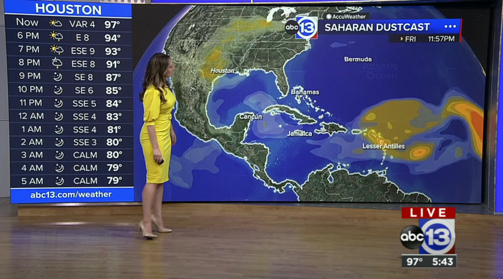
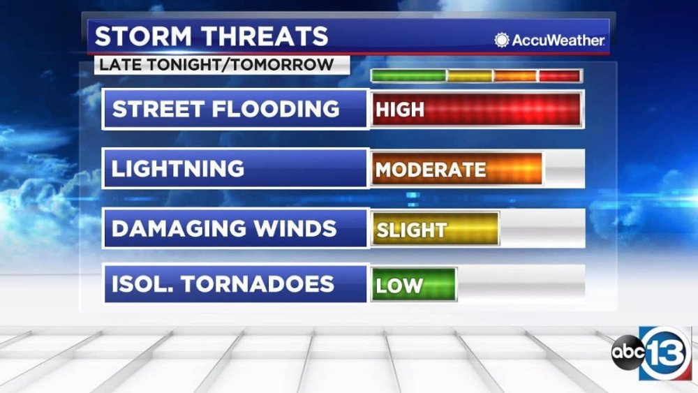
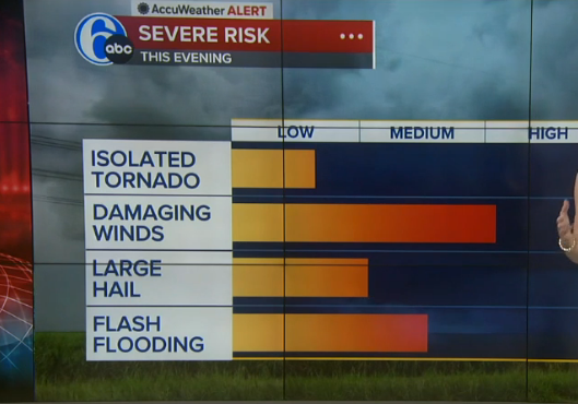
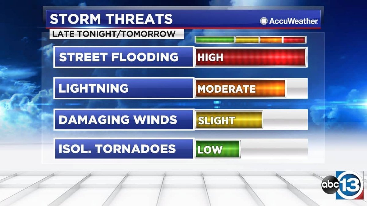
Just compare these risk outlooks from KTRK and WPVI. Which one is a better visual representation that viewers can remember more easily? The 'improved' version isn't listed in ascending order, isn't color coded, and has bar graphs that are all over the delineations.The isolated tornado bar looks like a mid-to-high end low risk, damaging winds could be a lower-end high risk or a high-end medium risk, etc. It's just poorly done and much harder to remember at a glance. KTRK's way is labeled on each bar, color coded, listed from highest to lowest risk, and each bar goes the full length of the delineations (4 vs 3 for new package). This isn't an improvement. It's a downgrade.
I should correct something: Hothaus Creative didn't not make the weather graphics for KTRK; they made current and prior news packages. It was their former Chief Meteorologist Tim Heller who designed the weather graphics. Tim used unique color gradients for radar, enhanced satellite, rainfall, dust-casts, etc. (I don't know who made the red High though). The package made by VividZero uses the same green, yellow, and red color tables for almost everything. It's just too basic.
-
 1
1
-
1
-
1
-
-
On 6/23/2023 at 7:51 PM, Briella said:
High is blue cause it's usually dry and cool, low is red cause it is warm and wet, there is no reason for the H to be red aside from someone who knows nothing about weather maps trying to be different with their artistic opinions. Hence, why I said you made up almost everything you said because you wanted to sound smart. It's not rocket science, and anyone who went to school and knows at least how to read, if not produce a weather map knows this.
That's true for a cold-core High, which is more common in the winter. In the summer, along the Gulf Coast, we get warm core High pressure systems. As I said before, the sinking air compresses at the surface, and that gives you high temperatures when high pressure is in control in the summer. The high pressure acts like a dome and 'caps' the atmosphere. Hence the terms, heat dome or heat ridge. That's all Channel 13 is trying to do--show people that there's a difference between an arctic high and a summertime warm-core high.
-
1
-
-
On 6/19/2023 at 11:59 PM, Weeters said:
I used to have the "menu" of icons WSI licensed out (to prevent multiple stations in the same market from using the same icons, there were 4-5 default packs that get exclusively licensed in each market) but I don't think I have it anymore.
That could explain why I started seeing some of those topical system icons on another station in the same market.
-
On 6/19/2023 at 11:59 PM, Weeters said:
Those are generic WSI icons as well. Here they are being used on a WTOC weather map from 2019. It's extremely rare for a broadcast graphics package to have entirely custom weather graphics. Most stations just go with whatever defaults are available on the system (WSI Max, Baron Lynx, Accuweather) they have for stuff like high/low icons, hurricanes, etc.
WSI rang a bell. Some of the station's graphic elements are designed by IBM's The Weather Company including "Max Reality," which is augmented reality. (KTRK was one of the first stations to use augmented reality.) KTRK does change certain elements quite often and they seem to mix a lot of things together, so I can't remember how long they've been using that closed center Low. They use Baron Lynx's radar display and has that 'exclusive' (in the viewing area, at least) product that can detect hail in a storm. They've probably used everything that's available to them expect for Accuweather at one point or another, and I guess that what gives it the more "custom" look. The main thing I don't like about the GMA graphics was really that it couldn't fit triple digits and if you put a surface low pressure's L icon on a circle, without showing the spin, it makes it look like a closed center of circulation, even though it isn't.
On 6/20/2023 at 2:42 AM, Briella said:Once again, you type this with such confidence when you in fact have no idea what you’re talking about when it comes to why the colors are the way they are. I’m sure you made this up in your head to justify why they are what they are but it’s just wrong.
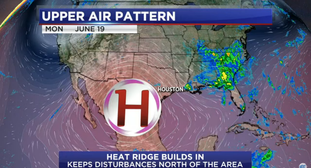
Okay, please tell me why are KTRK's colors that way? Is this not a depiction of a ridge of high pressure, its so-called "Ring of Fire", and the bump in the jet steam because of the high? I know showing a high pressure in red is "wrong", but they didn't make it red for the fun of it.
-
19 hours ago, Weeters said:
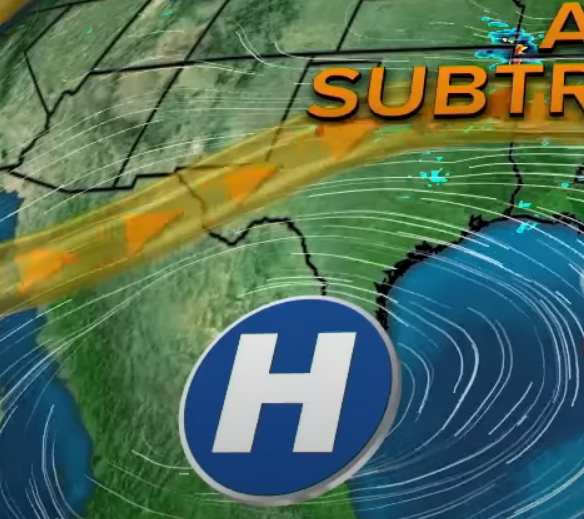
Firstly, blue for high pressure and red for low pressure is the NOAA standard marking. That KTRK one was designed in the weather office if it isn't a generic one. No broadcast designer would have made that.
I didn't realize this would cause such a stir. I know that the typical colors are red for low pressure and blue for high pressure. It's also typical to show a low pressure system in the gulf as just the standard L, as shown in your picture too. But, how do you show the difference between a tropical low, that has a closed center of circulation and one that's doesn't? The former can become a tropical system, while the latter can't. KTRK shows it with a (L), a circle around a red L, as seen in the video.
I don't know who made it, but KTRK has had similar looking red High pressure icons in their last 3-4 weather graphics packages, which were all made by Hothaus Creative. They do use the regular blue highs/red lows in the winter to show the upper air pattern. But the station does a lot that isn't "normal" and I always like that. We have color gradients that go up to 20" of rain. Might sound crazy, but that's happened many times in SE Texas. As seen in the video, we also have different color gradients for tropical weather, which don't look like regular radar reflectivity as there are no radars in the middle of the ocean anyway. Is this unique too? I've always hated seeing green/yellow/red color gradients on tropical systems because you aren't measuring the intensity of the rain without radar, you are only showing an enhanced satellite picture of clouds.
10 hours ago, Briella said:there is so much wrong here… I can’t even.
It's the way KTRK has been doing it for at least 10+ years. The map depicts the upper air pattern and temperatures aloft. The former is shown in the flow lines, and the latter with all the red around the map. The H, clearly, is high pressure, but is depicted in red to convey that it's a 'heat-ridge' and shows the way it spins--clockwise. You're trying to show life-threatening extreme heat here. A good weather graphic should tell the story just by glancing at it, and teaches viewers why what's happening is happening without saying a word. A high gives you sinking air, light winds, and clear skies. In the summer, that allows for maximum heating--and in this case dangerous heat--during the day. While in the winter, that same high will give cold temperatures because of a lack of cloud cover.
-
1
-
-
16 hours ago, SFTV said:
Not that I’m aware of….
KTRK started reairing a few old stories in the past few months. I think the station believes that people can't remember.
On 6/18/2023 at 4:56 PM, FiveNews said:KABC Los Angeles
-Morning Traffic Anchor Brianna Ruffalo also does 11am weather. Also Scott Reiff reports from Air 7.
-Dedicated automotive reporter and health reporter. No consumer unit, these stories are usually fronted by a GA reporter.
-I have seen a sports full screen with scores on the 11pm if no talent is available. Rob Fukuzaki is the long time sports director. Curt Sandoval handles weekends.
-Weather is stacked: Legendary Dallas Raines, Leslie Lopez, Tony Cabrera, Shayla Girardin, and Alex Cheney
-Fun Fact: Celebrity chef Bobby Flay's daughter is a community journalist for ABC7, Sophie Flay.
KTRK used to have a HealthCheck reporter, but after she retired, the station got rid of HealthCheck. They also used to have a "community journalist" and he left as well, but he wasn't related to Bobby Flay! We do have a SkyEye-13 reporter in the morning, but she doesn't actually work for Channel 13. She works for Helicopters Inc, which owns the chopper.
On 6/18/2023 at 8:12 PM, 24994J said:KTRK isn't using their talent resources particularly well. We get it
Well, now I can see that. I was assuming that other O&O stations also slashed key positions, but that doesn't seem to be the case.
-
On 6/17/2023 at 1:54 AM, ABC 7 Denver said:
Vivid Zero is managed by the Principals of Stun Creative.
They are much better at designing websites and magazines than news graphics. I guess that's why they tried to make some graphics look like web pages with tabs/arrows, tiles that swipe the screen like you would on some apps, and ellipses marks on banners that look like a more options icon.
I was watching part of GMA this morning and noticed their weather graphics, which look a lot like WLS', aren't optimized for hot weather and triple digits. They tired to show three one hundred degree days in a row, and it looked like 101100101 instead of 101 100 101. Even the weather lady said it "looks like a serial number." The ridge of high pressure was your basic white and blue and didn't show the clockwise spin around the H either. That high pressure, which has sinking air, is the reason for the hot weather and KTRK's way of depicting it much better with a red high, which does have the clockwise arrows that spin around on the H's circle and red color gradiant all over the map. Both of those elements makes it look hot and color of the High tells you why it's hot. Whereas a blue high looks cool, and with no arrows, you don't even teach viewers which way high pressure spins let alone convey that it's the reason for the heat.
-
 1
1
-
1
-
1
-
2
-
-
1 hour ago, SFTV said:
KGO is fully staffed
1 morning traffic anchor Jobina Fortson who also does LIVE Desk updates since Alexis Smith left for Seattle years back.
7 On Your Side consumer Michael Finney reporter during the 4,5 and 6pm shows
3 investigative reporters. 1 full time (Dan Noyes) and 2 (Stephanie Sierra /Melanie Woodrow) that report in the field when not doing investigative reports
3 sports crew. (used to be 4) 2 on air (Larry Biel and Chris Alvarez) 3rd one (Casey Pratt) is a senior sports producer and will fill in from time to time
5 weatherperson team. (Used to be 6, recently left to KSHB) the 5th one (Frances Dinglasan) is the back up when needed
Thanks for the response. Sounds like KGO has better management than KTRK.
That's the way it used to be at KTRK Channel 13 for years, expect we only had two investigate reporters (13 Undercover's Wayne Dolcefino and 13 Investigates, formerly branded In Focus, reporter Ted Oberg). The station pushed Wayne out more than 10 years ago, and decided to eliminate 13 Undercover a few years after that after two separate replacements only lasted a few months each. Ted Oberg left for DC in October 2022, and they still don't have a replacement for him. Action 13 consumer reporter Jeff Ehling is now a weekend morning anchor, and the station rarely helps anyone anymore. They only recently brought back the 'Action 13' name, but they don't have a dedicated consumer reporter. Why is KTRK doing this? Oddly enough, after letting Eyewitness Sports anchor Bob Slovak go in 2020, they hired him back last year for KTRK's "Programming/Special Projects department as the team's Premium Content Multi-Skilled Reporter." I'd much rather have him back for a much simpler title -- Eyewitness Sports Anchor.
One more question, does KGO ever re-air packages that aired a month or two ago, or even a year or two ago and act like it's something new?
-
1
-
-
1 hour ago, 24994J said:
No, that's the outgoing wordmark, but with the new ABC.
What does the new one look like?
-
20 hours ago, RaleighTVBOI1 said:
ABC11 got a flatter look of it's iconic workmark or at least the red and white logo template. Red has Eyewitness the white is News.
Would it be this? That's looks fine to me, because the logo is still unique and instantly recognizable, just 2D instead of 3D.
On the other hand, the sometimes used sans-serif logo for KTRK's 13 Eyewitness News looks way too generic and lacks any kind of sophistication or class. When you think of Texas, you don't think of a something that's soft and whimsical-looking. So, I think it's much more suitable for California than Channel 13.
-
3
-
3
-
-
12 hours ago, ABC 7 Denver said:
It was designed by
Smith GeigerVivid Zero who designed the rest of the ABC look.Do they have an previous experience making news graphics packages, because it really doesn't look like it. They tweaked the GMA look by basically taking the logo by putting it on a yellow circle. But didn't change much else, like the lower-thirds are nearly identical to before, which I like.
I don't really think anyone can call this a "rebrand":


-
1
-
-
1 hour ago, 24994J said:
Probably streaming, but it's on signage all over the inside of the station. Has been for more than a year.
They have one wallpaper sign with that logo in a conference room, but it's far more spaced out. (EDIT: Yeah that's the picture of it!) They also used it on their Hurricane Tracker last year as well. They did use that logo on a couple very short lived commercials mostly a year ago, and also used it on streaming when it was first introduced, but got rid of that too. Also, they used that plain typeface mashed-up with the 3D Channel 13 logo for Severe Weather Alerts during regular programming at the bottom of the screen, but got rid of that this year as well. They do have the regular logo in the newsroom, the studio, on their live trucks, and their newly redone open. They did introduce two new graphics that have the regular EWN font on them about 7-8 months ago, and another new one that they introduced maybe 1-2 months ago.
Here's why I don't like it: The flag of the 13 represents Texas and the Eyewitness News is supposed to represent unfettered, unmatched commitment to "Caring About Texas" as their one of their slogan used to go. It looks different, because the station is supposed to be different than anyone else. Though as you can read below, they don't always uphold that legacy these days, that station's logo should at least serve as a reminder of the level of detail and difference that no one else should be able to match.
1 hour ago, MorningNews said:Their current package was top notch when it launched and has been ruined, similarly to the studio and everything else about the station generally.
The package is still good, but last year, they just keep making mistakes like going to black screens, pausing/restarting the graphic, or going to the wrong camera, misspelling words (even Eyewitness News!). Lately, it's been a lot better. They changed the studio's light to LEDs a couple years ago and that really made the set look off and some of the elements aren't lighted up as well as before, while others are way too bright. "Everything else about that station" = How do we get Channel 13 to realize what they've done to wreck their legacy?! I didn't want to say it, but current management has run that station into the ground. Remember 13 Undercover, where the station used to go after pubic officials that abused their office and taxpayer money without fear, and it led to people getting fired, prosecuted, and convicted of crimes? Today, KTRK is too afraid to even investigate anything anymore. The last '13 Investigates' story I saw was a report that a small city outside of Houston didn't have a hospital, or so the tease said. The reporter couldn't even pronounce the name of the city correctly and we're talking about a pre-recorded piece not a live shot! The story actually said that the old hospital closed, which Eyewitness News already reported on in 2016, and a new hospital opened about year later. It said there were either two or three dozen small counties, most with tiny populations, that don't have hospitals in the state, but that is already common knowledge. Calling that an "investigation" is a desecration to the legacy of Eyewitness News. Also as much a desecration to their legacy is calling stories "ACTION 13" where they help no one and solve nothing. Marvin Zindler's Action 13 used to fight for the downtrodden and get people the help they needed--at no cost to them. Lawyers, doctors, carpenters, electricians, exterminators, you name it, Marvin could make it happen thanks to Marvin's Angels willing to donate their services to those that couldn't help themselves. Someone's been ripped off? Call Marvin. Now who do you turn to? In my opinion, good reporting, getting it right, and fighting for the little guy and for what's right should be the only things 'management' should mandate. I've live here and watched KTRK all my life, so I hate to say it this way, but that current typeface is the best thing the station has left. Getting rid of it would be like admitting they don't know how to--or don't care to--uphold the legacy of 13 Eyewitness News. I'm sorry that's too long or too harsh, but to see a powerhouse station fall so far, so fast is the saddest thing that I never thought I'd have to an eyewitness to.
---------------
20 minutes ago, froyo49 said:imo the graphics should complement the story, not distract from it, but the consultants often don’t seem to think so
You said it.
51 minutes ago, ns8401 said:Why do TV news people have to have the same hard headed product philosophies as car executives? Keep it simple and don’t try to overflash or make it harder to read a graphic or see an image in an open. A large chunk of the viewers are older and may be turned off by it.
It's not the TV news people, or at least I don't think it is. It's usually some ad agency that makes those graphics, but otherwise I agree with what you said.
51 minutes ago, ns8401 said:The transitions where the graphic swings in and swings out again (weather for example) looks familiar… like 2012 familiar. Making your audience dizzy trying to read your graphic still isn’t in style.
That's the one!! I knew it seemed familiar! Sadly, not the good kind of familiar.
-
1
-
-
1 minute ago, 24994J said:
Oops. Too late.
That's garbage. It looks like a cheap, off-brand product when compared to the original. Where did you find it?
-
1
-
-
37 minutes ago, Vlad said:
Overall are definitely a step down in my opinion from what they used to have, I don't understand this new direction these stations are going for with these large fonts and basic 2D looks, I guess this is a new trend now to go for a more flat and less flashy appearance
I agree, and I don't understand it either. Even in the 90s, KTRK had 3D graphics, many of which, still look better than some of these news ones and that's mainly because some graphics are either too busy or too plain in the WLS package. The pointless arrows that aren't pointing at anything, ellipse marks on top banners, and everything swipe in/up/around, looks busy and just doesn't look very polished. Not everything has to pop up or swipe on the screen.
22 minutes ago, 24994J said:WABC changing their wordmark is not clear, either way.
Changing KTRK's iconic workmark would be a huge mistake! For a station which a unique, rich legacy like theirs, you need a unique workmark to match. That logo, or ones that are nearly identical to it, have been in use at KTRK for all but 10 years of the station's 50+ years of branding it's broadcasts as Eyewitness News. I'd say keep the plain-Jane font for the lower-thirds (or stations that already use it).
-
1
-
-
44 minutes ago, Horizon said:
But, and this may be controversial, WABC. It's nice and simple, uses a good amount of red white and blue.
I actually agree with that because it's cleaner and simpler. I think the WLS package looks better in screenshots than the actual broadcast because when I saw the broadcast I felt like there's just too much movement, and the open is way too busy.
-
1
-
-
1 hour ago, noggi said:
I'm not sure I need a fake ticker and time/temp, but hey - props for trying something new. It's not the best O&O package out there but certainly not the worst and I think definitely an improvement over what most of the ABC O&Os have on the air now.
I think the ticker is real, but it's strange that you'd put a ticker in the open and not have it during the broadcast where you could actual read it. Which ABC O&O station would you say have a better graphics package? KTRK?
1 hour ago, noggi said:Odd choice though going back to a very dated-sounding (well, it is dated, it's from the 90s) music bed
I like the first cut of music, but not as an open. At KTRK, it was almost always used as a talent. The two different cuts mushed together, however, don't sound like they go together.
-
1
-
-
I've been wondering: Do any of your ABC O&O stations not have morning traffic anchors, consumer reporters, and/or investigative reporters? Might sound like an odd question, but KTRK-TV doesn't have any of them.
Also, do any of your stations routinely skip the sports segment on evening broadcasts that are supposed to have them? KTRK does that all time now, and in its place the station just reairs a random piece that air on earlier Eyewitness News broadcast. The Eyewitness Sports team is the smallest it has ever been with a just a sports director, sports producer, and a part-time sports and news anchor/reporter. You'd think that a station would fill all these 'open' positions (though they don't want to hire anyone but an investigative reporter), before hiring a 6th meteorologist.


ABC changing their logo; New graphics coming for ABC owned stations
in Graphics
Posted · Edited by 13 Eyewitness News
Finally! A station that knows those tiny icons are bad. It probably won't stop the pictures from not matching the icons though Just keep the icons and get rid of they busy and inconsistent pictures.
Very much so. The circle 13 isn't even centered in the middle of the 'frame'. The "Eyewitness News" doesn't match the 13. It is too generic and simple looking to be next to such an intricate, unique Channel 13 logo. Eyewitness News is 3D while the 13 logo is flat. The tiny Houston isn't necessary because there's only one 13 Eyewitness News. "Tomorrow Morning" isn't centered with anything either.