c.alexbrown
-
Posts
49 -
Joined
-
Last visited
Content Type
Profiles
Forums
Articles
Everything posted by c.alexbrown
-
The animated/vector looking render of Rockefeller plaza looks too much like KLG and Hoda's open
-
TEGNA Broadcasting and Digital General Discussion
c.alexbrown replied to ABC 7 Denver's topic in Corporate Chat
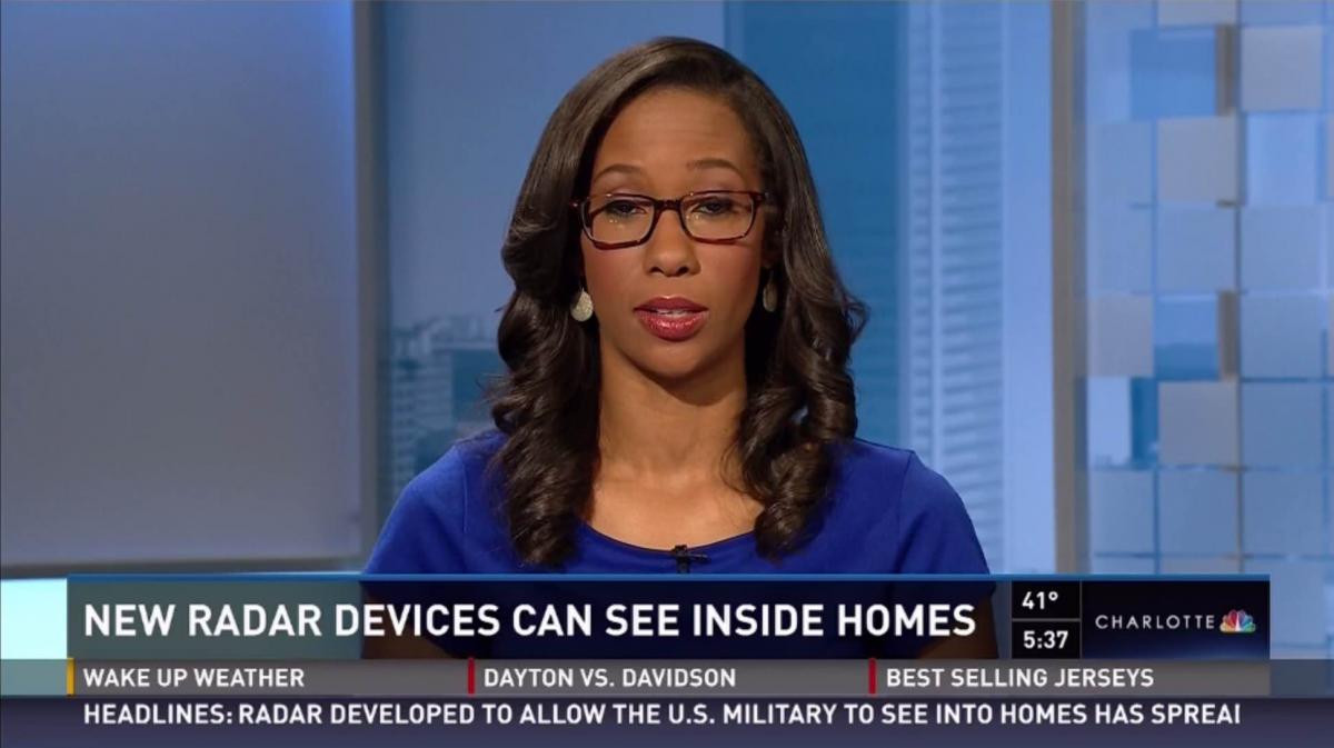
You know what the most annoying thing about this new change is.... The whole reason they made the change is because people who still have SD we're seeing cut off graphics and were throwing a fit. So finally, they at least move the time and temp to fit inside the 4:3 safe margin, and leave enough room for at least a small affiliate logo (abc, nbc). I hate how wcnc has the nbc logo on the right side of the box instead of having it in the left where at least someone who watches in SD would see the NBC logo. Sorry. Just a rant. -
TEGNA Broadcasting and Digital General Discussion
c.alexbrown replied to ABC 7 Denver's topic in Corporate Chat
Oh you're so right!!!! I don't like it. It isn't as refined as it used to be! -
TEGNA Broadcasting and Digital General Discussion
c.alexbrown replied to ABC 7 Denver's topic in Corporate Chat
So far, all I've seen is the breaking news one. And they only have used it twice. It's not good in motion either. I thought that the current package is flawless, minus the lack of design for 4:3 safe margins -
TEGNA Broadcasting and Digital General Discussion
c.alexbrown replied to ABC 7 Denver's topic in Corporate Chat
Of course Gannett is releasing new graphics on Wednesday.... I wonder why wednesday. Anyways, at WCNC here's what I've been seeing all morning. One thing to note. The ticker now extends to the edge of the screen. There is also a layer under the rundown that is goes across the screen as well... this will probably be coming later. [ATTACH]1459.IPB[/ATTACH] Also, new topicals and transitions. [ATTACH]1461.IPB[/ATTACH]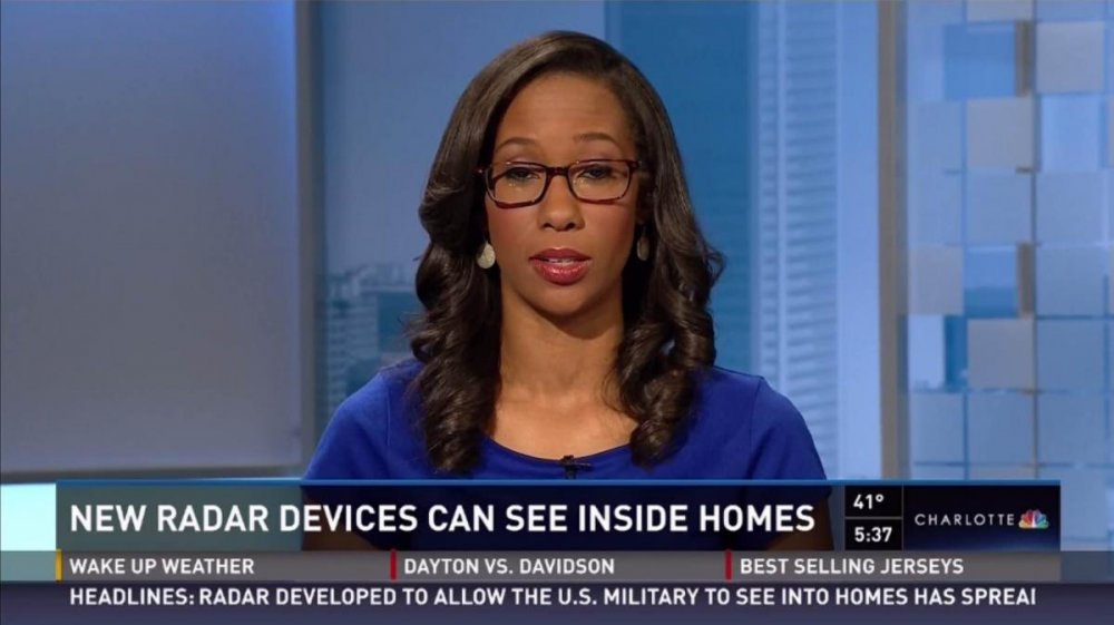

-
TEGNA Broadcasting and Digital General Discussion
c.alexbrown replied to ABC 7 Denver's topic in Corporate Chat
NO THANK YOU for that tip!!!! -
TEGNA Broadcasting and Digital General Discussion
c.alexbrown replied to ABC 7 Denver's topic in Corporate Chat
Ha. People want to see junk and banners? They haven't seen the old gannett graphics! -
TEGNA Broadcasting and Digital General Discussion
c.alexbrown replied to ABC 7 Denver's topic in Corporate Chat
Well, here in Charlotte WCNC is in damage control..... https://m.facebook.com/story.php?story_fbid=763396377035188&id=119243191450513 POSTED LIKE THE THIRD TIME TODAY! Gannett really needs to figure out how to switch it where it's like CNN SD..... How it's stretched out wide. Was it like this for other gannett stations when they launched? -
TEGNA Broadcasting and Digital General Discussion
c.alexbrown replied to ABC 7 Denver's topic in Corporate Chat
Okay. There are a few things that annoy me about the Gannett Graphics, however, the biggest annoyance to me is how they categorize stories. If you're talking about an app, its not LIFE! IT'S TECH! I mean come on! I wonder if there is some type of flow chart regarding choosing a story category. -
TEGNA Broadcasting and Digital General Discussion
c.alexbrown replied to ABC 7 Denver's topic in Corporate Chat
The reason I believe that WSOC doesn't use the ABC logo anywhere is because they also broadcast on TV64. -
TEGNA Broadcasting and Digital General Discussion
c.alexbrown replied to ABC 7 Denver's topic in Corporate Chat
Is it me or Is some shots of WSOC set oversaturated? i do think that the biggest problem with the new gannett graphics is that they aren't SD safe.... They're designed for 16x9 not 4x3 ratio! -
TEGNA Broadcasting and Digital General Discussion
c.alexbrown replied to ABC 7 Denver's topic in Corporate Chat
http://www.tvnewscheck.com/marketshare/2014/07/17/behind-the-doors-of-local-tv-consolidation-in-charlotte/ Here's an interesting article about tv consolidation, and wcnc is in the forefront of it. -
TEGNA Broadcasting and Digital General Discussion
c.alexbrown replied to ABC 7 Denver's topic in Corporate Chat
With the tower, wcnc loved cutting up the close version of it. -
TEGNA Broadcasting and Digital General Discussion
c.alexbrown replied to ABC 7 Denver's topic in Corporate Chat
yeah.. but I mean if you looked at the line-up, they do group the stories together... so its not like it would be blue - green - blue - purple. They do keep the stories somewhat closer together. I honestly don't care... just turn back on the lights please! -
TEGNA Broadcasting and Digital General Discussion
c.alexbrown replied to ABC 7 Denver's topic in Corporate Chat
http://forums.tvnewstalk.net/index.php?/topic/12313-wcnc-rebranded-to-nbc-charlotte-news/ FINALLY! WCNC IS NO LONGER A RED HEADED STEP CHILD! -
TEGNA Broadcasting and Digital General Discussion
c.alexbrown replied to ABC 7 Denver's topic in Corporate Chat
The building blocks of the gannett look tie into their studio with the block plexiglass. I'm telling you.... It would be awesome if they'd turn back on the lights and switch it with the rundown... blue lights for news, yellow for weather, green for money, etc. Here is the opening video in HD... It's still processing the HD I believe, but it's up!: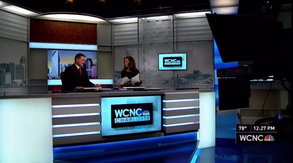
-
TEGNA Broadcasting and Digital General Discussion
c.alexbrown replied to ABC 7 Denver's topic in Corporate Chat
Not a fan of the name and VO.... It's too long and it doesn't flow. -
TEGNA Broadcasting and Digital General Discussion
c.alexbrown replied to ABC 7 Denver's topic in Corporate Chat
And don't forget about all TWC's weird new numbers too! -
TEGNA Broadcasting and Digital General Discussion
c.alexbrown replied to ABC 7 Denver's topic in Corporate Chat
Ahhh... I see. Ive got a digital recording version of it. Uploading in 1080. -
TEGNA Broadcasting and Digital General Discussion
c.alexbrown replied to ABC 7 Denver's topic in Corporate Chat
I'm uploading a video of the open and like first minute or so, now. I'll get a montage up of all the new graphics on youtube hopefully by the end of today. So far, so good.... It actually makes their newscast seem much better than it used to be, IMO. -
TEGNA Broadcasting and Digital General Discussion
c.alexbrown replied to ABC 7 Denver's topic in Corporate Chat
Okay Guys... Here it is.... WCNC is choosing to use the brand WCNC Charlotte!
-
TEGNA Broadcasting and Digital General Discussion
c.alexbrown replied to ABC 7 Denver's topic in Corporate Chat
That first warn logo looks terrible there!!! I noticed that when Brad posted a Sharknado video like 2 days ago!!!! -
TEGNA Broadcasting and Digital General Discussion
c.alexbrown replied to ABC 7 Denver's topic in Corporate Chat
I think I saw an updated promo this morning that changed it from the 30th to "coming soon" -
TEGNA Broadcasting and Digital General Discussion
c.alexbrown replied to ABC 7 Denver's topic in Corporate Chat
I did notice that! Keep in mind that the UX subdomain is the content staging and development site, so most likely, they'll fix that kink. -
TEGNA Broadcasting and Digital General Discussion
c.alexbrown replied to ABC 7 Denver's topic in Corporate Chat
I'm a designer myself and I love DIN. And im also pretty sure that it's not cebtury gothic..... Futura actually since they have so many varying widths. But whatever it is, it is indeed cheap looking.