


Axiom81
-
Posts
58 -
Joined
-
Last visited
-
Days Won
1
Content Type
Profiles
Forums
Articles
Posts posted by Axiom81
-
-
It appears the MMM group has moved their logo (after years of it being on the left) to the right and also made the graphics boxes LARGER . Not sure if this is a pre-cursor to a larger change , but now the logo on the right side rotates between the logo, Channel3000.com, and News3Now. (Also can confirm WKBT has this look now as well)..but not a huge fan of this constant right box change and the much larger text box...the before was the correct size ...but just 1 opinion

Before:

After"

-
WISC-TV is apparently undergoing some changes.
Chief Meteorologist Gary Cannalte is retiring at the end of February after 33 Years. (Alex Harrington will take over as Chief Meteorologist in March)
Noon and 4pm Anchor Mark Koehn is "retiring" after 46 years (last day is Jan 12th) ( special note that this was not entirely his decision based off his post and On-Air announcement) .
-
On 12/15/2023 at 10:32 AM, CoopInTheHouse said:
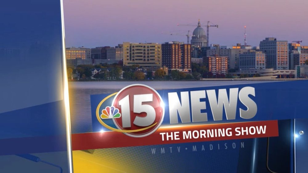
No switch to GrayONE yet, but WMTV got the new brand (15 News) and new music (Unite from Stephen Arnold Music) on Wednesday.
I will tell you, the new open is MUCH better than the old tired 20 year old music they had before. Not sure why they didn't just flip to GrayONE at the same time.
-
2 hours ago, HSV cheesehead said:
How old is WMTV's current package? (photos attached for reference)


They had a small graphics refresh in 2016 when they moved into their new studio. But i know the music for their intros, teases, etc are even older than this. Logo wise, they have had the same since the early 2000's.
-
30 minutes ago, GodfreyGR said:
Then the question is what do the ratings look like? If WMTV is #1 (And I'm pretty sure it's between them and WISC?) then "If it broken, don't fix it" might apply.
That said, WISC did blow up their graphics and branding a few years back...
I believe they run really close to each other. WISC I believe wins by a hair. WISC finally did get a new set 2 or so years ago and it was very much needed. Their graphics package I think was a small step back , but back to WMTV...I'll have to watch to see how they do their opens since NBC15 is embedded in their website, intros etc.
-
On 12/9/2023 at 1:52 AM, Wisco TV Watcher said:
The WMTV logo got "de-peacocked" and it looks ridiculous. They should just drop that swoosh element if they're not going to fill the space with anything. Better yet, they should reimagine the logo entirely when they get the new graphics package (which will hopefully come sooner, rather than later, because they have the most dated looking package in the Madison market.)
Based on a few recent social media posts, they are now branding themselves as "WMTV" and "15 News," instead of "NBC15."

This is a surprise ! I live in the Madison market and EVERYTHING they do is always "NBC 15 News". I agree though with the statements above, they haven't had any graphic refreshes in years! (WKOW still has the worst graphics IMO) ...but yeah this logo needs a HUGE refresh. I keep thinking with each sweep period coming, they will switch, but years keep coming and going and they still have the same package..same music..same blah...they def need a complete overhaul of music, graphics, logo..EVERYTHING lol .
-
Chief Meteorologist at KSLA confirmed new graphics at 5pm.
-
Meanwhile, WMTV in Madison still has the older GFX package ...not sure which version this was (is)..but it's been the same for several years now.
-
4 minutes ago, MichiganNewsGraphicsJunkie said:
Overall a big improvement.. but the anchor desk is a bit... wonky??
Yeah I think its that and how the weather center seems a bit close. The Lowcountry Live portion of the set is so much cleaner...but I'll give them this, its different than WCSC and WCBD which is good. I think WCSC wins the set look for Charleston though.
-
 1
1
-
-
WCIV has launched their new set...not 100% sure how I feel about it....Its a remarkable improvement over their existing early 2000 set
-
1
-
-
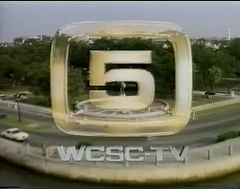
9 hours ago, GoldenShine9 said:
I think the ideal logo would be the gold "5" of old, combined with the font from that WBTV proposed design.
You read my mind
-
1
-
-
4 hours ago, Georgie56 said:
The GrayONE look has launched at WCSC.
This is a vast improvement over previous opens. Still gotta inject the logo sucks though
 .
.
-
 1
1
-
-
I noticed WCSC's Weather Banners have changed to the GrayONE package. After seeing WCAX's, this is certainly going to be their best look yet. (As of noon today, the new look has not launched, will check at 4pm ET.
-
3
-
-
I noticed a banner change for WCSC on Facebook....wonder if thats a hint at new GFX in the next day or so?
Old:
New:

-
Taking this with a very very fine grain of salt..but on one of the broadcast Facebook sites, I just saw a post for a new WBTV logo. Anyone have any info on it ?

-
1 hour ago, nycnewsjunkie said:
I wish they’d change that logo, but those graphics look like they’ll fit the station well.
Staggered launch..not sure why Gray did it this way, but looks promising. I haven't been a fan of the logo in a LONG time. Wish they would have brought this one back.
-
4
-
2
-
-
This is a very clean look, it's giving me a bit of Morgan Murphy Media Graphics vibe, but on a more simplified scale
-
21 hours ago, tylerSC said:
WBTV has a nice graphics package, which may be a modified Raycom style. And recently the Gray talk shows on WBTV and WHNS have identical new graphics.
WBTV historically has had the nicest graphics package since the (Jefferson) Lincoln days & were always a one off from the rest of the group even after the Raycom acquisition and then the Gray acquisition.
-
13 hours ago, MidwestTV said:
Good use of multiple colors at once.
I have to hand it to Gray, they did a good job and the flexibility of the set is fantastic. I'm curious to see the new GFX package next month.
-
6
-
-
So I haven't lost my marbles yet. Looks like the new GFX package for Gray is coming in March and goes with hardware upgrades mentioned in earlier posts ..so a bit of a wait
-
1
-
-
This set is going to easily qualify as worst set of 2023. What is with this big v shaped desk. It's like they took some of Nexstar's shiplap and added led light strips . I can't get over this strange desk though .
-
2
-
 1
1
-
-
WCSC went live with what I am now calling the "WANF" set design, but no new graphics came with it. Possible delay in that piece...so no updates on the GFX portion. Sorry to disappoint but I was just as excited as everyone else was.
-
1
-
 1
1
-
-
I wonder if new GFX is delayed. I heard from a reliable source there was new GFX on the way and it would make sense with the WANF look moving forward for Gray
-
1
-
-
23 minutes ago, ATLNewsExpert said:
Many similarities to the WANF set, so far so good! Hopefully we do indeed get new graphics!
Agreed, I see a good deal of WANF in the set, which is good.
Timeline of construction video : https://www.live5news.com/video/2023/02/13/video-timeline-new-live-5-news-studio-construction/?fbclid=IwAR3CT1LbRVn2unUeDXyue3_aV9AX1EQYSIsGHHbXSvJtbauWeFunyS5oN_Y
-
1
-

Morgan Murphy Media Graphics - Tweak
in Graphics
Posted
Yeah I REALLY wish MMM would get rid of the news ticker, it provides zero value and is more of a distraction.