13 Eyewitness News
-
Posts
36 -
Joined
-
Last visited
Content Type
Profiles
Forums
Articles
Everything posted by 13 Eyewitness News
-
ABC changing their logo; New graphics coming for ABC owned stations
13 Eyewitness News replied to Briella's topic in Graphics
I agree. There's just too much movement. If you're going for the 3D look, use 3D graphics! This is a 2D package with too much motion, trying to get the "3D look". The way the Channel 7 pops up in the open looks very cartoonish, and the tiny arrow pointing to a tiny Chicago also pretty cheap looking. The Eyewitness News typeface is too generic. Some of the graphics are also extremely plain (like weather forecast), while others, like the open/breaking news deal, have way too much going on with still images moving around that's it's kind of dizzying. But most have the same swiping motion that seems to be overused for almost every single graphic/transition. This isn't what I expected at all and I have to agree it is a downgrade. I'm sorry, but I feel like someone got paid a lot of money to steal elements for every other station he/she has ever watched, and much like the open's mashed-up music, just threw it together. -
ABC changing their logo; New graphics coming for ABC owned stations
13 Eyewitness News replied to Briella's topic in Graphics
After seeing an entire newscast, I have to say there is just too much motion going on. It seems like most graphics swipe the screen the way the open does and move pretty fast. The lower-thirds look fine as a screenshot, but there's a lot of strange movements their too. At first, the Eyewitness News reporter's name shows up in a larger white banner, it shrinks and moves up a little (like a tab), then the blue banner pops up, and the white tab disappears after a few seconds. It's just too much, and it's not what I expected at all after seeing the screenshots. Many of graphics kind of look like WABC's package, which I've never liked. Other than that, it's pretty strange for the Weather and Coming Up graphics to look almost exactly the same. -
ABC changing their logo; New graphics coming for ABC owned stations
13 Eyewitness News replied to Briella's topic in Graphics
I'll third that. The collage of pictures is too much to look at, and the way it swipes across the screen makes it look even busier. The second cut of music doesn't match the first and I don't like the way it sounds together either. I'd like to see a whole broadcast before I pass judgement on the entire package, but there are a lot of strange arrows everywhere like the graphic that says "Coming Up: Rainy and Raw Day". -
ABC changing their logo; New graphics coming for ABC owned stations
13 Eyewitness News replied to Briella's topic in Graphics
The first part it's the same cut KTRK used for decades. Here's the last time they used it in their old talent, which happens to be the best talent outro the station has ever had: -
ABC changing their logo; New graphics coming for ABC owned stations
13 Eyewitness News replied to Briella's topic in Graphics
I'd say it's brand recognition. For most of these stations, Eyewitness News is their brand. When the logos are different, they are instantly recognizable as a certain station. That might not necessarily be true for WLS since they dropped the EWN brand 17 years, but I think it's certainly true for WABC or KTRK. I mean, it kind of looks like someone just typed up "EYEWITNESS NEWS" the same font of WABC or KTRK's chyrons, so that's why I call it brandless. I agree. The other thing that doesn't make sense about it, is that they went from a 4:3 forecast, where there's room for the meteorologist to stand, to a 16:9, where the weatherman would cover up at least one of the days, while adding nothing new or better to the graphic itself. -
ABC changing their logo; New graphics coming for ABC owned stations
13 Eyewitness News replied to Briella's topic in Graphics
The current font looks unique, but this one looks pretty much brandless. It looks like another ABC O&O station, KABC. Why would anyone want to make them look alike? -
ABC changing their logo; New graphics coming for ABC owned stations
13 Eyewitness News replied to Briella's topic in Graphics
The current KTRK graphics package hasn't seen any changes other than an increase in point size for lower thirds, but they did murder some of the graphics in the prior one. -
ABC changing their logo; New graphics coming for ABC owned stations
13 Eyewitness News replied to Briella's topic in Graphics
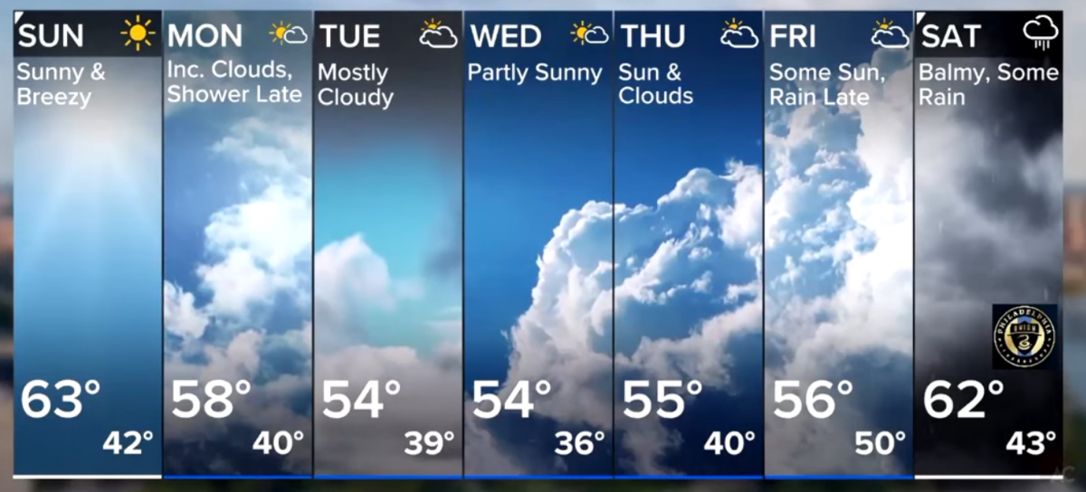
Some of the elements of the new weather graphics package look old and outdated to me since KTRK-TV Channel 13 was using many of these elements 12-15 years ago such as same wind arrows, raised counties, the same way one or two of the 7-day forecast days can be "highlighted", current conditions on a standalone graphic, and all the blank space for the meteorologist to stand next to the graphics on the chromakey. As shown in the video, Channel 13 doesn't use a chromakey for the weather and hasn't in the past 8 years. The current conditions at KTRK are shown with the Towercam and they have three different way to do it: It can hang from the top banner, or pop-in on the right hand side either in augmented reality or directly on the graphic on the weather wall. First they show the TowerCam and then the current conditions pop-up as seen in this video: On the other hand, the forecasts are too confusing and hard to read. The icons are way too tiny, there are no chances of rain or wind forecasts, and tonight's low is missing. The weather tiles don't even match the icons. Take this one as an example: MON, WED have the same tiny icons but different weather tiles. The same for TUE, THU, and FRI. It looks too much like a weather app. Not to mention, KTRK has a 10-day extended forecast so the tiny icons would probably be even tinier if they were every forced to use this package. There is just too much tiny print that would look even smaller if it's not used on a chormakey for many of the new graphics as well. Overall, it's a hodgepodge of old and new, and in my opinion isn't as good as the station's current package.
-
It sounds crazy, but I kid you not! I don't know what KTRK is thinking, but they haven't had a morning traffic anchor in over two years! All they do is show SkyEye 13 over one accident and it goes something like this: 6:35am -- SkyEye is over the accident at x and y roads 6:40am -- Here's another look at SkyEye over the same accident 6:45am -- Welcome back. Check out that backup because of that same accident 6:55am -- The accident finally cleared. That's literally what happened from a few days ago. They didn't show any Transtar JamCams, any other traffic, and that day didn't even show any drive times. Eyewitness News This Morning is so repetitive these days. It's just so strange with a 3-anchor tag team reading a 4-5 words each in the lead into a story. It's just too choppy.
-
KTRK has always had different pairs anchors for different weeknight broadcasts aside from 6&10pm. Years ago, Erik Barajas and Illona Carson used to anchor Eyewitness News at 4pm, Melanie and Art Rascon anchored Live at 5, Dave Ward and Gina Gaston anchored the 6&10pm. They broke EWN at 6 into two half hours as a stepping stone to push Dave Ward out, which was a huge mistake because Dave built that station to what it was. Brhe Berry left Channel 13 months ago. The station isn't bloated. In fact compared to a few years ago, is grossly understaffed and steaming stretches the station too thin. They don't have an investigative reporter, or a full time sports reporter other than the Eyewitness Sports director, they don't have a morning traffic anchor, Action 13 reporter, or 13's HealthCheck reporter either. They skip the sports segment at 6&10pm all the time now after the station forced Bob Slovak out.

.png)