
Leaderboard


Popular Content
Showing content with the highest reputation on 11/23/25 in all areas
-
I'd hardly say KDVR/KWGN has been "torched" when some of their shows pull in more impressions on A25-54 than KCNC and KMGH do total. There's a long over-held notion (in my opinion before people get salty) that Denver is KUSA followed by everyone else, when it's really KUSA and KDVR followed by everyone else.6 points
-
My AG has filed a suit for Colorado. I know he and his Political Director. So I can just comment directly. KUSA is still Denver's juggernaut. So Nexstar would just torch the place as they have with KDVR|KWGN.2 points
-
KWGN, to it's credit, does run an independent morning show that broadcasts to the whole state. It's not a retran of KDVR's morning show whatsoever, though they do share talent. Also the only 7 pm broadcast in the state.1 point
-
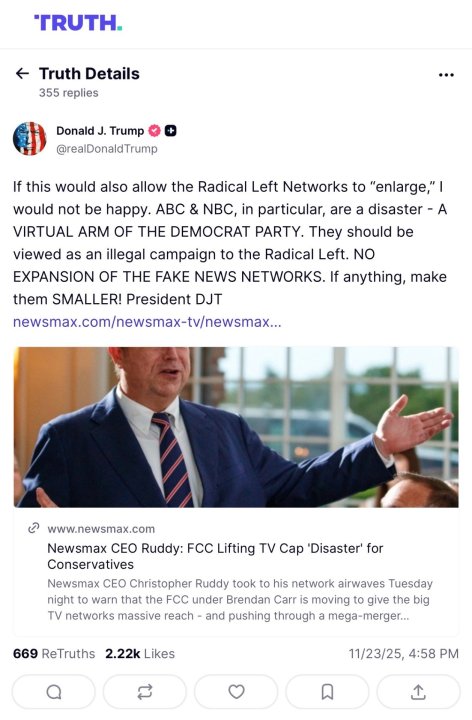
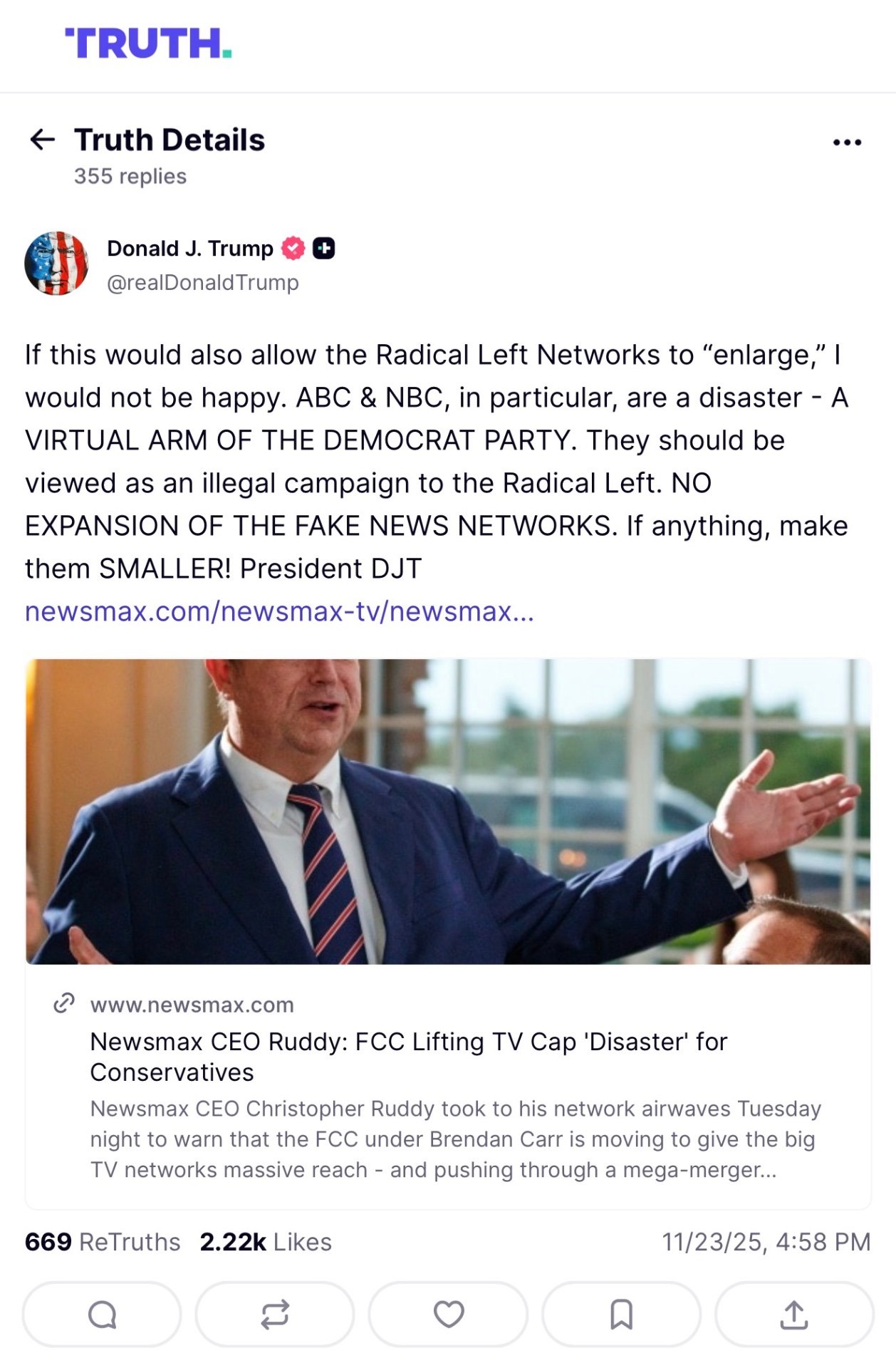
POTUS shares thoughts on broadcast deregulation through an article about NewsMax’s opposition to changing ownership limits. And it is not good news for people who want to get this deal done. (Although, the idea ABC and NBC are going to buy up more local stations if ownership regulations change doesn’t seem like a likely outcome to me)
 1 point
 -
What Tegna (I refuse to put the name in all-caps) should have done was put their stations up for sale individually (well, without breaking up the duopolies) to maximize how much they sell for. Instead, they're taking the easy way out to reduce the amount of time and paperwork involved.1 point
-
Best case scenario. These documents are the worst I have ever seen. And if this fails, Nexstar becomes blacklisted as well in the industry.1 point
-
He's basically reading a press release. Only in a market like Scottsbluff would this ever be news. It should also be alarming because Gray is effectively test running getting rid of all production people by having anchors checks notes report, read edit scripts, update web stuff, and now personally directing and operating cameras. No one cares if Scottsbluff looks a hot mess. I've done that full one-man-band stuff. While it's possible, it's also distracting because you're discussing what's happening now while also needing to actively look at controls and think what's ahead. Plus, if something goes wrong during/before production, it's a frantic dash to find someone who can help and that stress is unnecessary.1 point
-
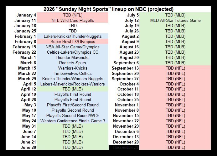
I saw this on Twitter (not calling it X simply to appease to Musk). This is what NBC would air on Sunday nights starting next year. Out of 52 Sundays next year, only TWO would be devoted to non-sports programming. The rest? Sunday Night Football (NFL), Sunday Night Basketball (NBA), Sunday Night Baseball (MLB), and during February, the Olympics as well.
 1 point
 -
And this is what it looks like when there are two people's names on the screen at the same time. Yes, the bug bar has been raised a few pixels. Not only does it take up way too much space, but now seeing the picture below the bar makes it look like a mistake. Either stretch the bar all the way to the bottom, or crop the left and right sides (similar to the CNN ticker). In my scanning of coverage the last few day, I've seen multiple instances where they used the wrong show's lower-thirds. Most of the time, it's most noticeable when a white box appears when it should be blue, but you can also see it when the banner first appears and displays the show's title. I saw The 11th Hour over the weekend, Way Too Early during Morning Joe (at least that's the same ugly color scheme), and The 11th Hour again during Katy Tur Reports. I know this is super nerdy but this is the only place to dump my nerdy observations.
.thumb.png.4bb0e2d4c4195a949269e9135ac7a006.png)
.thumb.png.07e214cba29cbf9748ec826b2a248dfa.png) 1 point
1 point -
Byron Allen saw the reaction to the 20 ads on-screen for the "NBA Finals Presented by YouTube TV" and decided he could be even more obnoxious today as the sponsor/broadcaster for the CIAA football championship.
 1 point
 -
CBS had some trouble removing their tease squeeze that they use during the first commercial break. It stayed up for the whole next package.
.thumb.png.6620e89c2664911e0f9e402a596a3e0b.png)
.thumb.png.54efff0e71fbf30ccb01d48903807d48.png)
.thumb.png.316d3cebe9ff587f3ae62a32742c3ab1.png) 0 points
0 points


b.thumb.png.b658c90e4e56cb08f2e8ba3195bb9da9.png)
.png.8bc17bf1c77bd29b994d2c4c73f482ab.png)
.png.b45b2ac5e225490613b6bb9b14cfef2e.png)


.png.9de6fd48925a6c980c2a4a4fddc9ddb7.png)
.png.08be332ad02208f6ca863770f6e50bfc.png)
.png.ea21d5f1c4b9ded5d38a4148f640b116.png)
This leaderboard is set to Chicago/GMT-05:00