


qunewsguy
-
Posts
528 -
Joined
-
Last visited
-
Days Won
18
Content Type
Profiles
Forums
Articles
Posts posted by qunewsguy
-
-
For being new graphics in 2024? Woof. They're pretty bad. That aside, the font is going after the FOX5 audience, the cold open banner reeks of GrayONE.
-
 2
2
-
 1
1
-
 1
1
-
-
On 10/11/2023 at 5:29 PM, tyrannical bastard said:
When GrayOne hits WHNS Fox Carolina, I wonder if they're going to tweak the package since WSPA's is pretty much the same thing (font and lower-wise).
WTNH in Hartford has the same graphics as WSPA. WFSB has GrayONE.
-
Not to derail this thread but a lot of broadcast design has trended digital-first in the last few years. Heavy 3D and gradients look horrible on highly compressed video formats and contribute to visual clutter. Had smartphones not taken off I think design trends would have gone in a completely different direction.
-
4
-
-
Not quite a "desk in the corner" but close enough. I have to say I liked the previous set a bit better since it fit with the circle motif.
-
1
-
-
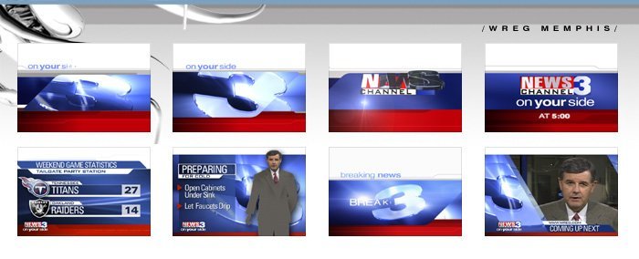
WWLP, Springfield MA from March 25, 1987. The 6pm was posted by NewsActive3 a few years back. This is the first time the 5:30 is online. The original tape was recorded by my mom, who appears here sitting on a blanket while watching me and a friend run down a hill at the 10:18 mark.
WVIT's 5:30pm newscast from May of 2002. Definitely hitting on all cylinders here!
-
I'm working on tossing old CDs and DVDs I've had laying around and I came across these work sample images taken from Giant Octopus' website in 2003. Probably the peak of their design trendyness. It's amazing how much things have changed in 20 years!
-
7
-
7
-
-
4 hours ago, cxd7346 said:
EGAD!
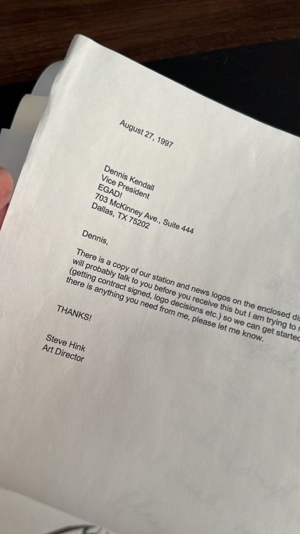
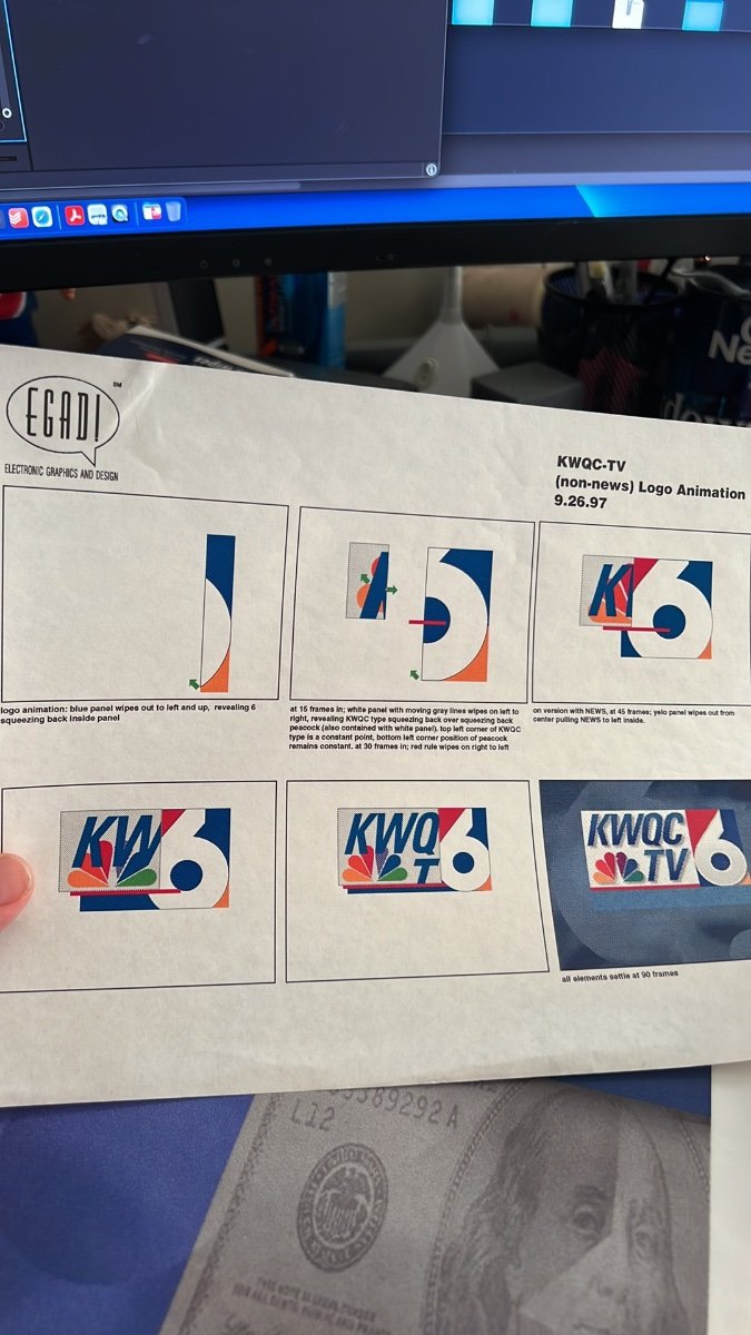
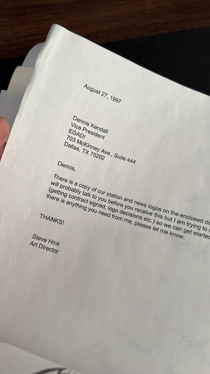
I found this folder in an about-to-be tossed bankers box at the station.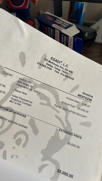
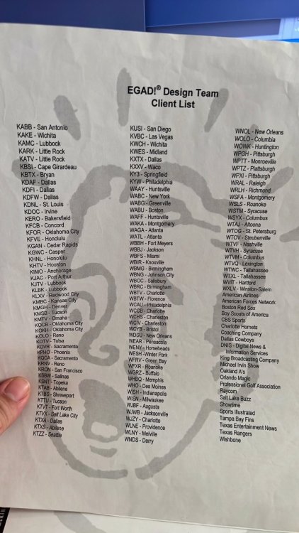

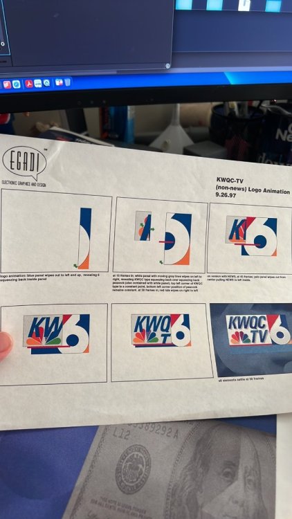
Egad did both WVIT and WVTM's 1998 looks. Pretty sure they did WVIT's 1996 as well which is why they're on the '97 client list.
-
1 hour ago, Geoffrey said:
I'm surprised the lower-thirds go to the edges and bottom of the screen. I thought that style was long gone.
The margins on everything are so tight this looks like a social/streaming-forward design more than broadcast. I'm super surprised they went with Bebas. It's EVERYWHERE these days.
-
4
-
-
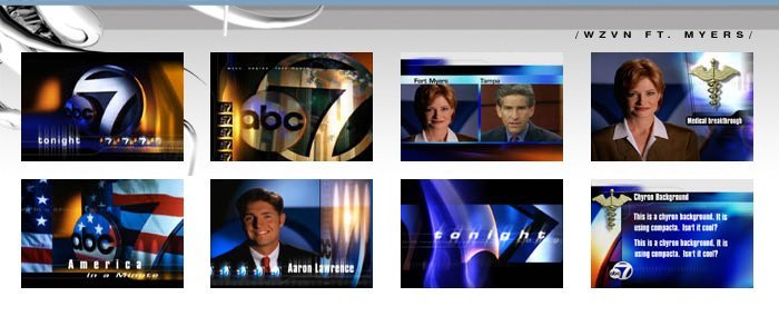
WJAR from December of 2000.
-
Hot off the digitization press: WTNH Action News 8 from May 23, 1986. This capture runs a good 45 minutes.
-
1
-
-
47 minutes ago, noggi said:
The insert graphics are decent. The opens have a lot going on in them, I'm not sure I need a fake ticker and time/temp, but hey - props for trying something new. It's not the best O&O package out there but certainly not the worst and I think definitely an improvement over what most of the ABC O&Os have on the air now.
Odd choice though going back to a very dated-sounding (well, it is dated, it's from the 90s) music bed... clearly they didn't want to spend the $20-30k for a few new opens/bumps?
My bet? There's no one left at WCPM who could compose a half decent update to the package.
-
1
-
 1
1
-
-
The package looks good overall but you can sort of tell it took years to finally implement. Some of the design trends used here are now a tad bit past their prime (arrows opening up sliding elements, semi-webpage looking animation cues). Also I'm seeing some very minor similarities to the CBS O&O look, likely owing to the fact that Wendy McMahon was the driving force behind both.
-
2
-
1
-
-
8 minutes ago, MidwestTV said:
Super interesting how the open has the live time and temp baked into it. Look closely and you'll see it said 3:59 and 61°. It even has a glimpse of the forecast. That has to be a first.
If they're still using VizRT it's super simple to integrate that live data into the scene.
-
1
-
-
That knockoff is so close it almost makes me wonder if it's the actual graphics package.
-
1
-
-
LED monitor arrays have made things more dynamic visually.
-
4
-
-
15 hours ago, Myron Falwell said:
It's not terribly expensive to make station merch. Just saying...
/sarc
Yeah because in 2023 when stations can barely afford to keep staff on the payroll, they're wasting money buying decoy swag?
-
4
-
1
-
-
11 minutes ago, CircleWXYZ said:
Can you post the video here please? Thank you!!!
I think you have the wrong end of the stick on this... all the videos posted today have the same graphics they've had for a while.
-
1
-
1
-
-
What? A Nexstar station using the real Gotham instead of Monserrat????
-
I just watched a few other videos from their YouTube page and the graphics are definitely Renderon. I do like the seamless monitor wall!
-
3 hours ago, CalItalian2 said:
She's already admitted she doesn't understand Los Angeles. There is a reason why KTLA is dominant in Los Angeles morning news. It's a family. It feels like a family on air. It was built as an answer to local radio morning shows. It's why there was so much reaction in the community to the circumstances surrounding Lynette Romero & her exit. Thinking putting your assignment editor on the set (and hilariously having a graphic in the back that only says ESK because his head is blocking it) isn't going to win you viewers. Too much corporate research & not enough gut knowledge about L.A. sums up this bland KCAL News Mornings.
Not sure which "she" you're referring to, but if you're talking about Wendy McMahon, she was head of Creative, Marketing, and Community Engagement for KABC for several years so it's safe to say she knows the market inside and out.
-
3
-
-
Stations in central time sometimes have to switch source feeds mid-way for live network events. My guess is MC at KSTP dropped the ball.
-
On 12/31/2022 at 8:22 PM, nycnewsjunkie said:
I don’t think so; there are plenty of Gray stations using old stuff from Gari/615/Non-Stop. IIRC, Warner Chappell is charging their clients a crap ton if they want upgrades to music packages. Advantage badly needed updates, but the price probably wasn’t worth it, so WFSB went with Arnold instead. Same reason why WOOD dropped Primetime News if I’m not mistaken. Sad, but I can’t say I blame the stations at all.
Breaking a bit of the fourth wall here, but we commissioned updates of Advantage from WC in 2019. They frankly were not great. Sometimes you just need to go in a completely different direction.
-
3
-
-
To me this rebrand looks great and is extremely forward-looking to the way people get their news and info today. Call letters and channel numbers don't hold the cache they did 50 years ago in TV's golden age. If the network brand has a stronger affinity than the local stations (especially most CBS locals which have always placed in 3rd or 4th) why not lean into it?
-
1
-
4
-
1
-
-
11 minutes ago, Geoffrey said:
Why are Drew Barrymore and Dr. Phil involved in a promo about local news?
Likely because all of the local talent they hired has zero name recognition in the market?
-
5
-
1
-


KSTP live bug
in Graphics
Posted
I'm surprised nobody's mentioned this yet but I hate the fact that it's a double live bug.