b.png.4a4f72b902e4210e6802e3e35b176cae.png)
Geoffrey
-
Posts
1239 -
Joined
-
Last visited
-
Days Won
48
Content Type
Profiles
Forums
Articles
Everything posted by Geoffrey
-
I don't think what you explained that counts as editorializing.
-
Can you show/explain an example or two?
-
Not necessarily. CNN is trying new things on Friday with the Bill Maher "Overtime" and now Chris Wallace. Not sure it'll be successful but I think they want it to be.
-
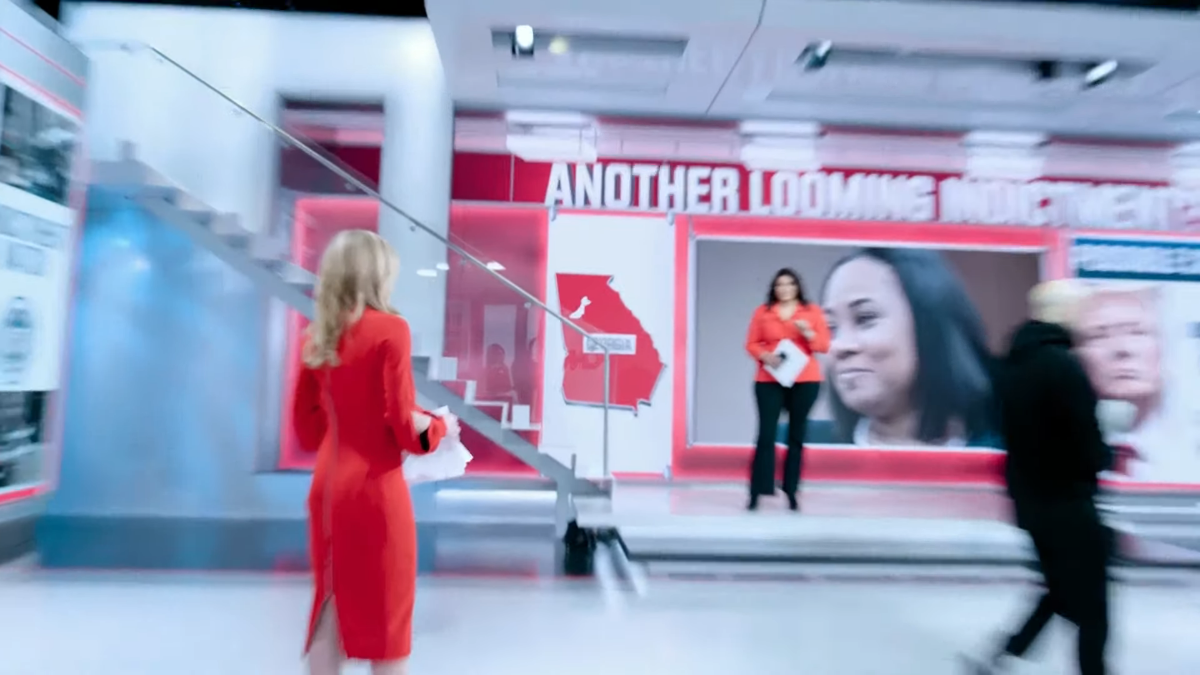
I'm not sure if you're suggesting that CNN is using a virtual set, but they are not. The only "virtual" part is that they're using graphics on the video wall to give the appearance of multiple smaller monitors and depth.
-
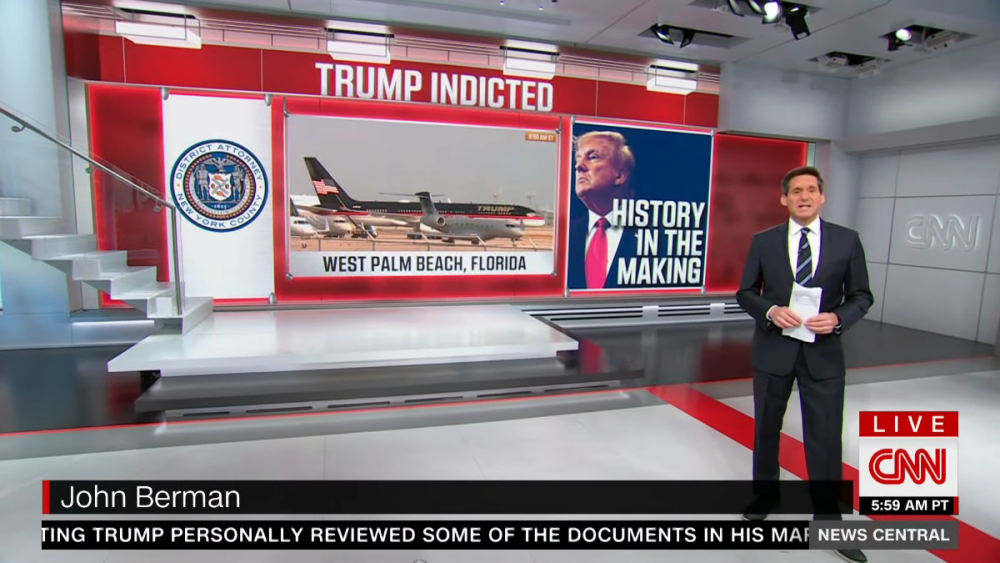
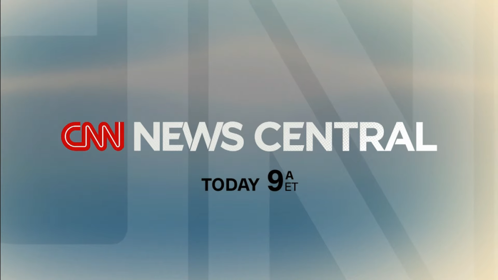
CNN's 1-4pm ET version of CNN News Central debuted today. The open is updated to include DC landmarks and it seems Wolf has lost his studio? (The Situation Room used a flash cam again today. I was wondering if they'd go back to using the studio once rehearsals were done.) Interested to see what they do on election/primary days when they are setting up the studio and rehearsing for the evening election coverage.
.thumb.png.b91a9c0f4d8c90b46a30db614f61526f.png)
.thumb.png.5fb3ca6a5c1ba8d1dc85d867a2ba0611.png)
.thumb.png.8cb3d1c7054a1c85aa1972b12762c9de.png)
.thumb.png.4f38535d906bb5a5f0a3c741c86029ed.png)
.thumb.png.234c291a7cccd664e76407b84d93c45e.png)
.thumb.png.c035e2e535c63f92ec5af95ab3bf1fd4.png)
.thumb.png.4282952ebda5580b53460db6f078902c.png)
.thumb.png.2da47587e327a11d82c5b6dac9faf213.png)
.thumb.png.497aff60aa4465331c91d898f7e39b74.png)
.thumb.png.d3a203f21ef060279f2745ade8adeab9.png)
-
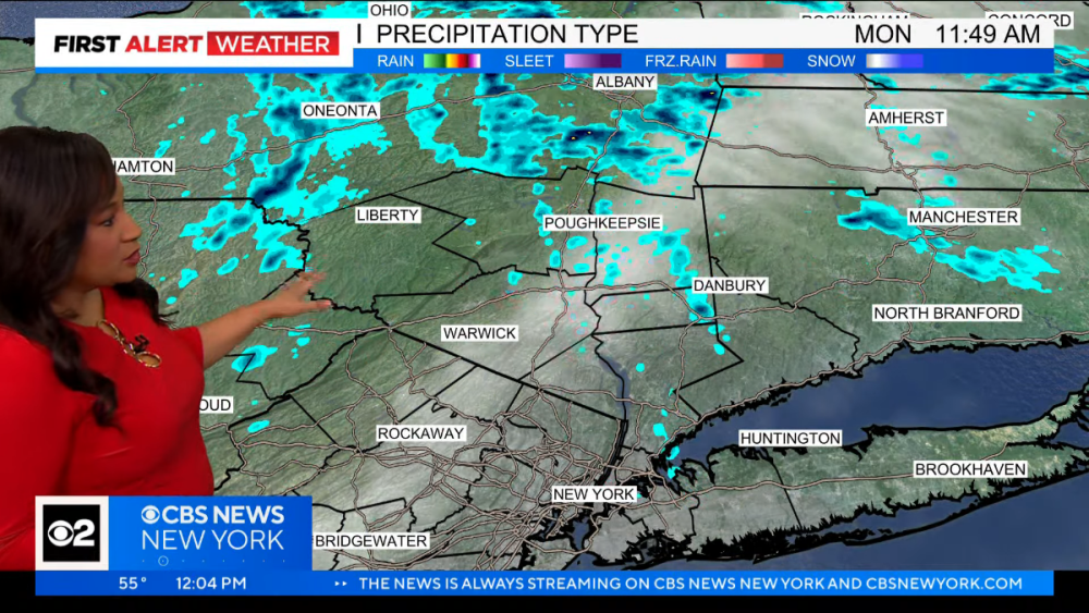
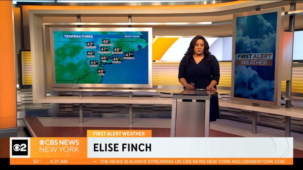
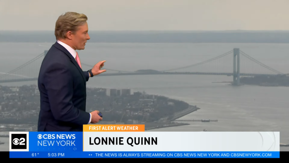
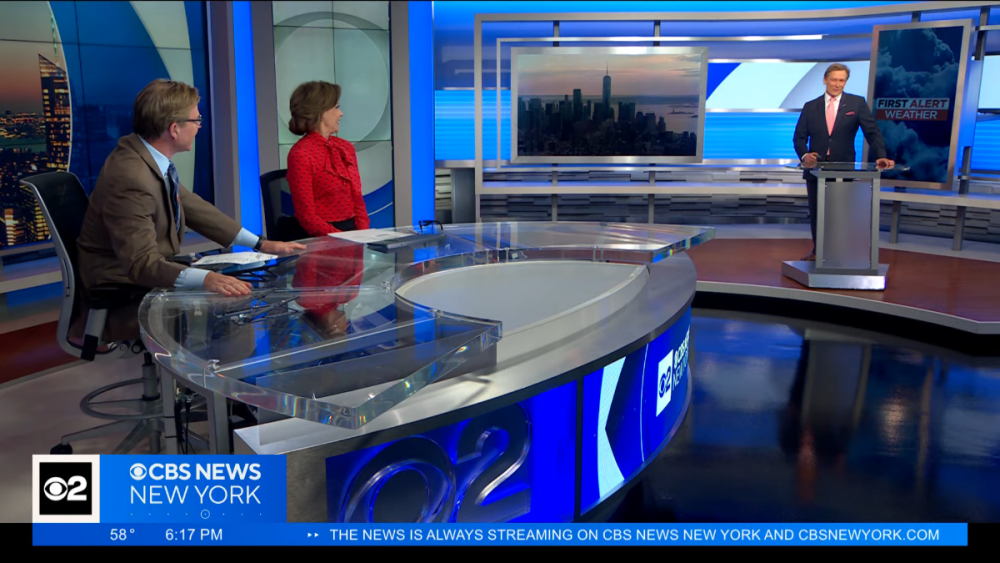
New 7-day at 5:00. Guess they slotted in the wrong slide at noon. Overall, the new weather graphics are a big improvement over the previous look, but that's not saying much. I like seeing more white being used as it makes it feel fresher. (The old look used a lot of black boxes and it just never looked good.) It seems like they really want to use all caps everywhere, except in one graphic. The | symbol seems like unnecessary clutter. And in the 7-day, it's weird to me how the temperatures split up the icon and the description (aren't they related and should be together?). Of course the usual sloppiness that we've come to expect from this station is present in terms of badly aligned text and squished logos. Maybe they'll get around to adjusting those pixels some day (though they're STILL using the sports graphic that repeatedly says CBS NEWS LOS ANGELES, so maybe not). At least the weather graphics match the rest of the graphics for the first time in many years. Will they ever fix this?
.thumb.png.56da800a49a303160f0f39d554d4b043.png)
.thumb.png.70cb2a0ac5cf386cfa2165b9a01c5fee.png)
.thumb.png.029ab242dddc71b3441152c9022a5c3b.png)
.thumb.png.5277242d079e271bed2430d88336996c.png)
.thumb.png.5d4cdcc8cfc07eebcd8aadb0e897d345.png)
.thumb.png.05b49687a4ac03a269d063d225427ddb.png)
.thumb.png.ac5a617e458d3d2520ec2bfceaabcfc9.png)
-
CBS 2 CBS News New York is finally using the new weather graphics as of noon. Except they're using the old 7-day.
-
Seems uncommon to announce your next job a month and a half before leaving your current job, especially when you're not staying within the overall company, no?
-
I generally have not been a fan of Don's for a while. He definitely seems to crave the spotlight in a way that is really irritating to me. I was shocked that he was tapped to headline the new morning show, especially over signs the network was trying to appease Republicans while also cutting back on drama. Don seems tired in the morning and just seems even less sharp than he was in primetime and adds little substance to any conversation. He is easily outshined by Poppy and Kaitlan. Don may be, dare I say it?, past his prime. I do want to correct something Variety twice claimed in the article, including here: When CNN hired Alisyn Camerota but didn't know where to put her at first, she was paired with Don for a time on CNN Tonight. It might have only lasted a few weeks or months but it was permanent enough for both anchors' names to have been on the show's logo. (Alisyn would go on to bump Kate Bolduan as Chris Cuomo's New Day co-anchor.)
-
How is the show and how does it fit into the right-leaning vibe the network has been giving off?
-
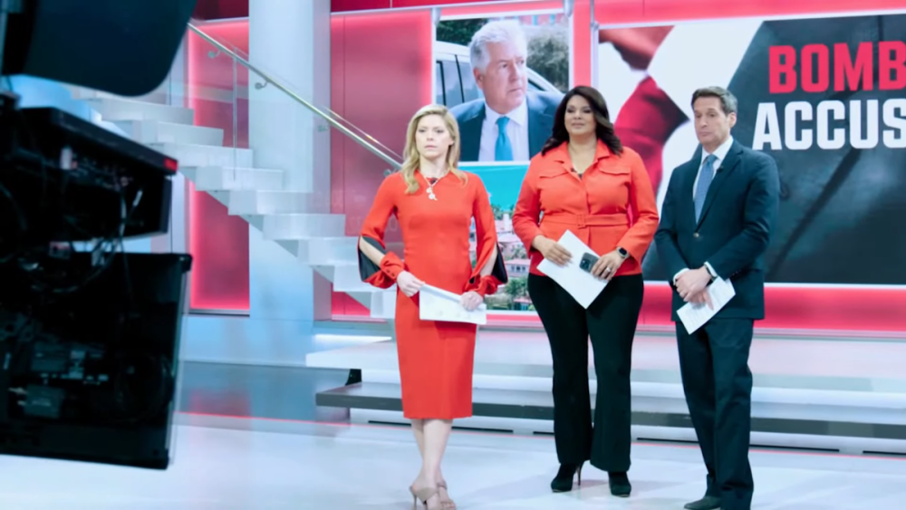
I'm not sure what I think of the new format. I like the use of graphics on the studio screens that give flat walls an appearance of depth. I like the new music (or at least the retro CNN signature -- the rest felt like generic production music). I'm not a fan of the lack of anchor interaction. There are three anchors but they almost never acknowledge each other. They're all pretty much presenting stories individually. Toward the end, John and Kate discussed March Madness with sports contributor Christine Brennan, but that was it. What's the point of three anchors other than to satisfy previous contractual agreements? John and Kate have worked together in the past (used to co-anchor At This Hour before John went to 9-11am Newsroom, before going to New Day) and have great, sarcastic chemistry, but none of that was seen today. It felt "heavily produced" which I actually don't like, especially for a daytime newscast. I wonder how well equipped they will be at handling unexpected stories if they don't have maps, graphics and camera shots planned in advance. Will they be slower? Also felt like fewer panels or discussions with experts with a greater focus on live reporters in the field. More reporting is good but I think cable news viewers have become accustomed to panels/debates. The whole broadcast overall felt kind of lifeless, and I'm a fan of these three anchors.
-
Initial impressions from just the first few minutes: I love the famous CNN signature being used in the theme. The use of the studio (the screens and RSS feeds) reminds me of the original The Situation Room.
.thumb.png.9df73d950c6018c812d2c436042415cd.png)
.thumb.png.8d9607f0496e39595a9a4cc02e1493e8.png)
.thumb.png.0c4cda3c806df140926151726f1b06da.png)
.thumb.png.98774ff2b7ff3c3f9849bbde5fcba011.png)
.thumb.png.1a0031e53e82901655bbb0595fc797ab.png)
.thumb.png.72fa28c9902b39b974f17b0ac2abf54f.png)
-
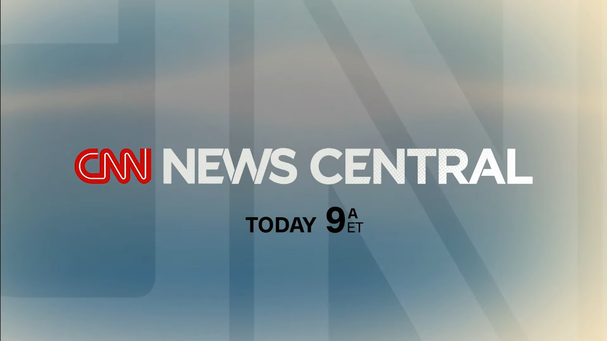
Saw a 15-sec promo for CNN News Central. It looks like they're using the CNN Tonight studio, at least for the rehearsals. (I was expecting to see the newsroom for this, but now I'm back to thinking the newsroom might be being redone for CNN This Morning's permanent home.) "Starting today, we're bringing you the news in a whole new way. The stories at the center of your day. CNN News Central, today at 9 Eastern." No new graphics on CNN yet as of the 8:00 hour, which makes me think they're not coming today.

-
Still interested to see if new network-wide graphics debut tomorrow... Also interested to see if the new News Central makes use of manned cameras. CNN previously was only using robotic cameras in the newsroom. It really made the broadcasts feel kind of cheap compared to the shows coming from other studios.
-
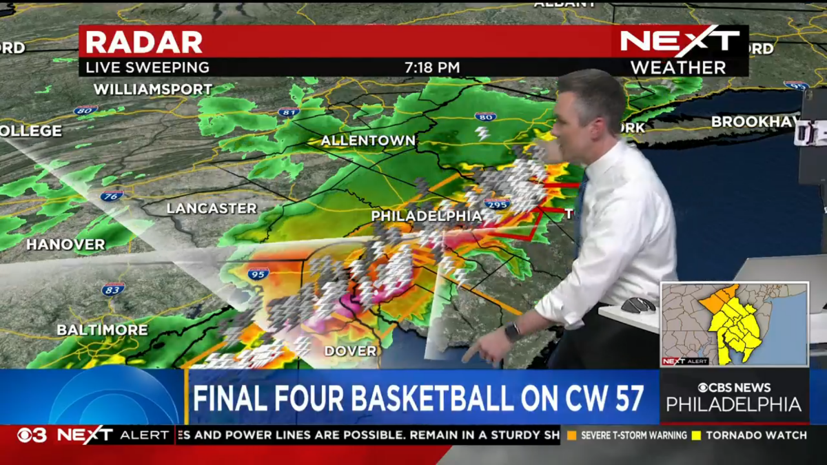
KYW broke into basketball coverage with the weather alerts. (Screenshot from the web. Guessing the normal CBS 3 bug is being used on TV.)

-
Let's please dial back the desire to make everything feel like a personal attack and to become angry at someone's opinions or guesses that do not align with yours. Stay on track and have fun. Thank you.
- 1275 replies
-
- 10
-

-

-
Interesting! I guess the streaming broadcast has an automated bug overlay and they don't have the ability or interest to change it red.
-
That 3 is hideous. I thought the channel numbers were only staying as some sort of transitional phase. They're creating a totally different logo and making it much larger than the CBS News Philadelphia logo? And it looks like it is a few decades old. What a mess.
-
Was not expecting two different launch dates. I also didn't realize that the afternoon block would come from DC, but I should have seeing who the anchors are. I guess this is why Wolf Blitzer has been at a flash cam instead of the usual studio for the last few weeks, at least. I wonder if we'll also see new network-wide graphics on Monday or later in the month.
-
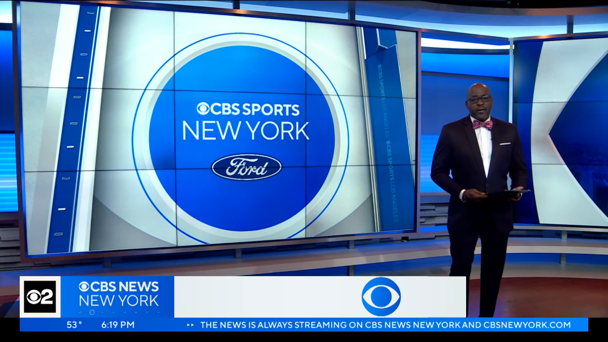
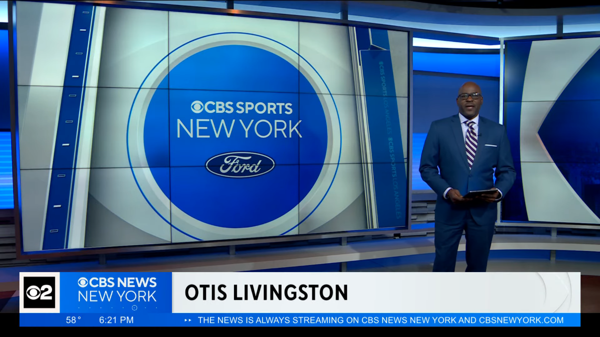
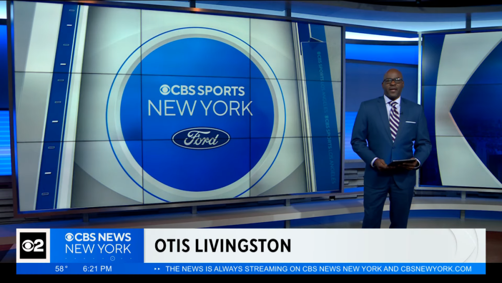
They changed one of the graphics in the weather center to the "dots with the moving circle." The CBS Sports New York animation used on the monitors for the tease still has "CBS Sports Los Angeles" on the right side. I expected that one to be fixed immediately. The font in the tickerless ticker has been fixed as well.

-
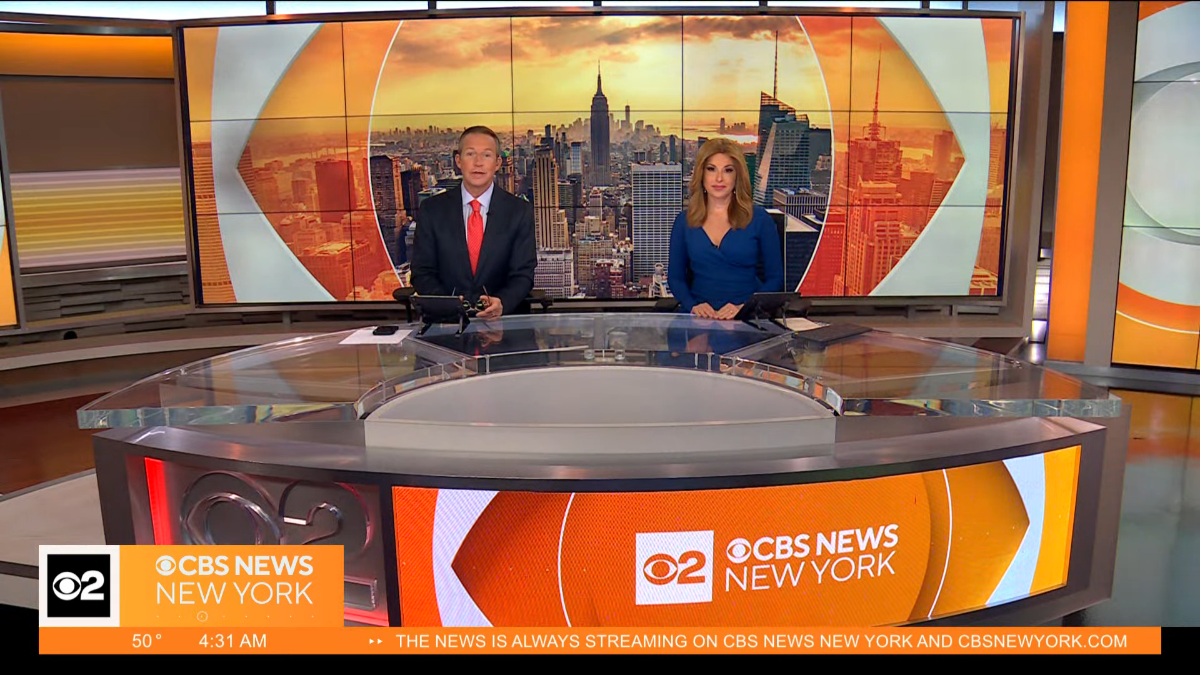
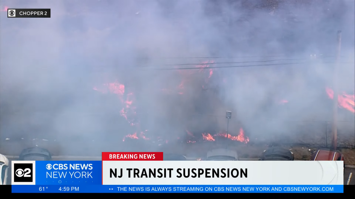
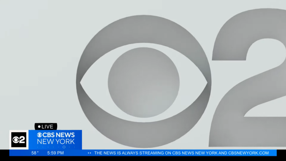
In at least the first 24 hours of the new look, CBS New York/CBS 2 News/CBS News New York (still not sure what to call them) did not use the red bug and tickerless ticker for breaking news. Except for a few seconds during the 6am open. It's interesting to see that they also have this capability available even though they haven't used it yet. Wonder if they're saving it for big breaking news. But it's a lot of red. And it's A LOT of orange in the morning. They used the long open at 5am and 7am (on WLNY), short opens everywhere else. There's a new station ID bug for network programming (of course it's not aligned properly), but the old CBS 2 logo is still used in the CBS Mornings ticker. (Why can't the ticker during local news... TICK?) By the way, the old Enforcer theme was used to open and close the 7:26 update, closed the 7:56 update, and they finally got it right by 8:26. The graphics are overall nice but I think will age very quickly. The theme, minus the signature, continues to be forgettable.


-
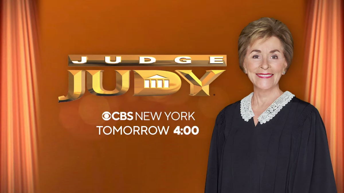
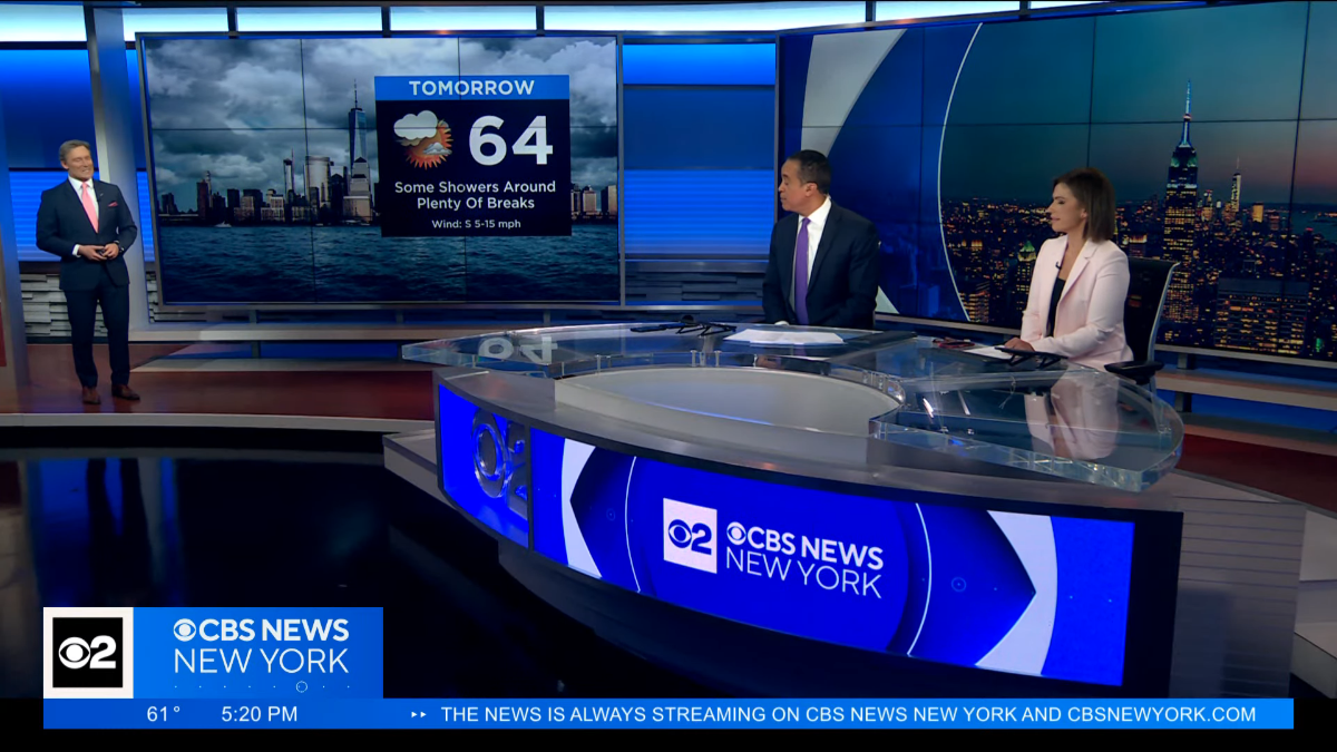
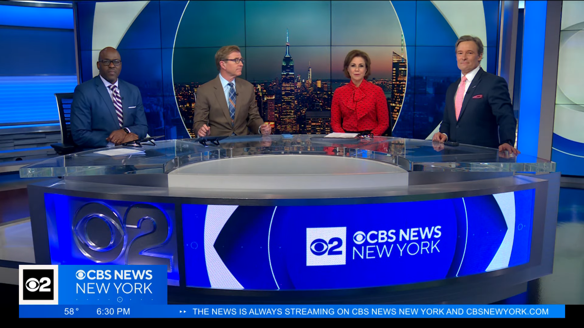
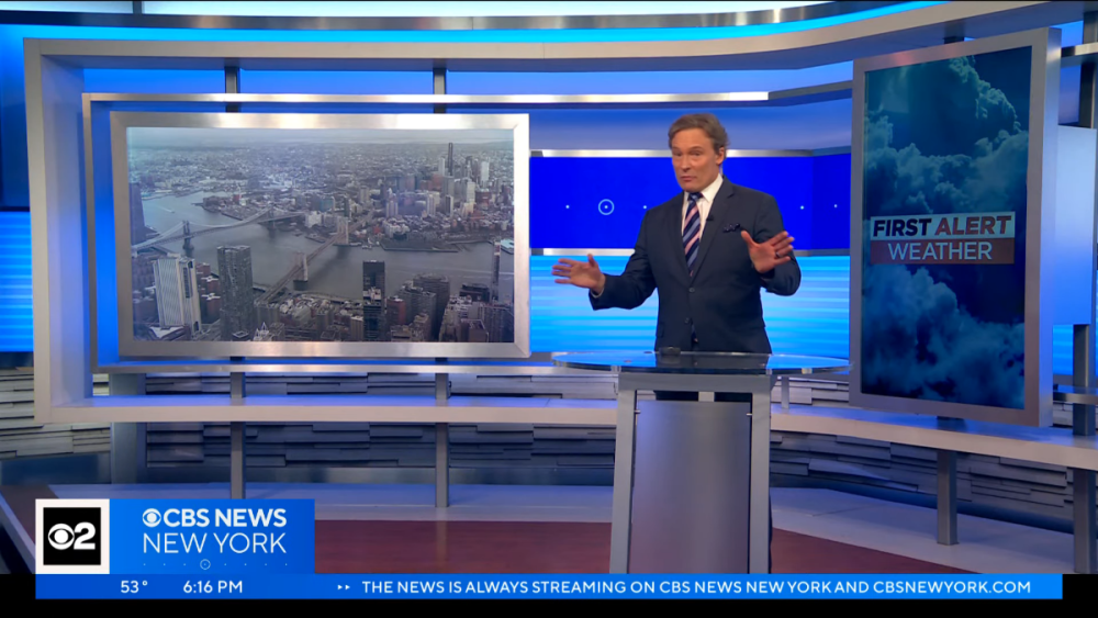
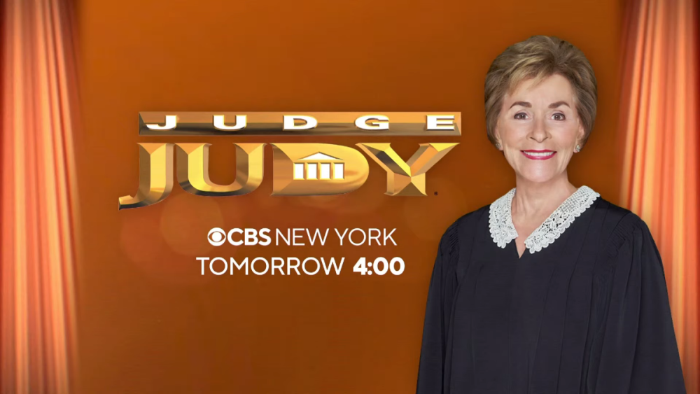
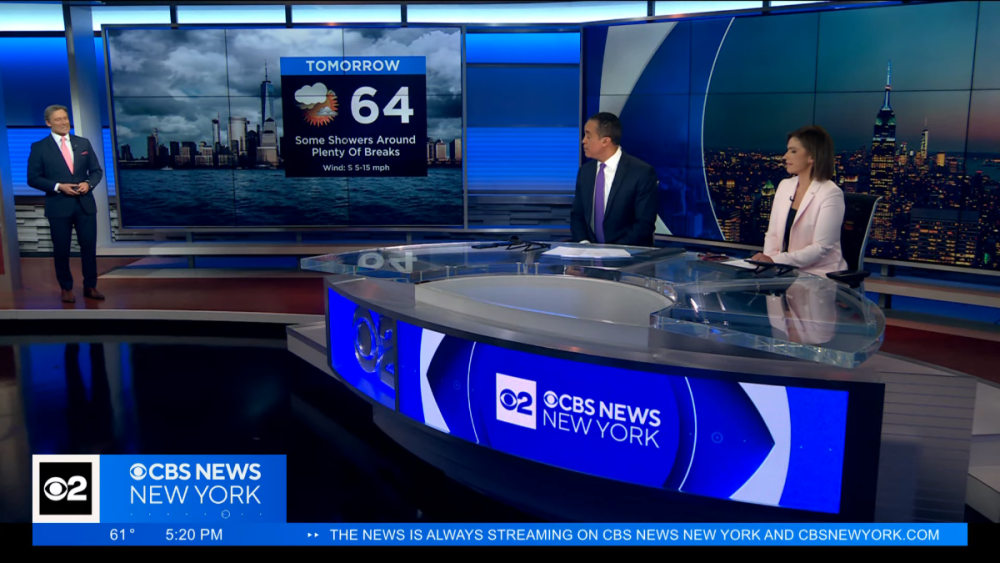
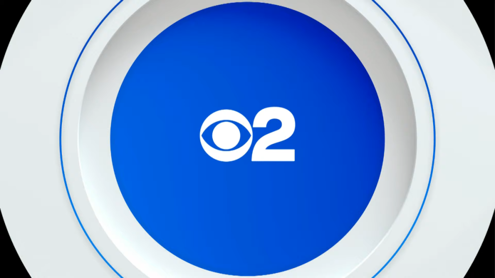
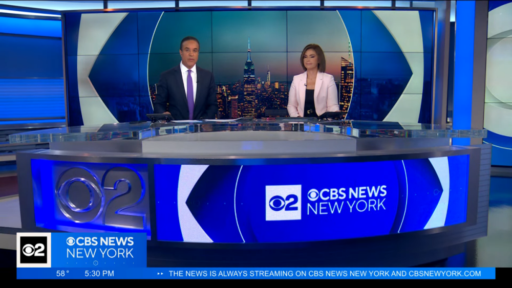
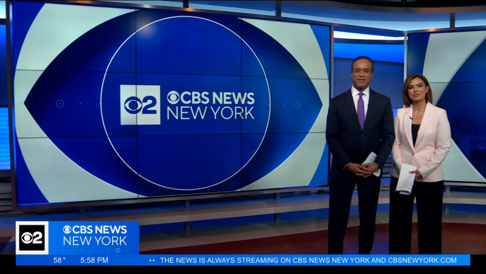
For I believe the first time in my many (26+?) years of being a CBS 2 fan/TV news nerd, the new graphics were not being seen for the first time as they debuted on CBS 2. Just feels weird having new graphics and it not feeling that big of a deal because we've watched them debut over the last few months. Overall, I think the look is fine. I wasn't a big fan of the previous look as it felt sloppily executed from the start and got worse over time as they used the "CBSN New York look" in many areas. I don't want to repeat myself too much but I'm just jotting down some of my thoughts. I was surprised that Brian Lee's VO in the opens still refers to "CBS 2 News." I'm also surprised that the CBS 2 logo is on at least one side (probably opposite sides) of the mic flag. It's one thing to have transitional on-screen graphics but transitional mic flags are odd to me. I am glad that the "2" remains, for now at least, but using two logos as your logo seems very sloppy to me. The CBS 2 logo is used on its own in at least one transition (breaking news) as well as a topical promo (the blue one below). Curious how long this apparent transition will last (months? a year?). Aside from the two-logos-in-one thing, I continue to dislike the bug. It's... large. I know the size is supposed to match the rest of the network (CBS News streaming, CBS Evening News, etc. -- and this centers around the super small CBS eye during network programming), but it's just big. It kills any sense of sleekness this package would otherwise have. The dots on the bottom bumping the logo up makes everything feel misaligned. And the length of it all means the "live" bug is incredibly long for such small text. Lots of screen real estate is being wasted. And with the bug being on the left side and attached to the rest of the lower-third, the tabs for things like "Breaking News" just feel awkwardly located. I'm very much opposed to using the ticker if it's not going to tick. At noon and at 5 and 6, it was just "THE NEWS IS ALWAYS STREAMING ON CBS NEWS NEW YORK AND CBSNEWYORK.COM"... No animation or anything. Just a waste of space. Essentially an extended bug that serves zero purpose. I do like how the studio looks with the new graphics being used on screens. Interesting how live chopper feeds only have the "live" bug, never yet accompanied by a "Chopper 2" graphic. But for when they play back taped chopper footage, a plain "Chopper 2" graphic was used on the top left. (I guess the whole Sky 2 thing has been abandoned.) While the CBS 2/CBS News New York logo is used on newscasts, localized promos for shows like Judge Judy and Inside Edition use just a CBS New York logo. But the CBS 2 logo is still used to cover the CBS eye for a few seconds when network programming returns from a break. What exactly is the name of this station right now? This is the first time in over 20 years (since late January 2003) that a theme with the Enforcer signature isn't being used on this station. I like the new "This is CBS" signature but the rest of the theme seems bland and forgettable. Overall CBS 2 executed the change fairly well. There were a few instances where the orange "First Alert Weather" tab, presumably intended for mornings, was used on the lower-thirds. Promos seemed to be updated with the new logo, including the Weather Watchers one, which otherwise used the same graphics. I wish the weather graphics had been changed at the same time. I believe the old theme was used after weather for the sports tease at 6:21 but I'm not sure there's an Enforcer signature there so maybe it'll stay. However the animated "CBS Sports New York" graphic on the monitors very clearly repeated "CBS Sports Los Angeles" on the right side. Anyway, it's here.


-
I think this is the best studio in New York, at least the parts we've seen. Graphics look nice, though the lower-thirds and even the bug ruin it for me. Not a fan of the very thin text bar on top... Text feels squished in there. The way the lower-thirds and the text on the full screens feels clunky to me. But overall I think this is a very big improvement for PIX.
-
What a shame for viewers to hear that Doug and Danielle are out. Even though News 12 often felt like a cheaper version of the city stations, it was nice getting local news from people who know the island and you've trusted for decades. But with more and more veterans leaving, and the station apparently covering more city and national news, there's less of a reason to watch, unfortunately. Still plenty of good people in front of and behind the camera (and the new people may be fine as well!) but it's feeling much less familiar.
-
I kept hearing an ad on the radio last month (sweeps) saying Mr. G did weather "from 4 to 10" (which is incorrect in two ways). And now they're beginning to reduce his hours.
b.thumb.png.b658c90e4e56cb08f2e8ba3195bb9da9.png)

.png.3cf0c2bee352688534021a9c931a900c.png)
.png.14b97f4f68344eb85bec456c84fe2dd2.png)
.png.9c3e1f88eed9cc82f45e69196215d5c8.png)
.png.832c04db35f29cc2a51e4068a6fd9029.png)
.png.35cea396ff07e53a8ca887256a9d85c3.png)
.png.d2384cd8b35c9d0ee49c6d39b53b433c.png)
.png.24187bdecc24f1c2137b3e93e2dc3f9c.png)
.png.570798cb968ebc389717ea8ac3926f0a.png)
.png.40891ef5f929e1eeec6316fb10aca727.png)
.png.bf07b13092e67bd1e26c8de3d00ee77f.png)

.png.263b48e01a5dd20162acd3ec5cbdb46c.png)
.png.263ce4e679ab755f56d84308a1355d8e.png)
.png.1b2d72d377cb64d878ebf52b6377b8b3.png)
.png.c705769e96cdcd223ee8c35bfb54f5a4.png)
.png.f7c551ce0d424eb79c8d26f65a007f7d.png)
.png.83456ad4540e3cc10438aeb1b2c3b795.png)
.png.48d2ce0709b65eea4bf1d07d3ec959c5.png)


.png.248f9420b9039be830144ae7a29c6801.png)
.png.861a2d6844ba0d1ae0002d7f36318347.png)
.png.3eaae19b147e8a36d15e0f2394d3d986.png)
.png.c620a677bdc3b0ba7a9601f8f729e20d.png)
.png.79081c1a525267c01b76cea02ebd53b5.png)
.png.a2c711964ed227f49abe90851ab9c204.png)