ttvn2000
-
Posts
238 -
Joined
-
Last visited
-
Days Won
8
Content Type
Profiles
Forums
Articles
Everything posted by ttvn2000
-
And according to Cleveland.com, he might be anchoring the 11pm news on Fridays??! Dear lord. So - they've ditched Chris Tye and Tom Meyer for Jay Crawford and Mike Polk?! I wouldn't be surprised to see Monica Robins out the door soon as well, as the writing seems to be on the wall for veteran talent at WKYC. This is prime time for WEWS and WOIO to get competitive with a news-intensive strategy.
-
After watching the video, I'm pleasantly surprised to see how polished his wife is. This has the potential to be good - but I fear the production value may hold it back...
-

TEGNA Broadcasting and Digital General Discussion
ttvn2000 replied to ABC 7 Denver's topic in Corporate Chat
True that. I’m still sad Andrea Cambern “retired” - and it’s been 7 years.- 3735 replies
-
- 1
-

-
- innovation
- tegna
- (and 1 more)
-
TEGNA Broadcasting and Digital General Discussion
ttvn2000 replied to ABC 7 Denver's topic in Corporate Chat
Not to speculate, but I could see her basically replacing Tracy Townsend (and presumably her hefty paycheck). -
TEGNA Broadcasting and Digital General Discussion
ttvn2000 replied to ABC 7 Denver's topic in Corporate Chat
I’m assuming because she’s been retweeting from the Ohio Dept of Agriculture...much like Kocot and the Department of Natural Resources. And...I didn’t know about the vacant weekend position. I’m assuming Karina Nova doesn’t want that gig? (I think she’s the rising star in the WBNS Tegna era, if she sticks around.) -
TEGNA Broadcasting and Digital General Discussion
ttvn2000 replied to ABC 7 Denver's topic in Corporate Chat
Within days of Kocot. But it looks like they both landed gigs with the State of Ohio. (See Twitter...) -
TEGNA Broadcasting and Digital General Discussion
ttvn2000 replied to ABC 7 Denver's topic in Corporate Chat
Former WBNS anchor Andrea Cambern posted publicly about it... Betting the mood is somber today on Twin Rivers Dr...- 3735 replies
-
- 2
-
-
- innovation
- tegna
- (and 1 more)
-
TEGNA Broadcasting and Digital General Discussion
ttvn2000 replied to ABC 7 Denver's topic in Corporate Chat
WTOL has let go of its news director. “Not related to the new ownership...” https://www.toledoblade.com/local/city/2019/06/05/anthony-knopps-out-as-wtol-news-director/stories/20190605117 I am surprised by this, particularly since he came from WTVG. -
WLWT news anchors Sheree Paolello and Mike Dardis are married... https://www.google.com/amp/s/amp.cincinnati.com/amp/1305327001 I started watching the WLWT live stream when their engagement went “viral” - and I must admit, their chemistry is apparent on air.
-
It would be nice, but I don't see it happening. With them going 'cheap' with Sara Shookman after Kris Pickel left, they could've had their chance to hire someone with more experience to co-anchor at 6 & 11 pm. I do think this is the opportunity to rethink their entire newscast team lineup. (Including mornings...) Deep speculation - but could this open the door for Russ Mitchell to go back to New York? I see the Jay Crawford hire as more of a potential Russ Mitchell replacement (a la Rob Powers on WEWS) than a Jim Donavan replacement. I think they're grooming Camino for that role.
-
Finally a 5pm for WKYC! Hate to enter speculation territory (but I will...) - my money is on Betsy Kling having some sort of regular anchor role. They're using her to anchor regularly now, in addition to doing the weather and cleaning out the office refrigerators. Even with such a deep bench of anchor talent (Jim Donavan, ex-19'ers Lynna Lai and the underrated Danielle Serino, plus folks like Monica Robins, Leon Bibb and Robin Swoboda on standby), they use Kling a lot. But surprisingly, she's really good at anchoring. (Better than Sara Shookman, IMO.) On another note - it's kinda sad they'd drop Chris Tye for Jay Crawford, since Crawford has to be commanding more of a $$ than Tye.
-
TEGNA Broadcasting and Digital General Discussion
ttvn2000 replied to ABC 7 Denver's topic in Corporate Chat
Crain's Cleveland Business has an interesting article on how a (fingers-crossed) successful Browns team benefits the stations. https://www.crainscleveland.com/kevin-kleps-blog/browns-resurgence-good-everyone-cleveland-tv-industry The author seems to be poking a bit of fun at WKYC's 'director of content:' #ThisIsTegna -
Could a clue be in another post on today's FTV Live? https://www.ftvlive.com/sqsp-test/2019/4/26/black-news-channel-to-launch-this-fall Or...is her ego so large she's headed towards something a bit more....mainstream? I'm not so sure though since she undoubtedly has a very "urban" style...and was a major component to WOIO's success in the mid-2000's. (Her sparring with Mike Trivisonno was classic.)
-
It isn’t too hard to read with enthusiasm...or is it? Not to go into speculation territory here, but could Chris Tye be coming to 19? If Tanaka signed a three-year deal, his contract would be up this summer. And if Tye has a 6-month non-compete, it would expire around that time.... A quick look at Instagram shows Tye is friends with Jason Nicholas. So, who knows....
-
TEGNA Broadcasting and Digital General Discussion
ttvn2000 replied to ABC 7 Denver's topic in Corporate Chat
Welcome to Toledo, TEGNA...
- 3735 replies
-
- 2
-

-
- innovation
- tegna
- (and 1 more)
-
TEGNA Broadcasting and Digital General Discussion
ttvn2000 replied to ABC 7 Denver's topic in Corporate Chat
Wanted to see these in action on their live stream, but they seem to have some Donate Life Ohio chair-sitting marathon happening on that streaming channel. Argh. -
TEGNA Broadcasting and Digital General Discussion
ttvn2000 replied to ABC 7 Denver's topic in Corporate Chat
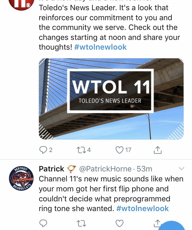
WTOL has been TEGNA-ized. Haven't seen it on-air yet, but this is what they're promoting on social media. (Gawd I hope this isn't their logo - I don't think it is...but eeeeeeeew.) -
Haha... I can't believe she's been with 19 for more than 10 years! And it's funny how we're harkening back to "19 Action News" as a "success" - particularly since "Cleveland 19" was such a snooze! Cleveland is a funny TV market. It seems 19 and 3 basically traded their entire stable of personalities over the past 5 years. Lynna Lai, Danielle Serino, Dawn Kendrick for Romona Robinson, Lydia Esparra and Mark Nolan. And they all lost their personalities in the process! If they want to bring the "Action" back into 19, they need someone with some personality... "Calling Danielle Serino from her Jim Donavan sidekick role at Channel 3......!" (Oh WKYC, talk about a station with a deep bench of talent yet so few newscasts. But I digress.)
-
I agree. And somebody needs to give Chris Tanaka a cup of coffee. His style is very bland for this reboot. They need to invest in some personalities to help pull this off. It is like they’re pressing the “undo button” and going back to the future...but new graphics aren’t going to fix the poor production and bland anchors.
-
“Back” to Cincinnati? Not sure his family actually left after looking at his recent Tweets about Mason HS and departing CVG airport. WKRC could use him, IMO, since their new 4pm anchor is less than stellar. They could’ve at least just acknowledged things changed when Crabtree decided to stick around.
-
TEGNA Broadcasting and Digital General Discussion
ttvn2000 replied to ABC 7 Denver's topic in Corporate Chat
They probably shouldn't have led their statement with more slang - but the takeaway of that article comes from the teachers who wrote the station: "I personally would like to say thank you to you and the rest of the anchors at your television station for having the courage to stand up and do something that teachers have been doing for years." Yep. Anyone who has ever attended a pep rally can attest to that. Like I said earlier, folks are too hasty to judge. And I totally disagree with Scott Jones/FTVLive on his continued ridicule. I think the Toledo Blade does a nice job summing this up - and alluding to a larger concern in the "Twitterverse": https://www.toledoblade.com/a-e/culture/2019/03/28/twitter-twits-ruin-fun-wtol-video-kirk-baird-commentary/stories/20190328141- 3735 replies
-
- 2
-
-
- innovation
- tegna
- (and 1 more)
-
TEGNA Broadcasting and Digital General Discussion
ttvn2000 replied to ABC 7 Denver's topic in Corporate Chat
These folks do not deserve all the hate they're receiving. This is not an actual newscast, but instead a video made for the school district - to help with a social media campaign "encouraging students to do well on their tests." It's no different than some of the 'funny' promos created to promote newscasts. It isn't abnormal for a local news station (or its personalities) to attempt humor. Look at the quasi-journalists on the air past and present....Robin Swoboda, Bob Herzog, Kristen Hampton. They all have a "schtick" that isn't for everyone - but they stay employed (or keep getting new jobs) because...on some level, it resonates with the target demo. I feel badly for these folks - but judging from how Melissa Andrews engages with folks on social media...she won't be taking the s***.- 3735 replies
-
- 4
-
-

-
- innovation
- tegna
- (and 1 more)
-
Entering Spectulatron territory here, but - they could also make them both a half hour a la Bold and the Beautiful on CBS. Or be truly unconventional (and old fashioned) and divide the two hours into three 40-minute shows. Since they all function in the same “world” - it could open the door for some fun crossover and hook fans in to the whole lineup. (Because I’d assume they’d film in LA like GH and AMC towards the end of its run.). Best guess is that they end up on a Disney-owned streaming platform.
-
If I recall correctly, BNS was trying to get Yolanda as early as 2012, to replace Andrea Cambern. Perhaps if she would’ve joined them then, the energy could’ve remained. (Kristyn Hartman simply wasn’t a Cambern clone, and it didn’t work out - but I do feel badly for how she left...given the 10 still dominated with her at the helm.) BNS is a tough station to watch...because truth be told, any energy and personality that station had left with Andrea Cambern. (But I digress...Mitch Jacob will have his work cut out fo him at WSMV. I remember his work at WTOL after his stint in Phoenix.)
-
Some of the momentum for WSYX was also lost once WBNS poached their talent (Yolanda Harris and Pete Scalia) and sterilized them. (You won't see this kind of "personality" when Yolanda is paired with Jerry Revish.)