

groupwfan
-
Posts
294 -
Joined
-
Last visited
-
Days Won
2
Content Type
Profiles
Forums
Articles
Posts posted by groupwfan
-
-
On 8/30/2022 at 5:08 AM, TheRolyPoly said:
Why can't it just be 3 News at 5:00, just like its 6pm news?
You’re talking about a station that used to be a NBC O&O. The O&O glory days (before the TEGNAization) are on the backroads…
-
 3
3
-
-
21 hours ago, Georgie56 said:
Why not just do 4pm news?Like (KVUE)24’s ABC O&O brethren a few miles away in Houston?!
-
11 hours ago, Georgie56 said:
Well, here are the other two SNF logos unveiled tonight.

I bet TROIKA also did these logos like they did the ‘06/‘07-‘21-‘22 logo…
-
On 7/15/2022 at 11:12 PM, ATLNewsExpert said:
oh gosh imagine Hearst's short ass intro's with WXIA's logo.....
With a custom cut of “Strive” for 11…
-
1
-
-
3 minutes ago, evwalker0901 said:
I captured audio of the close - it’s def something new.
Sounds like the new cut of IndyBand..
-
I hope KYW keeps the Eyewitness name, let’s not pull again what they did from 1991-98 (during the “NEWSDAY/beat/TONIGHT” and the “News3” era)…
-
1
-
 1
1
-
-
On 6/28/2022 at 4:20 PM, james32746 said:
WPXI's sister station, WFTV still has Jeopardy at 7 and Wheel at 7:30 on July 4th.
Just like their O&O cousin waaayyyy up on I-95, WPVI…
-
1
-
-
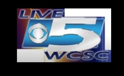
2 hours ago, TheSpeedKing said:
That logo doesn't look like it's from 2019. That logo looks like it came out in 2008.
WCSC’s current logo takes nod of their late 90s-early 2000 “LIVE5” logo that used Bell Gothic as the Font (as that was the font for CBS’ “Welcome Home III” campaign from 1998-99)
THIS is what they had in 2008:
-
1
-
 3
3
-
-
On 12/17/2021 at 4:44 PM, TheSpeedKing said:
Could this be rolled out to the affiliates as well?
It should roll out to the Non-O&Os that is currently using Looks F & N.
-
On 11/18/2021 at 1:53 AM, MyNewsArchive said:
C'mon KRIS 6, almost there...
Probably need a better “6” logo with a larger Peacock.
-
1 hour ago, Kenneth Kissel said:
Here are more Affiliate Tickers from Hearst (KCCI), Nexstar (WTAJ) , Gray (WBTV), Sinclair (WRGB), Meredith (WGCL) and another COX station WHIO.
I did try Scripps but none of the Scripps stations had a ticker at all like the Cox station I showed you yesterday.


KCCI TV8’s ticker looks good (but wrong font)
46’s decent…
others too.
-
9 hours ago, Kenneth Kissel said:
Looks like there is a difference depending on who owns the station. The first Picture is CBS O&O KOVR, the 2nd is Tegna owned KFMB, the third is Cox owned KIRO TV. Look at the difference in tickers or lack their of.
The other two NEED to have the same style ticker WITH their stations’ logos included. No excuses.
-
1
-
-
14 hours ago, Vincent said:
The 6 logo looks the same as it did when it debuted in September 1967 to denote color presentations.
And that was during the WFIL days before the call letter change!
17 hours ago, CircleWXYZ said:WXYZ in Detroit is now beginning to use the new ABC logo.
Probably better than their former O&O brethren! (Since ‘XYZ was an O&O before they got Scripp’ed…)
-
1 hour ago, ref1997 said:
WTVJ just launched Look S along with a new set... Bad news: It's time to say goodbye to the long lived WTVJ custom theme; Good news: They're using the KNBC's updated version of LA Groove

The new set looks kinda sexy~

I made a quick capture of the first 5 minutes if y'all are interested. Again I'm sure someone will post a better montage on YouTube so I'm not gonna upload it to YT.
I’m glad they kept the “The NEWS On NBC6 Starts NOW” spiel for the 4P.
-
18 hours ago, ref1997 said:
WVIT debuted their new set last night at 11PM... but it's still Look N~ The background monitors could be Look S...


So 30 got the new set, but not the new GFX like their Beantown brethren…
-
2 minutes ago, WCAUTVNBC10 said:
Night version confirmed:
Knew it.
-
6 minutes ago, WCAUTVNBC10 said:
I hope there's different versions for different dayparts like they did with their Look C refresh and their custom Look F.
I was about to say that. Their Look C refresh and the studioTEN version of Look F was one of the best adaptations of the O&O GFX…
-
6 minutes ago, ddaniels20 said:
Screencap of WCAU 4PM intro. I believe this is the first time they’ve had the Philly skyline featured in their intro since 2014 (which is when they switched to the standard Look F graphics). They’re also using the older cut of LA Groove in the intro that they used from 2014-2016.
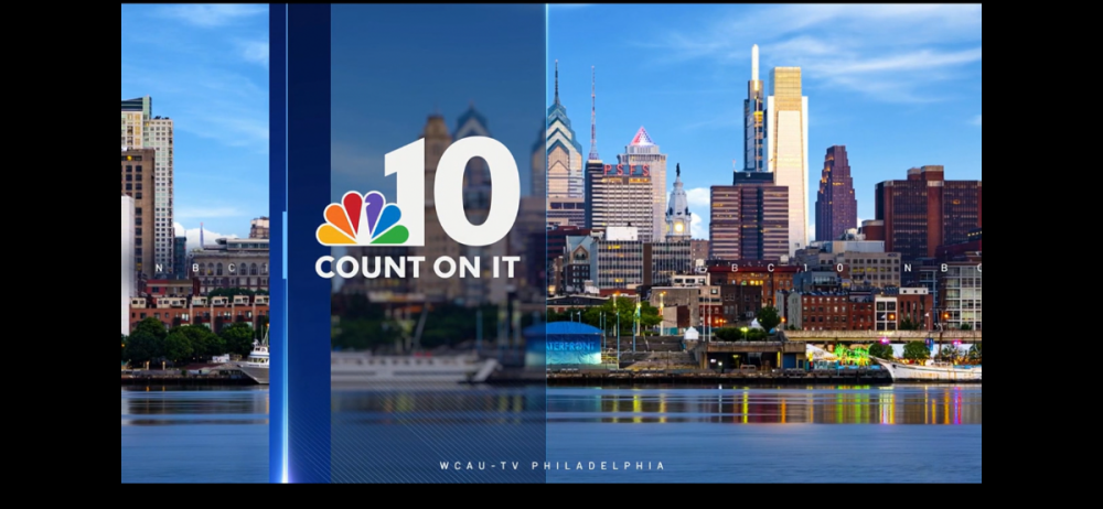
With no “NEWS AT [insert time here]”
But got the “COUNT ON IT
 “ slogan…
-
1 minute ago, phillynewslover said:
There was a breaking news open today. This is what it looked like:
Looks like WBTS’ Breaking bumpers…
-
1 hour ago, phillynewslover said:
Graphics just debuted on WCAU during the 11a news.
Wait, what?
(don’t tell me they STILL have the default Peacock background…) -
3 hours ago, Roadrunner said:
My hot take is every station should use WMAQ's "new" (really used by WCAU first among the O&Os) open. But I was also a 360 fan so I admit my biases. Regardless, I believe it has the most impact, but anyways, that's just my take.
Speaking of that, ‘CAU should go back and use that 360 theme FULL FORCE (LA Groove’s not it) for the opens again…
-
1
-
-
4 hours ago, ScottSchell said:
here’s what I recorded360 (NBC version) got updated and still kept their tagline in the open…
-
1
-
-
9 hours ago, dombrown2222 said:
I don’t want them to modify anything in this package. They need to add some skyline shots to their opens… they have kept an nbc logo in the background for over 7 years now.
I beg to differ. 7 years with the default Peacock logo in the background is 7 years too much. Time to stand out. Bring back the city shots. (And the Squares)
-
If WCAU gets Look S, I swear to Zeus that I hope they’d add the “NOVOCOM Squares” like they did with Look F in ‘12.
-
2
-


New CBS O&O Look Coming Soon?
in Graphics
Posted
The only Gray Media station that can EASILY fit the new Branding conventions is KMOV in STL, gives them their "O&O goodness" full time back to that station for the first time since '86 when they've became KMOV from KMOX.