


groupwfan
-
Posts
294 -
Joined
-
Last visited
-
Days Won
2
Content Type
Profiles
Forums
Articles
Everything posted by groupwfan
-
Probably fonts that their stations' O&O siblings would use.
-
They're not using Gotham like they used to.
-
Which why KD didn't go with the streaming branding for their OTA broadcasts like their fellow station since the Westinghouse days, KYW, did.
-
I would love to have 3 switch to the GFX already!
-
They need the KPIX/KCAL/WWJ GFX badly.
-
Noticing the 2009-16 era "5" logo on the mugs...
-
linearDRIFT at it again. And that sounds like a Arnold/NONSTOP Collab for their new theme...
-
Now he's going to their cross-neighborhood rival's (KYW's 5.5 blocks from 'CAU, BTW) sister station in the Charm City...
-
That rebrand made me make the switch to 3. Still a fan since '91.
-

KCBS 2/KCAL 9 - CBS Los Angeles News Thread
groupwfan replied to Roadrunner's topic in Los Angeles News
The LATE NEWS with Mike Rodgers on KCAL NEWS LOS ANGELES would be a good naming fit. -
That looks like the modified version of the Meredith ticker.
-
3 just announced that mid-morning newscast that’s gonna be on after MORNINGS at 9A, except it’s not gonna have the “CBS NEWS PHILADELPHIA” title; it’s STILL gonna be having the EWN name. (Thank Zeus)
-
That could easily be used on some non-O&Os. (especially WDJT in Milwaukee/Green Bay; as they're the only Weigel owned station to use the current O&O GFX)
-
The only Gray Media station that can EASILY fit the new Branding conventions is KMOV in STL, gives them their "O&O goodness" full time back to that station for the first time since '86 when they've became KMOV from KMOX.
-
TEGNA Broadcasting and Digital General Discussion
groupwfan replied to ABC 7 Denver's topic in Corporate Chat
You’re talking about a station that used to be a NBC O&O. The O&O glory days (before the TEGNAization) are on the backroads…- 3735 replies
-
- 3
-

-
- innovation
- tegna
- (and 1 more)
-
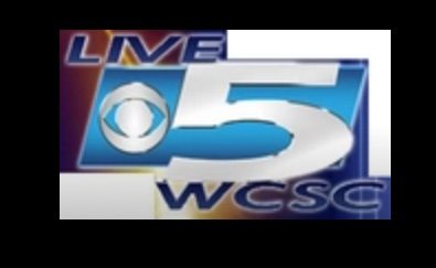
WCSC’s current logo takes nod of their late 90s-early 2000 “LIVE5” logo that used Bell Gothic as the Font (as that was the font for CBS’ “Welcome Home III” campaign from 1998-99) THIS is what they had in 2008:
-
It should roll out to the Non-O&Os that is currently using Looks F & N.
-
KCCI TV8’s ticker looks good (but wrong font) 46’s decent… others too.
-
The other two NEED to have the same style ticker WITH their stations’ logos included. No excuses.
-
And that was during the WFIL days before the call letter change! Probably better than their former O&O brethren! (Since ‘XYZ was an O&O before they got Scripp’ed…)
-
I’m glad they kept the “The NEWS On NBC6 Starts NOW” spiel for the 4P.
-
So 30 got the new set, but not the new GFX like their Beantown brethren…
-
Knew it.
-
I was about to say that. Their Look C refresh and the studioTEN version of Look F was one of the best adaptations of the O&O GFX…
-
With no “NEWS AT [insert time here]” But got the “COUNT ON IT“ slogan…


