


c.alexbrown
-
Posts
49 -
Joined
-
Last visited
Content Type
Profiles
Forums
Articles
Posts posted by c.alexbrown
-
-
I'm personally not a fan of it. It doesn't match the graphics of the show and I think it makes it look even more like a tabloid show and less of a morning NBC News program.
The animated/vector looking render of Rockefeller plaza looks too much like KLG and Hoda's open
-
I saw the graphics y'all are talking about on KHOU on it's live stream yesterday, and I'm guessing the Lone Star stations (and any other station should any more be acquired by Gannett) will be using those same graphics.
You know what the most annoying thing about this new change is.... The whole reason they made the change is because people who still have SD we're seeing cut off graphics and were throwing a fit. So finally, they at least move the time and temp to fit inside the 4:3 safe margin, and leave enough room for at least a small affiliate logo (abc, nbc). I hate how wcnc has the nbc logo on the right side of the box instead of having it in the left where at least someone who watches in SD would see the NBC logo. Sorry. Just a rant.
-
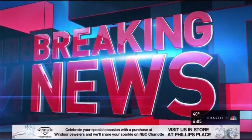
The Breaking News one I saw as well. It actually reminds me, and looks very similar to, CNN's Breaking News stinger.
Oh you're so right!!!! I don't like it. It isn't as refined as it used to be!
-
So, for the topical/transitions, does this include all of the cubed-themes ones the stations are using, or just for the stinger-types, like the breaking news one?
So far, all I've seen is the breaking news one. And they only have used it twice. It's not good in motion either. I thought that the current package is flawless, minus the lack of design for 4:3 safe margins
-
Of course Gannett is releasing new graphics on Wednesday.... I wonder why wednesday.
Anyways, at WCNC here's what I've been seeing all morning.
One thing to note. The ticker now extends to the edge of the screen. There is also a layer under the rundown that is goes across the screen as well... this will probably be coming later. [ATTACH]1459.IPB[/ATTACH]
Also, new topicals and transitions. [ATTACH]1461.IPB[/ATTACH]
-
Thanks for the tip. Will see if I can catch it and post it by the weekend. The 15th is a Friday BTW.
NO THANK YOU for that tip!!!!
-
Ha. People want to see junk and banners? They haven't seen the old gannett graphics!
-
Well, here in Charlotte WCNC is in damage control..... https://m.facebook.com/story.php?story_fbid=763396377035188&id=119243191450513
POSTED LIKE THE THIRD TIME TODAY! Gannett really needs to figure out how to switch it where it's like CNN SD..... How it's stretched out wide. Was it like this for other gannett stations when they launched?
-
Okay. There are a few things that annoy me about the Gannett Graphics, however, the biggest annoyance to me is how they categorize stories. If you're talking about an app, its not LIFE! IT'S TECH! I mean come on! I wonder if there is some type of flow chart regarding choosing a story category.
-
The reason I believe that WSOC doesn't use the ABC logo anywhere is because they also broadcast on TV64.Aren't all COX's ABC affiliates like that also? WSOC doesn't use the ABC logo on anything at all.
-
From the clips I've seen thus far, i'm impreseed. It's a major improvement over the previous package, and even the Belo graphics that preceded them.
I like how they go back and forth on the bug from WCNC to CHARLOTTE, but my only critique is that the peacock is slightly off between the two graphics; they don't line up.
It's a breath of fresh air that brings them on a higher level with WBTV and WSOC, and with their new look, really ties in with their set. WBTV and WSOC look very cheap in comparison with their sets (and WSOC's aging graphics).
Is it me or Is some shots of WSOC set oversaturated? i do think that the biggest problem with the new gannett graphics is that they aren't SD safe.... They're designed for 16x9 not 4x3 ratio!
-
Here's an interesting article about tv consolidation, and wcnc is in the forefront of it.
-
It's not custom...it's just a different cut of the open.
With the tower, wcnc loved cutting up the close version of it.
-
yeah.. but I mean if you looked at the line-up, they do group the stories together... so its not like it would be blue - green - blue - purple. They do keep the stories somewhat closer together.I think that could be distracting for some, if the studio itself was constantly changing colors.
I honestly don't care... just turn back on the lights please!
-
http://forums.tvnewstalk.net/index.php?/topic/12313-wcnc-rebranded-to-nbc-charlotte-news/
The station has been confused at least since 2008 on branding. But the rebrand sorta of makes sense considering they are next to the NBC News Channel off of the Billy Graham Parkway.
I would also say that WCNC is literally the red headed step child of Belo's group.
FINALLY! WCNC IS NO LONGER A RED HEADED STEP CHILD!
-
The building blocks of the gannett look tie into their studio with the block plexiglass.
I'm telling you.... It would be awesome if they'd turn back on the lights and switch it with the rundown... blue lights for news, yellow for weather, green for money, etc.
Here is the opening video in HD... It's still processing the HD I believe, but it's up!:
-
Not a fan of the name and VO.... It's too long and it doesn't flow.
-
And don't forget about all TWC's weird new numbers too!You forgot the 6. You can't forget about those cable viewers!

-
Ahhh... I see. Ive got a digital recording version of it. Uploading in 1080.Watching WCNC NBC Charlotte News now - It actually looks so much better than the mess that they had before. I uploaded the open (recorded from my phone) :
-
I'm uploading a video of the open and like first minute or so, now. I'll get a montage up of all the new graphics on youtube hopefully by the end of today. So far, so good.... It actually makes their newscast seem much better than it used to be, IMO.
-
Okay Guys... Here it is.... WCNC is choosing to use the brand WCNC Charlotte!
-
They managed to shove the First Warn logo in there. Lol
That first warn logo looks terrible there!!! I noticed that when Brad posted a Sharknado video like 2 days ago!!!!
-
I got an update saying that the WCNC graphics were moved, once again, to Thursday at noon. Apparently the news department wanted more time to practice with the graphics. However they already have a promo showing the launch of the new look for July 30th. We'll see...
I think I saw an updated promo this morning that changed it from the 30th to "coming soon"
-
Anyone else noticing the font for the "VIDEO" link buton is different from the rest?
I did notice that! Keep in mind that the UX subdomain is the content staging and development site, so most likely, they'll fix that kink.


NBC Nightly News
in Sets & Studios
Posted
I hate how the L3 stays up the entire time. What's the point of keeping one up if it doesn't have any real, valuable, worthwhile information. if there was a sub header with more information, I could deal with it, but there isn't. Plus the chasers and runner bars are toooooo busy. Way too busy.