


c.alexbrown
-
Posts
49 -
Joined
-
Last visited
Content Type
Profiles
Forums
Articles
Posts posted by c.alexbrown
-
-
Maybe they changed the colors to match that VERY bright studio they have.... the dark palette of the Gannett L3's kinda clash with that studio.
Again..... I wish they'd change the color of the background lights to match what type of story they are doing. I know that only one person in the history of the new set got permission to change the color of the lights and that was Dion Lim for her Dions daily deals during the 4PM newscast with Sonja gantt. I know there are some other anchors that wish they'd Change the lights to other colors besides the blue (now the ugly grey)
-
It isn't on their promo YouTube channel yet (WCNCviral) and I can't get my dish login to work, but here's a pic of the commercial I took. It's interesting to see that they did change the color of the news to a bright blue.Can someone post a link for said promo?
-
Yeah. In not suprised either. The footprint that Garnett has for the logo in the L3 is to skinny and wide for the current NBC CLT logo to fit in.
-
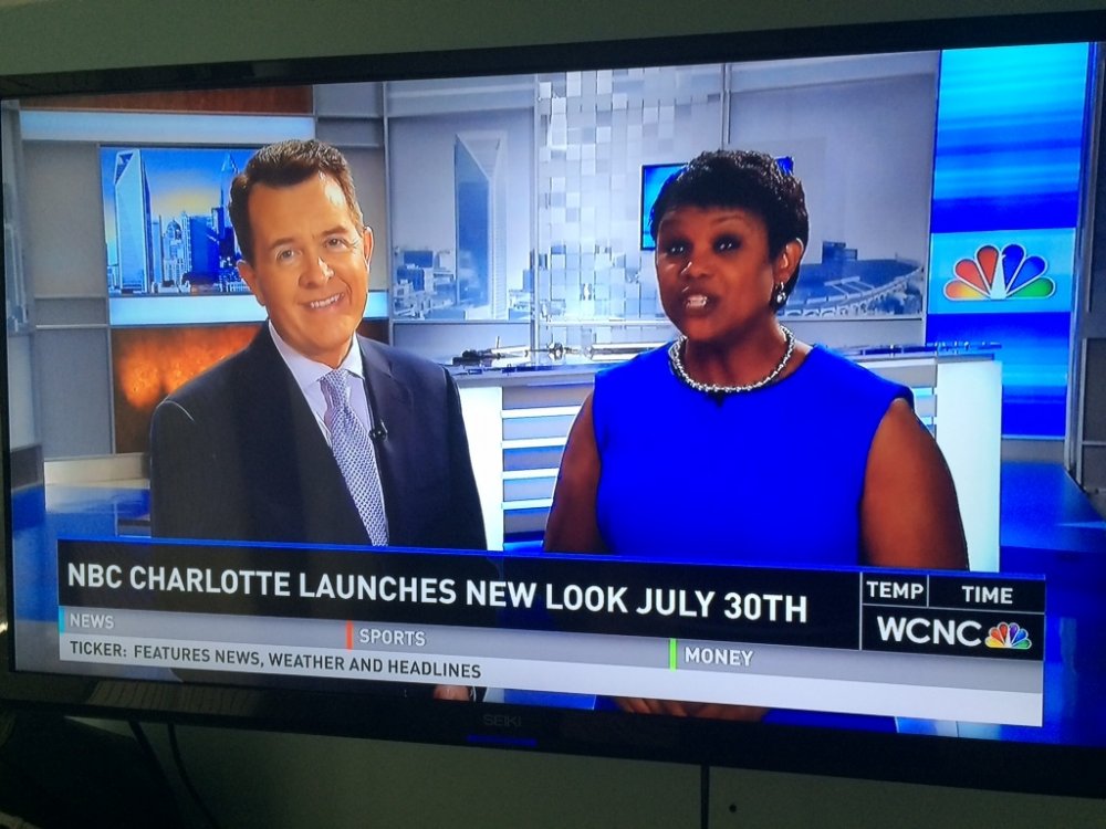
It's official. WCNC getting new Graphics on July 30th! Aired a new promo during the Today show.... And their logo.... WCNC. Interesting to note that that they still called themselves NBC Charlotte.
-
It would be really awesome if when the new graphics come to WCNC, that they change the color of the background to match what type of story they're doing - blue lights =news, purple lights = lifestyle, green lights - money, etc.. But who knows if that's even possible with their lighting system....
-
Who are the sources on wcnc switching over on Saturday? I think it's interesting that they havent done any promos or didn't do any for the new web launch.
-
Found the wcnc.com beta of the gannett site design while searching on the web.... http://ux.wcnc.com
How I got to it.... Search wcnc masthead (that's the name if the file) then I clicked on the image and it brought me to the new site. Maybe it will work with other stations? It looks like it has dummy content right now though
-
If this sticks (I hope it does), that would be the first weekend launch of the new graphics......
Well WCNC finally went full HD on Saturday, June 28th, so it wouldn't shock me if we see a weekend launch.

TEGNA Broadcasting and Digital General Discussion
in Corporate Chat
Posted
I'm a designer myself and I love DIN. And im also pretty sure that it's not cebtury gothic..... Futura actually since they have so many varying widths. But whatever it is, it is indeed cheap looking.