-
Posts
80 -
Joined
-
Last visited
-
Days Won
4
Content Type
Profiles
Forums
Articles
Everything posted by BluesNews
-
I like it, it's plain but it's clean. Though, if you're going to brand your newscasts "CBS News Bay Area," wouldn't it be more logical to brand as "CBS Bay Area"? Just my 2 cents.
-
PAX wasn't really even that great of a network. You can get the same comparable programming from Hallmark and other "family-friendly" channels now. The only thing PAX had going for it, IMHO, was Supermarket Sweep and Candid Camera. Aside from that, wasn't much of their dramas Canadian produced anyway? And it was never going to contend with the other networks with the amount of infomercials it ran.
-
Another noteworthy example is when WXIA debuted their new logo and this forum attacked it harshly. The 1993-debuted serif 11 with the blue boxes needed to go, it didn't fit the design language of neither the G3 graphics package nor the current TEGNA package. Plus, it was a change in direction for 11Alive; you could tell they wanted to target more urban, more city and more underserved neighborhoods, and be more activist journalism. Where Atlanta Speaks isn't just a slogan, that is a philosophy. Theoretically, this format is a modern day Action News or Eyewitness News, in that it is intended to be different than what the other stations are putting out. The problem is that their target audience isn't watching the local news. But, back to the logo, it definitely is not as inspired of a design as the 1993 logo, but it holds up really well given the autonomy that WXIA has been given to modify their graphics and opens to take advantage of the 11 shape. They couldn't have done any of that with the 1993 logo. That 11 can be scaled up, scaled down, and people would still recognize it. Honestly, it did what it was meant to do. And as far as still branding as "11Alive," they learned in 1993 that if you have a unique brand, don't fix it. Don't break it. It makes them stand out from every other "Channel 11" out there, it's been tested and futureproofed.
-
I wouldn't be so sure. It seems like CBS is all in on this new branding standard. If anything, I'd say the box with the call letters on some stations like KPIX is just a transitional brand until people get more familiar with CBS News Bay Area and then the box will go away. I mean it doesn't look like every station is getting box with call sign, only the select few with legacy brands that may be hard to just cut off right away. I.e. KDKA, WBZ, WJZ, KPIX, etc.
-

NBC Considering Giving 10pm/9pm Back To Affiliates
BluesNews replied to Georgie56's topic in General TV
The other issue being that I don't suppose Nexstar can actually buy anymore without selling off properties because they are at the cap. -
Well, I'm fooled.
-
As an Enforcer replacement, I'm not wild about the music BUT for the direction they're trying to go in, the music is perfect.
-
From what I've seen so far, especially with the music, I'm getting Time Warner Cable News / Spectrum News vibes. Definitely looks inspired.
-
Welcome to the last few years of the CBS O&O look.
-
I watch every morning and this morning was pretty different. It wasn’t addressed per se, Susan Hendricks filled in for Robin, but towards the end of the 6am hour they all sat together on the set which almost never happens, and ended the hour talking about Dolly Parton’s Christmas Special. Susan goes “and talking about special” and it cut back to them on the set holding hands and hugging each other as Dolly was singing a song from her special about being together in dark times and making it through, and the camera panned around to show all the staff behind the cameras in the studio. It was a very tongue-in-cheek moment where they were basically like F- you to Licht and CNN. You could tell Bob was starting to get emotional and trying to hold it back, before it cut to commercial he got up and started walking around trying to play it off and hold back his tears. What also made this morning different than the others was that only the 6am hour was live. Usually they go two full hours live and run the first two hours again pre-recorded before going into an entirely different hour hosted by Shyann Malone. Other times the third or fourth hour will also be live in the instance of developing stories or breaking news. Today they re-ran the 6am hour for four hours, and then at 10am when Shyann is supposed to come on (and the guide even said it was supposed to come on) they ran Forensic Files reruns. My guess is that some people didn’t show up for work today or they figured since they were being laid off anyway to give it the bare minimum today. From what I understand, the reason that Monday will be the last day of Morning Express is to allow Robin to get back from vacation and properly send the show off. She was off all week with regular fill-in Elizabeth Prann filling in Monday and Tuesday and Susan filling in Wednesday-Friday. Of course nobody expected this week to be the last week, so Prann won’t get a chance to properly say goodbye unless she’s somehow included on Monday. I also agree that NN should be doing whatever they can to scoop up all the talent from HLN and keep Morning Express on the air in some form. Heck maybe they could even work out a leasing deal with CNN to rent the old HLN space for a NN Atlanta bureau. Wishful thinking, and definitely speculatron, but this show shouldn’t end even if it has been on borrowed time for more than a decade.
-
This promo has Erik Candiani (former WJZY CSD) written all over it. You can tell even down to the use of Beau Weaver as voiceover.
-
Have you heard this guy's recreation on YT? https://www.youtube.com/watch?v=n94DLb9ND6M
-
That new 12News logo would be great if this was 1986. The lack of spacing between the circle 12 and the N bothers me, and the typeface used for the NEWS part leaves a lot to be desired. The 2 is overstretched. Honestly this is a huge downgrade. Don't knock the logo it replaced, the red crescent 12 was actually very decent. Also that set is terrible, that feels like it should be a temp set. The fact that only three other former MG stations/sister stations still use their crescent logos (WMBB, WBTW, and WJBF) doesn't mean that KWCH's logo made them look like a Nexstar station. Honestly, Gray probably left it up to the station since they had used their old MG logo for so long and it had become an identifying mark for them they decided to keep it. Now, it seems they're looking for a refresh to something else. There's three existing former MG stations with crescent logos still, WMBB, WBTW, and WJBF. Those three stations still have their crescent logos likely because, just like KWCH, it became their most identifiable logo mark, and if it ain't broken don't fix it.
-
As long as Norah helms the weeknight newscasts, don't ever expect CBS Evening News to leave DC. The only reason EN is there in the first place is because DC is where Norah lives. Edit: I should note CBS News has almost always been in DC with a bureau there, so it's not as if they moved in to DC just for Norah.
-
NBC Considering Giving 10pm/9pm Back To Affiliates
BluesNews replied to Georgie56's topic in General TV
They need to bring back Rock Center. -
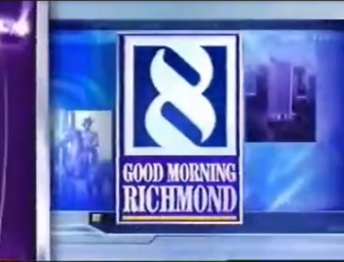
It's not their best look, and it's not the best thing to come out of Linear Drift. But it's manageable, and it certainly refreshes from an out-of-place and outdated old KOIN "arrows" package they were using. Given the station's history when it comes to creative services choices, I'd say this is pretty refreshing. It's not as jarring as that old gray/purple/navy blue look with the abrasive serif font and the lightning bolts they had about a decade ago. Even the sharpness and red applied to the old Young HD graphics. Like if a station was going for graphics that screams brutal murder, WRIC has a history. I can understand slightly the hate for the old 8 logo, it was kind of scary and jarring looking, very sharp like razor blades. But it was unique, very unique. What they use now and have used for a few years now isn't, it's very uninspiring. But to be honest, these new graphics are the first time I can look at WRIC and not be scared shitless by graphics, and that's like for the first time EVER, in over 30 years. Heck, even the animation of the open in the last package it replaced was too jarring. Now, it seems the station is finally starting to soften up it's longstanding "guy hiding in a dark corner with a knife and a menacing smile" image that they seemed to have had for a long time. And if you don't agree with me: (Why is the transition sharp razor blades?!)