DJonNews
-
Posts
115 -
Joined
-
Last visited
1 Follower

DJonNews's Achievements
AM Anchor (4/8)
104
Reputation
-
WTKR, I'm sure, will get the new graphics soon. If I remember correctly, they've begun phasing it in for a short promo or two.
-
There's also a new intro. I saw a comment a little while ago, and the commenter stated their graphics are supposed to be based on the Orioles' social media graphics. That's fine, but I can't help but feel as though MASN's graphics are a slight downgrade from what's come before (not to mention, most of the graphics still use the sliding animations from the 2022-25 set on account of using that same infrastructure). Also, the pitch clock is very tiny.
-
This. Nexstar was like the impatient child on Christmas. They wanted their shiny new toys now instead of waiting until it was their turn to have their gifts opened. They also let their arrogance get in the way of good judgement. Only doing the bare minimum to sell off stations (all but one of which are the lesser-prized of their possessions) so they can keep the more attractive ones, which solves very few, if at all, problems with regards to conflicts whatsoever; surely that will go over well. Putting aside the logistics of the deal, all they had to do was wait until after the coast was truly clear, even if the FCC told them to jump sooner rather than later. It's been botched already because they rushed it without thinking about what happens if they make too many changes too soon.
-
So, as it turns out, "Whiskey Fridays" is not going to be a real segment, according to CBS... it was not for broadcast, "not a real title...not a real sponsor, and this is not a real story." The graphics being tested were just a placeholder "for a potential non-televised, in-person private event."
-
The company is owned by the Ellisons, who... well, you know... Anyway, I'm sure they have full faith in Bari to not only continue CBS News' steps in the wrong direction, but also take it far right. "60 Minutes" and its hard-earned credibility are being sacrificed because of that shift. It used to be the outlier at a time when CBS News was (and still is) undergoing a period of instability, and for good reason. It was the perfect example of long-form journalism. Now, not anymore.
-
CBS wanted viewers and advertisers to think of this town hall as a display of "objective journalism," which it wasn't. They had no problem lining up mainstream advertisers for the "48 Hours" rerun that followed it, though. CBS actually plans to do more town halls and debates like this in the future, advertiser disinterest notwithstanding.
-
I just thought I'd drop this nugget into the conversation in the case of Sinclair: This is from Paul Farhi. And yes, "network programming" includes "Jimmy Kimmel Live," the very show they don't intend to show on their ABC stations for the time being.
-
One of the editors of the Hollywood Reporter imagined a meeting with a whiteboard reading the following: "M__ S__ N__ ___ ___" Crickets came up next for those who had to work with what they were given. "No one leaves this room until we have a new five-letter brand name that starts with MSN and stands for … something." So never mind that "MS NOW" sounds too confusing as a channel name and "My Source | News | Opinion | World" sounds too clunky when used in full (which Versant is hoping people won't have to do when referring to the channel from now on); in trying to come up with the acronym first before the full phrase, they've done the whole process in the wrong order. In branding, the phrases come before the acronyms, which are an "accepted societal shorthand" for what the people have latched on to.
-
This screams "rushed." They want it to be known as "My Source for News, Opinion, and the World," but those minute details alone don't make that name choice make any sense. Besides, most people won't even know that it's still the news channel they've come to expect at first until the channel beats them over the head with it in promos for several months, if not a whole year. If that's the end result and the viewers still don't come, then that suggests that they're failing at brand awareness. And after I typed this, I read an article detailing what Hollywood Reporter editors thought about the name change. Not even they knew what Versant was going for with this half-hearted attempt at a rebrand post-spinoff.
-
If they absolutely wanted to, they would've called it "mySRC." "SRC" is an abbreviation of "Source," so the name would've sounded like "My Source." And the "News, Opinion, World" part would've been used only if necessary to assure viewers that it's still MSNBC, but with a new name that finally, finally, does away with the "MS" part that was made irrelevant for years. Something like "my News, my Opinion, my World, mySRC" would've done for an extended logo animation. It would've made more sense to call it that, given the context, than what they ended up choosing. And as for the full name for "MS NOW," it's "My Source for News, Opinion, and the World." Like those minute details are going to make the name choice make any more sense.
-
 DJonNews changed their profile photo
 -
You know, I thought CBS would keep the 2021 scorebug, since I noticed that a wide majority of the insert graphics in Super Bowl LVIII were of the 2021 style but with color changes (not unlike the graphics Fox would end reverting to partway through Super Bowl LI, since they presumably also weren't proud of how the "flat" graphics turned out; of course, there would be a different flat graphics set come the 2017 preseason). Heck, the preseason game I'm watching is using a wide majority of the 2021 insert graphics right now! But I thought wrong.
-
By the way... Washington Commanders, Indianapolis Colts, Cleveland Browns: No change. Miami Dolphins: Am I the only one that thinks that Arial clashes horribly with the preseason graphics they've been using since 2018, which has Klavika elsewhere? (Never mind that they're an era behind when it comes to graphics and they're still promoting the preseason telecasts as broadcasting in HD in 2024?)
-
Yeah, I don't see CBS Sports changing to the graphics we saw in Super Bowl 58 for this upcoming regular season. The virtual down and distance marker? With a font change to TT Norms, maybe. But the graphics as a whole? Not at all (since many of the insert graphics are just reskins of what they've used since 2021, themselves reskins of the 2016 graphics infrastructure), and especially not the scorebug.
-
And I believed right. There was a theme to all this. According to Sports Video Group, the graphics package was designed to deliver "a punchier presence that leans into the pomp and circumstance of on-campus game days." And yes, there will also be minor tweaks to the graphics as the season goes by. I'm hoping one of them regards the team names directly below the logos. After all, what good are they if you can't read them and the font makes it no easier to do so?
-
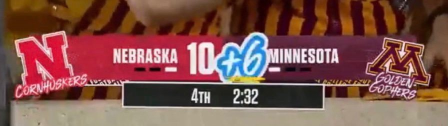
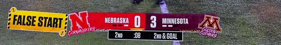
Here's more of the new college football scorebug, including the indicator of how many points a team has scored in a play (+6, +3, etc.), and the specific penalty a team will have committed. The more I study this, the more I become inclined to believe that the graphics were designed with a sticker theme in mind, which explains the tilted logos, tilted placement of the exact penalty committed (complete with exclamation warning marks, as if the black and yellow wasn't enough to let you know already), and even the slightly tilted bar containing the quarter, time, and down and distance. They've well and truly accomplished the style, but where's the readability, especially in the team names below the logos (not helped by them also being handwritten and sometimes in colors that clash with each other)?