
Leaderboard


Popular Content
Showing content with the highest reputation on 07/30/23 in all areas
-
Can we maybe start an "Anything and Everything Wrong with KTRK" thread, move the relevant posts there, and keep this thread just about the changing graphics at ALL the ABC O&O stations, not just KTRK? When kept on topic, I've found the posts and discussions about what we've seen overall at WLS and in weather on some of the others very interesting.7 points
-
It's a base graphics package that both stations' meteorologists have customized for their needs. If you don't like the way it looks on KTRK, well, that's the way their meteorologists have decided to use it. It's essentially a LEGO set. They were sent a box of parts, and this is how they've assembled them. There's nothing more that can be said about this.7 points
-
With all due respect, you sure use a ton of words to say the same damn things, over and over.1 point
-
I think we've gone over the weather graphics debate enough. People love to claim on here that viewers will switch away from Channel X in droves because they adopted the Tegna music, or because the weather graphics aren't "weathery" enough, and are almost always proven wrong. It's not even worth my time to rebut the absurd claims being made.1 point
-
Just copying KTRK's new writing style of endless repetition. "Only on ABC13, ABC13's [name here] is live with the story," and "As we come on the air, we got breaking news...more breaking news...this breaking news is just in..." (Even when some of those stories broke 5+ hours ago, and everyone knows you are on the air. Someone has to hate that kind of writing as much as I do.) But in all honesty, of course I'm repeating the same things over and over, because every time I watch I keep see the same mistakes happen. I know people from that station used to seek out criticism, so that they could learn from their mistakes. So I figure if someone at KTRK still does, he/she will know that how many Eyewitness News viewers feel ad nauseam. I tuned into 4 primetime broadcasts at random times last week and within the first minute of turning Ch 13 on, they made at least one mistake each time. I also sometimes forget that I said something here before, because I've told the station some of it at one point or another, and posted other bits of criticism in other places. Sorry. And I'm not sure I understand this idea of standardized graphics anymore, because what KTRK has now is a hodge-podge of what they had before mixed with the lists, forecasts, the simple icons, font, and three dot, thinner banners from WLS. They still have same unique high and low pressure icons, which you guys hate, unique color tables for enhanced satellite, radar, etc, the 4-TowerCam view with current conditions, the same flow lines, some full length banners like before, the same current conditions on the banner (expect a lot smaller) and in 3D (the same size as before), the same transitions, and as well the same way weather alerts pop out under the top banner on radar and the banner still changes from blue to red like before. Pretty much everything on the left hand side of the video wall is the same and augmented reality still looks the same. On the other hand, they removed one of the station's colors, red, from nearly everything. For some reason, the satellite picture in the background of Mega Doppler 13 and FutureTrack is a lot darker than before, and doesn't have the same level of contrast between the background and everything else. They even got rid of the Mega Doppler logo, which doesn't make sense since the station spent a pretty penny on that radar. So, yeah, even though I don't like it, the package at WLS is much better done in that it was clearly designed for them and everything seems to be an appropriate size, while what's at KTRK looks like a rushed copy-and-paste job with changes that don't make sense which make things a lot less legible.0 points
-
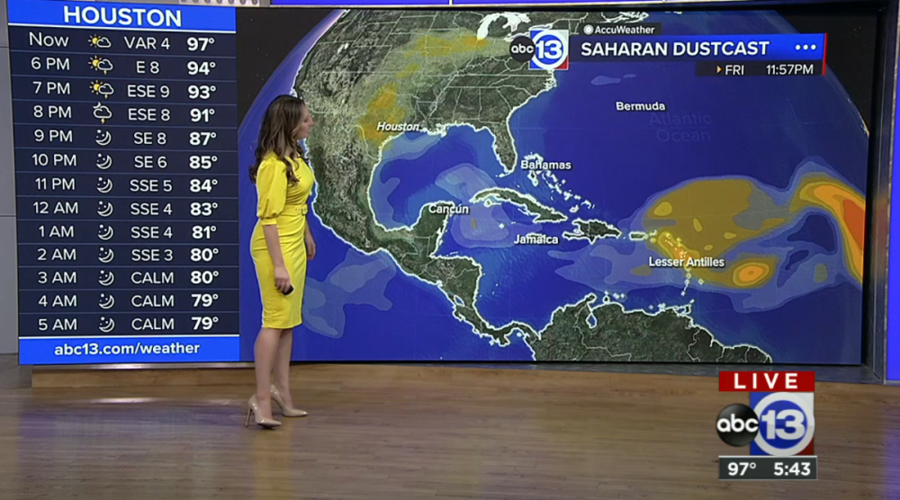
ABC13 in Houston has gotten the new weather graphics on the air.
 0 points
.thumb.png.3d66a1eeb7ecf5404151f8a77ea7cbfd.png)


This leaderboard is set to Chicago/GMT-05:00