
Leaderboard


Popular Content
Showing content with the highest reputation on 11/21/19 in all areas
-
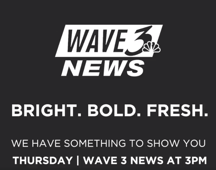
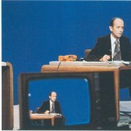
Here's a quick video slapped together of the new open, talent rejoin and weather graphics.7 points
-
Word on the street is Grays Graphic hub did not do these graphics. They were done in-house at WAVE 3. Great look if you ask me. Good evolution of the Limerick package of late.5 points
-
I have a feeling WAVE is getting Gray'd today!
 5 points
 -
No one's upsetting anyone. They were allowed to use these graphics, the same way they allowed WOIO to use their new gfx. I'm sure if the higher-ups would've have a gripe, we probably wouldn't see these gfx on the air.4 points
-
I know that guy. He’s a spammer who does that “Next” thing on my videos. I wouldn’t listen to him.4 points
-
For an in-house package, that is outstanding. Very nice. The gfx dept at WAVE deserve a pay raise.3 points
-
Betcha this would’ve been second gen Limerick if Raycom never got gobbled up.3 points
-
Was watching KMGH to get my opinion since they don't have the new graphics yet., to be honest it's both good and bad. On one hand the new graphics are more tolerable and less flashy. I have never been a fan of sensationalist imagery and the outgoing graphics had for years contributed to my opinion of Denver7 news as a sensory assault, and it is for the best that those graphics go away. On the other other hand the new graphics come off looking cold and I don't think they will succeed in turning heads. It feels like Scripps wants it's stations to approach audiences with a softer yet more serious look that for one thing will not change opinions of the stations that really try their best, and at the same time do nothing for stations that are not performing good. Ultimately, I don't think it's the graphics but the newscasts themselves that have to be convincing.3 points
-
WGN, Chicago; halftime edition featuring new graphics but still the old set (albeit with a temporary blue backdrop instead of the skyline), 1993:2 points
-
In another universe, it is! Nice look--if it indeed was in-house, well done. Hope it makes its way to other stations in the group.2 points
-
WAVE is next on the "Gray-vy" train.
 2 points
 -
I agree. It's hard to do better than Renderon gfx. A refined 2012 look would've been my first choice (bolder L3s with the same color scheme & a re-tooled open similar to WJAX/WFOX, basically flatter but still have some 3D). Or a new package but with a unique (not boring) design to set the look apart from other station groups while staying current. Hearst is a textbook example of a graphics update done right. They kept what worked from their 2012 pkg and yet stayed updated on the look. That was the route Scripps should've took.2 points
-
I probably remember the Springfield 33 News era during the times my parents and I would make that 4 hour trip to Branson for a Vacation1 point
-
How did WAVE pull this off without upsetting the bosses?1 point
-
Confirmed. These graphics were done in house by WAVE. They did not want the crap Gray is producing.1 point
-
Some KTUL and KOKI from ‘04: KOKI using early 2000s TVBD to its fullest.1 point
-
I wish this was the WBTV package (with Teal instead of Orange, tbh) This is probably one of the BEST packages I have seen in a while! The other Gray gfx (besides 'OIO) is not as good.1 point
-
Scripps should hire them! Beautiful evolution of the Limerick package. This and WOIO’s should be an option for other Gray stations.1 point
-
I very much like Gray's new gfx package(s) all around, but this new one from WAVE is the very best. Incredible overall.1 point
-
I believe everyone except WPLG rolled it out at the same time.1 point
-
Never mind. WPLG has the new look too. Despite being owned by BH, WPLG still acts like a Graham-owned station.1 point
-
I agree! other than the WOIO Hothaus look, these are the best graphics on a Gray station. This IMO, is a perfect evolution of the Limerick look.1 point
-
That L3 reminds me a bit of WFTV and KTVK. I'd be curious what the open looks like.1 point
-
How tied to Graham is WPLG these days? BH may be exerting some independence.1 point
-
Maybe I'll feel a tad bit better about this if when it gets to WEWS, the old "Circle 5" returns.... But I'm not holding my breath...1 point
-
I think that even having a faded Scripps logo in the L3s would've been more artistic than what WTXL debuted. At least it wouldn't have been so simplistic of a design that it looks like a text box made in PowerPoint. The music side of things is promising, although they need other cuts for the larger markets. I like the new Scripps music far more than Tegna's "C Clarity", overall. Although I need to hear more cuts before I make my final decision on that comparison.1 point
-
It's like a mashup of the Tegna package with a flat version of the Glass/Curves SBG look. The blue and some of the design is very Sinclair-ish.1 point
-
this pkg is a big disappointment... it has all the makings of something done in-house... at least tegna went outside the hub to get a designer... doubt there will be a warm reception to these from many stations management teams... to go from flashy renderon graphics (which most of the old jbg stations have used since 2004) to... this... this might be the second coming of the burnt orange scripps pack... i give it a few years before it gets replaced... hopefully the rumors of the "alternate package" are true...1 point
-
A "bunker" full of guns and ammo was found hidden in a wooded area just across the street from WTMJ this morning, after police were called out to investigate reports of shots fired. https://www.tmj4.com/news/local-news/man-arrested-after-bunker-with-weapons-found-near-estabrook-park1 point
-
Meanwhile at KOMO Plaza. https://komonews.com/news/local/beloved-komo-weathercaster-steve-pool-to-retire1 point
-
The first WLKY “Wednesday’s Child” segment from 1980 - posted by Liz Everman herself:1 point
-
Graham Media Group has a new look to their websites. https://news4jax.com https://click2houston.com https://clickorlando.com https://wsls.com https://ksat.com https://clickondetroit.com The only one that doesn't have it? WPLG.1 point
-
How she manages to land jobs is beyond me. One of the worst anchors I've seen in a big market.1 point
-
Oh my God.1 point
-
We don't EVER talk about that travesty.1 point
-
I'll miss the old package, especially with what is replacing it. I hoped they would build on what worked in the old package, but they have chosen to go a completely different route.1 point
-
To each their own. I mean, the white-and-blue look is a very good package when used correctly as intended, but there will always be those who will manage to botch it.1 point
-
That's not entirely true. I read recently that WLTX is making big gains and quickly eating away at WIS 10's dominance.1 point
-
KNBC news promo, 1977:1 point
-
TVNZ in New Zealand is cerebrating the 50th anniversary of the national network news. Before NZBC's four main TV stations were linked, all news was locally produced. That all changed in 1969, as this report from Seven Sharp explains:1 point


This leaderboard is set to Chicago/GMT-05:00