qunewsguy
Member-
Posts
528 -
Joined
-
Last visited
-
Days Won
18
Content Type
Profiles
Forums
Articles
Everything posted by qunewsguy
-
I'm sure some of this is comp time from storm coverage, etc as well. It's normal.
-
Motion Graphics agencies that did news graphics in the late 90s?
qunewsguy replied to JosephH1998's topic in Graphics
That's likely done in-house. Doesn't have any of the telltale flourishes of any of the major firms. By the late 90's AfterEffects was available to most individual stations' art departments. -
At least it matches the cheesiness of WABC's graphics now.
-
Local content is more lucrative than syndicated, and what's being shopped around for syndication isn't great.
-
Same but I think they did it better 20 years ago
-
and this has what to do with graphics?
-
general thread NBC Sports/NBCSN/Golf Channel/NBC RSNs Thread
qunewsguy replied to WCAUTVNBC10's topic in Sport Center
Sounds like generic production music to me. -
The current set is as old as the building sans the additions of a couple extra monitor arrasys, so it's definitely time for a full rebuild for them.
-
A nice, lighter update for sure! No change at WVIT yet but I'm guessing they'll wait til their new set debuts to roll this out.
-
Motion Graphics agencies that did news graphics in the late 90s?
qunewsguy replied to JosephH1998's topic in Graphics
-
Motion Graphics agencies that did news graphics in the late 90s?
qunewsguy replied to JosephH1998's topic in Graphics
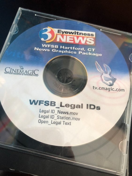
Yep! We still have all 100 deliverables CD's for the 2002 WFSB graphics package as well. Ah, those were the days... -
Motion Graphics agencies that did news graphics in the late 90s?
qunewsguy replied to JosephH1998's topic in Graphics
1998 WDIV was done by TVBD. There is one brief version of their 1998 site that was never archived (also featured the original HD launch graphics done for KRON). -
Motion Graphics agencies that did news graphics in the late 90s?
qunewsguy replied to JosephH1998's topic in Graphics
LoConte Goldman's website used to be great but I can't remember the address anymore so I can't find it on archive.org Also I see on Linda Kane's site that she has some early pitches for the WBZ 2000-era graphics. Given that those were done by Viewpoint Studios (which is still around) I have to assume she was a contract employee for them at the time. -
Motion Graphics agencies that did news graphics in the late 90s?
qunewsguy replied to JosephH1998's topic in Graphics
How to tell we've been news gfx geeks for wayyyyyy too long -
Motion Graphics agencies that did news graphics in the late 90s?
qunewsguy replied to JosephH1998's topic in Graphics
WLBT looks more like Giant Octopus' work at the time (WBNS, etc) than Cinemagic. Cinemagic had a very unique high-gloss style. -
Motion Graphics agencies that did news graphics in the late 90s?
qunewsguy replied to JosephH1998's topic in Graphics
https://web.archive.org/web/19980110120633/http://tvbd.com/tvbd_news.htm "Balls and Walls" was TVBD and a second version was developed in the early 2000's for then-WOKR in Rochester. TVBD's site used to have a GREAT timeline of station work and packages. -
Identical? Can I interest you in a new pair of glasses?
-
Looks like WAVE is about to lose their custom look...
-
The plexi skyline backdrop from this set still exists and it's actually installed in current anchor Dennis House's attic.
-
Going allllll the way back to page one of this thread, WOIO's look has been claimed by Matt Quinn, who also does work with Hothaus (explaining why it's so similar to other Hothaus packages but not an official one). https://mattquinncreative.com/woio-cleveland
-
TEGNA Broadcasting and Digital General Discussion
qunewsguy replied to ABC 7 Denver's topic in Corporate Chat
The big question: will they finally drop MCTYW?- 3706 replies
-
- 2
-

-
- innovation
- tegna
-
(and 1 more)
Tagged with:
-
That Mass Lottery music at 19:30... oh my God I'd forgotten all about that!!!!!!!
-
That's going to be interesting to see what they do considering WHCT doesn't even have must-carry status anymore.
-
Airchecks probably don't get much older than this!
-
How's that tinfoil hat working out for you?


