

b.png.4a4f72b902e4210e6802e3e35b176cae.png)
Geoffrey
-
Posts
1177 -
Joined
-
Last visited
-
Days Won
37
Content Type
Profiles
Forums
Articles
Everything posted by Geoffrey
-
Constantly changing the anchors isn't ideal, but I can also understand the mindset of "We can pay someone much less to keep us in third place."
-
I'm sure THIS is finally the time a WBBM anchor change will make them #1.
-
Good question. While being out in the field and telling stories might be more fulfilling, it can also be exhausting having to constantly be on the move in whatever weather, looking for people to talk to, and writing a story in time to be edited for air in a few hours. Traffic reporting is essentially an anchor-type job in a comfortable studio, laughing around with the other anchors, being part of the "team," and getting lots of face time. Everyone has different preferences but I would imagine most on-air talent aspire to end up in the studio.
-
Lower thirds look a lot nicer... much cleaner. But the open (the animation after the long tease) is incredibly dull.
-
They started using those graphics once they began sitting at opposite ends of the desk with omicron. I'm not sure I read too much into it except that they like using the eye and have occasionally trying to match the network look. It does seem inconsistent that it says "CBS 2 Mornings" but consistency has never been their strong point.
-
I accidentally came across this in my guide: CBS will be airing golf (Farmers Insurance Open. Golf. Round 3) this Friday at 5, so CBS 2 News at 5 and 6 will be airing on WLNY. I can't immediately recall CBS 2 moving their regularly newscasts to WLNY due to a network preemption.
-
I like the new CBS News look overall (even though I don't care for the name) but the CBS NEWS bug is too wide. They seem intent on keeping the small eye the same size and position across all broadcasts (news, primetime, etc.) but I wish they could have come up with a better solution.
-
I am not hopeful. The previous CBS O&O look was uninspired and felt dated from the very beginning. Then the sloppy combination with the CBSN Local look. I do like the CBS network look that's being replicated across CBS Sports, CBS Mornings, etc. But I'm not hopeful that this will be done well. We shall see.
-
I have been saying this for years. Unless there's a major incident, most traffic news you get from TV will be outdated by the time it's relevant to you. I'm fine not having dedicated traffic reports on TV.
-
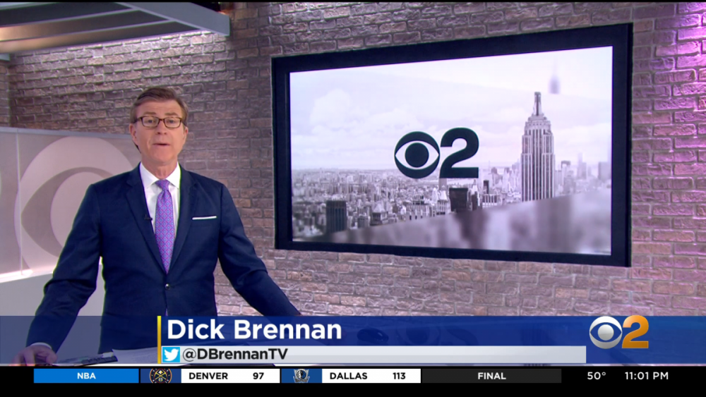
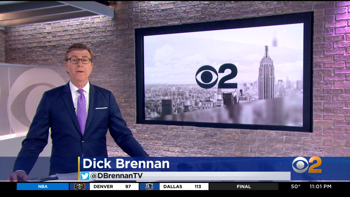
I think they both look nice, but I've decided that backgrounds that are just big skyline photos are boring. Putting a photo in a monitor does not take much effort. I prefer seeing some graphical design and physical set pieces.
-
I'm going to miss Hazel on CBS 2 but she's a great anchor and it seems like she already has chemistry with Dan Mannarino. I bet they'll be a very exciting team to watch.
-
Hazel Sanchez left CBS 2 last month after 21 years: https://www.facebook.com/hazelsanchez/posts/10227892059945996?__cft__[0]=AZV1Zbk6QSz0uiBuLapFI7_6T6huWemOqm0OvU3XaMwGQHK5S8_guZlQrg1etCkoOYD91xcgdc6dWhGHfHGSAg7YsyTGvzdVSbh2TRcFcZ06nTMlFFSGQLgVeJjF0d5ssdI&__tn__=%2CO%2CP-R She joined in 2000 as a reporter but often filled in as an anchor in the morning those days. In recent months, she began to have more fill-in opportunities again, so I was surprised to see her suddenly disappear. "I’m especially thankful the next chapter of my life will keep me close by. All I can say for now, is it’s a wonderful opportunity for me and my family. So it’s not goodbye. It’s see you around. And I’ll see you on tv again very soon." My first guess was maybe WPIX. The new news director there was at CBS 2 when Hazel joined so they have a long history. Hazel posted yesterday that an announcement is coming today, and she used hashtags #newsanchor and #ilovenewyork. The Facebook version of her post shows her sharing a meal with a guy whose face is covered up and the caption includes: "We’ve shared the stage and now we’ll share a desk." I guess we'll find out soon!
-
Not a bad refresh. I'm not a fan of the "live" and time not being on the screen all the time as they rotate with the show's name ("REPORTS" during the day). I also don't like how the lower-third shrinks when displaying someone's name (they've done this for a while). I do like the different colors for different shows and topics and how the bug's colors change to match.
-
One of two pretty damning stories about Peter Dunn in the LA Times today. https://www.latimes.com/entertainment-arts/business/story/2021-01-24/cbs-television-stations-peter-dunn-racism-sexism Some quotes but I recommend reading the whole thing:
-
-
I remember him doing this on CBS for The Saturday Early Show (and I think he brought it over to CBS 2 as well sometimes). I had no idea he had been doing this far longer than that. Thank you for sharing!
-
I think their intention is to keep it on the screen for a while so, if it's rather transparent, it's obstructing less of the action.
-
I'm a fan of the new look overall. The previous look was too bland and did not present the energy that you think of when you think of Fox. The touchdown graphics are definitely huge but do the trick if you're watching in a bar and not directly in front of a screen.
-
.thumb.png.b4e7ab990ea6fcdbaa9fc86aa73e0d16.png)
.thumb.png.46c977bfe7e90c3ac4d947f83957d9a5.png)
.thumb.png.6d124e2e9cf44bb0baf5d76c4cf5bad7.png)
-
If you're wondering what ABC 7 did with the old monitor backdrop, wonder no more. It's been donated to Hofstra University. I believe the previous Hofstra set was from ESPN. Before that, many years ago, they had parts of a "News 2" set from the "More News in Less Time, Every Time" era. Looks like a huge upgrade.
-
Check out Dave Price at 0:22.
-
I'm not a fan of the solid black. But at least, for the first time since John Bolaris was the chief meteorologist, all the days on CBS 2's extended forecast are the same size.
-
Definitely a CNN vibe. Some parts remind me of Wolf Blitzer's studio.
-
The studio looks nice. The graphics are a nice update from the super plain look that debuted a few months ago, though it still feels a bit on the cartoonish side to me. Strange that the old lower-third banners appeared sometimes, including for the top story. (That has to be a mistake, right?) I still hate the show's logo taking up a bar on the bottom of the screen. They had this for Jeff Glor but then switched to a box on the left. But why is this necessary at all? Neither ABC nor NBC has anything like this in the evening. The opening theme still feels lost to me. Sounds almost like a weak close, not an open. But overall, an upgrade from a visual perspective. Let's see if they can take advantage of being in D.C., put on a solid broadcast, and earn the trust of new viewers. I'm interested to see if the special report graphics are updated. I imagine we'll see that on Wednesday.
-
I like Jeff but felt he was a bit weak and bland as a lead network anchor. I preferred Scott Pelley. His writing was solid and I felt the broadcast chose the right stories to lead with. Once Pelley left, it felt like the broadcast became less serious and it stopped becoming required viewing for me.
b.thumb.png.b658c90e4e56cb08f2e8ba3195bb9da9.png)


.png.3b8368f107e6c7ca649fe6a2adb6b035.png)
.png.98c7fa04e211ece2bf1a1647516b0652.png)
.png.5c8c0e48e1b14a8f75e52032bb5a53e8.png)