


Vlad
-
Posts
2000 -
Joined
-
Last visited
-
Days Won
7
Content Type
Profiles
Forums
Articles
Posts posted by Vlad
-
-
On 12/31/2019 at 9:25 PM, Roadgeek Adam said:
David works noon and 4. Getting 4 was part of getting David back from CHI. Bill and Liz at 6 have been the norm for quite a while since Liz left the 11 for 4. As for why Bill at 5, he chose to take over for Diana is my guess.
As for Ken, he and Lori were both taken off the 12-1 shift to relieve the load of work. Bill (and now Sam) still work both, but there was a place needed for Shirleen, and Ken and Lori at the time got a break working from 4:30-7. Lori's leaving put Shirleen at mornings as well. Of course, Ken has a ton of seniority.
I wonder if Shirleen will eventually also step down from the Noon Broadcast. Seems like its a lot for her to do. Especially now that she's a mother of two..
-
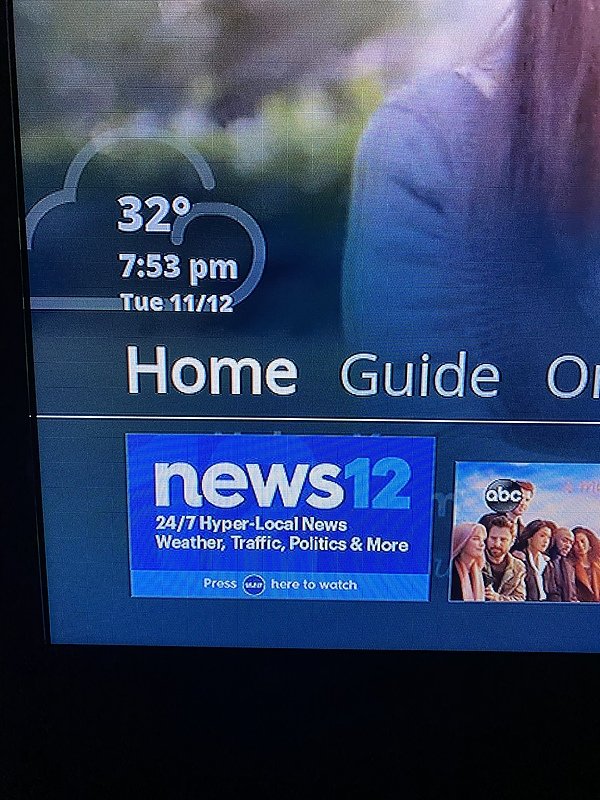
There was a weird issue with WABC tonight, their logo kept flashing on the right side:
I recorded the video during the Eyewitness News broadcast featuring the first report of Kristine Thorne of course haha. We were just talking about her.-
 1
1
-
-
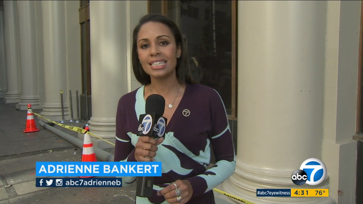
I love Kristin's style of reporting. She's super engaging and very compelling the way she tells her stories. So glad she's back!
Here's a demo reel from the mid 2010s in honor of her.
-
On 12/5/2019 at 2:18 PM, Roadgeek Adam said:
Jesus, the kvetching about that graphic package doesn't stop. I get it. It's not the best graphic package, but the old ones were going for multiple years at this point and it was time for change. Yes, it will get changed eventually. It's the not worst thing I've seen. It's readable.
It's light years better than KABC's.
Honestly it is just this particular package that we keep griping about haha because it is a downgrade in my opinion from what they've previously used. The Giant Octopus package from late Summer 2011 to Spring 2016 was arguably their best they've ever had:
In my opinion those graphics above were their best on air look.
Honestly I prefer the KABC graphics over the WABC. Much cleaner and more effective in my opinion.
Their previous package looks similar to WLS's current package. I wonder if GO did the same thing.
Maybe when they move to their new location we'll see an overhaul in their on-air look and branding.
-
2
-
-
Looks similar to the basic animations used for the WABC graphics package... I wonder if the same company did it for them.
-
Does the New Jersey location have new graphics?
-
Is that the Altice One System you're using
6 hours ago, RealNews18 said:Looks like News12 May be updating their logo.. seems like it’ll reflect the altice logo a bit more.
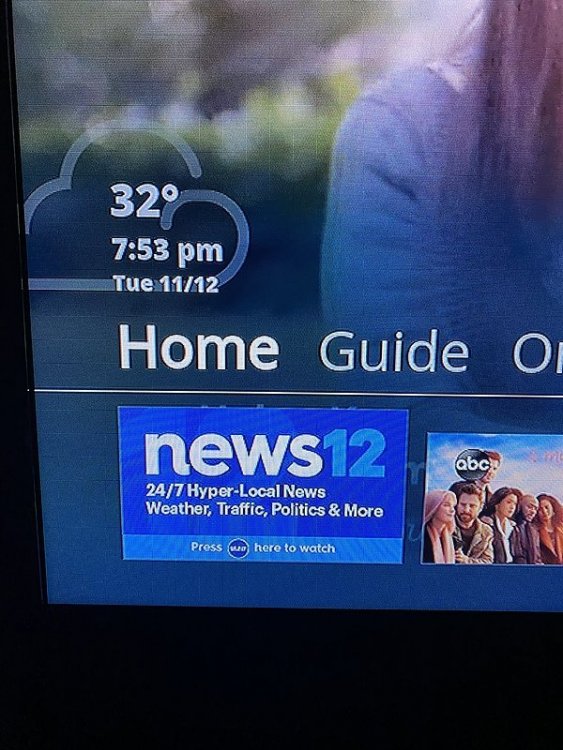
Is that the Altice One system you're using @RealNews18
-
Scott Chapin isn't any younger either. He came back after retiring briefly apparently.
-
6 hours ago, LarryFlick said:
it was, indeed, a bad era. There was a live on air fight between Steve and Bill Evans. There was the day he was passed out at his desk and missed a live broadcast. He was notorious in Chelsea, the NY gayborhood where he lived. I think there was a combination of shell shocked faces and celebrations when he was finally fired. A real shame.
This is the “argument” that Larry had mentioned. He did not pronounce the name “Melania Knaus” (Melania Trump now) correctly and Bill wanted him to say it again and Steve asked why don’t you read it and the argument ensues with Lori in the middle of it. All three of them are no longer with WABC. Steve is out of the news business altogether, Lori is on Good Day New York on Fox 5 and Bill is on the radio out east on Long Island. -
Ah okay, I wonder why...
-
What are they airing in leiu of the rebroadcast?
-
I’m recording the final broadcast. Hope they do something special for her.
-
15 hours ago, wabceyewitness said:
The current EWN music is officially 20 years old and still sounds as good as new!
Here is what WABC-TV looked like back in late August / early September of 1999 when it switched over to the current cuts of Gari’s “Eyewitness News” and, briefly, became “ABC7 Eyewitness News”.
5pm News short open, talent open, bumper:
“Coming Up” promo (from a few months later in May 2000):
I have a feeling they will continue to use this music until they switch to the new building. The music is good, just wish they could use more of their package.
I’ve always preferred the “ABC 7” branding better than the “Channel 7” but I doubt that ever change lol. I think they should rebrand themselves as ABC 7 for consistency especially since their website is called “ABC 7 NY”. I feel like saying “Channel Seven” in 2020 is like so dated. They switched back to the “Channel 7” branding in 2004. I remember we had a big discussion on that back then on this site haha.
I remembered one of the arguments was that the word “Chan-nel” was easier to say than “A-B-C”. Flows better, less syllables.
Another argument was the audience, older folks especially the baby boomers and native New Yorkers whom watch the broadcast call it “Channel 7”.
Where in conversation they would say;
“Yo, did you see that story on Channel Seven? That was Crazy!” Lol. With that New Yawk accent haha.
Out of curiosity, I’ve always wondered, does anyone know if they include Sam Champion for the Friday talent Morning and Noon opens since Sam does not work on Fridays?
-
1
-
-
Yeah and I think that’s where my issue lies with them it’s the transitions and the animations. The animations and transitions are already not that nice because the package looks pretty much sucks compared to their previous look as you’ll see below. This look is by far my all time favorite look they had from 2011 through Eary 2016. They were clean, shiny, and more appropriate.
What’s was appealing about the current package that made WABC switch? Was it pricing? Their previous graphics were done by Giant Octopus.
-
3 hours ago, ns8401 said:
Actually the WABC ones look more complete... the KABC lower thirds are weird looking... they are just kind of floating there disconnected and it looks odd...
Yeah, idk. I guess it looks nice still but in motion and animation, I feel like the KABC graphics flows nicer better than WABC.
Any thoughte? I don’t don't to turn this into a WABC vs KABC thread haha but just wanted to show what I meant with the way the two graphic packages flow and animate.
-
On 8/9/2019 at 3:23 PM, Roadgeek Adam said:
The other thing is under accessibility standards, people are going more and more to Capital letter then lowercase text. WABC's new graphics do that well. KABC's do not.
I do agree that the graphics are minimalistic, but I feel like they are much much cleaner and more appealing. I just feel like the west coast stations (KFSN, KGO and KABC) iWABC's just seems a bit sloppy, rushed, amateurish, and have super poor attention to detail. They honestly should've stayed with what they had back in 2011 - 2016 with the Giant Octopus, why did they change something that was not broken?
 .
.

-
Now, they just need to get new graphics and we are golden haha. Im thinking something along the lines of what KABC, KGO and KFSN in California use. Anyone know what company created those graphics for them?
-
Are the screens on the front of the news desk adjacent to the the giant Circle ABC 7 logo still split up or are they now uniform as well? It looked like they were replaced as well.
-
Looks like they did a Mid-Cycle upgrade. Kinda like what they did when they were in the previous studio when they went from the Cockpit Styled Backdrop from the 90s to the Duratrans backdrop in the late 2000s up until when they moved to their current studio. The studio current studio is really nice, to me nothing is wrong with it and these upgrades add new life to whats already really nice. This is hands down their best studio they've ever had, and as with WABC long standing tradition, if it is not broken, no need to fix it terribly lol. The only thing that WABC has always struggled with is their graphics in my opinion.
-
2
-
-
They are still on the newsroom set as of the 11pm broadcast. I guess they’ll be using it through Monday?
-
I think Talent Opens while we wanted them so much in the past, they are kinda a thing of the past now. In this day and age where everything is fast paced, producers have shifted to just a quick news open sting. WABC seems to be the only station that does talent opens now in the New York market. Do the other stations do talent opens?
-
47 minutes ago, Roadgeek Adam said:
I did. I don't mind it, but the old one was due for a change. You'll have to likely wait till 2022-2023 probably to get a new one.
I wish they would adopt the style that the ABC O&Os in California use. KABC, KGO and the KFSN styled package. Its much cleaner and a better look overall. Maybe someone can make a reimagined package with that look on the Graphics Forum?
 .
.
-
2
-
-
Last night, during the 11pm broadcast, anyone notice that they did not use the Time and Temperature on the Lower Third section of the ABC 7 Bug? It was just the WABC 7 Circle Logo and the "Eyewitness News" Banner during the 11pm show. I still think that blue square behind the ABC 7 logo is ridiculously hideous... Still not a fan of this graphics package. Can't wait for them to change it.
-
I could see him eventually taking the lead anchor spot when Bill leaves. Bill Ritter did say though, in a recent Instagram Post and Tweet that he plans on remaining with WABC for the foreseeable future and is not retiring anytime soon. (We could see Bill Ritter on the air for at least for another 5-7 years)
So maybe he could do something along the lines of what David Novarro did prior to him joining the First at 4 team when it first launched back in 2011. Also with the impending maternity leave that Shirleen Allicot will inevitably go on, i'm sure they will shuffle the anchors around and have him fill in somehow.
WABC - 7 Eyewitness News
in Station Chatter
Posted
Wow thats so awesome to see Sade in the morning! Would've loved to have watched that newscast. Is she filling in for her for the rest of the week?