


sfomspphl
-
Posts
705 -
Joined
-
Last visited
-
Days Won
10
Content Type
Profiles
Forums
Articles
Posts posted by sfomspphl
-
-
On 5/10/2022 at 5:30 PM, Oliverolang said:
Nice clean cut of the strings only mixdown of the main News Series 2000 bumper around 16:23 of that early 91 broadcast - have only heard it on WLS clips. Thought they had switched to the modern version of the package by then but guess it was later in the year.
-
On 4/14/2022 at 8:57 PM, SoFloTVClassics said:
WBBM The great Chicago flood of 1992
9/11 coverage from Knoxville, TN
Didn't realize WBBM did a copycat of the KTRK talent open with accents of the city names background from some other ABC O&Os (KGO, and one or two others I think).
-
I'm just amused Warner licensed the package in the same market KFSN used it for 20 years.
I guess exclusivity formally ends when the license isn't renewed.
Clever choice - it's familiar music to a lot of Fresno residents.
-
 2
2
-
-
KBTV summer 1982 open, clips - gotta love the 'computer search' segment
-
1
-
-
WNBC Pyburn in 2003 was a milestone package and set
-
5
-
-
15 hours ago, dandean said:
Just chiming in on this thread. Actually, I composed and produced music for 5 Seattle market TV stations at the same time which all ran concurrently.
KOMO TV
KING TV
KIRO TV
KTZZ TV
KCPQ TV
None of the stations were aware I had done most all of their competitors. This is the first mention of it. There were other stations added to the list. WTVD, WTNH, KOVR, WIXT, KDFW and a few others. Thank you for the info. posted on this site.
Dan Dean
Dan Dean Productions
Thanks for stopping by Dan - really enjoyed your early KOMO work just from coming across it here and I didn't even live in Seattle to hear it as broadcast.
Nice funk to it, a little playfulness, and urgent without being in your face. Still holds up well today.
I'd be curious about what the station feedback was, how they decided on changing things up, and what input / inspiration went into the work.
-
On 1/27/2022 at 5:47 PM, H-Town TV Fan said:
WFIE NewsWatch 14 Midday (May 7, 1997)
KXII Channel 12 News at 10 (Summer 1987)
KCEN NewsWatch 6 Nightcast (February 1986)
KLST TV-8 News at 10 (December 1986)
WNEV News 7 New England at 5 (August 31, 1989)
KABC Eyewitness News at 11 (January 8, 1996)
WGAL NewsCenter 8 Noon Report (January 27, 1988)
WPXI Channel 11 News Nightbeat (January 29, 1990)
Wow WPXI got a lot of mileage out of that set - looks like it was basically untouched through 2001/2, got a facelift by 2003, and lasted until they moved to a new building in the late 2000s.
-
 1
1
-
-
1986 Today show documentary - lots of behind the scenes shots and clips
-
2
-
-
Yeah the Paley page was taken down, looks like they're still taking registrations for the public to be streetside for Friday
https://www.today.com/popculture/join-us-today-turns-70-t244717
-
13 hours ago, newsteam13 said:
LONG promo for KUSA Denver back in 1985. This was after the call letter change from KBTV to KUSA in 1984, while channel 9 was STILL an ABC affiliate (now an NBC affiliate since September 1995).
I noticed the same visuals were used in another KUSA promo, which had the song God Bless the USA by Lee Greenwood.
Whoa they went really literal with the 'USA' branding at the outset
-
On 12/18/2021 at 10:25 PM, 24994J said:
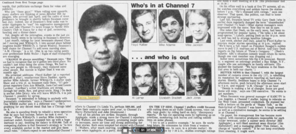
Temporary. They vacated the main set sometime after November sweeps, and with tonights upload, basically confirmed that News Series 2000, new anchor assignments, and the KABC-style set debuted after Christmas, but likely right on January 2nd, 1984.
And things improved really quickly - forgot Bill Applegate was brought in a few months before Swanson brought his KABC playbook. Here's part of a Feb 84 article that talks about his changes (including daily 'discrepancy reports' for on air technical glitches).
-
3
-
-
15 hours ago, Daybreak said:
YouTube has all of CBS Moring Shows openings from 1961 to present day and a couple of things caught my eye…
1. I did not know Diane Sawyer was on the CBS morning program so long. I just thought she was there for like a year but from the video it seem she was a cohost for much longer.
2. Out of all the cohost of this program, I distinctly remember Rene Syler and Maggie Rodriguez taking them getting let go from the show the hardest.
3. I always said it was a huge mistake to fire Maggie and Harry to replace them with Erica and Chris. They were not that good and it was destined to fail.
https://youtu.be/jTWV2lSeHvUThey finally figured out mornings with Charlie / Gayle / Norah, but then...
-
1
-
-
4 hours ago, bostonmediaguy said:
The date in question was a Sunday. The Sunday Morning studio would have been staffed and ready for that day's broadcast.
Yeah I’m guessing couldn’t use the main set because the video walls needed some extra support and / or newsroom empty.
Odd that the graphics were 2 generations behind but maybe that studios control room had an old character generator.
Maybe they hauled in the old background and desk when the new set was built as some sort of backup shot for skeleton crew. Or maybe that newsroom area was untouched just off camera although the idle camera behind makes it seem it’s in a studio.
-
2
-
-
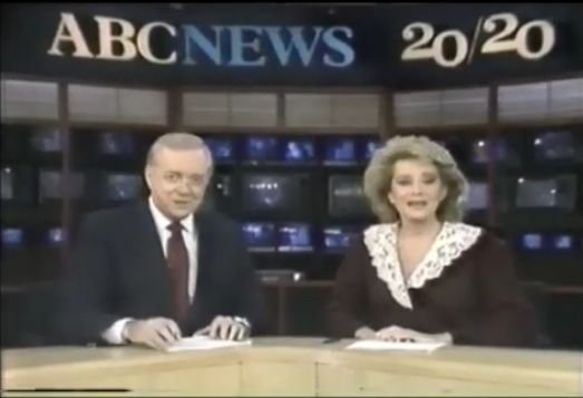
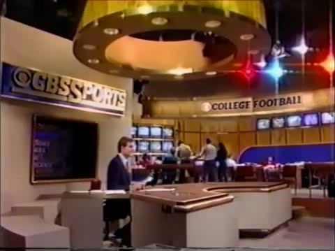
5 hours ago, bmasters1 said:
Excellent response-- very informative! I take it then that these studios from 20/20 in the 80s w/Downs and Walters, and The Prudential College Football Report in 1986 w/Jim Nantz for CBS Sports, are also examples of masthead banners.
Also, I'd like to know-- was CBS Sports' Studio 43 overhaul in 1981 (this Studio 43 of course also being used for CBS News at one time, on the CBS Morning News w/Kurtis and Sawyer) based on Roone Arledge's ABC idea?
Who knows if they specifically said 'copy ABC News' but wouldn't be surprised if it influenced people involved in the project. Not a lot else on TV those days than the 3 networks.
-
1
-
-
6 hours ago, bmasters1 said:
"Masthead banner"-- that's a term I've never heard before. Are you referring to the part of the set that had the title of the broadcast (or the overall name of that station's news operation), much like would be on CBS Sports in Studio 43 in the 80s, when Brent Musburger was on The NFL Today, with The NFL Today title in the background on the set?
You got it. 'Masthead' is what newspapers call their logo on the top of the front page. Banner well that seems like something you'd hang high up.
I think Roone Arledge, who started the practice when he overhauled ABC NEWS, had some name for them - maybe it was banner or signage or something.
I'm guessing in the KPIX case they saw KTVU had a plain beige masthead banner and used a world map for the center backdrop and was climbing in the ratings, so figured why not try that. Their prior masthead banner was an ABC NEWS knockoff with the black background.
-
2
-
1
-
-
KPIX Dec 1987 open (cut off) - glimpse of a short lived update to the 84-88 set that replaced the plain beige backdrop behind the anchors with a world map, and updated the masthead banner above
-
1
-
-
KRON May 1980 Update 11pm preshow and open
Some early Telesound Signature action on KPIX 1981 - cued up in 2 spots
KPIX 1987 Nightcast preshow (weeknight version. - a little more action packed than the weekend version above)
-
1
-
-
KRON 1981 preshow - rare stuff on this channel
Earliest Roz Abrams footage? - KRON Nov 1983 preshow (there's also a tease with her at 14:45)
-
KPIX Eyewitness News Nightcast April 1990 with a longish close of the 1988 Michael Karp package
These graphics / the open were replaced later in the year by the avant garde lower thirds that replaced over the shoulder graphics
And KGO March 1984 with the 1982-84 custom theme package
KPIX December 1983 Nightcast (partial)
-
1
-
-
KPIX Eyewitness News Nightcast April 1987 - weekend. First time a full newscast from this era of KPIX music / graphics has been posted.
-
1
-
-
On 10/3/2021 at 1:39 PM, Samantha said:
No kidding. Big fan of the theme music, too. Unfortunate why we have it, though—it was taped because of the story of a 2-year-old baby (and others) who died in a fire.
In the foreign language US local market news theme category this ones a winner…it’s from their 80s “Window to the World” jingle package
-
1
-
-
On 9/20/2021 at 7:55 AM, iron_lion said:
'Today' (1982). Loving how sped up the format is at this point compared to the Brokaw & Walters years. Not too slow and not the ADHD level pacing of today. It also seems that they were frequently experimenting with sets. I've seen the blue version of this current set before but wasn't aware there was a brown variation as well. The sets from the late 70s up until the O.G. studio 1a (which was awesome) were all very well done.
Steve Friedman the producer then sped up the pacing - also was there for the revolving sets while they tried to figure out how to beat GMA - he was there early 80s to 87. Probably got feedback his new blue set was too cold for the regular viewers, gave it the Earl Scheib treatment and made it brown.
I think Magid was their consultant - and they went to that textbook "plain background to let the talent pop and become identifiable" look with the minimalist 1983-85 set.
Then Bryant and Jane got their chemistry mojo after she came back from maternity leave in 84. NY skyline came back in early 85 with the new living room set, and they overtook GMA that year.
-
1
-
-
This 'flat logo' totaliarianism among brand circles in the name of working better on mobile / digital is misguided.
TikTok - probably the most breakthrough mobile / digital brand of the last couple years has a logo that's explicit in giving the impression of dimension and motion, complexity. Is it a good logo? I could care less for it, but it hasn't prevented them from being easily identified in a mobile environment.
Let the logo adapt to the medium. The bigger the screen, the more intricate and subtle the logo elements can be. Mobile can have a 'flat' look, and 4K TV something with dimension and texture. Yes I know a lot of video is repurposed for both screens, but the prior look was perfectly presentable on smaller screens.
NBC seems to get this.
-
1
-
-
KNBC 1986 4 and 5pm, with plenty of the low profile desk for the 4pm
Cued it up to the handoff to the 5pm with the dual sets in action, also some clean pieces of Newscenter II in the bumpers

ABC changing their logo; New graphics coming for ABC owned stations
in Graphics
Posted
Personally really liked the WLS graphics of the last several years, really easy to read from couch distance, nice dimension to them. 'Instant classic.'
I know others prefer the flat mobile / tablet screen look but it's not my thing. The blurred skyline background is pretty though. Reminds me of the KTVU late 90s look.