
kfc513
-
Posts
234 -
Joined
-
Last visited
-
Days Won
3
Content Type
Profiles
Forums
Articles
Everything posted by kfc513
-
I just found this on NewscastStudio... https://www.newscaststudio.com/2019/12/04/cbs-oo-new-graphics-rollout/
-
This wouldn't be the last time KARK would rip off another station's logo...


-
I just rewatched that section, but those graphics were actually for NBC’s former overnight news service, NBC Nightside. They do look similar though. Here’s the full open: https://youtu.be/xZQ1aMBNgvg?t=54
-
I didn't see WESH's version in there. Only WTVJ's.
-
In Florida, WESH copying WTVJ's Novocom look in the late 1990s... WTVJ: https://youtu.be/iDz4oiwQ_Rg WESH: https://youtu.be/-_RvbhzeRUs
-
So I randomly came across WLBT's website, and their About Us page had this across the top. It looks they'll be the next to get the WMC/KLTV look... https://www.wlbt.com/about-us/contact/

-
Knowing how cheap most of Gray's graphics packages look, this was the only thing that I feared would happen to the ex-Raycom stations when the merger was announced; and it's already happening in a couple of markets (Memphis & East Texas)
-
Came across these two stock After Effects templates that are blatant ripoffs of a couple Renderon-designed looks. First is a knockoff of WPTV's 2008 HD look, and it is BAD: https://videohive.net/item/news-opener/7776494 Second is based off KCTV's 2015 look: https://videohive.net/item/4ch-breaking-news-mega-pack-premiere-pro-after-effects/22028374?ref=mildtheme
-
That's NOT the real package.
-
Two possible reasons why this happened: 1. Sinclair executives are just now finding out about KOMO's "must-run" scheme; they threatened to fire the news director if the segments didn't come on during times when people are actually watching. 2. Ratings for KOMO's 6pm newscasts are taking a nosedive for some reason, so they're temporarily dumping the "must-runs" there until ratings pick back up.
-
Hate to bump this thread, but what was that graphics company in question? And what was their website?
-
Or WPTV, as that's where they tend to start out.
-
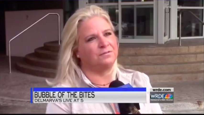
WRDE's lower thirds are looking a lot like Raycom's...
-
Now that was just extreme.