

kfc513
-
Posts
219 -
Joined
-
Last visited
-
Days Won
3
Content Type
Profiles
Forums
Articles
Posts posted by kfc513
-
-
Actually, if you right-click the image to a new tab or window from Mission broadcasting's website, the URL reads:"https://missionbroadcastinginc.com/stationlogos/wnac_tv_providence_logo__nexstar_styled__by_unitedworldmedia_ddxkyww-fullview_1623891723.png"Nevermind, it was already mentioned.
-
7 hours ago, edutv9 said:
Might be a glitch in preparing to possibly launch new graphics, but WFIE has had this extra time/temp on the lower right corner of the screen at the start of their 10:00 news tonight. Disappeared after the first break when the Gray weather ticker appeared.
Source: smartphone camera on OTA signal


I think that the extra time/temp on the extreme lower right is actually from the Today Show's Namedropper ticker.
-
No major graphics developments to report, but this happened to WKRC's news open tonight...
I should also point out that the background where the date would normally appear never cued up.
-
22 hours ago, CircleSeven said:
Vid courtesy of Daniel Garcia's YT page.
This is a spanish newscast. Why is their ticker in english???
-
 2
2
-
-
On 9/3/2020 at 7:57 PM, ABC 7 Denver said:
It's really hard to call these new graphics since they are almost 2 years old.
On 9/3/2020 at 8:36 PM, Gavin said:This is probably the slowest corporate television company graphics roll out ever, It should go in the Guinness Book of World Records!!!
They've got nearly 200 stations under their belt, so the rollout will take ages to complete compared to a company who only has, for example, 60 stations. And then there's stations that use different graphics systems - so you have to either convert the graphics to whatever system they're using or send the station a system that the graphics were designed to work with and set it up.
This was also the case with the previous graphics (Curves and Glass), and the rollout of that look took up its entire lifespan! (2014-2018) And it took so long that it wasn't even finished being fully implemented across all stations before the new look launched.
The current look is already on it's third year, and now you've also got the COVID-19 pandemic that's already slowing everything down.
-
 1
1
-
-
6 hours ago, Weeters said:
KMTV had the Scripps v.2 weather graphics for years and never used the full package. Scripps doesn't seem to care if the weather computers jump the gun.
Same thing with KGUN in Tucson. They kept the Journal graphics long after Scripps took over and never used the V2 graphics outside of weather.
-
On 6/27/2020 at 4:17 AM, Devon said:
I may have spotted the first sign of WRTV's new logo on their website. Now please, everyone, contain your excitement at this design marvel and do not bombard me with requests of black-market copies of this logo.

Next station that gets the graphics won't even use a logo at all.
-
 5
5
-
-
On 3/9/2020 at 12:25 AM, oknewsguy said:
Meanwhile KFSM has now adopted the Tegna website layout. Not sure how that got lost in the mist of this whole Gray/Tegna/Apollo talk
You know what else got lost?
They also got the Tegna graphics: https://youtu.be/AeFsLjpr9S0
And WQAD may be next because they're a different logo on their website right now.
-
12 hours ago, Georgie56 said:
Gray has a NOW fetish.
That was adapted from Raycom.
-
On 1/10/2020 at 6:36 PM, J1975am said:
Something weird occurring on KLFY in Lafayette, LA again: They are running the new Nexstar close, but mentioned in the background are cities/towns in the Nashville, TN viewing area.
Should be for WKRN in Nashville (WKRN & KLFY are longtime sister stations going back to the Young Broadcasting days)...
Anyway, here is a screenshot (I didn’t take the photo this way; somehow that’s how it came out after I uploaded it, and you’ll also have to zoom in closely to look at the cities in question).....

Nexstar's graphics hub is based in Nashville, which would explain this.
-
9 hours ago, ns8401 said:
WXYZ has a new investigative logo that matches the new look:

Replace the font in that logo with Proxima Nova, and that would look exactly like something from a Tegna station.
(Ironically, Scripps did say they wanted a "Tegna Lite" look)
-
1
-
-
3 hours ago, CircleSeven said:
That second one HAS to be FAKE. Don't tell me they use that second one on the air........
Both logos are on their Facebook page: https://www.facebook.com/foxeastidaho/
-
Does stolen logos count as knockoffs?
I'm asking this because KXPI-LD in Pocatello, Idaho stole the logos of FOUR other Fox stations! (KSWB, WNYW, WTTG and WAGA)


-
1
-
1
-
-
I just found this on NewscastStudio...
https://www.newscaststudio.com/2019/12/04/cbs-oo-new-graphics-rollout/
-
8 minutes ago, TheRyan said:
I wish I could give you 5 thanks because this might be the best comment in this whole discussion. Great comment
Thank you!
-
1
-
1
-
-
The new Scripps look isn't that bad...
...if it was made for a small-market station, or if this were a fan mockup, a cheap VideoHive template, or even a PowerPoint template. But for Scripps stations? Most of which are major broadcasters in major markets?
NO!!!!!!!!!
From everything I've seen of this look so far, it's way too boring for me to handle. Actually, it's so boring that I've actually ran out of ways to criticize these graphics! And since Scripps now owns WPIX, these ultra-underwhelming graphics might be coming to New York City!!! Take a minute to think about that.
That being said, I'll be shocked if these graphics manage to stick around for 2 or more years. In fact, I expect this new look to meet the same fate as Raycom's 2013 red/white/blue look: It'll only last for about a year and a half (or less), then decommissioned mid-rollout.
B O R I N G
17 hours ago, TheRyan said:I think everyone here wants the best for the Scripps stations.
Not me. After an issue that I had one year in a student program at WCPO, I stopped caring. The FCC can revoke their license for all I care.
-
2
-
2
-
-
5 hours ago, Yankees4life said:
Come on KARK, you're not fooling anybody with that (this was during the 80s)

This wouldn't be the last time KARK would rip off another station's logo...


-
22 hours ago, ABC 7 Denver said:
That sequence at 17s is pretty damning.
I just rewatched that section, but those graphics were actually for NBC’s former overnight news service, NBC Nightside. They do look similar though.Here’s the full open:
-
17 hours ago, ABC 7 Denver said:
You're correct. They did it for both.
I didn't see WESH's version in there. Only WTVJ's.
-
In Florida, WESH copying WTVJ's Novocom look in the late 1990s...
WTVJ:
WESH:
-
2
-
-
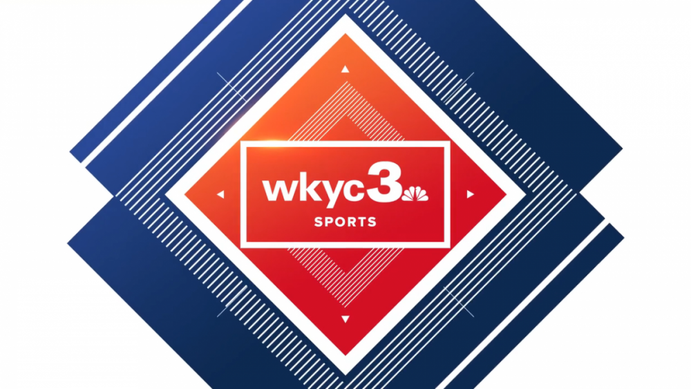
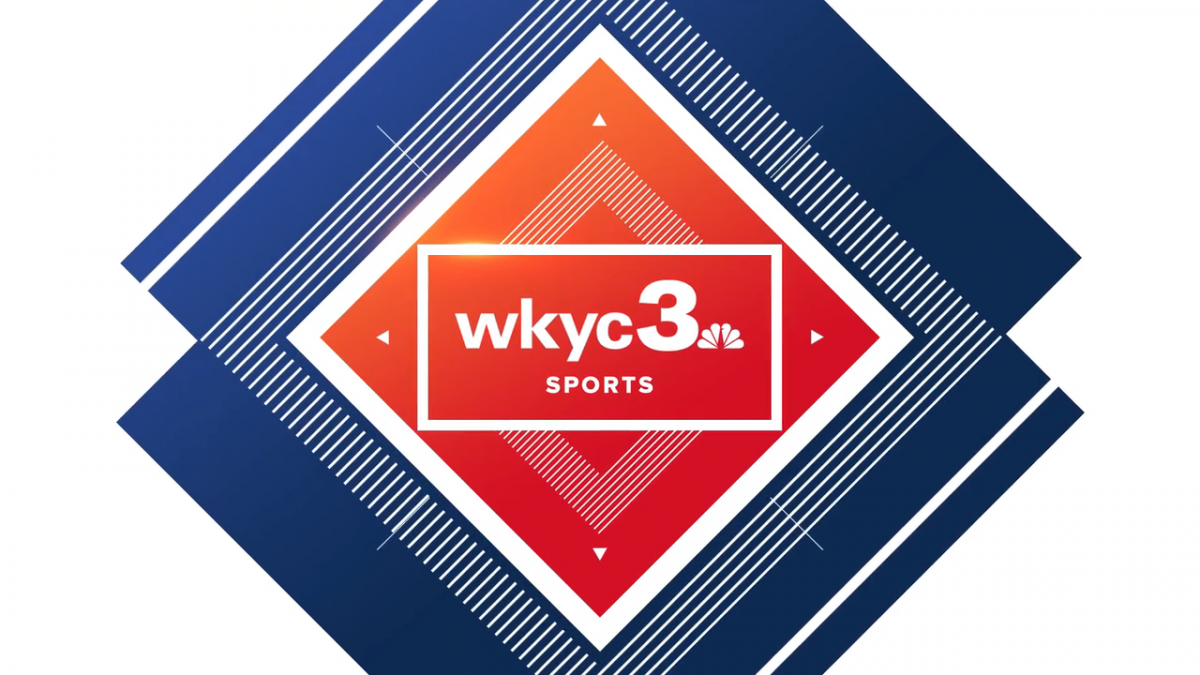
Surprisingly, their website still hasn't updated to the new logo: https://www.wkyc.com/
-
15 minutes ago, Info Junkie said:
This is a speculation: Is this downgrade gonna make WKYC even worse than the time they were NBC’s “farm” system?
Inside the station: As long as there isn't chronic talent turnover, they should be fine.
Outside the station (viewers watching at home): The rebranding shouldn't make the station any worse than the "farm system" era, but they're screwed either way.
-
7 minutes ago, MidwestTV said:
Slow your roll there partner.
Just wait 'til this logo debuts and viewer complaints start flooding into the station on social media!
-
3
-
-
12 hours ago, news89 said:
Their soon-to-be-new logo?
ARE YOU KIDDING ME RIGHT NOW??? WHAT THE F$&% IS THIS?!?!?!?!?!!?!?!?!?!?
THIS is where we're at with broadcast logo design?
There are things in life that just doesn't need to happen. This is one of them.
Now I gotta update their Logopedia page with this painfully underwhelming abomination that ANYONE can recreate in Powerpoint in just under ten seconds...
It hasn't debuted yet and it's already giving every bad station logo a run for their money; yes, even this logo from station KXDF-CD.
TROIKA EVEN MADE YOU A LOGO! AND IT'S 999,999,999X BETTER THAN WHAT'S ABOUT TO HAPPEN!!! (image below)
 Quote
QuoteBut KFC, you're overreacting to a simple TV station logo; even channel 5 in the UK used a logo exactly similar to this.
1. This logo is so underwhelming and bland that I cannot just sit on the sidelines and let WKYC or Tegna get away with this.
2. What works in Great Britain doesn't always translate well in here in the US.
-
2
-
 1
1
-

ABC changing their logo; New graphics coming for ABC owned stations
in Graphics
Posted · Edited by kfc513
ABC started using the new logo as their on-screen bug during The View today.