
Leaderboard


Popular Content
Showing content with the highest reputation on 01/22/19 in all areas
-
Not sure if that’s a compliment for MSNBC - we are talking about a person who has a gold toilet and his primary residence is golden and marble. Hardly the type for style advice.4 points
-
Throwing this out there... https://twitter.com/jeremymbarr/status/10870382612168458242 points
-
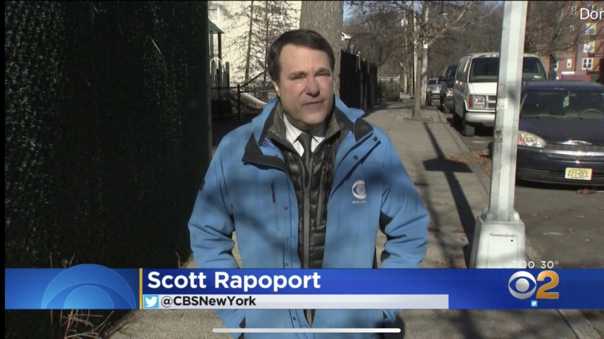
Good catch! As usual in recent years, CBS 2 seems to be doing things in their piecemeal style, which results in a sloppy on-air appearance. Why move the bug but not reconfigure the lower-third banners? I'd imagine that's coming next but what's with the on-air testing? I just went back and checked the noon broadcast. It seems CBS 2 had no idea what they were doing with the bug. They used the "new bug" at the beginning, then reverted back to the original position at 12:01, then moved it back to the new spot at 12:05. But then it was back in the original spot after the first commercial break and seems to have remained there for the rest of the newscast. Oh, and the left side of the lower-thirds haven't been 4:3 safe since this package debuted a few years ago because that's where they stick things like "Breaking News" and story-specific text. But the bug on the right had been 4:3 safe until today. I'm interested to see how long until they make the adjustments to the lower-thirds and if they can use the full screen for the seven-day forecast (that five-plus-two look should have died years ago but was a holdover of John Bolaris' "+2" thing... Yes, it's that old). (And my fingers are crossed for a complete redesign... This package is sloppy all over.) Update: WLNY has moved the bug over to the right as well tonight.
.thumb.png.0b8e02804e5a690828a61bfa4cbacd5b.png) 1 point
1 point -
CBS 2 seems to have finally moved its bug all the way to the right to fill the 16:9 screen, instead of being in the 4:3 safe zone. This is especially apparent in the attached screenshot from CBS 2 News at 5:00 tonight, where the white bar with “CBSNewYork” cuts off well before the logo begins. When the logo was in the 4:3 safe zone, the white bar ended exactly where the logo begins. I wonder why they did it this way? The package has always been tailored to the 4:3 safe zone, although with many elements out of the safe zone (mostly banners in the L3 to the left of the text). Why not just go for full blown 16:9, or just leave it all 4:3 safe?
 1 point
 -
Well, I guess it's the most bland thing that could have come out of this.1 point
-
Thank you, Marvin.1 point
-
The Weekend is here, AFC/NFC Championship this Sunday, enjoy it all. Have a good weekend, good golf, good tennis, or whatever makes you happy!1 point
b.thumb.png.b658c90e4e56cb08f2e8ba3195bb9da9.png)
.png.2084e989bfe2ee7942a82a2c5d50b384.png)


This leaderboard is set to Chicago/GMT-05:00