
Leaderboard


Popular Content
Showing content with the highest reputation on 03/24/23 in Posts
-
Oh I agree. There was absolutely nothing wrong with the black bug and ticker. Now it just looks ridiculously awful.3 points
-
I’m sorry, but that pee-stained Spirit Airlines vibe looks awful. They should have been forced to use the same colors like everyone else.3 points
-
Considering WLBT's Civil Rights Era history of being unapologetically racist to the point of FCC license revocation threats and an entire housecleaning of management...no sympathy for Barbie here. If this is some other station and an outlier incident, a warning would be fine, but she should know both her station's turbulent history and her own HR issues of the past.2 points
-
KDKA modified the end of the opens so the center of the eye is now the gold and the rest of the eye is white (like the other O&Os with the new graphics).1 point
-
I disagree. It has been well-known for some time that this entire process was going to be a collaborative one in which the legacy (whatever that may be) of each station would be taken into account with some flexibility when it came to graphics, logos, etc... That said, this is exactly what we're seeing. Has this process/rollout been executed perfectly???? No... which is why certain things have been (and likely will continue to be) fixed/tweaked. I don't think the intent has ever been to make the look/sound of each and every CBS O&O be the same. That would be very unfortunate.1 point
-
I assume WCBS kept their branding to differentiate themselves from CBS News given they are both based in NYC and to prevent viewer confusion. In KDKA's case, the call letters/branding coupled with the gold/black color scheme is synonymous with the station that it made sense for it to remain.1 point
-
WISN 1989 Commercial block Hurricane Andrew Aftermath 1992 from the Tampa TV stations (mostly WTSP)1 point
-
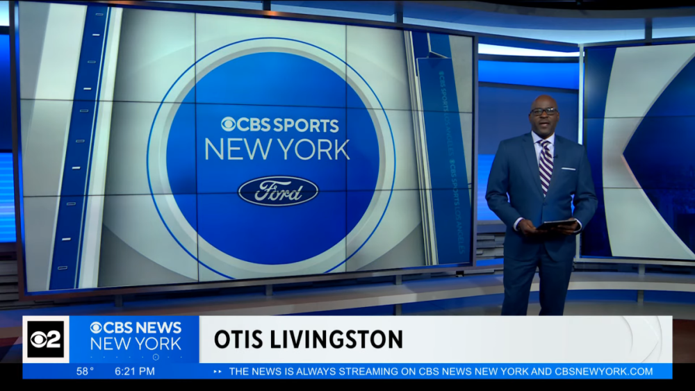
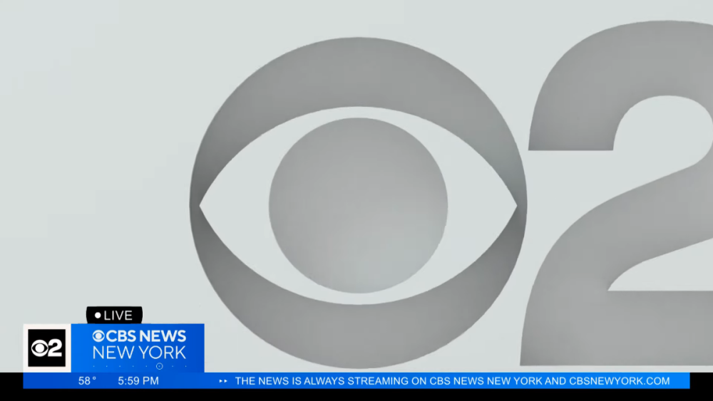
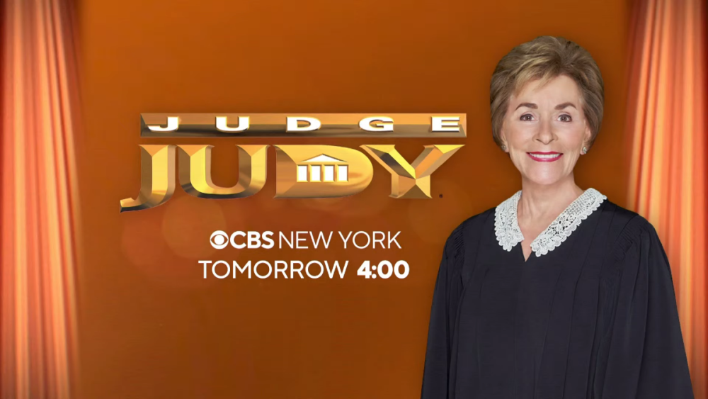
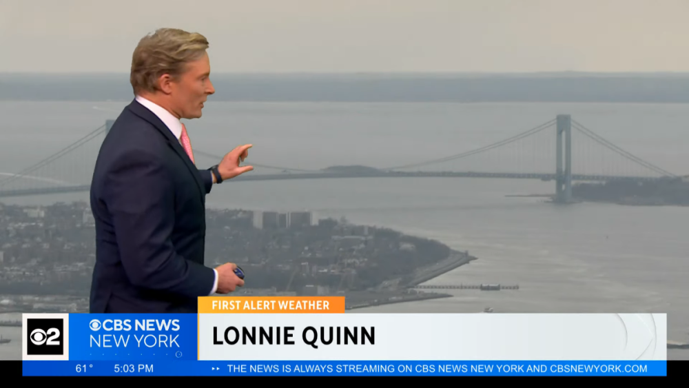
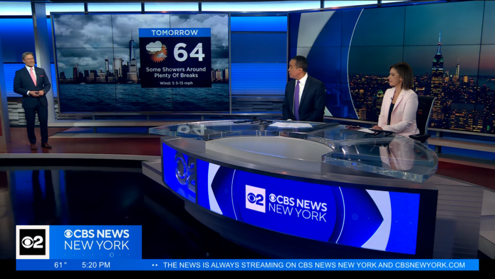
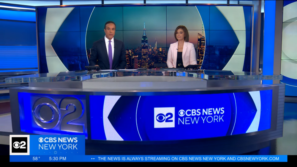
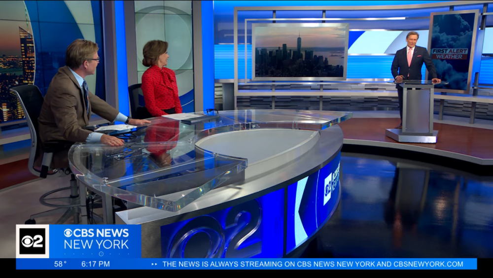
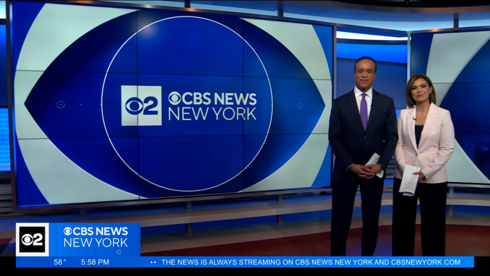
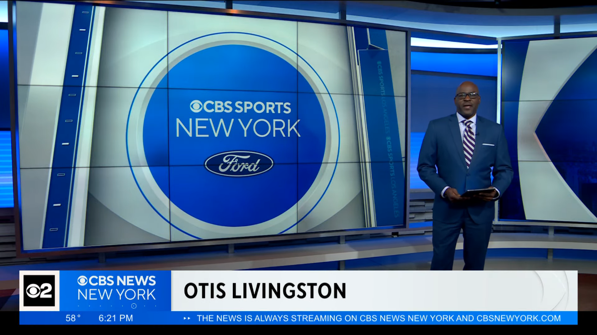
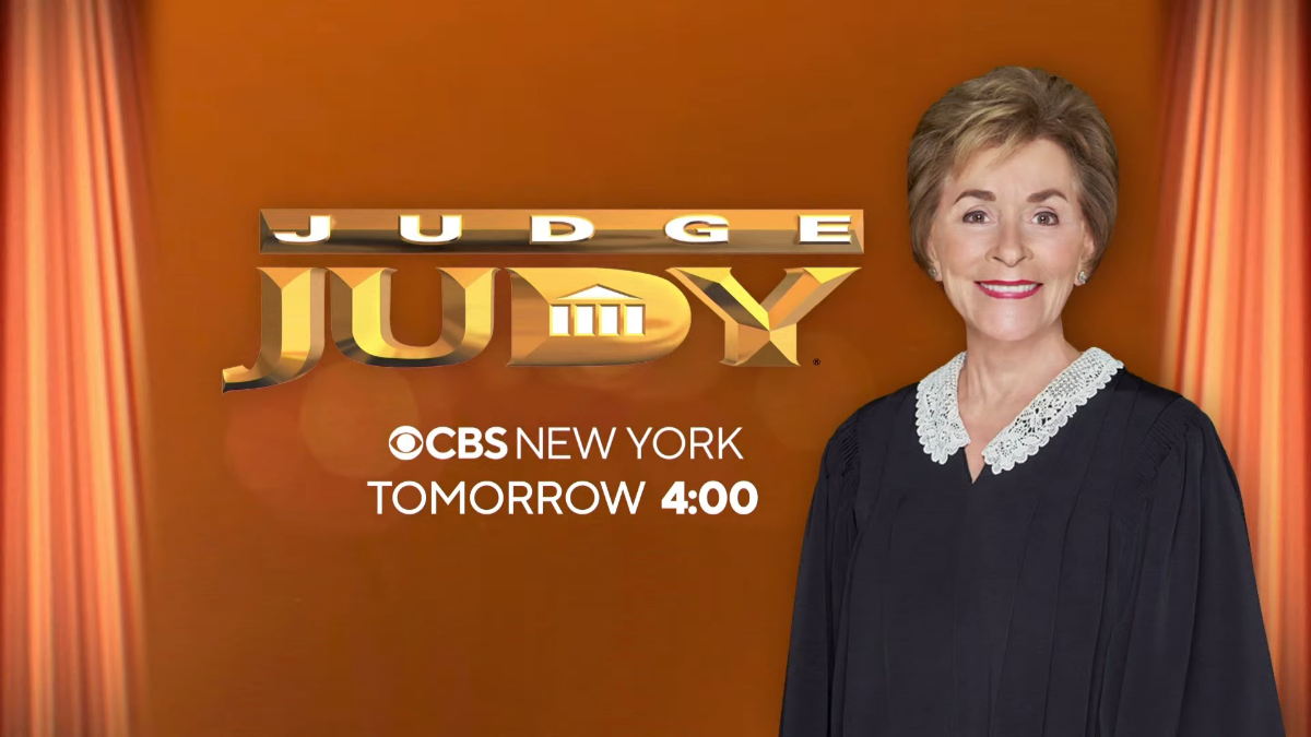
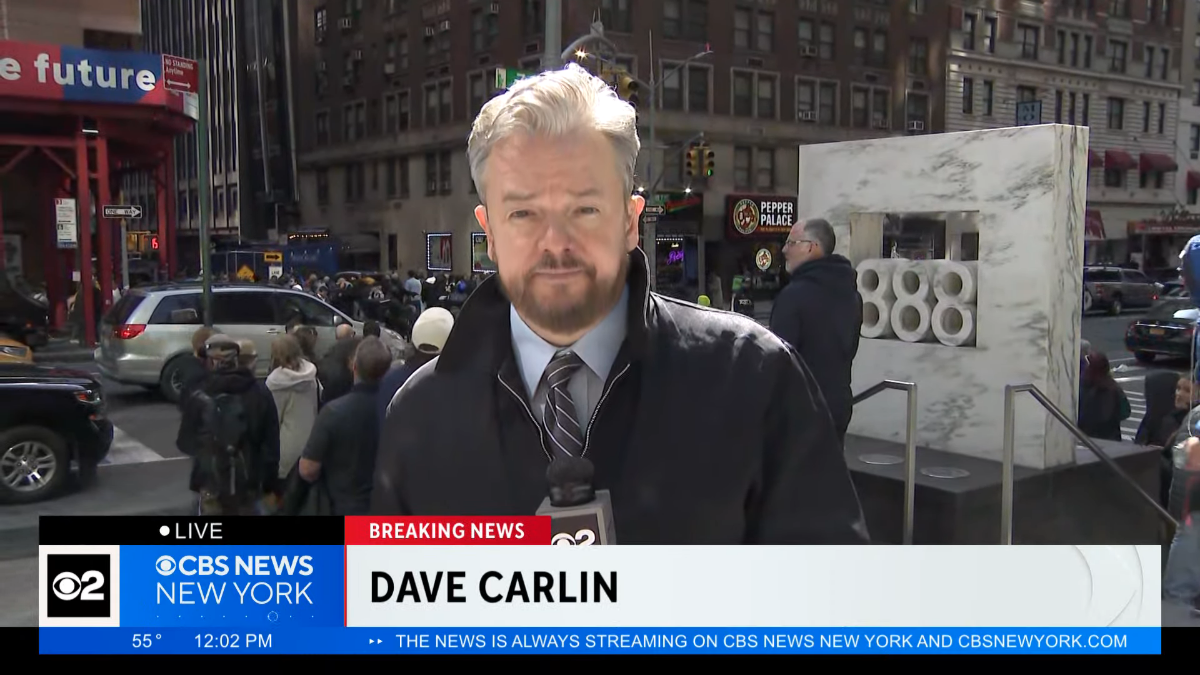
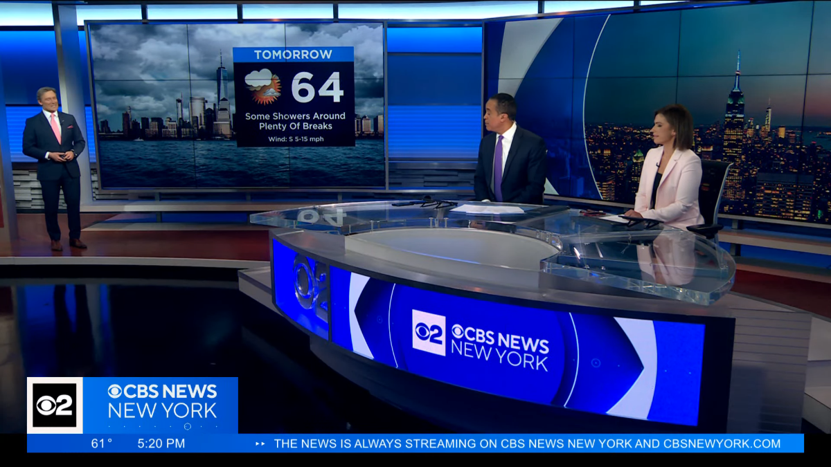
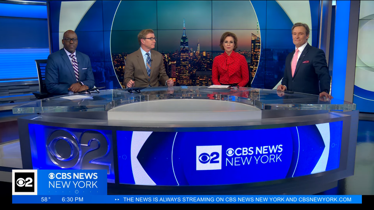
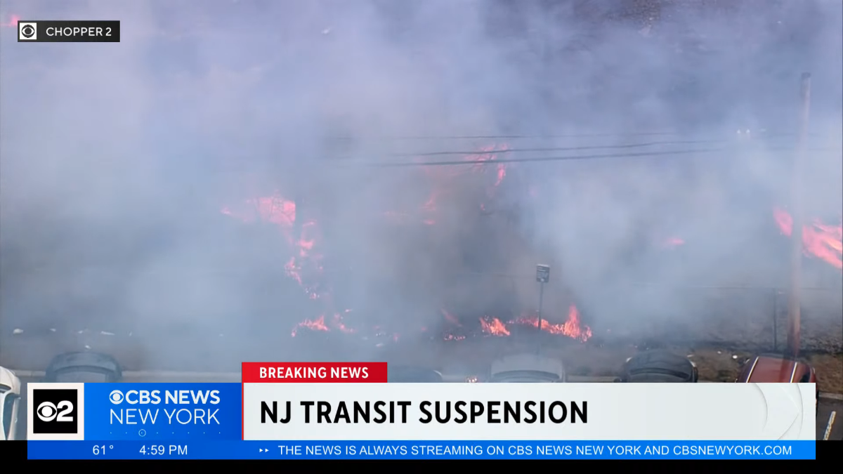
For I believe the first time in my many (26+?) years of being a CBS 2 fan/TV news nerd, the new graphics were not being seen for the first time as they debuted on CBS 2. Just feels weird having new graphics and it not feeling that big of a deal because we've watched them debut over the last few months. Overall, I think the look is fine. I wasn't a big fan of the previous look as it felt sloppily executed from the start and got worse over time as they used the "CBSN New York look" in many areas. I don't want to repeat myself too much but I'm just jotting down some of my thoughts. I was surprised that Brian Lee's VO in the opens still refers to "CBS 2 News." I'm also surprised that the CBS 2 logo is on at least one side (probably opposite sides) of the mic flag. It's one thing to have transitional on-screen graphics but transitional mic flags are odd to me. I am glad that the "2" remains, for now at least, but using two logos as your logo seems very sloppy to me. The CBS 2 logo is used on its own in at least one transition (breaking news) as well as a topical promo (the blue one below). Curious how long this apparent transition will last (months? a year?). Aside from the two-logos-in-one thing, I continue to dislike the bug. It's... large. I know the size is supposed to match the rest of the network (CBS News streaming, CBS Evening News, etc. -- and this centers around the super small CBS eye during network programming), but it's just big. It kills any sense of sleekness this package would otherwise have. The dots on the bottom bumping the logo up makes everything feel misaligned. And the length of it all means the "live" bug is incredibly long for such small text. Lots of screen real estate is being wasted. And with the bug being on the left side and attached to the rest of the lower-third, the tabs for things like "Breaking News" just feel awkwardly located. I'm very much opposed to using the ticker if it's not going to tick. At noon and at 5 and 6, it was just "THE NEWS IS ALWAYS STREAMING ON CBS NEWS NEW YORK AND CBSNEWYORK.COM"... No animation or anything. Just a waste of space. Essentially an extended bug that serves zero purpose. I do like how the studio looks with the new graphics being used on screens. Interesting how live chopper feeds only have the "live" bug, never yet accompanied by a "Chopper 2" graphic. But for when they play back taped chopper footage, a plain "Chopper 2" graphic was used on the top left. (I guess the whole Sky 2 thing has been abandoned.) While the CBS 2/CBS News New York logo is used on newscasts, localized promos for shows like Judge Judy and Inside Edition use just a CBS New York logo. But the CBS 2 logo is still used to cover the CBS eye for a few seconds when network programming returns from a break. What exactly is the name of this station right now? This is the first time in over 20 years (since late January 2003) that a theme with the Enforcer signature isn't being used on this station. I like the new "This is CBS" signature but the rest of the theme seems bland and forgettable. Overall CBS 2 executed the change fairly well. There were a few instances where the orange "First Alert Weather" tab, presumably intended for mornings, was used on the lower-thirds. Promos seemed to be updated with the new logo, including the Weather Watchers one, which otherwise used the same graphics. I wish the weather graphics had been changed at the same time. I believe the old theme was used after weather for the sports tease at 6:21 but I'm not sure there's an Enforcer signature there so maybe it'll stay. However the animated "CBS Sports New York" graphic on the monitors very clearly repeated "CBS Sports Los Angeles" on the right side. Anyway, it's here.


 1 point
 -
0 points


b.thumb.png.b658c90e4e56cb08f2e8ba3195bb9da9.png)


This leaderboard is set to Chicago/GMT-05:00