
Leaderboard


.thumb.png.3d66a1eeb7ecf5404151f8a77ea7cbfd.png)

Popular Content
Showing content with the highest reputation on 07/15/23 in Posts
-
Please don't encourage people to call newsrooms, even if you're not serious. Frankly, I suggest you lose that number, as well. Nobody should be calling a newsroom line (what was posted above was a public NEWS tipline), whether publicly-advertised or not, for any trivial shit, like weather graphics. If you don't like it. Don't watch. It's that simple. Frankly, I'm getting tired of this discussion, no matter someone's opinion on this matter. That means that no response to this post is necessary. Failure to restrain from reiterating the same tired points could result in...well, let's hope it doesn't come to that.2 points
-
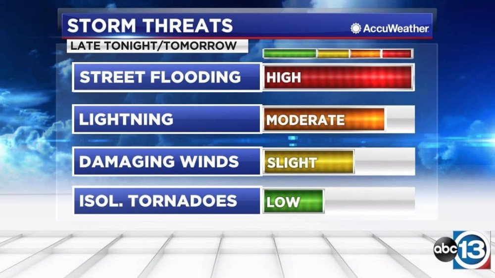
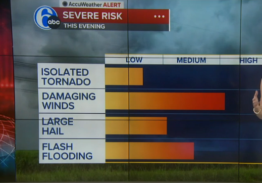
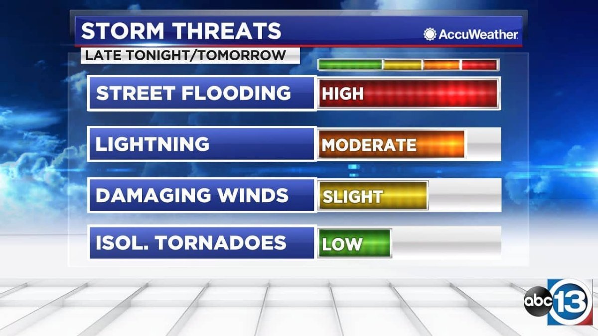
Just read this from a small market station and it will help you understand the difference: https://abc17news.com/weather/2022/01/26/insider-blog-what-is-arctic-high-pressure/ Let's get back to the new graphics... Just compare these risk outlooks from KTRK and WPVI. Which one is a better visual representation that viewers can remember more easily? The 'improved' version isn't listed in ascending order, isn't color coded, and has bar graphs that are all over the delineations.The isolated tornado bar looks like a mid-to-high end low risk, damaging winds could be a lower-end high risk or a high-end medium risk, etc. It's just poorly done and much harder to remember at a glance. KTRK's way is labeled on each bar, color coded, listed from highest to lowest risk, and each bar goes the full length of the delineations (4 vs 3 for new package). This isn't an improvement. It's a downgrade. I should correct something: Hothaus Creative didn't not make the weather graphics for KTRK; they made current and prior news packages. It was their former Chief Meteorologist Tim Heller who designed the weather graphics. Tim used unique color gradients for radar, enhanced satellite, rainfall, dust-casts, etc. (I don't know who made the red High though). The package made by VividZero uses the same green, yellow, and red color tables for almost everything. It's just too basic.
 1 point
 -
Don't give up ABC or any of the O&Os it isn't like Capital Cities is gonna rebuy them. That was the merger in the first place.1 point
-
Just heard about this on the radio. Longtime DFW anchor John Criswell has passed. He anchored at WFAA for 17 years, then moved to KDFW and anchored there for 7 years. Criswell is likely the most notable for starting WFAA's regular feature "Wednesday's Child", where a child is profiled who has been fostered and would like to eventually be adopted. "Wednesday's Child" is still a weekly feature on WFAA. Criswell was 83. https://www.wfaa.com/amp/article/news/local/wfaa-anchor-john-criswell-dies/287-84a009b0-db4e-4457-a2f5-22416b476aba0 points
-
I don't think I've ever seen this happen before... Fox Weather cut to some program involving the American Red Cross from Kelly Costa's usual overnight weather update loop, then cut back to the latter. That's odd... (This is being typed only a few minutes after the "technical difficulty" happened)0 points

This leaderboard is set to Chicago/GMT-05:00