Vlad
-
Posts
2072 -
Joined
-
Last visited
-
Days Won
11
1 Follower

Recent Profile Visitors
6105 profile views


Vlad's Achievements
Station Group CEO (8/8)
406
Reputation
-
Aw, was hoping he'd stay till 80 like Chuck on WNBC, I grew up with Bill, he is the face of WABC, when he retires it will be truly an end of an era.
-
What happened? Did he say something out of script during a recent newscast or is this just a general observation?
-
You know come to think of it now, the studio lighting for WABC has always been on the dimmer side comparatively to other stations. Even with their previous studios at the former 7 Lincoln Square building which is now completely gone and demolished (as we've discussed earlier) sadly only in our memories now.. the lighting was also like that. I almost wonder now if the set lighting being dimmer is intentional, maybe they don't want it to be too distracting for the anchors. And yes I remember all too well that day, when the First at 4pm broadcast debut, they were so young! Haha as we all were. ;p. On a side note, its wild to see how their graphics at the time were quite beautiful even though their studio was not as nice. Almost as good as what we have today! Funny enough they were just months away from the debut of the Giant Octopus graphics which were also beautiful. They've come a long way, kudos to them for pioneering the 4pm broadcast here in New York! Can anyone identify specific key differences between the broadcasts in terms of tone and delivery? Is there a different tone for the 4pm, 5pm and 6pm? Here is how I note the differences: 4pm seems to be emphasize more on lifestyle and more entertainment, more light hearted. 5pm being more investigative and long form reporting a bit harder and the 6pm of course being the traditional hard delivery. Its also important to remind ourselves that that each newscast/show has its own dedicated staff. A lot of things behind the scenes that we don't know about its a lot more than just the people we see on camera haha.
-
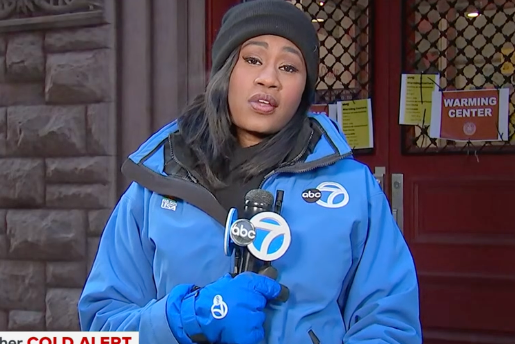
A sign of the times that Bill's days with WABC are starting to be numbered. But its fair, he's 76 now.
-
Aw, she will be certainly missed. I will miss her for sure. I loved how graceful and warm she was with the forecasts. Her delivery of her forecasts always came from a place of humility. I wish her the best!
-
WABC, In my humble opinion, from an on air presentation (graphics and set) standpoint, I think we can all agree that they are comfortably "the best" just recently. KABC was always the better one for years and even today I think the KABC set is probably still a bit nicer than WABC's by a touch (they have the extra space that WABC doesn't have). The news product itself which is what ultimately matters has always been one of the most top notch local news productions in this entire country. They've always been prestigious at which all other local stations try to model. Both KABC and WABC stations do a near excellent job with that. And now we are starting to see both stations work kinda together on some stories which is kinda cute. For WABC, in terms of the on air graphics and set, I think that was a long journey for them. At this point the only criticism I have now for WABC and now KABC is I wish they used more of their news music package. I'd imagine they have full access to the entire suite of music. At this point, its probably safe to say that WABC is the best overall O&O ABC station now and now we are seeing the rest of the Circle 7 ABC O&O stations model them (Logo and Graphics etc..) A bit of history with WABC; from an on-air graphics and presentation perspective, they were always far behind the rest of the O&Os until this past year really. KABC always had the edge over the years. I would always envy KABC because of how they just excelled over WABC. It wasn't till probably around 2012 with the Giant Octopus graphics that their on air appearance represented what a flagship station should be but it was short lived, they literally took two steps back with those terribly looking flat graphics in 2016 which pretty much sucked in my opinion they were really boring and just lazily designed. We had to deal with that disaster for 8 years and finally they got their new graphics in 2024 followed by their new beautiful set in 2025 which KABC now modeled and has a slight edge over.
-

The Passing of the Legendary Anchorman Ernie Anastos
Vlad replied to IceManNYR's topic in New York News
A stark reminder of the fragility of life, just 2 weeks prior he was alive and well. https://www.instagram.com/reel/DVcAtGYEhWJ/?utm_source=ig_web_copy_link&igsh=MzRlODBiNWFlZA== His final message to the world couldn't be more fitting; "Now more than ever we need to promote and protect the truth! It's an obligation we all have. I'm still pretty sad he's no longer here.. . He was in such good spirits just two weeks before, definitely a tragic loss and gone too soon. -
The Passing of the Legendary Anchorman Ernie Anastos
Vlad replied to IceManNYR's topic in New York News
Ugh, , Damn. This is some difficult news to bear. I really revered him. Im honestly a little bit heartbroken. I seemed to believe he could live much longer because of how well he l had taken care of himself. Even though he was no longer on TV, it seemed like he was always available in someway. I mostly remember him on Fox 5. The face of that channel really at the time. I remember watching him leading in, after American Idol in the late 2000s and 2010s. He was so respected and well liked here on these forums, we always talked about him. Especially during the earlier days of this forum. Ernie Anastos was is on par with all of New York's great anchors we all know, Roger Grimsby, Bill Beutel, Chuck Scarborough, etc, he was the face of WABC in the 80s and then of course WNYW in through the 2000s. I miss his calm demeanor and his smile. Great wholesome man with a lot of integrity, valor and trust. He will be missed. May he rest in peace and may our memories of him keep his spirit alive. -
KABC once again has the best O&O news set, after WABC's reign being the top for just about a year, KABC has dethroned them. Sorry WABC, I love you, but I think KABC has the edge, once again. KABC also has the advantage of the extra space. The So-Cal region and the city of LA itself (more sprawl and spreadout) despite the nation's second largest city is massive compared to NYC (way more denser and but less land area) so the scale matches that. They've got the space and they are making use of that. KABC out of all the O&Os are the best of the best when it comes to their on air look and overall design. Only minor critique I have are some of the sentiments that ABC 7 Denver had. It's a bit too blue and too reminiscent of their sister here in NY. For a So-Cal set, it should've been a little more different, perhaps a lighter shade of blue like what they had before, or maybe more warmer colors (brown, yellow) which they did incorporate in some of the other areas of the set. Even the new Circle 7 logo could've been a different shade of blue than what WABC uses just to be able to know whose who. Now with the two stations presenting in a way that's almost identical it may be challenging for the average person to understand or distinguish between the two. The lighter colors, music, and individuality that they had in the past will be surely missed. I truly miss the previous KABC music cuts and the NG Eyewitness News themes (Awaken and Valor) they would've been so much more ideal to complement the new studio, but they insist on using the WABC Dispatch theme which to me, still feels out of place for the region but its what they want. Overall it's great look for them. Excited to see how they maximize the use of the set, especially that staircase! . I don't think i've ever seen staircases in any US local news or national news studio before. Bravo to them!
-
Wow the new KABC studio is going to look really nice! I'm excited to see the rest of it! Based on what we are seeing thus far, there are some elements and motifs that look kinda similar to WABC, especially with the new darker blue colors. I now wonder if its the same company that designed WABC's beautiful set.
-
Yeah their top talent is on. Wild to see Lee Goldberg in early in the morning. Sam Champion wasn't around today. I guess he'll be back tomorrow haha.
-
Eyewitness News is a format that has evolved over the years. It originated in Philadelphia (KYW) and early on in New York, (WABC), emphasizing more detailed storytelling from the perspective of the reporter and their constituents out on the field, providing an Eyewitness accounts on the story rather than it being reported from the desk. It was more compelling and made the story itself more interesting than the traditional news often boring reading that was done prior to that format. There is also Action News, also originating in Philadelphia (WPVI) which emphasized more faster paced news, with reporters still out on the field, but delivered at a faster pace, and timed, to allow more stories to be told and to cover a wider area. At the time of their debut there were distinct differences especially in the earlier days. But today, unless you really attention and are laser focused, there are some elements derived from both formats, its a blend. It's really kinda the same thing and Eyewitness News is just a title now rather than a format. Some stories are faster paced, some stories are slower depending on the context. Today, when I watch WPVI and WABC, who pioneered these formats, there is hardly a difference in their delivery and storytelling style maybe a few elements but they have loosened up a little bit. WPVI still kinda holds onto their Action News format with less reporting and more delivery, whereas WABC, embodies the storytelling from the field approach with the anchor introducing the story and the reporters telling the rest of the story.
-
Wow just like WABC haha, one difference is that the ABC ball on the WABC circle 7 mic flags are still glossy and are the old ABC logo back in the mid 2010s when they had the glossy look. These are the ones they unveiled after the HD transition era. I remember when a few of the ABC O&Os adopted the "ABC 7 HD" for a hot moment in the late 2000s to early 2010s and thereafter, they returned back to their original early 2000s style one that they use today. Hopefully WABC gets a refresh on theirs, i've seen some of the ones that the reporters use, they are looking like they've seen better days lol. Here's the one from the early 2000s Here's one they used today:


-
We all oughta agree that WPVI; WABC and KABC's sister station is more the wild child , especially now in these circumstances haha. They are most resistant to changing their identity especially their music, because of how strict their viewers are. The 6ABC identity has embodied themselves in Philadelphia culture. Philly locals literally love WPVI's identity to the point where the music itself has become the defacto anthem for the region. They tried to deviate from their iconic Move Closer to Your World Theme with a more orchestral modern format in 1996, which was extensively discussed here, and we all knew they had a lot of issues and backlash from the public so they quickly went back to their original theme within less than 24 hours so I don't see them really changing much when it comes to their on air branding and theme. So there are unique times where the public gets involved and expresses their concerns greatly but this is not the case all the time. WPVI's theme, format, and presentation, arguably is the best in the business and has worked for them. Thats what I wish we could see more of for the rest of the O&O stations. An established brand and identity that really captures the region that they are serving in addition to retaining the overall O&O look which WPVI exemplifies. The Eyewitness News Dispatch (Series 4) theme to me is very New York and it should be exclusive to New York in the same way that Move Closer To Your World is Philly and should be exclusive to them, but I digress now haha. Now, regarding WABC adopting "ABC 7" instead of "Channel 7". I guess they can do that, makes sense since they are known as "ABC 7 NY" for their digital platforms, so its only fitting for them to switch to "ABC 7" Eyewitness News, but its been widely discussed and understood that New Yorkers refer to the station as Channel 7 rather than ABC 7. In the same way WPVI says "Channel 6" instead of "Six-ABC". But time will tell, im really interested in seeing what KGO does.
-
Yeah to this day i'm still stunned that KABC decided to switch to WABC's Dispatch / Series 4 theme. I really liked the themes they had before ("Awaken" AM and "Valor" PM). Just was more fitting for them. Every time I watch their newscasts it just feels kinda the wrong tone for LA and it feels too familiar. Which is I guess what their intention was the entire time, to make the stations feel familiar amongst each other at a time where there is less attention span and everyone is watching the broadcasts on their mobile devices when brand identity matters less. All the ABC 7 O&Os now bear a similar resemblance now so the resources are quickly efficiently shared.