Vlad
-
Posts
2072 -
Joined
-
Last visited
-
Days Won
11
Content Type
Profiles
Forums
Articles
Everything posted by Vlad
-
Yeah it's an evolution indeed from their previous set, arguably one of the nicest in the market, just well executed and placed properly. The lighting is great, the set is large and no longer cramped, overall a major much needed improvement that we've all waited years for. Cant wait to see the other one elements and how the dynamics are put it to use during their other shows. Overall it's an incredibly wonderful improvement! Gonna really miss the streetside studio, at this point only Chicago's Eyewitness News (WLS-TV) has the State Street Studio if I remember correctly. Only gripe I have is the ticker with the Eyewitness News and ABC7NY etc, I don't think having that moving behind them is necessary, its a bit too busy, but other than that, its an amazingly beautiful set! WABC now the cream of the crop with their on air presentation and product.
-
Thats wild! Glad they had a safe landing! Im sure they'll be covering that tonight in their newscast. BTW, Does anyone know when the final broadcast from the UWS studio is gonna be? I want to make sure I'm there for it!
-
Yikes! I totally missed this thread! I've been wondering where the conversation was for this topic, but makes sense to have it here as this is the space on the forum for Sets and Studios! Wow, the new set will be amazing to see when it goes live in the coming days. I'm excited to see the new look of the studio, looks like it's pretty much ready to go. Based on what we've seen thus far, the set is beautifully designed, which exemplifies and embodies the flagship that WABC is and its signature product. The new space looks extraordinary and the current outgoing set's future is quickly coming to an end, it's been more than 10 years in their current studio. The street studio was amazing and a nice treat for New Yorkers passing by so it will be sad to see it go. But it served its time. It's the end of an era for sure for ABC's presence in the Upper West Side, but the new set now is as I expected very reminiscent of the grandeur of the KABC West Coast flagship and the quintessentially "Eyewitness blue" color which is a staple of WABC continues to be the case here in the design of this new set. Very nice element of having the blue neon Circle 7 overhead that is really beautiful and reminiscent of the past iterations of the design. Let's see how the unveiling goes! Exciting times are ahead for WABC and New York fans of Eyewitness News in what will be the dawn of a new generation and chapter of this news organization and arguably the rest of the world who watch and stream on the internet! I gotta say, WABC is finally embodying who they are with their on-air appearance. It took YEARS of us griping and bemoaning on these forums (I've certainly been one of those critics and outspoken about their appearance) at how they were never the "best" with their on-air look. They delivered a solid product, but never had quite the appearance that represented that because they always seemed to have the shorthand of the stick in that aspect, despite being the flagship ABC station. But as of this year, this will no longer be the case as that all changed last year when we witnessed the amazing graphics upgrades which are now the best in my opinion in the market, and now what looks to be a gorgeous studio to be unveiled in the coming days. Perhaps we'll see the new set unveiled ahead of the Oscars. Congrats to them they certainly deserve it!
-
Aw, I will miss her. She always had a sense of grace when delivering the news. She always delivered the news in a calm way that was captivating will miss her dearly. So unfortunate that her home was also destroyed in the Eaton Fire, that must've been wild to report on a story that was directly affecting her. Godspeed to her in her future.
-
There were some photos shared in an earlier post here. Ryan Field posted some photos on his X account on the unfinished studio, but nothing recent has shown up, they are probably keeping it under wraps for now.
-
Does anyone know when WABC and the Eyewitness News Operation will move to the new studios downtown in Hudson Square? Was curious because I wanted to make sure I see their final day at the West 66th Street location.
-
Yeah there is a lot of hidden opposition in the reporting there is a bit of resentment in it across the board on all of the news stations.
-
Gonna miss their outgoing space so very dearly. I remember when they moved to the street-side on Columbus Ave in 2011. It was a refreshing moment for them. I remember driving there from Long Island and parking the car just beside the studio just to get a star-stricken glimpse of the anchors haha. I think it was during the weekend so I saw Jeff Smith, Joe Torres, and Sandra Bookman at the time seated there. But it's been more than 10 years in the studio so it makes sense for them to refresh again, hopefully, they'll get a nicer look, hopefully, a bit brighter this time than their previous look. But they used that space pretty well all in all so will be nice to see what the future holds for them at their new space at 7 Hudson Square.
-
Seeing Shirleen Alicot anchor the New Year's Eve broadcast was nice. When Bill inevitably retires, I could see her being a future 11 p.m. anchor; she has the poise and presence. Maybe Mike and Shirleen in the evenings?
-
I know its been several days past Christmas now, but I gotta say, it was a solid broadcast. And remember there are no newscasts for the entire day at WABC so I think its more than fair to have the broadcast. Solid broadcast non the less, thanks RolyPoly for posting this!
-
Jim Dolan retired. He had a small gathering of friends and colleagues for his retirement on an IG post a few months ago. It wasn't posted on his profile but I believe another mutual follower posted it. I'll try to look for it and share it here. :).
-
Based on the previous posts, it seems like the changes will happen in Spring 2025 ahead of their move to the new studios in Hudson Square.
-
Are these changes going to happen to coincide with their new space in 2025 after the elections, or will this happen sooner?
-
I think Josh Einegar is a really good contender for the evenings, he has such a captivating persona and grips the viewer with this style of storytelling. Another excellent future candidate, with a lot of personality is Chantee Lans. They are solid future fits for the station's flagship broadcasts. But they also may not like the anchor desk and more than likely love the field. But I think they are good candidates because Chantee has anchored a weekend broadcast once and she was fantastic. Also, Josh Einegar often does the "Extra Time" segment on ABC7NY and he too is just excellent with his delivery. Lets see how these changes play out. Mike Marza is also great too but for some reason he doesn't really leave a lasting impression. The station really has some of the best storytellers and talent in the country when it comes to news delivery and reporting, they will make the right choices. Chantee Lans reporting on the Memorial Day Weekend Festivities at Jones Beach this past year. Josh Einiger's report on 1 year later on the Hamas attacks in Israel:
-
Dallas Raines is actually much older than Marc Brown. Dallas is 70 and Marc is 62.
-
I still dearly miss their previous music.. But great execution of the new package! I guess when I go to LA it will feel like I'm at home with the WABC theme haha.
-
Sade on GMA! She did an awesome job, she did say "Good Night" though at the end of the broadcast hahaha, cute blooper.
-
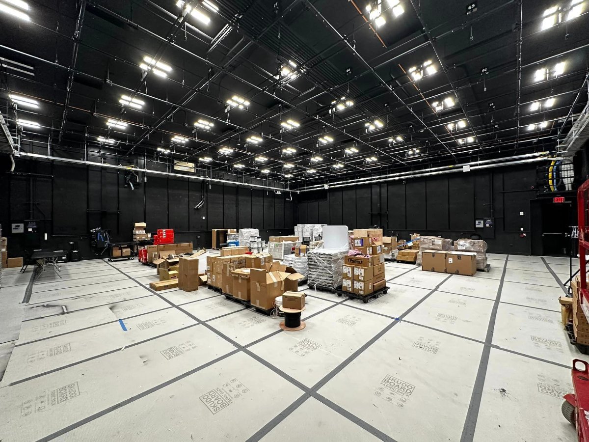
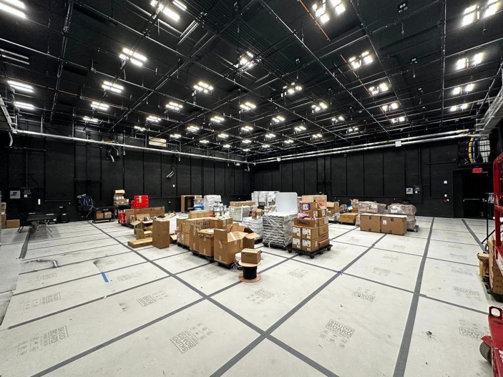
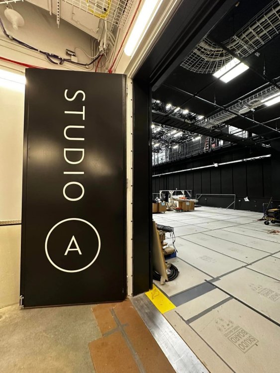
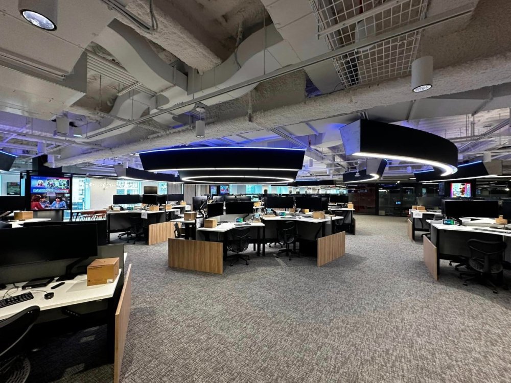
Yeah if those images that Ryan Field shared with us are what could be the new WABC studio next year, then it looks much larger and spacious than their current one. I'd imagine it to be on par with KABC. Perhaps these images below are the unfinished new WABC spaces? Could also be for ABC News / World News Tonight as well... But the newsroom pic on the bottom certainly looks like that could be for WABC / Eyewitness News especially with the characteristic blue lighting hue on the ceiling.
-
I wonder if they'll retain their current on-air look i'd imagine they'd do so. Graphics are less than a year old. Anywho, I'm going to greatly miss their street-side studio that was such a nice way to connect with them. Their current set so far has been their nicest studio. I remember when they first opened the set in 2012 and I was living on Long Island, I would drive to the station just to get a glimpse of the broadcast lol. I noticed they kinda stopped showing the outside shots in the newscast or at least they don't really emphasize it anymore so maybe it could be their way of shying away from that..
-
Phil Lipof former WABC morning anchor left to go to Boston and then went on to return back to ABC to work for ABC news. He went from Local to National so I don't think that is always the case.. Also non-meteorlogist / weathercaster who learned on the job, Sam Champion a very unique case, went from Local to National back to Local and back to National again. So while it is far and few, it does happen.. And also with all due respect, New York by no means is a downgrade. Landing a job in the in the nation's top market is pretty much an honor and a pretty high honor for people in this industry. This market is the cream of the crop. So good on Tanya Rivera for landing a job in arguably the most coveted local news station in the country.
-
Yeah they used the old 2012 morning theme for the 7AM stream as well. The only rationale I see behind the WABC music adoption is to keep the West and East largest cities streamlined and sorta unified in a way on their appearance, so if someone from New York tunes in they'll recognize the Eyewitness News theme right away and vice versa.
-
By chance right now I'm watching a 7AM stream of KABC ABC 7 Eyewitness News with Leslie Sykes, and I noticed they are using their previous morning NG4 cut again!. Did they switch the music back? Also the open didn't have the WABC cut, was so nice to hear it with the new graphics. .
-
Aw what an incredible tribute to Dallas. Really the talent at KABC is such a class act. So cool to see them all on the set. KABC has some top notch talent, to say the least! Dallas is incredible too, hope he stays at least till his 50th anniversary! 10 more years!
-
It is basically that. New Yorkers have a lot of colloquialisms and have a relaxed way of referring to things sometimes, and one of those is referring to WABC as "Channel 7", especially for the older generations, they identify ABC 7 as "Channel 7" not sure how much longer people will continue to say "Channel 7" since these days we don't "tune" channels anymore everything is digital so perhaps in the near future, I wouldn't be suprised if they returned back to rebranding their newscast as "ABC 7" Eyewitness News especially since their online presence is now "ABC 7" NY. to me it makes more sense to identify as "ABC 7" again. There is an old thread over in the New York Forum here that discussed the branding switch when it happened in 2004 (20 years ago now, wow does the time fly). Most of us came to the consensus at the time that the switch was made because the average New Yorker identified Channel 7 with the newscast. I don't think they are mandated to say "Channel 7" ocassionally reporters say "ABC 7". Another thing that WABC and the other O&Os abandoned that KABC and KGO in the north retain is the iconic "Circle 7" Pins. Every KABC and KGO on-air staffer wears it, WABC and WLS had that standard for a while, especially in the early days but dropped it I guess in the early 90s. Personally I like them, and since WABC is the top in the nation, it would be a nice honorary symbol for them.
-
Yeah he's been with WCBS for a while now started exactly three and months ago (February 29th) with them after a brief freelancing stint in DC's Fox 5. https://www.instagram.com/p/C386yHVOj1i/?hl=en