
Leaderboard


Popular Content
Showing content with the highest reputation on 06/05/21 in all areas
-
Honestly, it will probably not be noticed by most viewers being so subtle. It makes you wonder why go through the expense if there is no real return.2 points
-
Indeed. eems a bit of a hassle, and expense. for such a small tweak. Better go all out (I admit, I wouldn't mis the left-pointing arrows, but the rest of it is spot on, imho). I saw the promo mentioned above, and I actually like the animation of it, and the inverse black and white. Time will tell. I am more into NBC and CBS (news, mainly).2 points
-
I still like the 1988-2007 logo better. Just very simple.2 points
-
I’ve loved Ilona from her first day at channel 13 In 2004 or 2005. She’s one of the best.1 point
-
Elex Michaelson at KTTV comes to mind (although his style is LA through and through) especially since KTTV isn’t particularly strong.1 point
-
Sinclair has been names to the Fortune 500 list for the first time. https://sbgi.net/pr-news/sinclair-broadcast-group-named-to-fortune-500-list/ In the 1000, Nexstar is about 60 steps below and other groups like Gray, Tegna, Graham and Meredith make appearances as well. Of course, the media giants like Comcast, Viacom and Disney are much higher on the list. Here's the 2021 list: https://fortune.com/fortune500/2021/search/1 point
-
WGEM Promos and Newscast 19941 point
-
This strikes me as an unnecessary fix of something that isn't broken: What is up with this flat trend?? It's like news graphic design is getting cheaper and unimaginative as time goes on. Sports networks like ESPN, TNT, NBA TV, and FS1 are really exceeding news outlets at set and graphical design.
 1 point
 -
Signage is probably the last on their minds. KGTV still has the signage from the 80’s but modified after the Scripps buyout from McGraw Hill with a spinning 10 on top giving that gas station feel. KTVU still has the old 80’s / 90’s sideways FOX logo with the searchlights.1 point
-
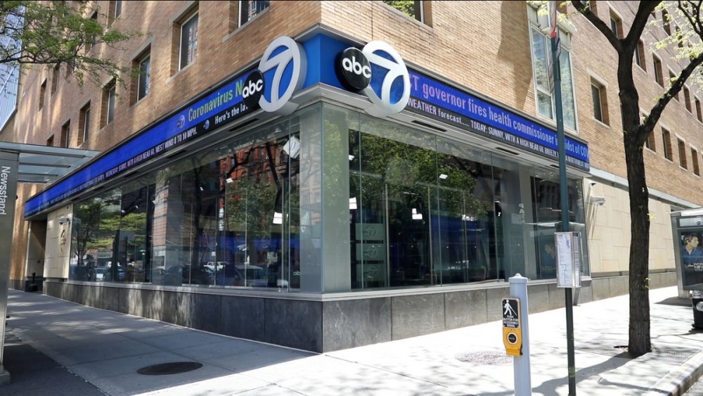
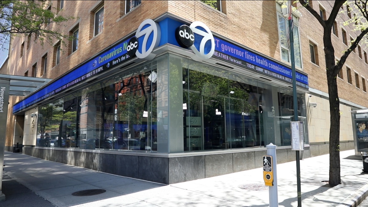
That's a great question-- how would that play with other luminary stations of that family like 6ABC in Philly (WPVI) and ABC11 in the Triangle (WTVD)?1 point
-
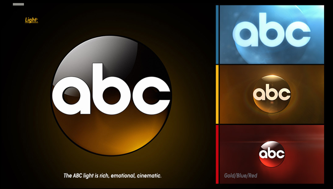
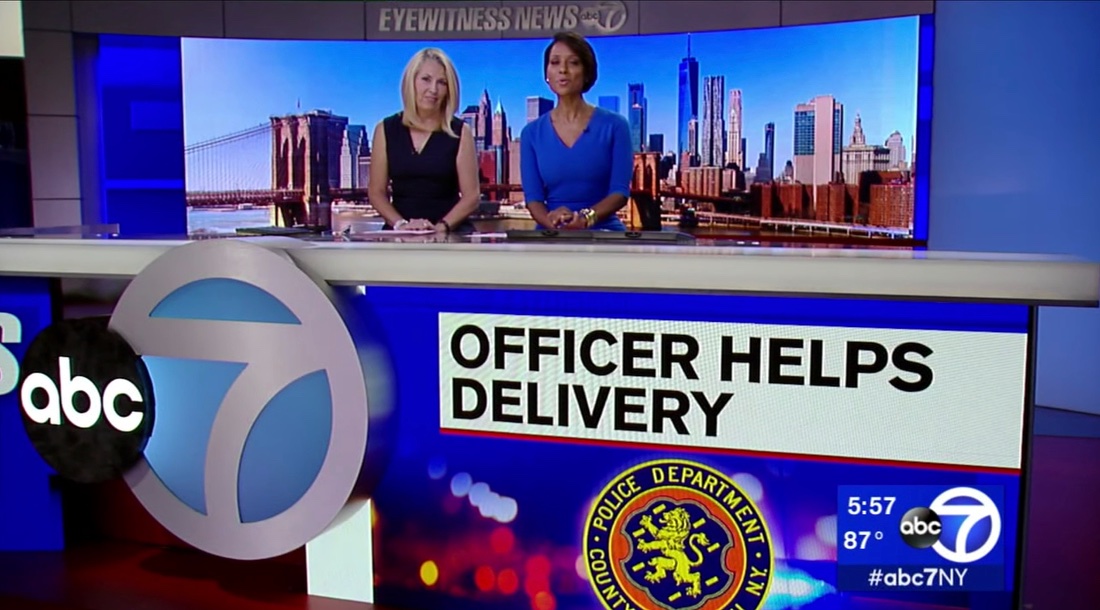
If this awful “rebrand” of the ABC logo and Circle 7 co-logos is forced on stations, will they also change the signage inside and outside the WABC studios that are connected to ABC HQ? And what about all the O&Os and affiliates with signage on their sets and buildings?
 1 point
 -
The new logo is not an upgrade, its just oversized and flat. The current logo is the best ABC ever had.1 point
-
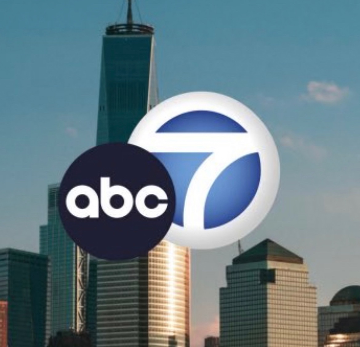
Agree with above. Proportions are terrible with the circle 7 and if they want to go through with this new flat ABC ball, then the circle 7 needs to be re-tuned as well. Could not agree more. I can recognize the value of the original flat ABC but turning everything else "new" or keeping it more of the same does not make for a congruent appearance. Speaking of new, the introduction of red to the ABC color palette is so out of left field. I'd also expect the new sampled font and templates shown to be something I'd find on Freeform and not on ABC. I can admit that I sound kind of like a grinch, but I'll wait and hopefully anticipate something more sensible.1 point
-
The proportions are all wrong. Demanding the “dot” is 75% of the circle 7 basically has the two elements fighting for dominance. Maybe I’ll get used to it...but it’s awkward.
 1 point
 -
The flat ABC logo next to the 3D Circle 7 logo seems a bit odd. I have to wonder if there would ever be a consideration to flatten the Circle 7 to match the design.1 point


This leaderboard is set to Chicago/GMT-05:00