
Leaderboard

Popular Content
Showing content with the highest reputation on 09/30/22 in all areas
-
Lori Stokes reliving her Good Day NY days, presenting the 9am edition today.
09-3010-24-58.thumb.png.4277b730aaab0ac0c774b4d1c5c25a87.png) 3 points
3 points -
It would be Al rolling in his grave if KYW dumps Eyewitness News at least CBS let them keep the it and incorporated in to it. “CBS Eyewitness News Philadelphia” or at least have reporters announce it at the end of live shots. This is so sad and it’s an blasphemy station are dumping it. Especially legendary Fox stations FOX5 Atlanta or Fox 2 Detroit. Since it started at CBS. And perfected in ABC.2 points
-
The board is back running it seems
 1 point
 -
Hothaus won. Death to the Gray graphics hub!1 point
-
Wasn't KYW a NBC station back then? It was the old Group W stations that carried the Eyewitness News moniker. Once Westinghouse bought CBS, all their NBC stations switched affiliations.1 point
-
Does MyNetwork provide any value to any station group outside of Fox Owned? It's pretty useless with repeats you can find elsewhere. Have to admit, I never watch Ch 9 WWOR here. No one I know does.1 point
-
Quick history lesson: when KYW-TV launched Eyewitness News, the station was in Cleveland and an NBC affiliate. Networks have nothing to do with local news branding, at least back then.1 point
-
Yeah I’m not in the discord because of well you know like you do you have any evidence?1 point
-
Do we have a picture or video?1 point
-
Interesting. I guess everyone might be getting the call letter treatment, at least temporarily. If so, it would be reminiscent of how CTV handled their standardization. Come to think of it, that might be the branding differentiation between newscasts on KCBS and KCAL.1 point
-
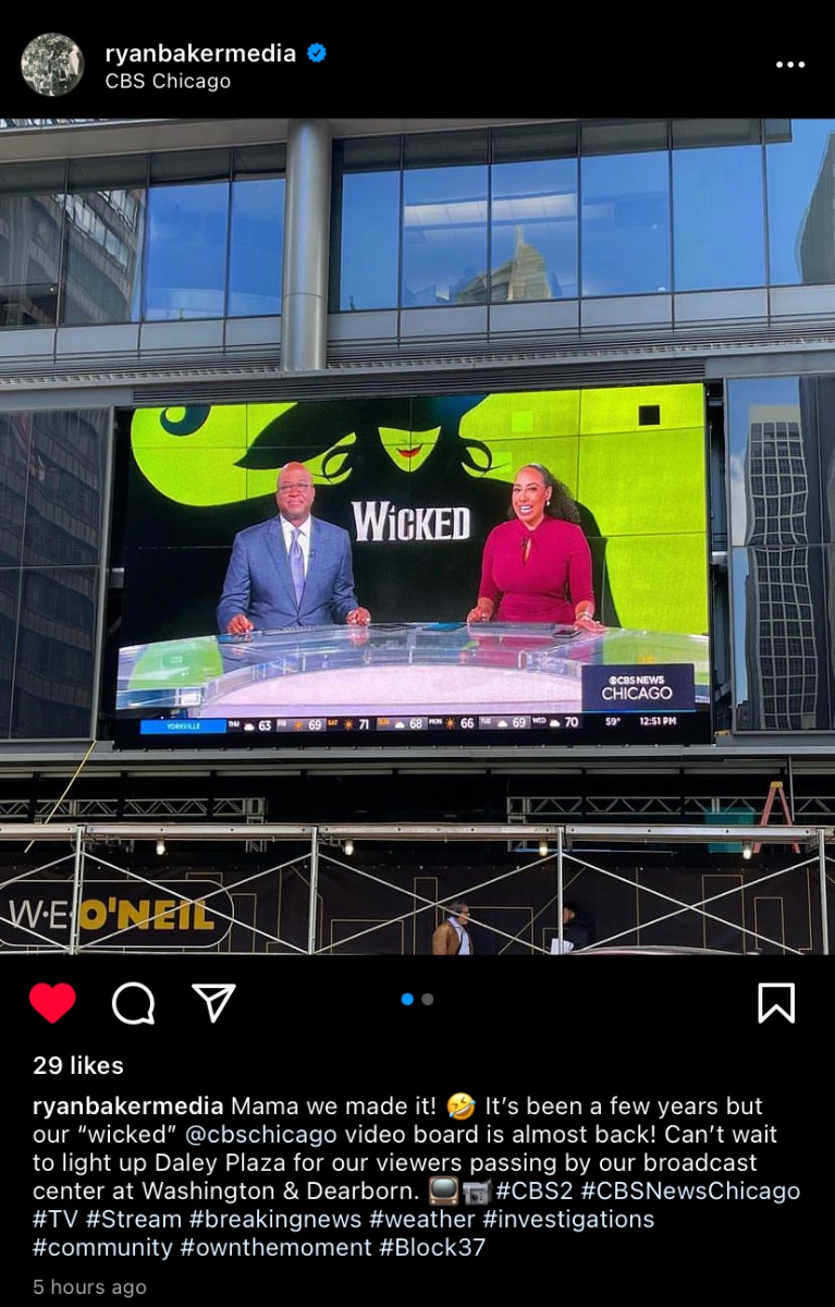
Credit to @CaptainNewsfor flagging it on the Discord: WBBM is airing a promo celebrating Brad Edwards' 10th anniversary at the station that features the "CBS News Chicago" branding with "WBBM" in a black box, similar to what the Group W converts and WCCO have.1 point
-
We're not gonna rehash this in another station's thread. Romero is now at KNBC. KTLA is in the past.1 point
-
1 point
-
WJZ chief met Bob Turk is hanging it up after 50 years.1 point
-
That new 12News logo would be great if this was 1986. The lack of spacing between the circle 12 and the N bothers me, and the typeface used for the NEWS part leaves a lot to be desired. The 2 is overstretched. Honestly this is a huge downgrade. Don't knock the logo it replaced, the red crescent 12 was actually very decent. Also that set is terrible, that feels like it should be a temp set. The fact that only three other former MG stations/sister stations still use their crescent logos (WMBB, WBTW, and WJBF) doesn't mean that KWCH's logo made them look like a Nexstar station. Honestly, Gray probably left it up to the station since they had used their old MG logo for so long and it had become an identifying mark for them they decided to keep it. Now, it seems they're looking for a refresh to something else. There's three existing former MG stations with crescent logos still, WMBB, WBTW, and WJBF. Those three stations still have their crescent logos likely because, just like KWCH, it became their most identifiable logo mark, and if it ain't broken don't fix it.1 point
-
I really wish someone would, but I have a hard time seeing anyone doing it any time soon. The networks aren't going to bother with a second full production when they can insert segments into the east coast-produced shows. Out of the big station groups, Nexstar is the only one that has enough non-big-3 affiliates to make it work but I think they're too busy trying to push NewsNation to try anything else.0 points
-
Former tv news director and executive Al Primo, credited with conceiving the Eyewitness News format for Group W in Cleveland and Philadelphia, and then perfecting it at ABC in New York, has passed at age 87. Here's the story from WABC-TV, where Primo served as ND and where his creation attained perhaps its greatest and longest-lasting success. (Note [9:52 PM ET]: the story contains an incorrect reference to Stu Nahan and Bill Bonds launching Eyewitness News in NYC in '69, which they did–but in LA. I've already reported this to WABC-TV and hopefully, they'll dig deeper into their own history and make the necessary corrections rather than cut-and-paste from another source.) (EDIT [12:35 AM ET, 9/30]: Said corrections have been made.)0 points
-
Some sad news on this Wednesday evening. Just saw this on the CBS Evening News Bill Plante Former CBS News White House correspondent has passed away at the age of 84. Bill Plante Dies: Longtime CBS News White House Correspondent Was 84 – Deadline0 points

09-3010-24-58.png.46283fa564dafbd2973bebb3cc6f3e61.png)

.thumb.gif.2ea41b68fa52695338e390da587d15a1.gif)


.thumb.png.3d66a1eeb7ecf5404151f8a77ea7cbfd.png)


This leaderboard is set to Chicago/GMT-05:00