
Leaderboard


Popular Content
Showing content with the highest reputation on 10/26/22 in Posts
-
Sounds like she had an opportunity to do specific storytelling she wasn't going to be able to do in Cincy. Also, Tegna is one of the most LGBT friendly media companies out there. It's also overall just not a bad company to work for.4 points
-
Megan Mitchell is joining WFAA from WLWT starting in January.1 point
-
The design language matches what we've seen across other CBS News properties. It definitely might not be the final form, but I can guarantee that it's something that was thrown out. While the 2016 package, in its original state, is totally fine, so many stations have tweaked their own looks to the point where there are some major inconsistencies, from market to market. Post-Moonves CBS has created a unifying brand that, at least to me, is meant to keep everyone in-line. And for the record, TT Norms is not, and was never previously the font for the 2016 package. That lack of attention to detail pokes some holes in this opinion. All signs point to KABC having a new look on the horizon (within the year, weeks, or even days), with the current package lasting so long only because the final details of a groupwide look are being ironed out. And your thought about KTLA is shared with me.1 point
-
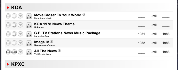
An awesome discovery that KOA-TV Denver (now KCNC) has used Move Closer to Your World. Yep, that long-running Philadelphia news theme has invaded the Mile High City back in the 70s. Now, if only we could find proof of Channel 4 Denver using MCTYW in action. A news open, a promo, anything
 1 point
 -
Nah. That assumes NewsNation had any sort of lead to begin with. They’re more like the 2022 Denver Broncos. A very expensive flop.1 point
-
Nexstar is someone I highly recommend not investing in. They don't know their ass from a hole in the ground.1 point
-
Talkback Feedback! This segment is always gold.1 point
-
Those of us of a certain age will remember Rankin/Bass productions. Jules Bass died recently. Rankin died years ago. https://variety.com/2022/film/news/jules-bass-dead-rudolph-the-red-nosed-reindeer-1235414059/0 points
-
I get why you'd think individual stations would want the 10 PM hour for their newscasts, but if (say) Sinclair or Tegna come down and put a program in that timeslot, they're not going to have that much of a choice. Perhaps the station-group produced programming could solve that issue with duopoly stations, where (hypothetically) the 10 PM newscast stays on FOX while the new program airs on the NBC affiliate. All else fails, split it half-and-half.0 points
.thumb.png.3d66a1eeb7ecf5404151f8a77ea7cbfd.png)


This leaderboard is set to Chicago/GMT-05:00