
Leaderboard


Popular Content
Showing content with the highest reputation on 12/15/22 in all areas
-
Because of a logo change? That’s a bit of an overstatement IMHO. ABC and NBC’s new logos are more mobile-friendly, and the new CBS bug is less intrusive. Besides, we’re the only people that are consciously noticing this stuff; all of these changes are so minuscule that I’m not sure it’s even worth calling them different logos.6 points
-
And just like with the ABC logo change, the average viewer will not notice or care as long as Lester Holt and The Voice are on the same channel they've always been on.5 points
-
I keep hearing it said that flatness is more mobile friendly. In what way? It's a fair statement to not nitpick too much given that the average viewer just cares about channel content more so than presentation elements. A tweaked logo isn't the end of the world. On the contrary, a large portion of what we critique here like lighting, studio setup, and graphics, only industry junkies would care about. My point remains though, a lot of these graphical "updates" networks are doing to their logos seem to take a step backwards. The NBC news logo IMO is the perfect all around peacock design to settle on. White borders with depth, gloss, and gradient to the colors.3 points
-
I like the abc tweaks, makes it a little bolder. Hate the miniscule cbs eye. The peacock doesn't look right without the white. I liked their 1980 peacock the best with the tail feather and two feathers for each color.2 points
-
WEWS will still be (to me)... TV5 Eyewitness News and NewsChannel 5. Happy 75th Anniversary TV5.2 points
-
NBC basically gave the peacock a chemical peel and a little filler in the beak.2 points
-
As for the “why is flat better for mobile?” question, I’m far from a design expert, but I think this article puts forward a good argument for it (and explains it better than I ever could). Long story short, flat design allows for greater contrast and more flexibility. When you’re working with a smaller amount of space, gradients and gloss can be unnecessarily complicated and distracting. It’s the same reason why IOS and Windows dropped their old glossy designs they had for their operating systems several years back. I’m not against the old peacock or anything, but on the subject of NBC News, their visual presentation is looking rather dated IMO (although not nearly as dated as ABC). I’m sure they’ll eventually adapt their graphics to suit the new peacock, but I doubt they’re in any rush to do it given the similarities between the logos. I can be nit picky about this stuff myself, but I honestly didn’t even notice the changes when the new promos first aired. That’s how subtle they are IMO. But to each their own.1 point
-
Would like to see an afternoon hour returned to Brianna Keilar.1 point
-
This was unnecesary and not an improvement by any measure. First ABC ruined their logo, then CBS gets a miniscule screen bug, now this. Its like the networks are dertermined to spend money for a worse product.1 point
-
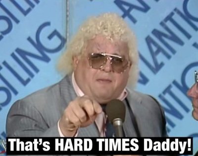
My first thought was...Good lord!! Between the illness/death of Chris Bradley four years ago this month, and then the Mike Davis scandal and now this...another sign that the once-mighty 10TV has fallen on hard times. We might need to hold a séance and reach out to the legendary "American Dream" Dusty Rhodes so he can cut a new version of his classic promo just for them...
 1 point
 -
This won’t be an “overnight” change like in 1986 - as that change was a complete overhaul of the logo and IIRC, it took effect immediately. this one, like the ABC logo update, is small enough that both variations will probably be floating around for years… Jim1 point
-
Not a fan of dropping the white fill. As very clearly seen in NBC's own promos, feathers get lost depending on the color scheme. Might've been better served to make the feathers bigger and lessen the negative space.1 point
-
Not a flattering capture here nor the best picture they could have used in the background. It looks like this team was sent packing, lol.1 point
-
I hate to say this, but this image of what protestors/rioters did to the CNN center in Atlanta (and this logo) sums up exactly what Jeff Zucker has done to this network, and how his recklessness has helped this country get to where it is today. Viewer discretion is advised (scroll down to see it, so if you're easily offended, this is your warning to click away now) . . . . . . . . . . . . . . . . (scroll down if you wish to see it....naughty language ahead....) . . . . . . . . . . . . . . . . . . . . .1 point
-
Damn. That's young. I'm so sorry for his family and team.0 points
-
Earlier tonight on the NHL on TNT, Liam McHugh announced that their production assistant passed away earlier this week.0 points
-
Ads have already started running in affected markets with a Nexstar-owned CBS station:0 points


This leaderboard is set to Chicago/GMT-05:00