


WCAUTVNBC10
-
Posts
2472 -
Joined
-
Last visited
-
Days Won
8
Content Type
Profiles
Forums
Articles
Posts posted by WCAUTVNBC10
-
-
19 hours ago, Geoffrey said:
Sunday morning baseball?
Yes Sunday Morning Baseball on Peacock. Started last season.
-
 2
2
-
-
1 hour ago, 24994J said:
Welllllllll...you're kind of correct. This logo has been plastered over on the station's creative services channel. While it hasn't launched, and could theoretically still change, it appears that the '3' isn't going away, entirely.
.thumb.png.61f81526faff0299b4671586097c1056.png)
Oooof. I kinda see where they're going with this. Really smacks of their late '80s logo:
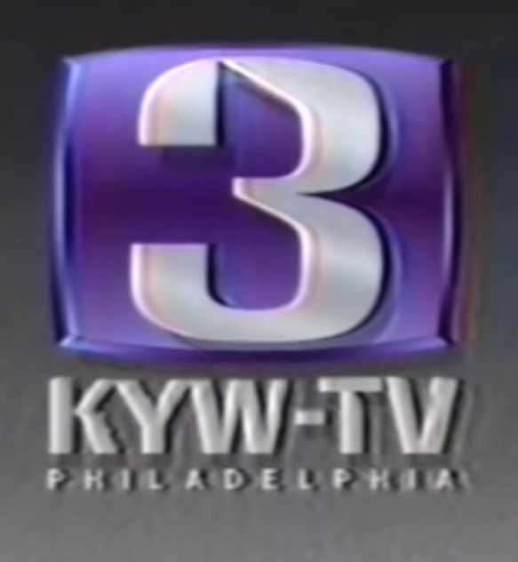
If that's the case they might as well have dug up the old 3 and used that.
-
1
-
-
NBC Sports will be going to DTC via Peacock eventually as well.
-
1
-
-
22 minutes ago, JosiahCubed said:
Minus KYW and plus KCAL, it’s beginning a trend with the former Westinghouse stations.
I wouldn't be surprised if KYW goes sans box and fully embraces the CBS News Philadelphia brand. Them moving towards the brand even before launching the new graphics and music kinda hints at them going in that direction. I think the Eye-3 logo goes away altogether when they do launch the new look.
-
1
-
-
13 hours ago, TVNewsLover said:
Wonder where the new hire will be placed. Interestingly, Johnny has been on with Tracy at 5pm this week, and Keith with Jackie at 6pm, 7pm, and 11pm.
Going by the announcement, it sounds like 6, 7, and 11.
-
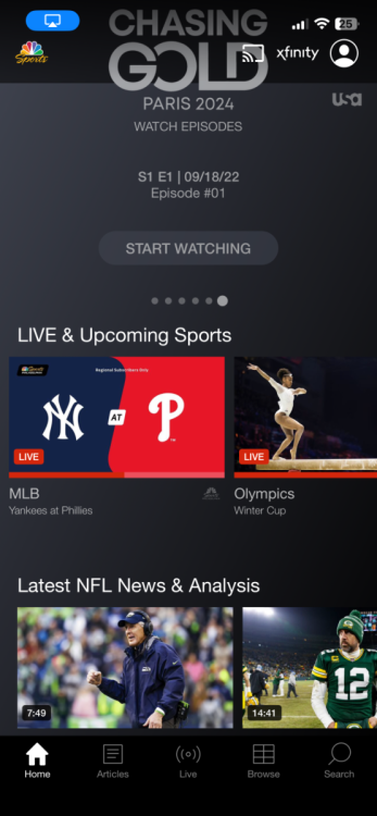
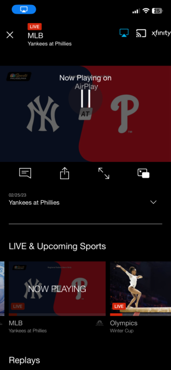
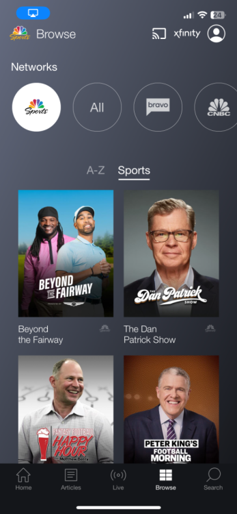
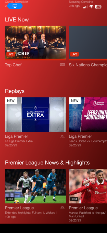
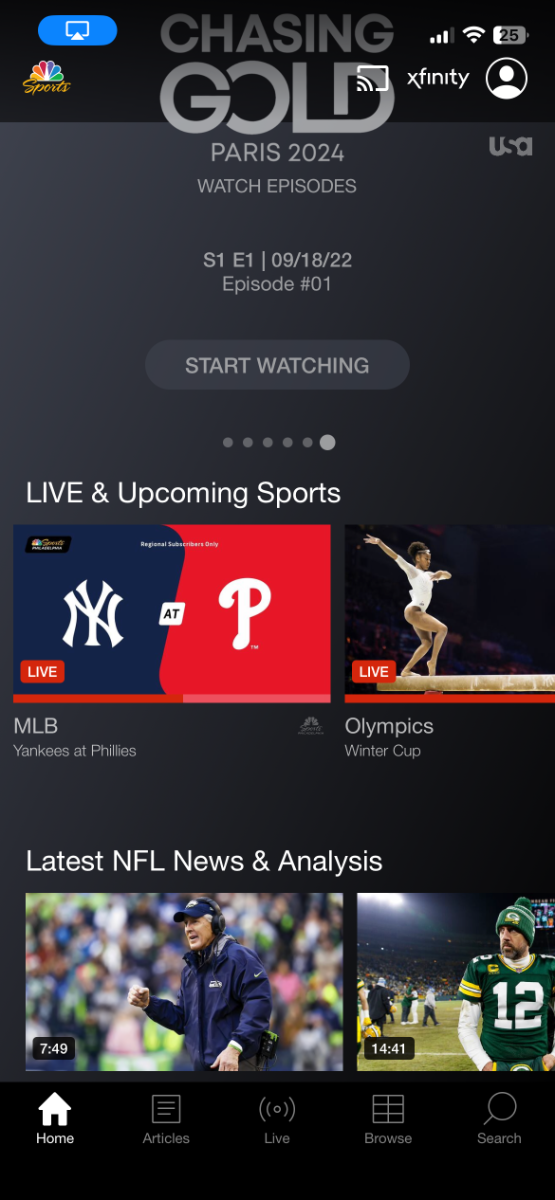
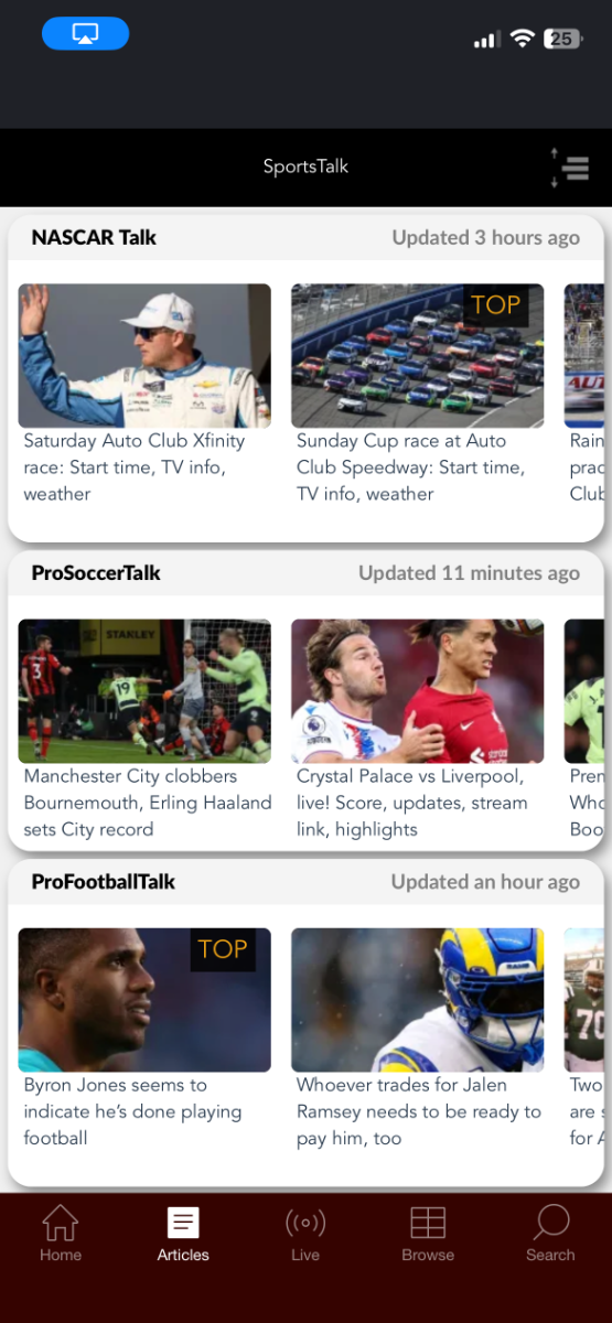
Hadn't seen this announced anywhere but NBC Sports completely overhauled their app. Gone is the clunky old app that was a mess to navigate and stream in the background to one that looks like it takes the best elements of Peacock and Xfinity's Streaming app. Here's some screenshots:

-
3
-
-
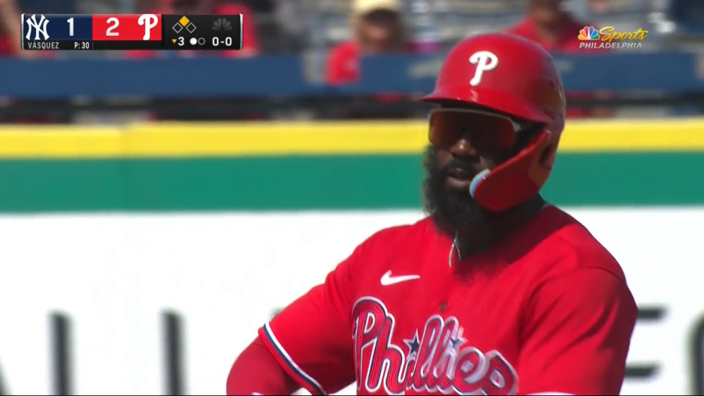
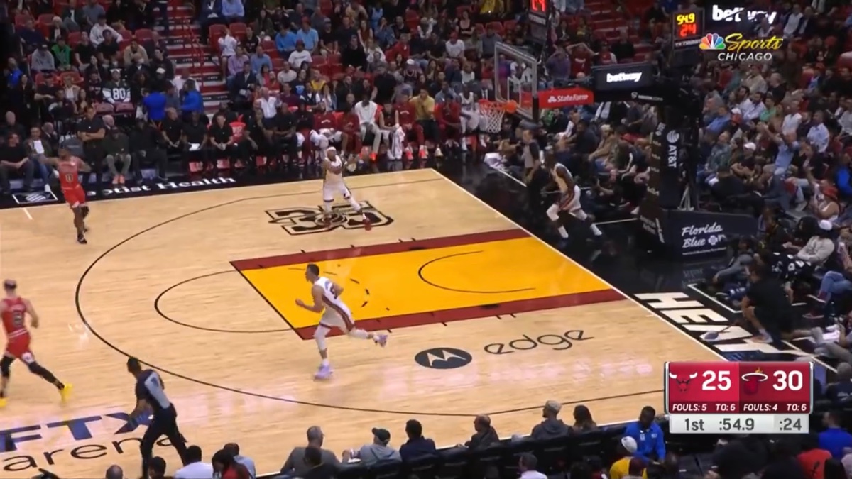
Here's a look at the modified NBC Sports baseball score bug. I'm assuming the pitch clock will go where the peacock is (with Spring Training production values limited NBC Sports Philadelphia is showing a camera shot of the clock in a separate box).
-
3
-
-
On 2/15/2023 at 6:44 PM, nycnewsjunkie said:
If I had to guess, it’s probably because Peacock is starving for content (and subscribers). Also, IIRC, they can’t simulcast on Peacock and USA due to some archaic reason related to cable.
Pretty sure that's not true as most of the EPL matches on USA are simulcast on Peacock.
-
1
-
-
They had the opens already to go for tonight:
I have to say Charlie is sounding rough these days. I wonder if they have plans to move on from him in the future. Maybe to someone like Paul Turner.
-
1
-
 1
1
-
-
They'll also be running an hour long special this Thursday at 8PM to say good bye to him.
-
3
-
-
21 hours ago, PhillyWatch said:
So the writing is on the wall that this was likely a buyout. NBCU will save money in not paying him, but I wonder what the long run will hold for WCAU. Will saving on his salary be worth wrecking 10's stability in evenings, particularly as 6 is about to lose JG?
I'm guessing they'll hire a younger up and comer from within the station group.
-
You can file this one under "It's about damn time", the RSNs are heading to Peacock (complete with live sports [IE no blackouts])by the end of the year in their regional markets:
-
1
-
-
1 hour ago, groupwfan said:
Both games on both ends are gonna be on myPHL17 AND my20Vision, respectfully...
*PHL17. WPHL doesn't recognize its MyTV affiliation.
-
1
-
-
1 hour ago, Geoffrey said:
A very well done look at some of the great work they've put out over the years.
I like that they included the time NBC O&Os were about to lose the channel numbers. (Unless I'm misremembering, this look was never really used, aside from maybe some promos and bus stop ads before an aborted launch, correct?)

I know I'm in the minority here, but I was always a fan of this package. Way ahead of its time in terms of visual themes. I think with a few tweaks and giving the stations more latitude with branding, this would have been a very smart looking package. WCAU was ready to pull the trigger on this package and from what they had let out into the ethos, it looked like their creative dept took this package and ran wild with it:
From a promo for the original incarnation of their 7PM newscast:
-
2
-
-
15 minutes ago, MidwestTV said:
When was this used? Starting at 1:40.
It looks a whole lot similar to KXAS' 2012 package. Same color scheme, same glassy textures to all the visual elements. Perhaps it was offered to the other O&Os as well but they all went with Look F. NGL I always liked that look over Look F.
-
1
-
-
On 10/19/2022 at 8:31 PM, Georgie56 said:
The NBC RSNs have slightly updated their NBA scorebug.

There is also a new 3-point animation, as well.
They must have new tech driving their scoreboard graphics and thus an update to the layouts. I hope upon hope this leads to the 2015 insert package finally being retired in the near future.
-
3
-
-
MLB has never allowed regional broadcasts for playoffs. Could be that they awarded a separate contract to Sportsnet to broadcast the Blue Jays games in Canada.
-
1
-
-
18 hours ago, Viper550 said:
In addition, NBC's tweaked their scoreboard for regional games; it is still the same basic layout as before (the 2015 package, and not using the short-lived scoreboard from the 2021 playoffs) but it takes cues from the MLB update by switching to logos only and bigger score numbers, and has an inline shots on goal counter where score used to be. Those graphics are going to be ten years old soon, and they are not leaving without a fight.
I don't understand why they don't just build an insert package based on the animation package they debuted last fall. The old inserts really clash with the new animations. Hell you can even base the design of those new inserts off the old stuff to make migration to the new look easier.
-
1
-
-
4 minutes ago, nycnewsjunkie said:
That’s gotta be a one-off thing. There’s no info on the period, SOG count, etc. Just a wild guess, but maybe they had some production issues and had to slap that scoreboard together?
Yeah that appears to be the case. The traditional scorebar appeared a few mins ago.
-
2
-
-
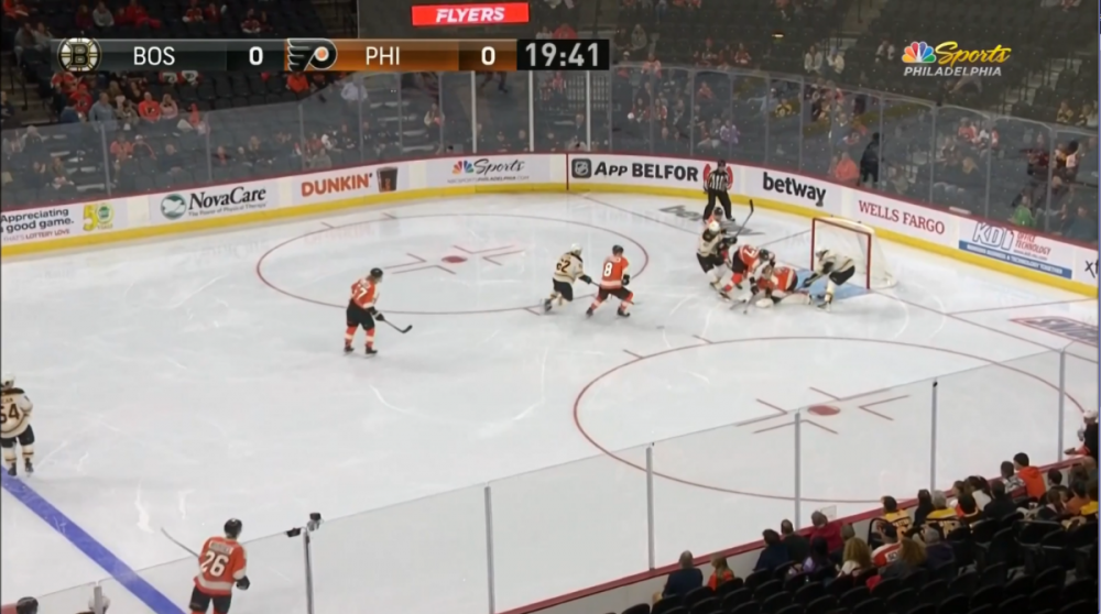
The Flyers' first preseason game on NBC Sports Philadelphia is tonight and they trotted out this monstrosity of a scorebar. Please tell me this is temporary:
-
2
-
1
-
-
31 minutes ago, Viper550 said:
Fellow Disney subsidiary Star Sports is the host broadcaster for Indian national team cricket; is it me or does it look like ESPN's NBA graphics rubbed off on it a bit?
Looks like a superior version of them yes.
-
Love all of it except the lowers and the font weights they went with. TT Norms is a very versatile font with a variety of weights and widths and they went with medium condensed? As a designer I would have went a normal width and mixed thin/medium weights (for first and last names) for the talent lowers and medium weight for everything else. Secondly the lowers themselves are just too damn big with way too much wasted space.
It is good to see the I Love Chicago signature be put out to pasture for the CBS jingle.
9 hours ago, Georgie56 said:
No. WCCO will debut today, then KCNC next Monday. Every O&O is not launching at the same time.Pretty sure I saw somewhere KYW would be debuting theirs somewhere around the fall season kickoff. Maybe this coming Sunday night after football.
-
4
-
-
19 minutes ago, TexasTVNews said:
KYW just made the switch as well.
They switched three weeks ago.
-
On 8/23/2022 at 11:27 AM, Georgie56 said:
Not surprising. They're the only one of the NBC RSNs that didn't get the group set or any other upgrades to their facility. There was talk about them moving out of their dated facility in Bethesda and in with WRC but those plans were squashed even before COVID. BTW if it wasn't clear in the in press release, Monumental owns the Caps and Wizards so this would become a team owned and operated RSN.
.png.bf1ebb61576cf483a25616a84c509583.png)


New CBS O&O Look Coming Soon?
in Graphics
Posted · Edited by WCAUTVNBC10
Having it horizontal actually looks a lot better than that stacked logo in previous spots.
I'll also say that definitely is vestigial given they aren't mentioning the 3 at all verbally.