Viper550
-
Posts
1159 -
Joined
-
Last visited
-
Days Won
2
Content Type
Profiles
Forums
Articles
Everything posted by Viper550
-
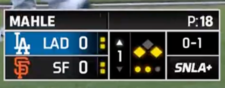
Both BravesVision and Sportsnet have also added the ABS indicators within the past few games. The Dodgers also fixed the rather unusual placement they were using before (which put them in the corner where the pitch clock was) in favor of using vertical pips like everyone else so far (with an ad for SportsNet LA+ appearing in their place).
-
Since it doesn't operate in Canada, Sportsnet has been using a version of the ABS screens without the T-Mobile sponsorship/branding. Now it's got a sponsorship from the eyewear retailer Specsavers (which had already been sponsoring replay reviews on Sportsnet recently; both cases have been using the tagline "A Closer Look"). You may remember them from the upside down ads they were running during the postseason last year.
-
Some more observations: CHSN has started overlaying the pitch clock as an augmented reality graphic near the mound. As far as I know, they are the first to do this. The Mariners will be airing 10 games on broadcast TV in Washington, Oregon, Montana, Idaho, Alaska, and Hawaii, with KING 5 as flagship. https://www.mlb.com/press-release/mariners-king-5-tv-announce-six-state-list-of-telecast-affiliates Speaking of Seattle, I've noticed that the Mariners' MLB Local Media productions (both this year and last year) frequently use a type of "panel" graphic above the scoreboard that appear to be completely unique to them, and have not been used by any other team. As much as I detest them for how dated they look, this is a detail that does make them stand out in terms of presentation. I think I may have an explanation for them: the old ATTSN/Root graphics did similar "toasts". Given they maintain team-employed staff, it may have been added to replicate this functionality.
-
Angels' Not Quite FanDuel Sports Network added ABS lamps. Unsurprisingly, they're following everyone else in placement (not to mention the Bally graphics already used that particular style of lamp for timeouts in its uncommonly-seen football mode)
-
Not quite. New inserts, but in-game graphics are still the same as last year.
-
Make that 3, SportsNet LA is doing it too Though ... they missed the mark. A lot.
-
The BravesVision intro has a callback to the old TBS theme music
-
CHSN and MLBLM are so far the only broadcasters to have lamps for challenges remaining on their scoreboards (with CHSN basically doing the same design MLB did)
-
Mostly based on the RSN graphics, but there are some new elements. The texturing and team logos on this version of the scorebug makes it look a lot nicer.
-
Rather than go MLBLM, the Angels bought out FanDuel Sports Network West from Main Street and got an interim deal with the Los Angeles Kings for their next season; their first spring training game had a few noted changes to strip the FanDuel branding (even though the team didn't announce any specific rebranding plans ... yet. May I suggest "Prime Sports"?), and they appear to be keeping the Bally graphics for now (becoming, notably, the only MLB team to still be using them). A side effect of this ownership transition is that the remainder of the Kings' 2025-26 season will move to FanDuel Sports Network Prime Ticket SoCal (likely due to the new ownership not covering the SoCal channel and the rights for this season still being owned by Main Street, but also probably as overflow because I'm certain they were operating under the assumption the Kings would be the last team it ever covers. The Clippers live on SoCal, and the fate of that channel will depend on whatever they do).
-
Yesterday was the first BravesVision game. It's using the Gray Media graphics that the OTA games use, except they moved the scorebug from the top-left to the bottom-right.
-
Swiss has been disappearing from anything NBC Sports-related. Though Barlow looks less jarring than what Golf Channel replaced it with. Meanwhile, as with last season, the Mariners have a Spring Training-specific scoreboard (but will undoubtedly be using the MLBN one later). This one is giving me real "NFL preseason" vibes and, honestly, with some polish, it could probably work as a full-time one.
-
NBC figured out NHL-style "digitally-enhanced dasherboards" and is substituting the Milano Cortina logos on the boards during hockey with ads for the primetime show and specific events. Feels a bit excessive.
-
As for the OBS graphics, they seem to be still following most of the design first used in 2021 but some of the scoreboards have been updated, most noticeably on curling and hockey. The hockey one is now pretty much in line with typical NHL scoreboards, complete with shots on goal. It is giving me MLB Network vibes, except teal. Though this "Winter Olympics™" tab they're putting on everything is getting annoying (they did something similar in Paris but without the ™ on it, but at least it did eventually change to things like "Gold Medal Match"; would it be easier to just slip a "Women's Group A" in there?)
-
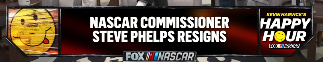
Unless we get a shenanigan like the NFL where the studio segments use one set of graphics, but the in-game graphics are the frameless/minimalist ones. We are getting a new NASCAR package this season, but it's going to debut during the Daytona 500 and not during Speedweeks/etc. like it usually did in the past. Though, the podcast Kevin Harvick does did switch their graphics to this recently, which does look quite a bit different than the "comic book" graphics they were using before.
-
general thread NBC Sports/NBCSN/Golf Channel/NBC RSNs Thread
Viper550 replied to WCAUTVNBC10's topic in Sport Center
With the Versant spin-off and other things happening, there appear to have been some slight font changes on NBC/USA broadcasts still using pre-2024 graphics, largely replacing the previous fonts from the 2015 graphics with a more generic sans-serif. This has been most apparent on motorcross, Notre Dame hockey, and Golf Channel (which is still using the graphics they used before, but with a different font, and their previous "G" emblem making a return) -
Before today's divisional game, ESPN was apparently testing a new MNF graphics package possibly for next season. This iteration looks more like its iterated from the CFB scorebug, with some elements of CBS's and the NBA one for good measure. I swear I did see a few "tower" graphics that looked like they matched up with this look rather than the current graphics too.
-
Looks more like a refresh than a full-on overhaul, and honestly it looks more streamlined. They went through the effort of making unique touchdown animations for every team this season, and those utilize a similar art style/incorporate the "hub" into them, so I wasn't expecting something new unless it were adapted for that.
-
It also looks like the bar will turn black for primetime programming, if The Weekend Primetime was any indication last night. In general it looks like a mix between the previous MSNBC graphics, CBC News (with the behavior of names/titles being separate from the L3), and a sports studio show (where I see centered text like this a lot more often)
-
The New Orleans Pelicans have also dropped the stock (W)NBA scorebug in favor of a new one: this, specifically, is a new standard graphics package for Gray's sports broadcasts, which originally debuted during their Atlanta Braves spring training package from earlier this year. It's not bad and feels like an evolution of one of the old Raycom Sports packages from back in the day.
-
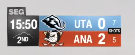
TSN updated their scoreboard, adopting some visual elements from the CFL scoreboard they debuted this season (which went to a centered box akin to NBC and ESPN's CFB graphics). SEG Media also adopted the new Mammoth graphics for Utah Jazz games too, with a similar design but a white/silver pod for the clock/quarter rather than black.
-
Root Sports is closing in 2026, MLB Local Media will be taking over distribution for Mariners games next season. https://www.seattletimes.com/sports/mariners/mariners-are-shuttering-root-sports-network-after-regular-season/
-
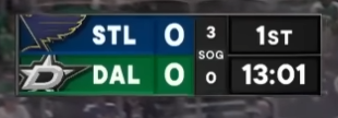
Preseason has begun and we already got some scorebug changes here and there on the NHL front: Victory+ has updated graphics on Dallas Stars games The newly-rechristened Utah Mammoth dropped the MLB Network graphics for a custom look, and I actually like it. Kinda reminds me of MSG's (which, I must also add, finally added a shots on goal counter this year too), with the clock/period area being shaped like the state itself as a nice touch
-
ESPN's annual High School Kickoff showcase has revealed ESPN's third different college football graphics package in a year new "main" college football graphics for the upcoming season. As expected, most of the graphics follow elements of both the SEC and CFP graphics we had already seen.

-
Meanwhile, the Jets have the current CBS graphics now, and the Jaguars actually updated theirs (Twitter isn't embedding though)