Viper550
-
Posts
1159 -
Joined
-
Last visited
-
Days Won
2
Content Type
Profiles
Forums
Articles
Everything posted by Viper550
-
Only significant change I've seen so far, is that the Commanders are now using the 2015 CBS graphics rather than NBC graphics (they had moved to WUSA last year).
-
general thread NBC Sports/NBCSN/Golf Channel/NBC RSNs Thread
Viper550 replied to WCAUTVNBC10's topic in Sport Center
NASCAR -- one of the few remaining properties to have used the 2015 graphics -- has a new look. Given NBC Sports was the producer of Amazon's NASCAR coverage earlier, the new graphics are largely a variant of them with different fonts (although the Prime version, aside from the use of the bold italic font from the TNF graphics, actually looks more NBC-ish by using the fonts from the Sunday Night Football/CFB graphics) https://x.com/TVSportsUpdates/status/1952084514001314079 https://x.com/TVSportsUpdates/status/1952094104197955598 -
Fox decided to work in some of its NASCAR graphics for the (rain delayed) game at Bristol Motor Speedway, although they didn't go as far as to make a custom scoreboard too.
-
KCPQ did some changes today: most newscasts from 4 p.m. onward are now branded as "Seattle News Tonight". An exception is the 6 p.m. hour, which is now split between "Washington News Wrap", a re-scheduled "Washington Sports Wrap", then the joint West Coast News Wrap. And Good Day Seattle is also going to get one more hour soon. https://www.adweek.com/tvspy/fox-seattle-expands-news-lineup-and-adds-streaming-content/
-
Some things of note that may or may not have already been mentioned: The Lightning are joining the Panthers and moving to Scripps Sports next season from Fox Bally FanDuel Sports Network Sun; WXPX is going to shift from Ion to an independent to become its flagship station Something odd I've noticed in Sportsnet's Stanley Cup coverage is that very recently, the network has switched to using a bug of the Rogers logo instead of the Sportsnet logo during Stanley Cup coverage. No other changes to the graphics (which are still primarily branded with Sportsnet logos, with the Hockey Night in Canada brand heavily downplayed despite the CBC simulcasts; the previous graphics package/Stanley Cup logo had a Sportsnet/HNIC co-branding on either side), and all of Sportsnet's other programming/broadcasts still use a Sportsnet bug. The CBC simulcasts also still use a CBC bug.
-
The Pirates quietly dropped the standard-issue-but-grey NESN scoreboard for an updated version during their home opener It's serviceable and definitely an improvement (though the white backgrounds on the batter/hitter is a bit iffy. Would probably make them color coded for the teams)
-
According to that other site, the Braves on Gray graphics are actually the first outing for what will eventually be a group-wide graphics package for regional sports broadcasts on Gray channels.
-
Gray's Braves Spring Training games have their own graphics that aren't too bad. It's serviceable with that "NFL preseason"/late-2000s Raycom Sports vibe. Even though they are going to be produced by FDSN instead, you begin to wonder if the regular season games may keep these, since they went as far as even making a "Braves on Gray" branding for them.
-
So far the studio graphics on the pre-game are brand new and do not appear to match up with these. In fact so far they may actually be an improvement, and may actually lend some credence to the theory this may be a decoy, some other test version that is not going to be used (though if they did that layout but with the trim/design of these graphics we're seeing...), or someone going a lot harder in trying to make fake leaks than usual. Now, of course, we've seen Fox basically "chicken out" on debuting graphics before (LI), but the last two games they have been consistent.
-
Kinda looks like an ultra minimalistic take on the ESPN CBB/SEC on ABC graphics with how it handles the "slide-outs". The team names being in a typeface that appears to actually be derived from the Fox logo is a neat touch, though this looks like something you'd see on a preseason game rather than the Super Bowl. Somehow this makes the college football graphics look good.
-
There's another one going around claimed to be a test from a satellite backhaul but it looks so absolutely plain that I don't think Fox would do it.
-
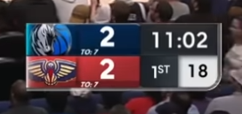
Missed this (though given the team got some, err, attention just now), but in December the Mavs switched to their third scorebug in several months (or second if you count changing the NBA-provided one to use your team font more of a half-step), and this one looks a lot more final. It's pretty clean.
-
Netflix gets some creativity points for actually having a dedicated graphics package built around their logo (with CBS producing, I thought it was going to be just a rebranding of their graphics per the precedent of the Yahoo games from earlier). Though this scoreboard looks a bit iffy, almost like it's a preseason game on a Gray station. Not to mention the preseason-like errors (such as the Steelers somehow starting the game with only two timeouts)
-
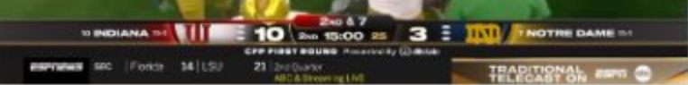
The new CFP graphics were interesting. They definitely felt like an evolution of both the existing graphics and the SEC graphics, while also having clearly adopted some elements of the MNF graphics. https://x.com/FOS/status/1870281123609092348 Meanwhile as was reported earlier, despite how surprisingly competent their Mountain West coverage was, the CFP games on TNT are ESPN productions, just with ESPN logos replaced by TNT Sports on the graphics.
-
We may have a new scoreboard coming for non-SEC ESPN games, specifically debuting during the College Football Playoff. I was personally expecting the SEC one but more white and gold; this appears to be a hybrid between the SEC on ABC scoreboard and the current one. The fact they adapted both the Saturday Night Football and CFP logos into the same SEC template indicates this is probably the look going forward.
-
A promo for the CFP rankings show has a logo that follows the same "shield" template as the SEC on ABC. Though except for the bracket graphics (which used a completely different style of graphic to anything else), the current studio graphics were otherwise out in full force
-
All the new teams with OTA broadcasts this year (except for the Trail Blazers which continue to use their Fox NFL 2020 knockoff) are using a generic NBA-provided graphics package for team-produced broadcasts, which had debuted on Jazz games last season (albeit tweaked; the clock is bigger with a black background now, which doesn't make it look as Bally-ish)
-
For some reason, I'm betting this is not going to be the end for Bally's stupid graphics. I'm betting they're just gonna take all the Bally graphics and make them blue and flatter. Or only change the intros and make the B in the ticker the FanDuel emblem, and nothing else.
-
Another new scorebug from Amazon for its new NHL package in Canada; uses the same art style as their Premier League (UK)/NWSL graphics (which have some hints of the Thursday Night Football look but flatter) An interesting feature is that the power play clock (displayed on the circle with the Prime logo on it) has a little countdown border
-
CHSN suddenly dropped the "banner" scoreboard it was using after criticism from viewers over its use in the NBA; both NHL and NBA now use more typical designs (though they may need to adjust how it interacts with the goal animation since it was clearly meant to go above the vertical scoreboard).
-
Or HDNet's obscure NHL package from the early 2000s
-
CBS did a few subtle changes this week, namely changing the down and distance arrow font to the condensed font that some graphics use, and bolding the font used for team names. The weird alternate "light mode" version of the scoreboard has also popped up.
-
Panthers unsurprisingly have the Scripps graphics from Golden Knights games, which are serviceable Meanwhile, the Utah HC games are still using the NHL/MLB Network graphics but with SEG Media branding, implicating that these are remaining team productions rather than Scripps Sports productions from the top down (as the Utah Jazz games also have that branding and a league-provided graphics package -- which is used primarily by some WNBA games)
-
Morgan Murphy and the former Marks Stations
Viper550 replied to tyrannical bastard's topic in Corporate Chat
Morgan Murphy did one more thing last week, moving WJMN's MNTV schedule to 3.3 in favor of mirroring WBUP's ABC and The CW (itself simulcast from WBKP) on 3.1 and 3.2 -
Graphics feel like a mix of TNT with some CBS-esque stylings. Besides the size I'd say that's pretty nice. MSG also has new graphics


.png)