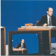
WWUpdate 1290 Posted September 15, 2019 Share Posted September 15, 2019 This is how good TV news graphics can be when a TV station is not afraid to embrace the 21st century -- when it gets rid of rock-inspired theme music, glossy computer game graphics, logos that are better suited to sports team than TV stations, and other detritus -- and embrace grown-up sophistication instead: Link to comment Share on other sites More sharing options...
TSSZNews 1046 Posted September 15, 2019 Share Posted September 15, 2019 I don't necessarily believe there is one right "look" for TV news - it all just depends on the message the brand is trying to convey. There can definitely be sophistication in 3D - and 2D can look super tacky (see: TEGNA.) It comes down to process, development, and execution. Franceinfo isn't completely my cup of tea, but I don't necessarily think it's a bad design. Link to comment Share on other sites More sharing options...
WWUpdate 1290 Posted September 15, 2019 Author Share Posted September 15, 2019 10 minutes ago, TSSZNews said: I don't necessarily believe there is one right "look" for TV news - it all just depends on the message the brand is trying to convey. There can definitely be sophistication in 3D - and 2D can look super tacky (see: TEGNA.) It comes down to process, development, and execution. Franceinfo isn't completely my cup of tea, but I don't necessarily think it's a bad design. What I dislike most about most TV stations' approach to design is their unwillingness to be different and to take risks. If something is not consultant-approved these days, it's essentially off-limits as far as most stations are concerned -- and this shows on the air. That's why I really like what TEGNA is doing. And, yes, 3D graphics *can* also be elegant, but I surely haven't seen too many examples of that recently. Link to comment Share on other sites More sharing options...
susquvalleywgal 494 Posted September 15, 2019 Share Posted September 15, 2019 5 hours ago, WWUpdate said: This is how good TV news graphics can be when a TV station is not afraid to embrace the 21st century -- when it gets rid of rock-inspired theme music, glossy computer game graphics, logos that are better suited to sports team than TV stations, and other detritus -- and embrace grown-up sophistication instead: If Apple Stores had a news set … it would be this. Very beautiful open and functional set. The circles in the open tho for me is a little over excessive. But other than that … magnificent. -- Matt Link to comment Share on other sites More sharing options...
TVIntheDesert 183 Posted September 16, 2019 Share Posted September 16, 2019 6 hours ago, WWUpdate said: What I dislike most about most TV stations' approach to design is their unwillingness to be different and to take risks. If something is not consultant-approved these days, it's essentially off-limits as far as most stations are concerned -- and this shows on the air. That's why I really like what TEGNA is doing. And, yes, 3D graphics *can* also be elegant, but I surely haven't seen too many examples of that recently. The best graphics in American TV over the past five years were with the Dispatch stations. Now that they're TEGNA, I can see them screwing it up big time. Link to comment Share on other sites More sharing options...
C Block 1488 Posted September 16, 2019 Share Posted September 16, 2019 What’s also so great about the franceinfo look is that it’s very modular. There are differently sized lower thirds for different uses along with different colors. They also will emphasize certain facts, statistics, and other information in stories with really large text over the picture. I think this is something that US TV could very well adopt in the years to come. If you don’t fancy the franceinfo look, since we are mostly a local TV forum, then I’d suggest checking out how the franceinfo look was adapted to all of the France Televisions properties. That includes France 3, which is really France’s only local TV news system. It operates on a somewhat local/national model not unlike the UK. National: Regions. Take a look at the sets as well. This is something that could easily be pulled off in the US. And here’s the interpretation of the same (but different) look on France 2’s 8pm news, which is one of the two flagship nightly national newscasts. I also still love the France 24 look, which elegantly combines 2D and 3D design. This debuted six years ago and has had only very minor alterations. It still looks great. Link to comment Share on other sites More sharing options...
TSSZNews 1046 Posted September 17, 2019 Share Posted September 17, 2019 I'll second the accolades for France 24 look - that has aged VERY well and still feels very urgent and sophisticated. Link to comment Share on other sites More sharing options...
PTVNews 188 Posted September 17, 2019 Share Posted September 17, 2019 What's up with the mics on the desk on France 3? Link to comment Share on other sites More sharing options...
JosiahCubed 238 Posted September 17, 2019 Share Posted September 17, 2019 6 hours ago, PTVNews said: What's up with the mics on the desk on France 3? I believe it had to deal with costs. Link to comment Share on other sites More sharing options...
C Block 1488 Posted September 19, 2019 Share Posted September 19, 2019 On 9/17/2019 at 5:07 PM, JosiahCubed said: I believe it had to deal with costs. Its really more of one of those peculiarities of French television. For the longest time, they’ve put the mics in the desk on news programs instead of using lav mics. I assume that’s partly because, up until very recently, French news was very formal with the anchor almost never leaving the desk. Now, especially on the France televisions properties, they’re trying to have anchors more engaged and standing up, so they of course now need to have lav mics. But you’ll still see the mics in the desk for other reporters and guests. I suppose it might help with cost too, and honestly I think it’s probably not a bad idea, but definitely something we don’t really do over here. Link to comment Share on other sites More sharing options...
WWUpdate 1290 Posted November 2, 2019 Author Share Posted November 2, 2019 Some more avant-garde news graphics on display in this news promo from Arte, a binational channel based in France that produces its news (and other programming) in two versions, French and German. It's an "alternative," highbrow channel and its appearance reflects that orientation: Link to comment Share on other sites More sharing options...
WWUpdate 1290 Posted December 18, 2019 Author Share Posted December 18, 2019 And here's a German-language news open from Arte -- with some wonderfully contemporary graphics and music: Link to comment Share on other sites More sharing options...
WWUpdate 1290 Posted January 20, 2020 Author Share Posted January 20, 2020 Here's another clip of Franceinfo TV -- it's nice to see how versatile and sophisticated this entire look is: Link to comment Share on other sites More sharing options...
ns8401 846 Posted January 20, 2020 Share Posted January 20, 2020 I think I’ll stick with what we have... however I like the music on the French one... I can’t stand all the junk floating above the lower thirds as an intro with the bubbles and arrows.... it’s much more cluttered than anything you get here... American consumers would find this... boring... they aren’t really interested in straight news as much as confrontation and excitement... that’s the part that really needs changing before we talk graphics... I actually ended up not going into the business because I got to see the sausage being embellished to dress up a story and it didn’t feel right... the photographer I got to ride around with was from Britain.. didn’t get along with him often but I did manage to get him to talk about the differences between his time at the BBC and his time state side... fascinating conversation... Link to comment Share on other sites More sharing options...
WWUpdate 1290 Posted January 20, 2020 Author Share Posted January 20, 2020 15 minutes ago, ns8401 said: American consumers would find this... boring... they aren’t really interested in straight news as much as confrontation and excitement... that’s the part that really needs changing before we talk graphics... And that's the sad part. Unfortunately, many people "prefer" confrontation and excitement because they have been conditioned to expect that over the decades. Cronkite's newscasts contained neither confrontation nor excitement, yet they got incredible ratings and made him the most trusted person in the nation. Sure, the era before audience fragmentation had many drawbacks as well, but there's much to be said about the news values of that time. By the way, The Newscasters by Ron Powers, published in 1977, is a very prescient book about the decline of television news in America. Link to comment Share on other sites More sharing options...

Recommended Posts
Archived
This topic is now archived and is closed to further replies.