
Leaderboard


Popular Content
Showing content with the highest reputation on 09/08/18 in all areas
-
The I doubt the logo was changed with the express purpose of attracting the 21-54 demographic, but I'm sure that played a part. "Young people don't watch local television" is exactly the kind of thing they would be trying to change with a "hip" new logo/brand. This isn't the first time this debate has come up about a TV station logo. I'm kind of getting tired of it. I don't think a lot of people on here understand the "usual" process that happens with this kind of change, especially when it comes to large markets and large broadcast companies like Scripps (who LOVES to research and focus group everything they can.) A logo change could stem from dozens of carefully researched problems a station is facing. If ratings are down, maybe it's time to conduct market research. Maybe the market research shows that the ol' reliable "classic" logo from 1973 isn't memorable after all amongst any age group. Maybe only senior citizens can remember what the "circle 5" logo means. Maybe they're even shown the old logo and a new logo next to each other, and asked: "which of these TV channels would you rather watch?" I've seen (older) market research before, and it can even include showing people photos of talent and asking them who they are and what station they're on. It may shock you, but quite often people can't match a name to the face or a name/face to a station. And then comes the focus groups. They might be shown the same news clips with different logos/bugs and, days later, asked which logo they remember seeing. People tend to remember more simple things, which is why most brand logos are pretty simple. Market research is a science. There are big research companies that do this every day. Just because an old logo works on one station, doesn't mean that it's a universal fact that all viewers love classic logos. Changing the logo back to the Circle 5 is not going to make ratings skyrocket, and I doubt anyone tuned out because the logo changed. This is going to sound weird, especially after all I just said, but the vast majority of people don't care about a TV station's logo. The real goal is to make them remember the logo and remember the station and make the gears in their head turn when they're at work the next day, talking about something they saw on TV. I will also argue that WISN has updated their logo several times over the years, changing the fonts and colors (and for a while, the angle) to keep up with the times.5 points
-
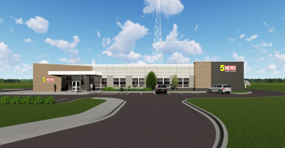
Here’s what KFSM’s new building will look like: http://www.bild-architects.com/projects/new-northwest-arkansas-news-studio-for-channel-5-news-kfsmkxnw/
 3 points
 -
WCVB poaches another key reporter from crosstown WHDH; this time it's Jennifer Eagan. https://www.boston.com/culture/media/2018/09/20/a-local-tv-reporter-is-moving-to-a-rival-station3 points
-
And those same asshats are too afraid to send that truck to a hurricane...or a wildfire. Why? "Because it might get broken." Parking asshat meets corporate asshat.3 points
-
Man, don't you hate it when asshats park their big trucks across multiple spaces?3 points
-
Massive trolling would be putting a Russian flag outfront.3 points
-
That's not really how that works. First off, NXT is not the brand, it's a graphic that's a stylized shortening of the word "next". Second, whatever trademark WWE has for "NXT" would be limited to wrestling. In fact, since I found it, the registrations WWE has for "NXT" are essentially limited to merchandise related to the league and wrestling broadcasts on TV and online. A quick search of the US Trademark database lists 200+ trademarks using "NXT" (including at least six that are exclusively the letters "NXT") as trademarks for things like Artificial turf Sports drinks enhanced with minerals; Sports drinks, namely, performance drinks; Sports drinks, namely, recovery drinks Retail store services featuring manufactured homes management of multi-tenant living facilities Vacuum cleaners and vacuum cleaner parts Semiconductor lithographic machines, namely, lithographic machines used to manufacture semiconductors, and structural parts therefor Water treatment equipment, namely, water filtration units. Electric battery fast chargers TL;DR There's nothing stopping them from using a graphic that says "NXT" in promos.1 point
-
I doubt if ABC does it, this Television season because if they did then there's no way WFAA moves their 12pm newscast to 11am1 point
-
KATV 10pm, 1987.1 point
-
For some reason his show bombed on WEWS, to the point they flipped timeslots with it and a double run of Right this Minute (!). Oz has done well at WJW since they added him, however.1 point
-
Oh you mean my avatar..one Mr. Cheatwood who created the greatness of 7 News back in 1989. Sir..sadly Mr. Cheatwood works for a competitor now since Scripps wouldnt take any of my ideas. I'll show them. [end sarcasm]1 point
-
Okay. Follow-up. Someone uploaded this. This is from KETV. They're also will be airing GMA Day at 11am/CT on Monday. [MEDIA=twitter]1036699244202262533[/MEDIA] I know I said earlier it was doubtful, but now I wouldn't be all that surprise if the network supply an earlier 12pm/ET feed for these stations (WBRZ & sister station KRGV; along with KETV). And should that be the case, this would be the first time since Port Charles that the network supplied an earlier feed for one of their daytime shows.1 point


This leaderboard is set to Chicago/GMT-05:00