
Leaderboard


Popular Content
Showing content with the highest reputation on 06/30/22 in Posts
-
WABC is currently hiring a new creative director of design https://abc7ny.com/31669/2 points
-
I’m a big fan of how GMA has been ending the show on days with musical guests by letting the interview close out the program rather than rushing an interview for an ad break just to come back for a 10 second sign off.2 points
-
In WALA's case, it's filling the two hours for the outgoing The Real at 10 and Nick Cannon at 11. Wasn't Judge Jerry cancelled as well? If they do two hours of Studio 10 and a 2 hour Midday newscast, that would be 8 1/2 hours of local news and programming. I know Gray is ramping up their local news and programming efforts, but this could be the most of any market in the country up to this point, and a sign of things to come for local TV as we know it...1 point
-
WALA FOX 10 is expanding Studio 10 to TWO hours and adding a midday newscast this fall. Not sure if the midday news will be on at 11am or noon. Joe Emer announced this morning on Good Day Gulf Coast, and he will be moving to these new shows, bringing Eric Reynolds back to the program with Sarah Wall. Eric currently anchors the 4:30-7am portion. That's the first time I've seen a lifestyle program expand to 2 hours....has this happened anywhere else?1 point
-
Is this confirmed? WABC’s on-air look is a special kind of bad, easily the worst in the market.1 point
-
Until the graphics debut, there is zero reason why it deserves its own discussion in the individual station threads. Besides, WABC's inability to be trusted with their own look is one of the reasons why a group-wide package is necessary.1 point
-
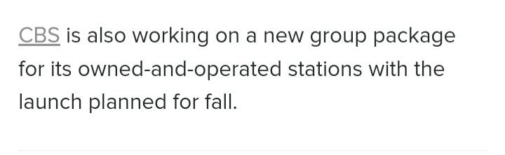
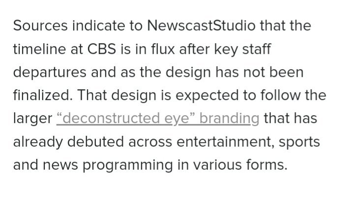
We have confirmation on new O&O graphics from NewscastStudio.
 1 point
 -
This looks FANTASTIC!!! I hope the complete package is just as sharp...1 point
.thumb.png.3d66a1eeb7ecf5404151f8a77ea7cbfd.png)

This leaderboard is set to Chicago/GMT-05:00