mightynine
-
Posts
304 -
Joined
-
Last visited
-
Days Won
14
Content Type
Profiles
Forums
Articles
Everything posted by mightynine
-
Fox News does have a few payoffs from legal rulings to deal with and cuts will come from non-essential areas, like, say, your somewhat new weather channel that may or may not be getting a lot of eyeballs.
-
Someone has uploaded the full hour to YouTube. They've recreated more than one Local Forecast intro plus there was some limited narration, regional conditions plus satellite and radar and even a travel cities forecast! This is an unusually decent effort for something that runs at 4 in the morning.
-
Well that's....random. With a little bit of tweaking this could be an interesting take on the retro graphics. Or maybe they could just reach out to the Youtubers who got the original hardware up and running and do a different piece of equipment every night of the week! If you're looking for this on your schedule, it's called Retro 8s Live, followed by Twilight Live.
-
As an aside, HLN has updated its logo. In use on-air, not on their socials. And maybe a new tagline: "We play favorites".
-
It's a minor change, and it's....ok. Still way too much mix and match on font weights, the now no-longer rounded edges on things like location bugs feel misaligned since I think the space is still there for the curve but now it's just an edge, the gaps between the name of the reporter and title like above feel way too big, that all caps on the flipper is a big no... Ok, so maybe OK is a little strong. Slapdash feels better. I wonder if they might be experimenting a bit to see what may or may not work rather than just loading up the old graphics template and calling it a day.
-
Looks like a paid program (which would make sense considering the time) decided to make their own logo, IMO. EDIT: Considering the show appears to be a Daystar (Christian broadcaster) program, highly unlikely this is official from WWJ. In fact, I’m a little surprised at the liberal use of the Eyemark.
-

ABC changing their logo; New graphics coming for ABC owned stations
mightynine replied to Briella's topic in Graphics
Looks pretty good to me. -
This has nothing to do with ability or training, this is a cost-cutting measure, plain and simple.
-
Collins will still be a go, but I wonder if "King Charles" will get quietly cancelled. Maybe moved to a weekend slot, seems silly to break up your newest host's week like that.
-
New York Times reporting this too. And so is CNN’s Oliver Darcy.
-
Quite the contrary. This is the Saudi's basically buying control of world golf.
-
Everybody's got a price. https://thestreamable.com/news/breaking-pga-tour-liv-golf-tour-agree-to-merge-into-global-golf-organization
-
I would call this an improvement, honestly. That gigantic box above the logo never looked good, IMO. Might look even better without a tab over it.

-
https://thestreamable.com/news/bankruptcy-reveals-bally-sports-plus-only-has-203k-subscribers-is-streamer-closer-to-closing-than-hitting-10m-goal Yikes.
-
If you're an Apple News+ subscriber, you can read it there too. And yeah, I agree - this article is pretty damning for Licht. Not a good look at all.
-
I believe this is still that typeface, just a thinner, narrower weight. There's some spacing issues to me, especially when you go to the two line identifier, that make things look a little TOO thin. But put it next to the old look, and I'd have to say the new look is cleaner:
-
Eight CBS Stations to Ditch CW and Go Independent This Fall
mightynine replied to AKA's topic in General TV
Considering the path the other CBS O&Os have gone, call letters in a box is probably more likely than not. It would easily slot into any CBS News (Local Name) graphics set. -
CBS Sunday Morning - Will it Ever Go Back to Live?
mightynine replied to Jascarter's topic in Network News
-
Those don't look that great. Feels like a step back rather than an evolution.
-
Fell right back to their normal 3rd place levels. Gained zero momentum from the town hall.
-
This week, Chris Licht will show his programming genius by running the town hall every night in Primetime with Kaitlyn Collins and Anderson Cooper is a box in the corner shaking their heads at anyone who doesn't like it! Also, new CNN slogan: "Get Lichted"
-
Wonder if the fact Trump walked all over her in the Town Hall will give anyone second thoughts. Then again, she got her start at the Daily Caller, so maybe she had no intention of putting up much of a fight.
-
Eight CBS Stations to Ditch CW and Go Independent This Fall
mightynine replied to AKA's topic in General TV
A rebrand from the CW, IMO, is a matter of when, not if. -
Eight CBS Stations to Ditch CW and Go Independent This Fall
mightynine replied to AKA's topic in General TV
Clearly positioning for potential local sports opportunities as RSNs fail, and also I wonder if we could see some simulcasts of CBS Sports HQ or CBS News Streaming? Even better question - are there options for the CW in those markets? -
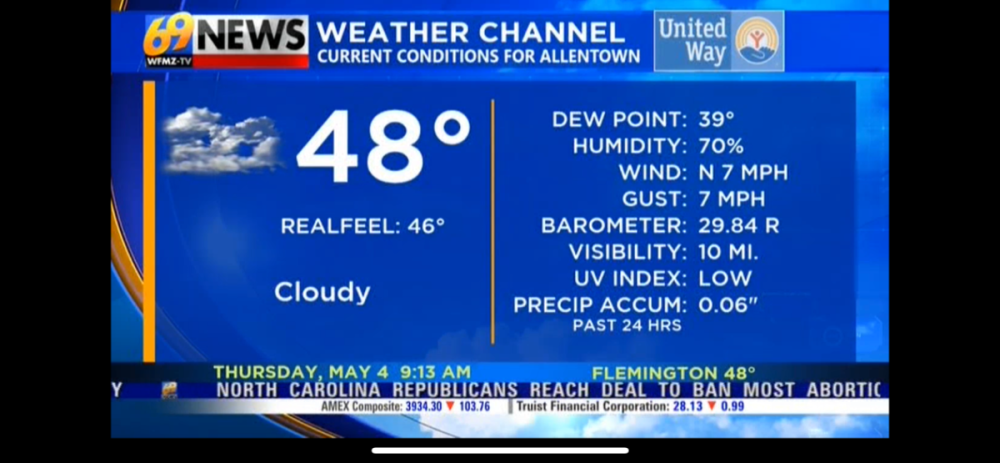
The 69.2 Weather Channel even got a refresh. Looks good.