
Leaderboard


Popular Content
Showing content with the highest reputation on 09/21/21 in Posts
-
The O&Os still have the rings on because with the Winter Olympics only a few months away, there's no use turning them off.3 points
-
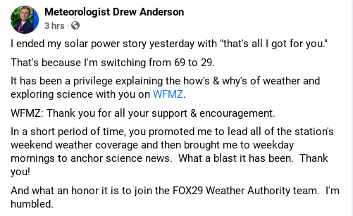
Drew Anderson will be joining the Fox 29 Weather Authority team from WFMZ, where he worked weekend mornings. He is a great meteorologist and will be an awesome edition to their team.
 2 points
 -
I totally agree with you. It’s strange that we got warm colored, glossy and textured graphics in the age of standard definition, and all this flatness in the age of 4k and HD when tv’s would really be adept at displaying complex graphics. To each their own but flat graphics really look cheap and amateurish in most examples I’ve seen. Hopefully flat becomes less ubiquitous as the decade goes on. We just need more creative diversity instead of one look everywhere!2 points
-
WEVU (WZVN) 5 P.M. and 11 P.M. Newscasts 19882 points
-
Washington as well1 point
-
WLNE ABC 6 News 1997 WRGB Newscenter 6 1990 KSTP Eyewitness News 1990 WKTV 2 News 1990 WFLD FOX News Chicago 1994 WFXT FOX 25 News at 10 promos 1994 WCIX (WFOR) 6 Action News promo 1994 WDAF Newschannel 4 prime time promos, I believe this around the time of KC's Big switch, 1994.1 point
-
I don't know about the black color in all honesty. I liked the glossiness from before. Both WPLG and WPBF actually shrunk the abc logo from the previous one. And they are certainly smaller overall than before.

 1 point
 -
LOL! It’d be cool if Lynn White and John Muller could work together again1 point
-
The ABC logo's design does not stray too far from the 1962 Paul Rand original. The "b" is slightly shorter, the "c" has a smaller gap and all three letters are centered, but the logo is still instantly recognizable. The reason for the centering of the letters, is to add an outline to the circle/dot in some inverted applications, such as an on-screen bug seen during ABC's network programming.1 point
-
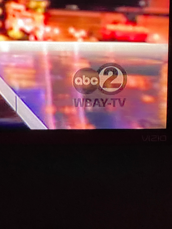
It looks like affiliates will also be rolling out new after-break logos during network time, at least. WBAY and WISN changed theirs today.
 1 point
 -
Between images of WLS & WPVI, and a report of change at WTVD, it appears that the network mandate forced the O&O's to change the logos in network promos in time for tonight's new season. I haven't seen anything from non-owned stations.1 point
-
I mean this is the same station that put someone like Sukanya Krishnan on air every AM for 15 years, I don’t trust them to pick talent wisely.1 point
-
'Today' (1982). Loving how sped up the format is at this point compared to the Brokaw & Walters years. Not too slow and not the ADHD level pacing of today. It also seems that they were frequently experimenting with sets. I've seen the blue version of this current set before but wasn't aware there was a brown variation as well. The sets from the late 70s up until the O.G. studio 1a (which was awesome) were all very well done.1 point
-
XETV-TV 6, Tijuana, Baja California, Mexico/San Diego, California, USA (formerly Independent/ABC/Fox/The CW, now Canal 5) "XETV-TV 6 News Up To Date" newscast with Ron Fortner, December 30, 1977:1 point
-
Two more videos for this rainy Saturday (i.e., relief to douse out nearby wildfires!) KNSD News San Diego Weekend Edition, 6/30/1991 - over-the-air signal so it's fuzzy I also have the first 90 seconds of KREM News at Ten on KAYU Fox 28, taped 1/8/1992. Now-Mayor Nadine Woodward and Charles Rowe are the anchors...they were together for several years on channel 21 point
-
nothing about this rebrand makes sense.1 point
-
This is totally true. Here we are in an era where we now have access to screens that have huge capabilities for resolution, gradients, color, etc. and designers these days are flattening everything out for some bizarre reason. They're not using the medium to it's fullest potential. It seems like most station groups are falling victim to the blue banner/white letter syndrome. I'm not saying for designers to make things look gaudy; I'm saying there needs to be more creativity to differentiate stations/station groups. Stations need to have more of an individual "visual personality".1 point
-
This 'flat logo' totaliarianism among brand circles in the name of working better on mobile / digital is misguided. TikTok - probably the most breakthrough mobile / digital brand of the last couple years has a logo that's explicit in giving the impression of dimension and motion, complexity. Is it a good logo? I could care less for it, but it hasn't prevented them from being easily identified in a mobile environment. Let the logo adapt to the medium. The bigger the screen, the more intricate and subtle the logo elements can be. Mobile can have a 'flat' look, and 4K TV something with dimension and texture. Yes I know a lot of video is repurposed for both screens, but the prior look was perfectly presentable on smaller screens. NBC seems to get this.1 point
-
WFLD, Chicago; 9 p.m., 1991 -- with a newly heard theme or just a different cut from the Tatgenhorst package?1 point
-
15 minutes of a July 2004 WCCO newscast: And the complete 5/20/1993 KNDO News 23 Late Edition, the night the final beer was poured at Cheers. Top story: that said finale, with Yakima-area watch parties.1 point
-
WJBK 1980 Newsbreak and promos.1 point
-
Thank You! Was always curious how WSVN’s flashy format would have handled something as cataclysmic as 9/11. It’s also interesting to see the WB Miami station using New York’s WB affiliate coverage, since the network had no national news service. Apologies for taking the thread back to that dark day but this video has a compilation of how several cable channels broadcast 9/11. Apparently Viacom networks (VH 1, CMT, and MTV) showed CBS News coverage, TLC carried BBC World News and even HSN carried some international news service. Facinating. I cannot think of another event in which entertainment cable channels suspended programming to carry a national news event other than BET carrying CBSN coverage of the Derek Chauvin verdict in 2021.1 point
-
WBOC Delmarva report 1988 KPLC SevenNews 1984 KGWN Newsource 5 Newsbreak 1995 WBOC Delmarva report Newsbreak 1998 KTVO Image campaign 1995 KGWN NEWSCHANNEL 5 2000 WWLP TV 22 Blooper reel 80s1 point


.thumb.png.3d66a1eeb7ecf5404151f8a77ea7cbfd.png)


This leaderboard is set to Chicago/GMT-05:00