
Leaderboard


.thumb.png.3d66a1eeb7ecf5404151f8a77ea7cbfd.png)
Popular Content
Showing content with the highest reputation on 06/16/23 in Posts
-
Thread cleaned up and unlocked. The user that initiated the disruption has been banned. In the future, I humbly ask members to use the "report post" function and the block tools built into the forum over "backseat modding" users disrupting a thread. -Weeters13 points
-
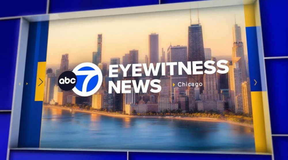
Well I'll give them this - the open is very distinctive and has depth to it that takes full advantage of the big screen. That angled depth look carries over to the topical graphics. Not a fan of the generic wordmark - the prior one had more sophistication and was more unique. Overal - the prior package was great and better, this could have been worse, and points for effort on the open. For the music... I expected to hear KTRK anchor names after those first few notes, and interesting they went back to the 1992-2013 notes for the signature, after 10 years of going back to the 1983-1992 signature. Again I think the prior version was more sophisticated. Although like that they went pretty much unadulterated with the signature notes vs the original 1992-2013 version. Im going to guess the market research said people associate the teletype sound and the NS2K plus signature with WLS growing up so they mashed them together.2 points
-
No taking notes by WABC. They're getting it. All 8 stations are getting it. Period. WABC changing their wordmark is not clear, either way. 'Similar' is the point. The lower thirds (and likely yellow as an accent color) will be universal. It's the opens, segment brands, etc. where the stations have the freedom. WLS chose this cut for WLS. Everyone is doing their own thing. They're continuing with all the cuts they adopted in 2013, for closes, bumpers, etc. Sorry for the multi-quote. Just easier to break it down, point by point.2 points
-
Just watched the end of last night's 10pm - they're still using the Stimulus close1 point
-
Kelly Costa did a mix of live and recorded segments through at least 2:40am ET. The only reason I know this is because right now at 3:40am ET, they mistakenly have a segment in the prerecorded loop from exactly one hour ago, which contains live radar and tornado warnings/severe t-storm warnings from last hour. Same thing that happened last night, where a previously-live segment with active radar and warnings mistakenly aired in the pre-recorded loop an hour after it first aired live. Kelly did record some different non-time-sensitive segments earlier tonight that should be airing right now. Looks like they've got the wrong playback file loaded up.1 point
-
It's comparable to my doctor praising me for losing 3 pounds this year compared to one pound last year. Sure, the percentage of growth is big - but the reality is the audience is still not substantial. Their PR team does a great job selling a story that's all smoke and mirrors.1 point
-
I could see WABC doing a full launch at once. The weather graphics would be extremely out of place with what they have currently so I don’t see them doing a slow roll.1 point
-
So WLS, WTVD, and WPVI rolled out the weather graphics ahead of the package but the others could just roll out everything all at once at any time. It'll be a waiting game just like the CBS package.1 point
-
It was designed by Smith Geiger Vivid Zero who designed the rest of the ABC look.1 point
-
The fancy arrows DO have a purpose… they “move” the little line below the headline in the previews… you know… like you do in an app! Kinda like tabs that look like text boxes… it’s what all the kids are into right? I swear these ideas are from somebody about to retire who is about as hip as a heart attack.1 point
-
The pointless gloss that doesn’t emphasize anything, lens flares on top banners, and everything flying in/up/around This game can be played with any decorative element, and for the same reason your neighbor covers their house with Christmas lights, it’s there to draw attention. imo the graphics should complement the story, not distract from it, but the consultants often don’t seem to think so1 point
-
I managed to fire up the online newscast on my Apple TV so I can see what this looks like on a TV vs. my phone… the lower thirds owe royalties to somebody in Fargo, ND. There is no separation to the names of someone being interviewed and where they are from. A thin line between top and bottom would be awfully nice. The transitions where the graphic swings in and swings out again (weather for example) looks familiar… like 2012 familiar. Making your audience dizzy trying to read your graphic still isn’t in style. The best part of the package is probably the weather graphics. I never thought I would have a use for this but… *Cough* Why do TV news people have to have the same hard headed product philosophies as car executives? Keep it simple and don’t try to overflash or make it harder to read a graphic or see an image in an open. A large chunk of the viewers are older and may be turned off by it.1 point
-
There's not many things I dislike about this package. I'll agree the opens are a little busy, it will be interesting to see how they evolve over time. The music though... The music is bad. I am sure some people are going to love that previously unheard cuts of the "classic" music are being used, but hoo boy, they are 22 years old, and you can tell why they were tossed in a drawer in 2001 and forgotten about. My understanding is these might not have been their first choice, but for various reasons this is what they ended up with. It would be nice if they find the money in the coming years to commission something new. It's past time for some of these Gari packs on the O&Os to be put out to pasture, or at least updated to not sound like a bunch of 90's synth work.1 point
-
Obviously it has real time data - I meant “fake” in a more general sense, just questioning the design rationale behind it. It’s a lot of effort for such a little throwaway design element. I saw this on the NS write up and felt the same - would have made for a much cleaner open. There’s just too much to look at now.1 point
-
Found this on another site. I would honestly prefer this as the open. Its less busy and cleaner. This is just a still and I have no clue where this came from but it looks better than the current open.
 1 point
 -
The insert graphics are decent. The opens have a lot going on in them, I'm not sure I need a fake ticker and time/temp, but hey - props for trying something new. It's not the best O&O package out there but certainly not the worst and I think definitely an improvement over what most of the ABC O&Os have on the air now. Odd choice though going back to a very dated-sounding (well, it is dated, it's from the 90s) music bed... clearly they didn't want to spend the $20-30k for a few new opens/bumps?1 point
-
Those are fair points, but the package is still a massive upgrade for pretty much all of those stations (esp. WABC). Imo, it’s still on par w/ the other major network O&Os, and it looks far better than the packages the major station groups have put on their stations.1 point
-
The package looks good overall but you can sort of tell it took years to finally implement. Some of the design trends used here are now a tad bit past their prime (arrows opening up sliding elements, semi-webpage looking animation cues). Also I'm seeing some very minor similarities to the CBS O&O look, likely owing to the fact that Wendy McMahon was the driving force behind both.1 point
-
Earlier tonight in Brazil, Rede Bandeirantes' main newscast "Jornal da Band" launched their new set and graphics. It's hosted by Adriana Araújo and Eduardo Oinegue1 point
-
Does anyone actually think WPVI will get new graphics? The current package debuted a few years ago. They always march to the beat of their own drum1 point
-
If WLS is using music that dates back to 1994 (I think), I doubt WABC or KABC is changing anything music-wise (especially how expensive it reportedly is to commission upgrades from Warner Chappell). I could see them dropping talent opens, but that’s about it.0 points
-
They have one wallpaper sign with that logo in a conference room, but it's far more spaced out. (EDIT: Yeah that's the picture of it!) They also used it on their Hurricane Tracker last year as well. They did use that logo on a couple very short lived commercials mostly a year ago, and also used it on streaming when it was first introduced, but got rid of that too. Also, they used that plain typeface mashed-up with the 3D Channel 13 logo for Severe Weather Alerts during regular programming at the bottom of the screen, but got rid of that this year as well. They do have the regular logo in the newsroom, the studio, on their live trucks, and their newly redone open. They did introduce two new graphics that have the regular EWN font on them about 7-8 months ago, and another new one that they introduced maybe 1-2 months ago. Here's why I don't like it: The flag of the 13 represents Texas and the Eyewitness News is supposed to represent unfettered, unmatched commitment to "Caring About Texas" as their one of their slogan used to go. It looks different, because the station is supposed to be different than anyone else. Though as you can read below, they don't always uphold that legacy these days, that station's logo should at least serve as a reminder of the level of detail and difference that no one else should be able to match. The package is still good, but last year, they just keep making mistakes like going to black screens, pausing/restarting the graphic, or going to the wrong camera, misspelling words (even Eyewitness News!). Lately, it's been a lot better. They changed the studio's light to LEDs a couple years ago and that really made the set look off and some of the elements aren't lighted up as well as before, while others are way too bright. "Everything else about that station" = How do we get Channel 13 to realize what they've done to wreck their legacy?! I didn't want to say it, but current management has run that station into the ground. Remember 13 Undercover, where the station used to go after pubic officials that abused their office and taxpayer money without fear, and it led to people getting fired, prosecuted, and convicted of crimes? Today, KTRK is too afraid to even investigate anything anymore. The last '13 Investigates' story I saw was a report that a small city outside of Houston didn't have a hospital, or so the tease said. The reporter couldn't even pronounce the name of the city correctly and we're talking about a pre-recorded piece not a live shot! The story actually said that the old hospital closed, which Eyewitness News already reported on in 2016, and a new hospital opened about year later. It said there were either two or three dozen small counties, most with tiny populations, that don't have hospitals in the state, but that is already common knowledge. Calling that an "investigation" is a desecration to the legacy of Eyewitness News. Also as much a desecration to their legacy is calling stories "ACTION 13" where they help no one and solve nothing. Marvin Zindler's Action 13 used to fight for the downtrodden and get people the help they needed--at no cost to them. Lawyers, doctors, carpenters, electricians, exterminators, you name it, Marvin could make it happen thanks to Marvin's Angels willing to donate their services to those that couldn't help themselves. Someone's been ripped off? Call Marvin. Now who do you turn to? In my opinion, good reporting, getting it right, and fighting for the little guy and for what's right should be the only things 'management' should mandate. I've live here and watched KTRK all my life, so I hate to say it this way, but that current typeface is the best thing the station has left. Getting rid of it would be like admitting they don't know how to--or don't care to--uphold the legacy of 13 Eyewitness News. I'm sorry that's too long or too harsh, but to see a powerhouse station fall so far, so fast is the saddest thing that I never thought I'd have to an eyewitness to. --------------- You said it. It's not the TV news people, or at least I don't think it is. It's usually some ad agency that makes those graphics, but otherwise I agree with what you said. That's the one!! I knew it seemed familiar! Sadly, not the good kind of familiar.0 points
-
I agree, and I don't understand it either. Even in the 90s, KTRK had 3D graphics, many of which, still look better than some of these news ones and that's mainly because some graphics are either too busy or too plain in the WLS package. The pointless arrows that aren't pointing at anything, ellipse marks on top banners, and everything swipe in/up/around, looks busy and just doesn't look very polished. Not everything has to pop up or swipe on the screen. Changing KTRK's iconic workmark would be a huge mistake! For a station which a unique, rich legacy like theirs, you need a unique workmark to match. That logo, or ones that are nearly identical to it, have been in use at KTRK for all but 10 years of the station's 50+ years of branding it's broadcasts as Eyewitness News. I'd say keep the plain-Jane font for the lower-thirds (or stations that already use it).0 points
-
To me, as someone else here alluded to, this looks like a mash-up between WABC and KABC's current on-air look (WABC with the Lower Third and large font elements) and KABC with the titular wordmark graphic (ABC 7 EYEWITNESS NEWS) and a few other elements from both stations, put together to make this new look at WLS; the third largest market in the nation. Even the color schemes and the text and font elements are very reminiscent of both the East and West Coast flagship station's current look. The on-air appearance and graphics team at WABC needs to seriously take notes down on their sister's new appearance because this would be a logical upgrade for the nation's largest market. I could see this easily being adopted at WABC. Which would be a nice, but modest upgrade to their on-air appearance. Not sure if WABC will change their signature and iconic italicized "Eyewitness News" font/logo to this new flatter "Eyewitness News" look that KABC and now WLS is adopting but we'll have to see how it plays out. I think it could work. I'm not too sure if this package color scheme would work for KABC, where these large lower thirds would be a bit much for the LA viewers, but nonetheless, it is overall a decent on-air look but it needs a lot of work it feels rushed in my opinion. Maybe KABC could adopt these graphics and also use a lighter blue scheme to match their current looks, I don't think the dark blue colors would work, as it would also look very similar to KGO in San Francisco. Overall, I think it's a great look. The lower third font to me is just way too big and should be on the scale that KABC has in my opinion. The music arrangement of the graphics is just messy, unfortunately. It's too old! We are in 2023, not 1995 haha. They should've gone with an all-new updated theme altogether or at least go back to their previous News Series 2000+ which was more charming and more appreciated. I understand they are trying to keep the News Series 2000+ / WLS Signature but it doesn't flow well at all with the Eyewitness News theme. The opening cut is great, but that signature on the last bit just doesn't work. They should redo that theme altogether or find another suitable music cut for it. I haven't heard the rest of the theme but this new theme just doesn't work, I hope this is not what WABC and KABC end up using because it sound's out of place, like a puzzle piece that doesn't fit. The News Series 2000+ signature just doesn't match the Eyewitness News signature. That opening cut was for KTRK, not sure what they were thinking merging the iconic WLS signature with KTRK's variation on the theme. The bottom line is WLS's News Series 2000+ signature just doesn't go with the Eyewitness News theme. I hope they modify that cut soon or change the music altogether for the opens because it just doesn't work. Overall are definitely a step down in my opinion from what they used to have, I don't understand this new direction these stations are going for with these large fonts and basic 2D looks, I guess this is a new trend now to go for a more flat and less flashy appearance, but overall it reminds me of how much of a buzzkill WABC's current on-air appearance is. Let's see what the other big two sisters will follow up with. Overall I still think KABC is the best with their current 2D on-air look. It's simple, the music flows and it just works and is easy on the eye. WABC's graphics are just boring and too flat. WLS well they just got too much going on, it is a nice upgrade, but overall I probably give it a 3 out of 5.0 points
-
I actually agree with that because it's cleaner and simpler. I think the WLS package looks better in screenshots than the actual broadcast because when I saw the broadcast I felt like there's just too much movement, and the open is way too busy.0 points
-
I mean, they still do use it in the morning newscast, but I get your point. As for the question, of course the new graphics Trumps all the others. But, and this may be controversial, WABC. It's nice and simple, uses a good amount of red white and blue. But the issue is when they want to make a graphic for something, sometimes I feel like they're inconsistent with the theme of it. Hopefully that's not the case when they get the new look.0 points
-
I think the ticker is real, but it's strange that you'd put a ticker in the open and not have it during the broadcast where you could actual read it. Which ABC O&O station would you say have a better graphics package? KTRK? I like the first cut of music, but not as an open. At KTRK, it was almost always used as a talent. The two different cuts mushed together, however, don't sound like they go together.0 points
-
Those opens are a mess. Way too much going on, and a weird mash-up of 25+ year old music gives it an outdated vibe instantly. It’s like they said “let’s make this local” by plastering literally EVERY photo of the given city in the graphics. I wonder how this will look in Raleigh/Durham or Fresno?! This is one of those instances where the “KISS” approach should’ve been applied. Take one element away and it gets closer to a viable package. Even switching out the two city photos above and below the “Eyewitness News” panel with some solid colors would help immensely! Also, not a fan of the use of red/blue for Breaking News and yellow/blue for everything else. It almost looks like a mash of a WABC version and a KABC version (with colors those stations have historically used). I would’ve done red/yellow for Breaking News. As for the lower thirds and on-screen newscast elements, I actually like them. They could be a bit more subtle, but I like the treatment of talent names and the overall visual hierarchy of the headline and supporting details.0 points
-
I agree. There's just too much movement. If you're going for the 3D look, use 3D graphics! This is a 2D package with too much motion, trying to get the "3D look". The way the Channel 7 pops up in the open looks very cartoonish, and the tiny arrow pointing to a tiny Chicago also pretty cheap looking. The Eyewitness News typeface is too generic. Some of the graphics are also extremely plain (like weather forecast), while others, like the open/breaking news deal, have way too much going on with still images moving around that's it's kind of dizzying. But most have the same swiping motion that seems to be overused for almost every single graphic/transition. This isn't what I expected at all and I have to agree it is a downgrade. I'm sorry, but I feel like someone got paid a lot of money to steal elements for every other station he/she has ever watched, and much like the open's mashed-up music, just threw it together.0 points
-
NewscastStudio confirmed that the new graphics are mandated.0 points


This leaderboard is set to Chicago/GMT-05:00