
Leaderboard

b.thumb.png.b658c90e4e56cb08f2e8ba3195bb9da9.png)


Popular Content
Showing content with the highest reputation on 06/20/23 in Posts
-
Those are generic WSI icons as well. Here they are being used on a WTOC weather map from 2019. It's extremely rare for a broadcast graphics package to have entirely custom weather graphics. Most stations just go with whatever defaults are available on the system (WSI Max, Baron Lynx, Accuweather) they have for stuff like high/low icons, hurricanes, etc. I used to have the "menu" of icons WSI licensed out (to prevent multiple stations in the same market from using the same icons, there were 4-5 default packs that get exclusively licensed in each market) but I don't think I have it anymore.2 points
-
I'm assuming this is the team actually purchasing time on KJZZ rather than Sinclair having the direct rights (though still holding marketing rights), which allows much more flexibility with the contract overall than they had with AT&TSN.1 point
-
KJZZ are getting back the Utah Jazz:1 point
-
Once again, you type this with such confidence when you in fact have no idea what you’re talking about when it comes to why the colors are the way they are. I’m sure you made this up in your head to justify why they are what they are but it’s just wrong.1 point
-
That promo is impressive for a televangelist show. Usually, promos for televangelists are rudimentary with the most basic of promotions. Whoever is working at Daystar’s promo department needs a raise ASAP if they were able to do the CBS look in-house.1 point
-
For literal decades. Even after the hard reset new look a year ago, Chicago's weather graphics have always been rather evolutionary. Hell, there are differences in how WLS, WPVI and WTVD have implemented the weather package. Not every station is going to have the exact same everything.
.thumb.png.eb944b82cca7816abc7456e601d6cbd8.png) 1 point
1 point -
Probably the same, I don’t know if they’ll be customizations. But i see pictures Raleigh skyline (which changing a lot so they probably have to update the pictures, the aerial shots a lot for the next few years.) as they currently do with the current opens. Maybe Downtown Raleigh, the NC state bell tower, PNC Arena, Midtown, i don’t see Durham or Chapel Hill, and Fayetteville being included. The Durham studio is getting renovated, 4pm and 5:30pm Amber Rupinta confirmed that on a Facebook live. The skyline has changed a lot.1 point
-
there is so much wrong here… I can’t even.1 point
-
it’s interesting that Shayla has been filling in for Lisa Argen on weekend mornings the last 2 weeks at KGO. Legendary Spencer Christian was doing weather from home a few weeks ago. Must be under the weather. Frances Dinglasan was filling in for Spencer last week and this weekend. Drew Tuma pulled overtime the other day doing all newscasts except 11pm which looked taped and still worked Friday morning. I guess they couldn’t get Lisa. Spencer or Frances since Sandyha was out. Side note: KPIX. We only have 3 person weather team and we’re still surviving Not that I’m aware of….1 point
-
Firstly, blue for high pressure and red for low pressure is the NOAA standard marking. Also, I'm fairly certain those are both just generic graphics that came with the systems... That KTRK one was designed in the weather office if it isn't a generic one. No broadcast designer would have made that. For what it's worth, WLS is using generic WSI high/low pressure system icons...
 1 point
 -
We don't need anymore ABC O&O line-ups. KTRK isn't using their talent resources particularly well. We get it.1 point
-
I know we have talked about this before for previous years, but why hasn’t the BBC, ITV, and Channel 4 tired to sell some of their shows to the US syndicate market? I’ll say it, I will watch Countdown, Pointless, and Tipping Point before I watch another newscast.1 point
-
Thanks for the response. Sounds like KGO has better management than KTRK. That's the way it used to be at KTRK Channel 13 for years, expect we only had two investigate reporters (13 Undercover's Wayne Dolcefino and 13 Investigates, formerly branded In Focus, reporter Ted Oberg). The station pushed Wayne out more than 10 years ago, and decided to eliminate 13 Undercover a few years after that after two separate replacements only lasted a few months each. Ted Oberg left for DC in October 2022, and they still don't have a replacement for him. Action 13 consumer reporter Jeff Ehling is now a weekend morning anchor, and the station rarely helps anyone anymore. They only recently brought back the 'Action 13' name, but they don't have a dedicated consumer reporter. Why is KTRK doing this? Oddly enough, after letting Eyewitness Sports anchor Bob Slovak go in 2020, they hired him back last year for KTRK's "Programming/Special Projects department as the team's Premium Content Multi-Skilled Reporter." I'd much rather have him back for a much simpler title -- Eyewitness Sports Anchor. One more question, does KGO ever re-air packages that aired a month or two ago, or even a year or two ago and act like it's something new?1 point
-
Here's a 1982 promo for the Satellite News Channel, a short-lived competitor to CNN jointly owned by Group W and ABC. The promo focuses on SNC's regional coverage and features partner stations KOMO, WKYZ, WCCO, KPIX, and KTTV, which produced regional inserts for SNC viewers in their part of the country. The expense of these segments, which were distributed via different satellite feeds, contributed to SNC's financial woes and its eventual takeover (and closure) by Turner: Here's a promotional video produced in 1983 to mark SNC's first year on the air, which would its last full year on the air:1 point
-
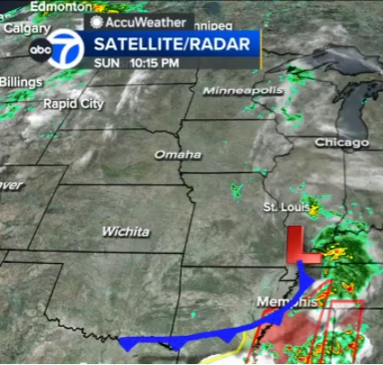
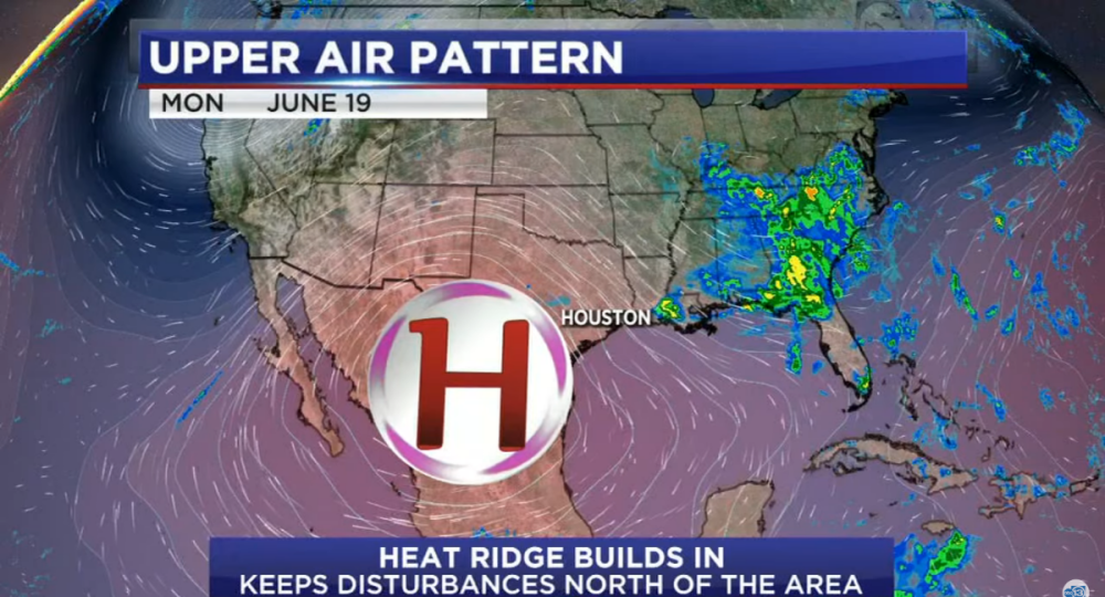
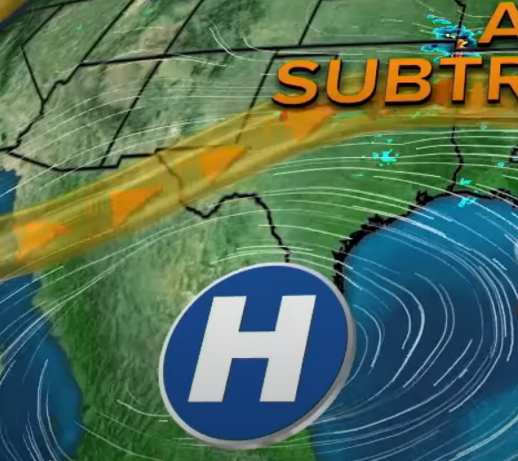
I didn't realize this would cause such a stir. I know that the typical colors are red for low pressure and blue for high pressure. It's also typical to show a low pressure system in the gulf as just the standard L, as shown in your picture too. But, how do you show the difference between a tropical low, that has a closed center of circulation and one that's doesn't? The former can become a tropical system, while the latter can't. KTRK shows it with a (L), a circle around a red L, as seen in the video. I don't know who made it, but KTRK has had similar looking red High pressure icons in their last 3-4 weather graphics packages, which were all made by Hothaus Creative. They do use the regular blue highs/red lows in the winter to show the upper air pattern. But the station does a lot that isn't "normal" and I always like that. We have color gradients that go up to 20" of rain. Might sound crazy, but that's happened many times in SE Texas. As seen in the video, we also have different color gradients for tropical weather, which don't look like regular radar reflectivity as there are no radars in the middle of the ocean anyway. Is this unique too? I've always hated seeing green/yellow/red color gradients on tropical systems because you aren't measuring the intensity of the rain without radar, you are only showing an enhanced satellite picture of clouds. It's the way KTRK has been doing it for at least 10+ years. The map depicts the upper air pattern and temperatures aloft. The former is shown in the flow lines, and the latter with all the red around the map. The H, clearly, is high pressure, but is depicted in red to convey that it's a 'heat-ridge' and shows the way it spins--clockwise. You're trying to show life-threatening extreme heat here. A good weather graphic should tell the story just by glancing at it, and teaches viewers why what's happening is happening without saying a word. A high gives you sinking air, light winds, and clear skies. In the summer, that allows for maximum heating--and in this case dangerous heat--during the day. While in the winter, that same high will give cold temperatures because of a lack of cloud cover.0 points
-
I wonder if there is room to declutter the opens a bit. I’ve been watching WLS since the new package debuted. As a whole, it’s great and I’m excited to see it implemented at other stations, but there is A LOT happening in those opens that distracts the eye from the actual newscast name and brand.0 points
-
A few thoughts (probably way too many for such a short clip tbh): 1) I don’t know why they would bother promoting a show that airs on Sundays at midnight (assuming this is a promo). 2) If your station’s on channel 62, I’m not sure I would be eager to make that the prominent brand. I get that their station is harder to find for OTA viewers, but using channel 62 as the primary brand sort of makes your station look cheap (as if you’re promoting the fact that your station is hard to reach). It also goes against the whole “streaming first” thing that they had going for them.0 points
-
They are much better at designing websites and magazines than news graphics. I guess that's why they tried to make some graphics look like web pages with tabs/arrows, tiles that swipe the screen like you would on some apps, and ellipses marks on banners that look like a more options icon. I was watching part of GMA this morning and noticed their weather graphics, which look a lot like WLS', aren't optimized for hot weather and triple digits. They tired to show three one hundred degree days in a row, and it looked like 101100101 instead of 101 100 101. Even the weather lady said it "looks like a serial number." The ridge of high pressure was your basic white and blue and didn't show the clockwise spin around the H either. That high pressure, which has sinking air, is the reason for the hot weather and KTRK's way of depicting it much better with a red high, which does have the clockwise arrows that spin around on the H's circle and red color gradiant all over the map. Both of those elements makes it look hot and color of the High tells you why it's hot. Whereas a blue high looks cool, and with no arrows, you don't even teach viewers which way high pressure spins let alone convey that it's the reason for the heat.
 0 points
 -
They have different commercial break structures for one, along with an entirely different structure to their unions and they're royalties overall, so unless it's packed into an ad-friendly format like Benny Hill and Monty Python were, it's usually passed on. There's also 'oh no scary accents!' syndrome that makes them a hard sell (though all those Discovery reality shows with bad mic work needing to be subtitled/lots of mumbling are much worse). But the other thing is a lot of folks have long figured out VPNs to watch direct from overseas without the obnoxious sell-throughs many syndicated shows have now (theme weeks and 'special offers'), and UK-specific streaming services now exist in the US, so that's where their focus went long ago, along with public television. It's also why BBC America is just an American rerun farm now, because AMC's budget cuts have killed their acquisition budget.0 points


.thumb.png.3d66a1eeb7ecf5404151f8a77ea7cbfd.png)
.png.006d0bb4950941ffaf62c9a823697dad.png)


This leaderboard is set to Chicago/GMT-05:00