


ABC 7 Denver
-
Posts
2713 -
Joined
-
Last visited
-
Days Won
51
Content Type
Profiles
Forums
Articles
Posts posted by ABC 7 Denver
-
-
1 minute ago, TheRyan said:
I agree--this is certainly not Stephen Arnold's best work, imo.
Comparatively, Guardian is a modern success and Signature is a classic success.
-
 1
1
-
-
5 hours ago, TheRyan said:
Well I tend to also think that the music choice does help mask the unsightliness of this new gfx pkg at WFTS, to a degree. I genuinely feel sorry for WFTS and Scripps' other powerhouse stations for having to use the new gfx.
And the Scripps music is pretty slow and it sounds non-descript and like production music. As a news music curator and composer, I'm very underwhelmed. SAM's production cuts have a stronger more sonic sound. This isn't that.
2 hours ago, 24994J said:KABC's full screens are everything Scripps' look is trying (and failing) to be.
Which is somewhat ironic given that ABC is developing a standardized package. This KABC look was developed in-house too.
-
 3
3
-
-
16 hours ago, Info Junkie said:
That voiceover is annoying.
“LET’S GET YOUR DAY STARTED!”
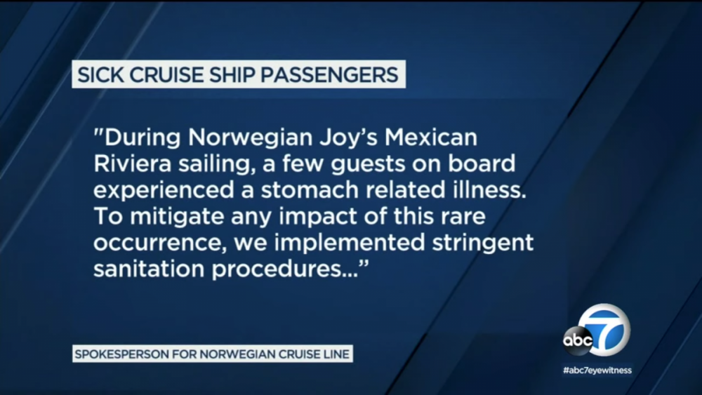
Seems like someone's reading the itinerary on a cruise ship. Very utilitarian. Nothing more.
-
3
-
-
1 hour ago, jase said:
I agree. I would guess, going forward, Norah will be doing more political reporting (in-studio interviews with lawmakers, etc..) on a regular basis. If not, moving the show to DC would serve no purpose. She definitely is going to have to take on a 'leading role' in their overall political coverage.
I think that was kind of the point, and I am honestly very excited!
-
1
-
-
3 hours ago, KCActionNews said:
Just got these screen caps sent. Looks like Tampa was next on the list. My opinion hasn’t changed so no need for me to rehash. I’ll just leave these here for your enjoyment. Lol
Yeah. I'm bored!
-
1
-
-
22 minutes ago, Brother said:
From the Orlando Sentinel article itself:
"The 5 and 10 p.m. newscasts on Estrella will be delivered in English and closed captioned in Spanish."That's, frankly, insulting to any Spanish viewer.

-
4 hours ago, MarkBRollins88_v2 said:
KOAA’s graphics are pretty dated—definitely need an upgrade. They try to mimic Scripps with their newscast opens and their use of Inergy, but their lower thirds, weather graphics and everything else don’t match at all. Color scheme is off and all looks wonky. Their OTS graphics have a 3D NBC peacock in the background that look straight out of 2001.
it’s funny because they were kind of Cordillera’s crown jewel. Cordillera gave them a state of the art building with a state of the art set, but they have always had graphics that looked amateur compared to other Cordillera stations. They have a great set that many major market stations would be jealous of, but their current graphics package does not nearly do it justice.Would love to see them get a GFX upgrade ASAP. They deserve it.
So they lost their last Creative Director who commissioned a pretty descent package from Rey Rodriguez when he was freelancing (before he created Linear Drift) in 2014. In 2015 that Creative Director left the station and two years lader a new graphics/logo/music was created and implemented to mirror KMGH. The crappy 3D Peakcock in the OTS super is a graphic pulled from the 2002-2004 package.
This is actually the best package they had but it was used for such a short time (3 years)!
-
9 hours ago, KCActionNews said:
Word is that the rollout is a mess. A graphics change was supposed to happen by late summer and there is only one small market going into December. Look for the next targets to either be more small markets so they can say they have launched on a higher number of stations or a launch of Florida markets. They seem to like to work the florida stations together. I wonder if there will be fallout at the graphics hub after this?
I’m still not warming up to it. Going flat and simple was the trend 3-4 years ago. They are late to that party. Just putting a station logo in background is amateur. Someone else on here summed it up best, it looks like a PowerPoint presentation page was put on TV. I was really hoping Scripps would come out of the gate with a look that would set them apart and have some artistic elements to make you notice. This is so bland. Maybe at least some texture or shades of blue so something stands out. An accent color? But not gold lol
Dude, this is in-house. As I know, and maybe we all should, Scripps has a weak internal design hub. They built this themselves and spent very little money on it. I'm not surprised that it's so basic because the concept is basic. As Scott Jones posted, Scripps is hit or miss with employment. I would imagine that large components of that are with regard to station and infrastructure investment and brand development. Scripps is way too focused on acquisition and aligning infrastructure at this time then anything else.
-
2
-
-
30 minutes ago, TheRyan said:
So KJRH is getting the graphics soon it would appear.
Not until 2020.
11 hours ago, ns8401 said:You really haven’t been able to say much of anything besides bash things... I just did everything when looking at this carefully including stand on my head and I still can’t figure out what sort of irony you could possibly mean...
You would only understand the irony if you had inside info like I do. That's why you can't see it.
-
1
-
-
9 minutes ago, ScottSchell said:
Looks like KJRH will actually have a little bit different version of the new graphic along with a white logo as well they have been using this on certain promos.
Lmao! There's some irony here that I literally can't say anything about!
-
1
-
 1
1
-
-
On 11/22/2019 at 8:26 PM, C Block said:
I actually thought that the Scripps look matched KMGH pretty well initially. The blue and yellow reminded me of the previous early 2000s looks, and the Hothaus graphics were looking pretty tired and mutilated by the time they were replaced. The only thing that's been weird about it on KMGH is that they used the house style open literally one time the day the graphics launched and then went back to doing a hodgepodge of cold opens, no opens, and whatever collage of stock video and music they use to open newscasts now.
The new graphics look uninspired, but we'll have to see how the rollout goes. Maybe there's more to see than just what's gone out on WTXL.
I've seen the style guides. They are either blue or red (for breaking news).
-
1
-
-
41 minutes ago, DENDude said:
This would be an improvement to KMGH, the graphics they have now have always seemed a little out of place to me. The current package feels like it was thrown together with not a lot of effort.
It would be nice to see a station group use more orange, yellow or green in a graphics package vs always blue & red, that gets boring.
Their current open is using elements of the new in-house Scripps package.
-
3
-
-
16 hours ago, ns8401 said:
You’ve heard 1 cut from the music package and seen graphics on a third rate station in a small market... Could you at least wait till WXYZ, WEWS, KSHB or the like adopt the look before declaring it to be so terrible? Even then I can think of much worse they could have done than these...
You have no idea what I've seen and heard. Thank you for your presumptive diatribe.
-
1
-
-
This is so painfully generic. It reminds me of those terrible mock newscasts that you see on TV shows to indicate some content being briefly tied to the TV show episode. This is what you get for in-house garbage graphics hub. Also the music is literally the least interesting thing that I've ever heard from Stephen Arnold. How much did any of this cost? $250 and a lap dance?
-
1
-
.png) 2
2
-
-
1 hour ago, channel2 said:
It does feel like the pool of V/O artists skews pretty old, honestly. Like there is no one to take the reins from the mainstays as they decline or leave the profession.
Sounds like there's room for me!

-
KMPH:
KPTM:
Interesting, though, that KPTM is still using the FOX O&O Weather Franchise and L3s.
-
26 minutes ago, montydavis said:
WCSC has been “Gray-ed”. With a new logo.

Reminds me of KCTV's logo.
-
18 minutes ago, Greggo said:
Aaaaand he’s deleted it. The comments were ridiculous, including one person who wrote ‘Hope you two f——d’
And that Remington Hernandez is the creator of this threat. He's Big Country News.
-
44 minutes ago, DENDude said:
KCDO-TV Dropped NewsNet Sunday October 6, 2019. NewsNet now has no Colorado affiliates.
Thank god. What a terrible program. Everything about it is bad.
-
50 minutes ago, mrschimpf said:
They've branded with 'Fox 19 Now' in all ways for several years, thus they are 'always now'...kinda wish that could've gone for just plain 'Fox 19'.
What stupidity that is. Do you want news that's even 24 hours old?
-
On 10/11/2019 at 10:10 PM, Georgie56 said:
Really nice job with the open and graphics here.
The fuck kind of slogan is 'Always Now'?
-
On 10/7/2019 at 6:40 PM, MikePulse said:
You like this!? This is a terrible package. I wish the CSD had better options, but because of these massive layoffs his team has shrunk by about half and he has no graphic designers on his team.
-
1
-
-
18 minutes ago, tyrannical bastard said:
Gray is treating their much larger stations to better packages, while the smaller ones seem to be getting the "leftovers"...i.e. more dated and recycled graphic packages.
I like WBTV's new look....it's clean, simple, and serves as a nice evolution from the prior Raycom look.
I just want to state that the WOIO package was in the works well before Gray took ownership. Stations get 4 options to from Gray, no customs.
-
1
-
-
15 hours ago, kfc513 said:
I didn't see WESH's version in there. Only WTVJ's.
That sequence at 17s is pretty damning.


Scripps Graphics 2019
in Graphics
Posted
Denver too, but there are quite a few things that aren't working in Denver.