


-
Posts
1945 -
Joined
-
Last visited
-
Days Won
98
Content Type
Profiles
Forums
Articles
Posts posted by MediaZone4K
-
-
4 hours ago, Breaking News said:
There were times where WAGA did beat WSB in the 70s, 80s and 90s before the switch. There were times WXIA beat both WSB & WAGA at 11pm due to NBC primetime lead in the late 80s and early 90s.
When the 80s came around in the bigger markets NBC & ABC just changed with the times. CBS hasn't fared well in the bigger markets, but NBC & ABC does really well. CBS does well in mid size, smaller and rural markets. Prior to the switch in the 90s. Atlanta, Cleveland, Milwaukee, Dallas, Phoenix & Tampa Bay those CBS affiliates did really well.
Yes! CBS shows appeal to an older audience.
I can also see why CBS stations do well in rural smaller areas. Historically the network has run rural comedies like Green Acres and in the 90s *shows* like Murder She Wrote, Diagnosis Murder, Walker Texas Ranger etc. Today they've got an endless portfolio of procedurals. It's definitely a watch with your grandparents kind of channel which must trickle down to the newscasts.
-
 3
3
-
-
My theory for the affiliates is that their struggles stem from the '94 realignments. They lost some stronger affiliates, left to pick up weaker ones. Look at ATL, CBS lost WAGA 5 to Fox, so they had to settle for WGNX 46, a weaker station with a dial number up in the boondocks.
For the owned and operated stations I'll say again...CBS O&O newscasts have a very generic, corporate, "Spectrum News" like feel, that isn't always authentic to the markets they're in. Big example, CBS' defunct "Nowcasts". WUPA's version, produced in NYC, felt so out of place in a country/soulful/hip hop city like Atlanta.
WCBS' Mary Calvi and Chris Wragge could do one of those nowcasts because they don't add any extra personality to make it feel like you're watching a New York morning show. This in contrast to the loud-brash-Brooklyn Rosanna Scotto on GDNY or the Jamaican Dancehall or Street Soldiers segments covered on WNYW.
Even though all o&o station groups duplicate their formats across markets, ABC, NBC, and especially FOX & CW stations are better at adding local touches.
-
4
-
-
4 hours ago, carolinanews4 said:
If this is a benefit of a group product, and that is a big IF, then it is an inadvertent benefit. To say a New Yorker who goes to LA will be drawn to KABC because they share a lower third with WABC is probably overstating the impact of graphics. The real driver for a group package is cost savings. Plain and simple. In ABC's case, it is one package for eight stations. Fox and NBC have been doing it for years. Not only do you save on development but there are downstream savings because topical graphics can be shared. KABC, KGO, and KFSN are probably all sharing flooding graphics for intros, display monitors, etc.
Exactly! The network news division (save Sunday Morning and 60 Minutes) is in last place. Many of their local stations (save KDKA and WCCO) were laggards in their markets. So why not reimagine the branding to try to help both? But again, this is an excellent cost savings for the CBS group. And as NYCNewsJunkie rightfully points out, it gave them a comprehensive streaming approach for the first time.
Not to turn this into the CBS thread but the issue there is that if their national news brand is not doing well outside of two shows, does that justify duplicating it on the local level? If anything, CBS stations need to be seeking separate identities. I'll save that for it's designated thread.
Fox O&Os, like ABC stations, are a prime example of duplicated yet still locally fresh format. WAGA feels authentically Atlanta as WNYW feels uniquely NY with personalities like Rosanna Scotto, and segments covering say Jamaican Dancehall culture... despite both stations being "Fox 5 News" with the same graphics. Again WABC does this well also.
On 2/19/2024 at 7:29 PM, MorningNews said:I’m all about a mandate if it prevents stations from the on-air presentation WABC had in place for a long time.
Back to WABC, I have to agree. Left to their own volition, Channel 7 has shown us for decades how bad their sets and graphics can get.
-
14 hours ago, Abraham J. Simpson said:
The thing is: who actually notices? For all the complaints about common elements, how many viewers are actually going to be in two markets with common designs, and happen to watch the stations in question, and happen to pay that kind of attention, and actually care? Effectively no one.
Nobody cares if WABC and KABC, for instance, have common design elements. A few people like us on message boards aren’t representative of the public at large.
True. I see both sides. I agree with the idea of identifying a similar product via aesthetics through several markets. Not to drift off topic but, comparing the more successful ABC O&Os vs CBS O&OS...I don't mind duplicating a look just with added personal touches like KWY doing green instead of the standard CBS blue and white. I know the argument is a similar look for content sharing but the audience does not care if WCBS takes a KYW green graphic.
The issue becomes when stations sound like a bland corporate carbon copy and not locally authentic. Look at WCBS with its pharmacy jingle ringtone open and clean corporate feel which doesn't match the vibe of a gritty intense city like New York. In contrast, even though WABC is one of ABC's many Eyewitness News copies, it still feels locally authentic to NYC with its diverse set of long-tenured reporters and its "flashier" (as some have said) format.
-
6
-
-
5 hours ago, Vlad said:
I just hope under this change, the O&O stations continue to keep their individuality and local news branding instead of making them all look alike. There is a charm to that indivualistic aspect of a news station versus them all looking alike and sounding the same.
Say it louder for CBS to hear.
-
2
-
-
9 hours ago, abc7 Man said:
Rosanna is a contributor on FNC show Outnumbered right now.
I'm not saying I necessarily disagree with some of the points Rosanna made. But, she (as usual) drifts into editorialization. Sanctuary "Trap" for example is a loaded title. "This is coming to a city near you, unfortunately" which she said, is also another iffy statement. That's fine for Fox News Channel, but very slippery for her already compromised 'neutral image' role on GDNY.
-
7
-
-
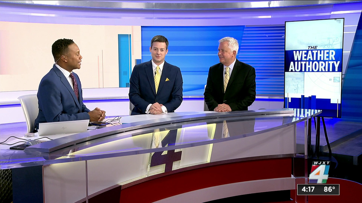
Very underwhelming, especially for Graham which has some good looking stations. They should have taken a page from sister station WJXT whose set looks way better. IMO, stations need to tone down the video walls, quit the furniture minimalism and get some physical set pieces.


-
3
-
-
4 hours ago, GodfreyGR said:
Apologies in advance if there is something obvious that I am missing here- But do the affiliates have more leeway on Sunday mornings with where they air network programs vs. local news?
With a little channel surfing, Fox News Sunday had Shannon Bream interviewing Israel PM Netanyahu, now an hour later I'm on ABC This Week and Jon Karl introed his interview with the PM as the "first... in over three months". Could be true for a variety of reasons- if This Week airs at the same time as Fox News Sunday in some markets and is pre-empted an hour in mine? Or if ABC taped their interview before Fox? Is ABC assuming that if their viewers are channel surfing, they're not landing on Fox?
Or... Am I way overthinking all of this?
Interesting catch. Just this morning my local CBS affiliate skipped Face the Nation (for the first time that I've seen) and aired E/I programming instead. The did however air Sinclair's Sunday morning political show "Full Measure".
-
1
-
 1
1
-
-
5 hours ago, Jase said:
No amount of time could have saved the first incarnation of CNN This Morning. Don, Poppy and Kaitlan were (are) polar opposites of each other and never truly seemed interested in making the show work nor supporting (uplifting) each other in any way from the beginning.Of course building chemistry takes time, but everyone has to be willing to do the work and I never got that from them. It was a pain to watch.
Yep!
12 hours ago, mountainave said:Bit of a shame. I may be in the minority, but I think the first incarnation of CNN This Morning with Poppy Harlow, Don Lemon, and Kaitlan Collins was a quality product that just needed time. The three of them each brought something -- Poppy as a longtime anchor with a business acumen, Kaitlan as an incisive political questioner, and Don as an older guy attuned to social issues with an ability to humanize. Yes, Lemon stuck his foot in his mouth one too many times, but in the three of them you really had an ensemble of three smart anchors with different yet complementary skills. When there wasn't off-camera acrimony or awkward on-camera blunders, the three actually did have good TV chemistry. To be clear, I'm not saying they should've kept Don. Just lamenting the show's potential, had things worked properly.
Firing Don and plucking Kaitlan off was a one-two punch to the show. Then it never got the new set it was promised. Then they decided to return to a stale two-anchor format, and plopped in Phil Mattingly who has a goofy sense of humor and a great political acumen but is still somewhat awkward at the anchor desk and plays too much "inside baseball" when asking questions during his political interviews, which works for a midday show but not for morning. The morning warmth disappeared from the show and it started to feel like any other two-anchor show of CNN's prior days.
Something else that's telling. After deciding to move News Central up, they could have moved Poppy and Phil from the morning slot into the 10a-noon slot, either together or each with their own show. Instead, they completely took them off the schedule, brought Acosta over from the weekend, and gave Pamela her own show. Apparently someone decided Poppy and Phil have had enough.
I wasn't sorry to see Don go, he was one of many annoying cable pundits. I just didn't like the circumstances under which it occurred.
-
On 2/2/2024 at 12:07 PM, Geoffrey said:
Wednesday

Wonder why they changed Interestingly, it was done on the first day of sweeps (not sure how much those matter anymore).
Pardon me for me for being facetious, but the video *wall* would look better and more seemless without that red thing (a table?) in the background.
-
On 2/5/2024 at 7:06 AM, Geoffrey said:
New graphics premiered.
The open basically looks the same, but has been made shorter.
The lower-thirds look cartoonish and they went with a bold condensed font for the main text. Is the text an afterthought?
The logo, now stacked in two lines, stays on the left side of the screen like the other CBS newscasts and local news. (Previously it would move above the lower-third.)
Edit:
I should add that this is an upgrade over the previous look, which didn't let the text breathe and had too many sections that were just black. This is mostly white and feels lighter.
WCBS seems to be having problems with the ticker. It's been blank most of the time, occasionally running a single headline from the website before being blank again. It also remained on screen during most of the first commercial break.
Agreed. The concept is not horrible. The L3's just look too cartoonish, flat, fat, and white. The graphics looked better in the CBS News Mornings shot, maybe because it doesn't have the ticker and the upper subject bar weighing it down.
Broadstroke: As time advances television graphics are not.
-
2
-
 1
1
-
-
On 2/3/2024 at 4:50 PM, TheNewsTV said:
WFOR has already debuted


The network keeps making adjustments to this show (and it's predecessor's) graphics that aren't better. The CBS logo needs to be shifted to the right to fill the dead space where the ticker ends.
Excluding the ticker, this was probably the only decent L3 CBS This Morning/Mornings has ever had:
-
1
-
-
3 hours ago, mouseboy33 said:
Ugh. I remember as a kid GMA having the worst sets. Too me they were also so....outdated. Like a grannys attic or basement. Or they felt like a old living room full of brown furniture. They were never distinctive, just old and full of old dusty stuff. I dont remember this set in particular, but i remember them always having this "feel". This set looks like a old furniture store full of closeout furniture that hasnt sold. NBC Today always felt fresh, new, urban and modern. Still not a fan of GMA. ABC News sets always felt "off" to me. This includes the graphics. Though I was a fan of Peter Jennings.
I think that's what help sets Today and GMA apart and ABC vs NBC as a whole. Today/NBC was the sleek urban show/network and ABC/GMA was the more homely middle America network/show. I would take physical pieces over the proliferation of bare video walls that we have today. that's basically the modern version of the 70s chromakey set trend.
-
Pulling for big names much like Fox 5!
-
Snippet from Today in New York, 2007.
WNBC's looked really good aesthetically here, and they had good talent. So, I'm still trying to figure out exactly what caused them to drop in the ratings to the point of cutting newscast at that time? Was it simply because WCBS made improvements and displaced them for second in some timeslots?
-
21 hours ago, Drew said:
That column was nice and it worked! Embrace it, maybe even stick a Today Show rainbow at the base, similar to the 80s.

-
It looked better when the camera feed monitor was frameles
-
1
-
-
Yikes large white box L3s. At least the time-temperature bug looks less cramped.
Having just discovered the Morgan Murphy group, I will say some of their stations's graphics and sets look better than some stations at larger companies like Sinclair.
-
1
-
 1
1
-
 1
1
-
1
-
-
On 1/16/2024 at 1:49 PM, Vlad said:
...constructively disagree with you MediaZone about WABC's current set being abysmal. I honestly don't think their set is "abysmal" not at the very least, astute time viewers of WABC remember vividly how terrible their set used to be before they moved to the street studio, remember back when they were sharing the space with Live with Regis and Kelly? (Early 90s through 2011) when they had the cramped space now that was "abysmal" at the time, their current studio is pretty good, but when they move to the new headquarters sometime next year, i'm sure they'll get a well deserved update, hopefully more spacious and perhaps by the street again? One can hope!
From that era you mentioned, as simplistic and unremarkable as it was, this was probably most their decent set. The early 90s graphics wern't great compared to WNBC but it worked.
Arguably the best set this aestetically troubled station had was the steps look from the 70s.
-
1
-
-
41 minutes ago, Abraham J. Simpson said:
And Steve Harvey has done Feud something like 20 years, far longer than the likes of Dawson and Combs hosted.
*14 years this year
-
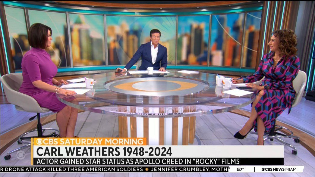
He was a great sucessor to Kurault!
I always used to skip over Sunday Morning but since the day first watched the program I make an effort to catch it every weekend. RIP!
-
2
-
-
On 1/21/2024 at 10:41 PM, nycnewsjunkie said:
Couldn’t have said it better. I do think their newscasts would come off as being rather ostentatious and gaudy in most other cities, especially when you consider the occasional mild editorializing on the part of the anchors. However, the “populist” (for lack of a better word) style of WABC’s newscasts does fit in NYC imo.
Someone else, perhaps you, also talked about WABC's NY Post look and feel. As for tabloid, I would love to see what Sunbeam would do with NYC station lol.
As others have said, their look must be deliberate, because it's hard to believe the #1 station in the country would be that aesthetically clueless. Especially considering sister stations KABC and KGO look so much better in contrast.
On 1/22/2024 at 9:13 AM, sfomspphl said:When I last watched just before Jim’s retirement I had the same network nightly news impression except 6 seemed even more professional.
Jim Gardner not Vance I should say. This was perhaps WABC's last decent graphics package:
-
5
-
-
WPVI still holds out, but their current lower thirds are pretty decent. Very Graham like. I almost hope they don't change.
PVI's flat graphics look cheap though. These can definately stand the new upgrade. Just like the new Cox package, 3D and flat look awkward when mixed.

Reguarding tone which was brought up during the WABC's discussion...Having seen snippets from their evening newscasts, especially when Jim *Gardner was there, 6ABC has a real national evening news like presentation. Very clean and ultra professional news product.
-
1
-
.png) 1
1
-
-
13 hours ago, MorningNews said:
^ mostly agree with this. Not to belabor the point but is there a theory to WABC’s approach? I remember being shocked at the 2005 set and their graphics. You’d think the top station would have a more ambitious on-air presentation especially since the other O&Os in the group were mostly always solid.
Channel 7’s format is flashy, maybe even obnoxious. In contrast, their on-air presentation has always been one-dimensional. Feels like it’s by design.
People here often say WABC is flashy. I can hear it in their writing historically. But, Compared to stations like WWOR or WSVN I'm having trouble seeing it. Maybe it's because they do as you say have a one-dimensional look.
-
1
-


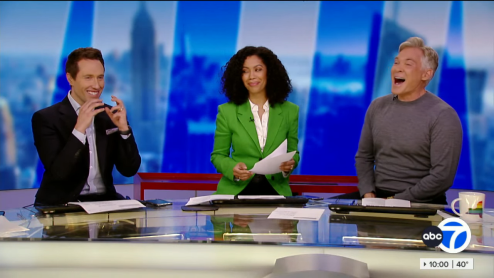
WPIX - PIX11 News
in Station Chatter
Posted
Nice and clear talent line up too. not confusing to know which time your favorite personality will be on.