
Leaderboard


Popular Content
Showing content with the highest reputation on 10/21/19 in all areas
-
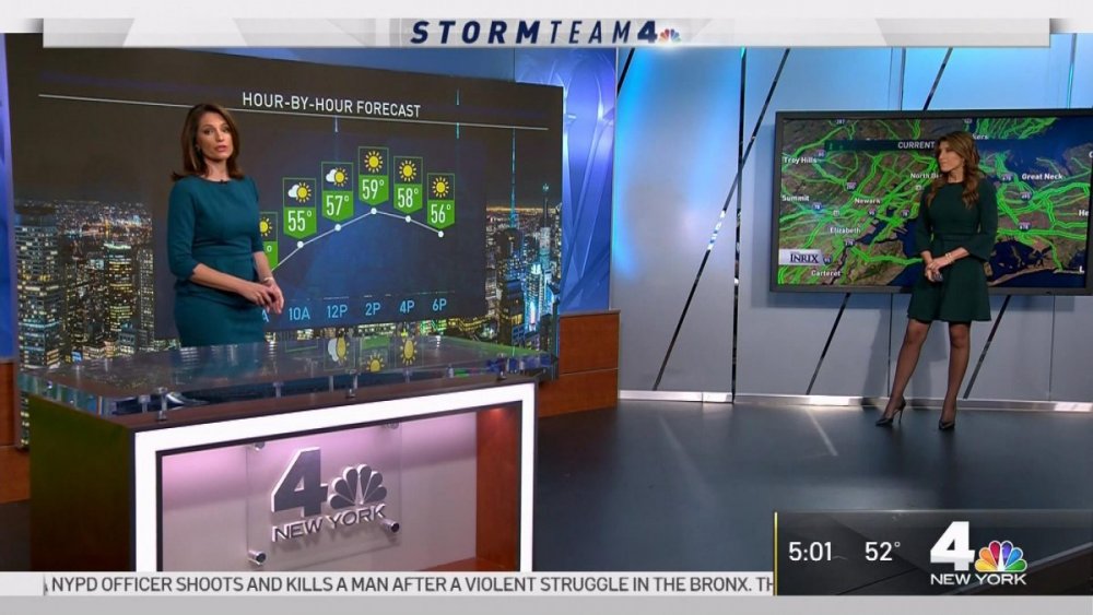
WNBC has done some updates to the studio. They added a silver frame around the large video screen. The higher floor for the area to the left of the news desk has been removed and they added sliver molding to the bottom of the walls. The desk next to the left of the video wall was not there today.
 2 points
 -
Live on Lakeside isn't doing much better either.1 point
-
Don't forget Hometeam 19/43, 43 The Block, numerous attempts from WKYC (5:30, Weekday Fever, multiple attempts at a one-hour 6pm newscast), Today's Morning Exchange, any of WEWS' in-house attempts to replace Ted Henry, Cleveland Television News (WOIO and WUAB's merged newsroom circa 1995), and so on. Am I missing anything? Speaking of ei8ht is News, here are commercials from when WJW was transitioning from that branding to FOX 8. Even the announcer was calling it "Fox ei8ht is News."1 point
-
I'm not convinced the FTVLIve story is accurate, simply because I can't imagine anyone high up in the company would have allowed WKYC's blanket rebrand to go through were that the case.1 point
-
At least WJZY was an upstart with nowhere to go but up.....but it started when they began doing a real newscast and not their half baked effort.... WKYC? They're like "let's take a station that rose from the doldrums of "farm teaming" talent into a well executed, polished, informative news operation....and trash it all for some young cheap talent who knows cool buzz words and social media...and some new pretty graphics!"1 point
-
This whole WKYC thing is a better-executed version of what Fox tried (and failed) to do in Charlotte....1 point
-
The Morning Exchange comparison is the most interesting observation of the bunch - because that's a format that has and can worked well in Cleveland and attract some new eyeballs.1 point
-
I can see it now. A 2:07 am newscast called "3 News: Let's Go Get Some BBQ and Get Busy" or "3 News: A Hero Ain't Nothin' But a Sandwich." It would feature TV and movie clips fitting to news stories with popular tunes as news music. It would be dope! (By the way, I'm being sarcastic)1 point
-
I actually like the Channel 5 logo more than the new Channel 3 logo. Like you said some love it, others hate it. Then there are those who are indifferent, and just want the news. Even Channel 19's current logo (a HUGE improvement over the Cleveland 19 logo, which was the "Cleveland's CBS 19" logo but with a different color scheme that was more of the Wolverines and even the Warriors) is better than 3's new design. That's just my opinion.1 point
-
It's amateur hour at "Circle thin 3".1 point
-
I think this looks absolutely fantastic. The logo, the graphics, everything looks really really fresh. While I can't speak to the content this is the sort of thing I really want to see more of in broadcast graphic design.1 point
-
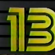
And then this guy shows up
 1 point
 -
What works in WKYC's favor is that they've remained a strong station. This isn't a dog station like WTSP, WUSA or KNTV... WKYC has become a valiant competitor to WJW since the late 1990s and that hasn't waned. I'm from Cleveland. I've seen too many stations get boring McGraphics and get the same basic look. The 2007 Fox O&O package, the 2008 Gannett package, the 2009 Scripps package and the 2014 Raycom package were among the more boring visual looks possible... harmless, but boring. This is... audacious. It's easily the best look for a local TV station I've seen since the JcB WOIO nineteen era of the late 1980s. And seeing how the logo is presented, it's both static but fluid... it's a literal contradiction. The NBC peacock is ... well... proudly a part of this, WKYC is showing their history and NBC ties and doing rather creative ways to emphasize it. Furthermore, leveraging the WKYC calls in tandem with "3 News" is equally commendable. The calls have value and cachet in the market. WKYC is doing their own thing with Tegna's full blessing, pouring money and resources into the operation. Funny thing is, when you invest in a station and hire people with bona fide credentials, that causes people to tune in! WKYC was the beneficiary of that under Multimedia and Gannett, and it continues today. And I can't let it be unsaid that Channel 3, then as KYW-TV, tried a rather revolutionary approach to TV news in 1959, 60 years ago. A little thing called "Eyewitness", a 90 minute newsblock that was so earth-shattering, WEWS' Dorothy Fuldheim was compelled to launch a competing newscast in response.1 point
-
It is the “mastermind” of a gent with no broadcast design experience who admitted he “didn’t watch broadcast news.” https://www.linkedin.com/in/john-forgetta-a2313b44 Their “Director of Content’s” claim to fame is the 4th hour of Today. https://www.cleveland.com/tv-blog/2018/08/today_show_producer_adam_miller_named_director_of_content_at_wkyc.html As for GM Micki Byrnes? How could she let this happen? Gotta wonder what her husband (former WKYC GM Brooke Spectorsky) thinks of this evolution...1 point
-
I saw that af the end of last night's 11pm show too. But for how long? They always find a way to cook these numbers.....1 point
-
Well, so far, the open is a hot mess. And Lynna Lai's story about the old look being "so 2018...." Sound effects aren't going to change my mind. The old look LOOKS better and does a much better job trying to explain the story.1 point
-
I'll give it a chance. But I'm a firm believer in if someone hypes something into oblivion, it better rock my socks off.1 point
-
I'll give it a chance, reminds one of the "Square 3" when it was own by NBC ,saw one of the TV Guide ads on a facebook group1 point
-
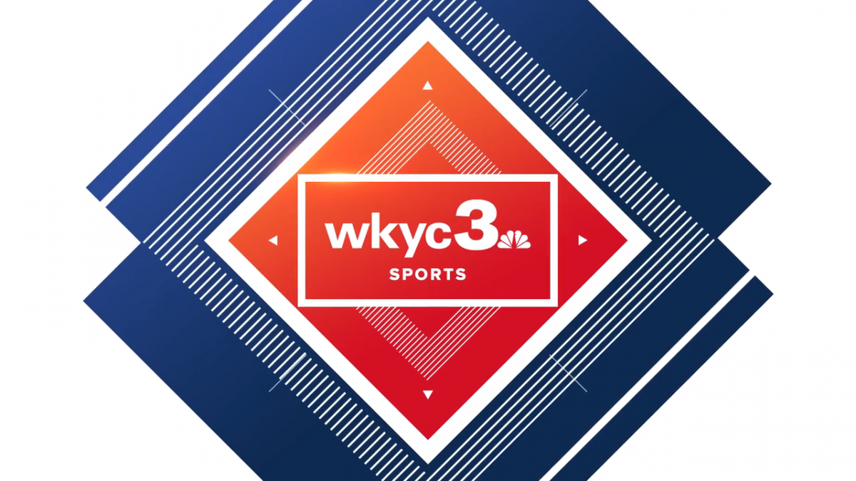
Well looks like Tegna is doing a custom graphics package for WKYC. It's actually not bad, tbh. Clean and simple.1 point
-
My thoughts. The line up reminds me of cable programming. That's what more people want! Cable news!! Also, about the logo, anybody down for a game of pool? I call stripes!1 point
-
It'll be later than 11pm because of SNF (hope the game goes to overtime so folks can sleep and not have to watch this trainwreck).1 point
-
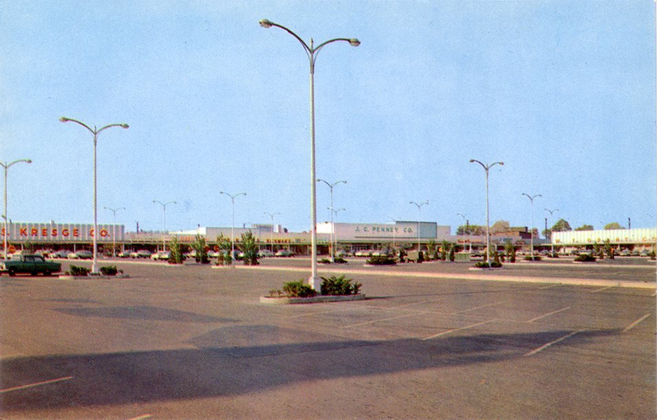
I just wanted to point out one more thing. Look at retail store fronts back in the old days. They all kind of used the same lettering on their storefronts. This WKYC logo isn't exactly old school, but it is more in that direction. For anybody who cares, the picture is of the Monroeville Miracle Mile Shopping Center in the Pittsburgh area. But the same developer had shopping centers in various Ohio cities and they all kind of looked the same..
 1 point
 -
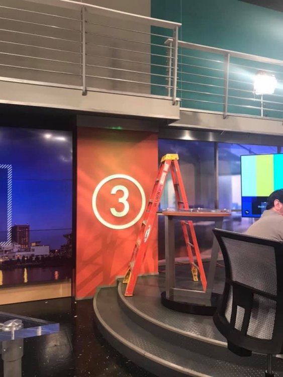
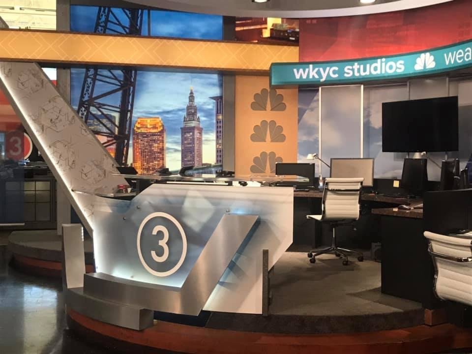
This was when the background was the 3 itself. Here are the backdrops themselves. Like I said before some of us can't stomach that Circle 3.
 1 point
 -
I love those pictures and how it looks. That said, I was at Giant Eagle tonight and maybe that's where they got the idea?
 1 point
 -
This explains a lot - the station’s creative director had no previous TV experience and admitted in this interview that he did not watch local TV. https://www.wkyc.com/mobile/article/entertainment/television/liveonlakeside/liveonlakeside/95-243d301f-06ca-4369-b280-50eafcfd45ca1 point
-
I'll give 'KYC props - It takes guts to put up such a dull, bare-bones, unimpressive logo across the building as if it'll last long1 point
-
1 point
-
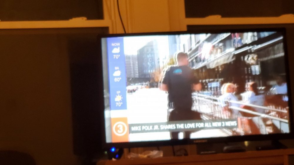
Some behind-the-scenes images... I bet it was difficult to put that logo on the cookies
 1 point
 -
I'd wish 'JHL would just take 'NCN's lead and honor the Network/Channel branding...1 point
-
We'll keep the concepts to a minimum, but I will say, I'm very impressed by WTHR's upcoming Tegnafication.
 1 point
 -
I wonder how much the person who took .32432432 seconds to design this "logo" (it ain't one sorry) got.... I wouldn't even give a quarter for it...1 point
-
FTVLive brings up another good point.... In the eyes of ratings, the "news" is going away and being replaced by these other-named shows. https://www.ftvlive.com/sqsp-test/2019/9/19/exclusive-cleveland-station-to-no-longer-have-newscasts All this is really doing is taking away any comparison to other newscasts....correct? Alas, instead of companies actually improving their products they just try and hide the problem by gaming the numbers....1 point
-
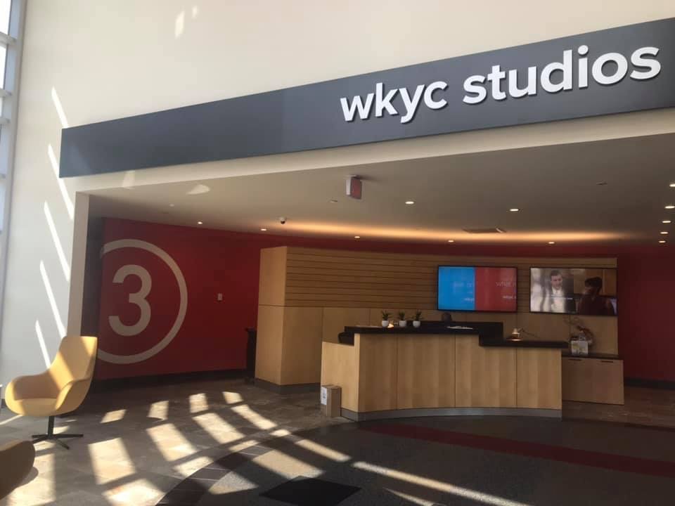
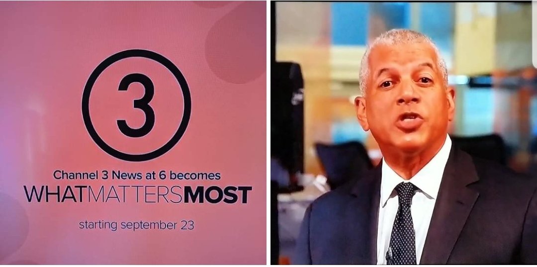
The definitive photo.
 1 point
 -
This isn’t like WPVI removing MCTYW.1 point
-
Complaints might get all the way into the double digits.1 point
-
This even seems like a classy promo these days. They should have done the reboot like WPXI did in 2006.1 point
-
More or less, this logo re-appeared in the early 90s when Multimedia assumed majority ownership of WKYC. Back then, even NBC's affiliates played into this style. How they ever went to the "Proud N" and Serif Gothic from this is mind-boggling. And then there was the awful programming during that era when even Fred Silverman couldn't save them.... I've started a new thread in the Graphics section about the impending "3"....i'm all for moving discussion over there as WKYC's relaunch nears closer....1 point
-
Good luck with that. That's like telling McDonalds to have some local flavor to it. If it's corporate it's corporate.1 point
-
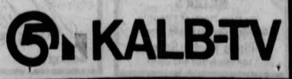
KALB in Alexandria, LA, had a similar logo in the late 70s, although theirs was either drawn or designed rather poorly.....
 1 point
 -
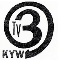
Here's an old KYW (Cleveland) logo...looks kind of similar, doesn't it? According to Logopedia, this was the second logo after the Triangle 3 logo that Westinghouse introduced when they "moved" to Cleveland. It wouldn't be until 1963 that KYW got the "Westinghouse Treatment" complete with font and all. Two years later, the swap was nullified and NBC came back to Cleveland and Westinghouse went home to Philadelphia.
 1 point
 -
Their soon-to-be-new logo? ARE YOU KIDDING ME RIGHT NOW??? WHAT THE F$&% IS THIS?!?!?!?!?!!?!?!?!?!? THIS is where we're at with broadcast logo design? There are things in life that just doesn't need to happen. This is one of them. Now I gotta update their Logopedia page with this painfully underwhelming abomination that ANYONE can recreate in Powerpoint in just under ten seconds... It hasn't debuted yet and it's already giving every bad station logo a run for their money; yes, even this logo from station KXDF-CD. TROIKA EVEN MADE YOU A LOGO! AND IT'S 999,999,999X BETTER THAN WHAT'S ABOUT TO HAPPEN!!! (image below) 1. This logo is so underwhelming and bland that I cannot just sit on the sidelines and let WKYC or Tegna get away with this. 2. What works in Great Britain doesn't always translate well in here in the US.
 1 point
 -
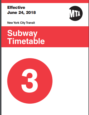
Or copied it from the New York MTA. I've seen some bad design decisions in my time - working in IT, its inevitable I suppose - but this...I can't even wrap my head around this one.
 1 point
 -
I can't even. And we thought the 11Alive logo or WFAArrow logo was bad. THIS CANNOT BE. (Maybe this conversation should move to a Graphics or TEGNA Corporate Thread?)1 point
-
Someone saw the "3" in the universal film leader and decided 'hey, this is good enough'; It's just kind of blah...WISC did a much better rendition of the 'circle 3'...hopefully it has a little more life in actual use. I understand minimalism is the new thing, but this is absurd.1 point
-
You got to be bleeping me. Seriously. What the hell is this?!! Forget the lottery ball, this is worse. It looks like they took the "3" from a sign out of a street corner. This is not a TV logo, it's an outdoor sign. I swear you can't get any worse than this. Pitiful. Just plain and extremely pitiful.1 point
-
Oh. My. Gawd. Someone please tell me this is a placeholder logo, like what WTOL did a few months back. 3 Ball makes Lottery Ball 5 tolerable in comparison....1 point
-
1 point
-
CBS 19 News with Denise Dufala and Gretchen Carlson. Lasted about a year perhaps? This was after Emmett Miller left and before they hired Kevin Cokely. Jack Marschall would later add WOIO's newscasts to his WUAB duties until the great Action News blowup of 2002. Was this after Bob Hetherington left? IIRC it was Charlene Brown and Yolanda Harris?1 point
-
Move over, | | | | | | | | | s, > > > > > > > > > is the new trendy thing in town.1 point
-
Nexstar needs THIS for its stations!1 point


This leaderboard is set to Chicago/GMT-05:00