
Leaderboard


Popular Content
Showing content with the highest reputation on 05/29/21 in Posts
-
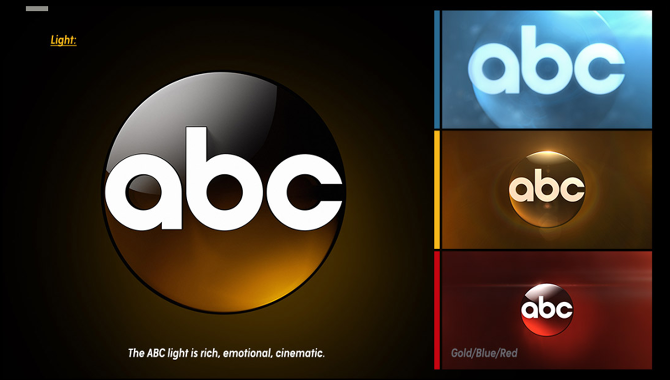
The last bullet in this slide is the biggest BS.... This change is not going increase the legibility at smaller scales; it will most likely make it worse. That smaller gap in the letter c will be an issue.4 points
-
I liked the current logo, it’s a shame they’re getting rid of it. The gradients flowed nicely and it wasn’t irritatingly flashy. The smaller letters in the new one make it look cramped and uninviting. If they wanted to make it plain for digital, I would have preferred the original 1962 one. The reason why flat design is everywhere is because young people, like myself, prefer it. Since companies are desperate to appeal to us, they feel the need to make their branding and graphics as flat as possible. I never understood the need for news to rely on gaudy 3D effects and lens flares. The story should be front and center, the graphics should only supplement it. When I watch or read the news, I want to be informed, not distracted by unnecessary clutter. Sports are for entertainment, so they make the graphics entertaining to watch. News is meant to inform about serious topics, so I prefer flatter and subdued graphics. I’m not saying it’s bad for news graphics to be creative, but it shouldn’t take away from the main subject.3 points
-
This strikes me as an unnecessary fix of something that isn't broken: What is up with this flat trend?? It's like news graphic design is getting cheaper and unimaginative as time goes on. Sports networks like ESPN, TNT, NBA TV, and FS1 are really exceeding news outlets at set and graphical design.
 3 points
 -
Signage is probably the last on their minds. KGTV still has the signage from the 80’s but modified after the Scripps buyout from McGraw Hill with a spinning 10 on top giving that gas station feel. KTVU still has the old 80’s / 90’s sideways FOX logo with the searchlights.1 point
-
The open was the old open. At the top of the hour Gray said, “Jaclyn Lee joins us”, and Jaclyn said, “so happy to join you this morning”.1 point
-
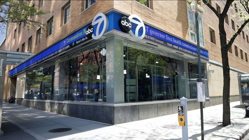
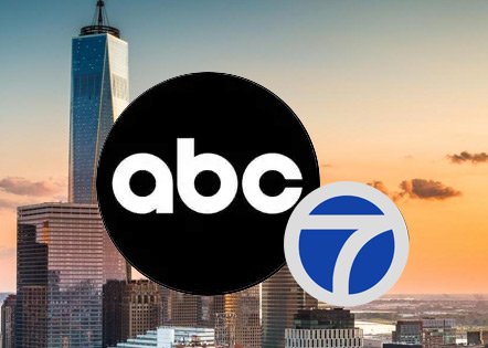
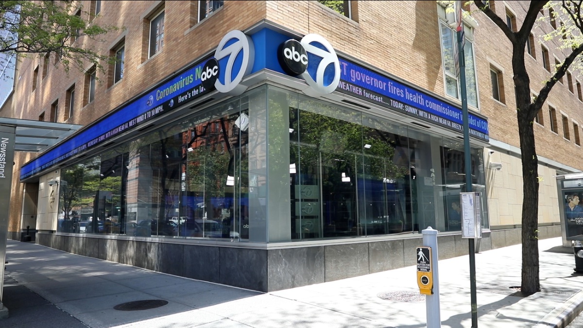
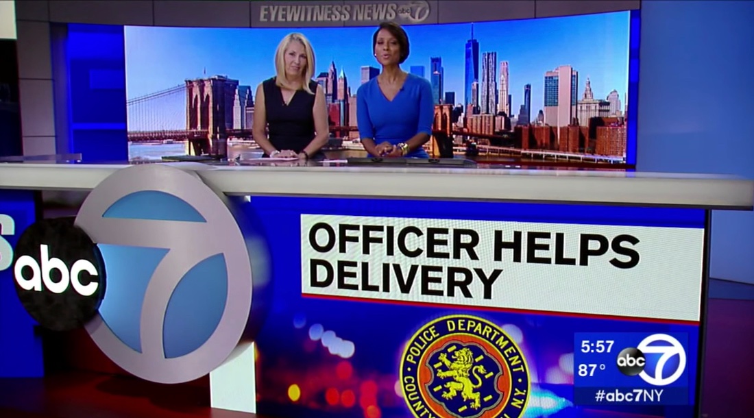
If this awful “rebrand” of the ABC logo and Circle 7 co-logos is forced on stations, will they also change the signage inside and outside the WABC studios that are connected to ABC HQ? And what about all the O&Os and affiliates with signage on their sets and buildings?
 1 point
 -
I third it-- think about what it would have been like if the ABC logo change discussed here had been in one of ABC's movie broadcast openings of the 80s, like the Star Tunnel; how would that have played w/viewers of the time?1 point
-
WLS has only adopted a bumper going to break. Nice and quick, not messing with the flow of the anchor's greeting at the top. An introduction at the top seems like too much. 2021 late hulu outro.mp41 point
-
1 point
-
Which is the way we've known NBC for 3.5 decades (anniversary this year)!1 point
-
That’s going to look like KGTV’s logo since it’s literally sitting on the upper left hand corner of the 101 point
-
I do like the new ABC logo, but not the size of it. Rather the ABC size be same size as the 7 logo and be right beside it. Like CBS 2 for example. By 2033, we should have this logo.
 1 point
 -
The actual stuff KSAT used is a composite of several Sonoton cuts.1 point
-
Just because something shows up on someone's demo reel or portfolio does not mean they created the entire thing from scratch. If there was some "rule" that you could only include stuff you made 100%, nobody would be able to get a job.1 point
-
With May sweeps over, KXAN/Austin has parted ways with evening anchor Sydney Benter. She’d been there about 4 years. Britt Moreno from KCNC/Denver has said she is heading to KXAN and is the presumed replacement. Sydney’s post is actually kind of heartbreaking. It sounds like she was completely caught off guard. https://mikemcguff.blogspot.com/2021/05/sydney-benter-leaving-kxan-austin.html0 points


.thumb.png.20cbae3777de7f140153442a1bb805e7.png)


This leaderboard is set to Chicago/GMT-05:00