
Leaderboard


Popular Content
Showing content with the highest reputation on 06/23/21 in all areas
-
I wonder where they got that...4 points
-
NewscastStudio tweeted out that it was known as Look S about two hours before it’s name was known in this thread. So this time they didn’t steal from us.3 points
-
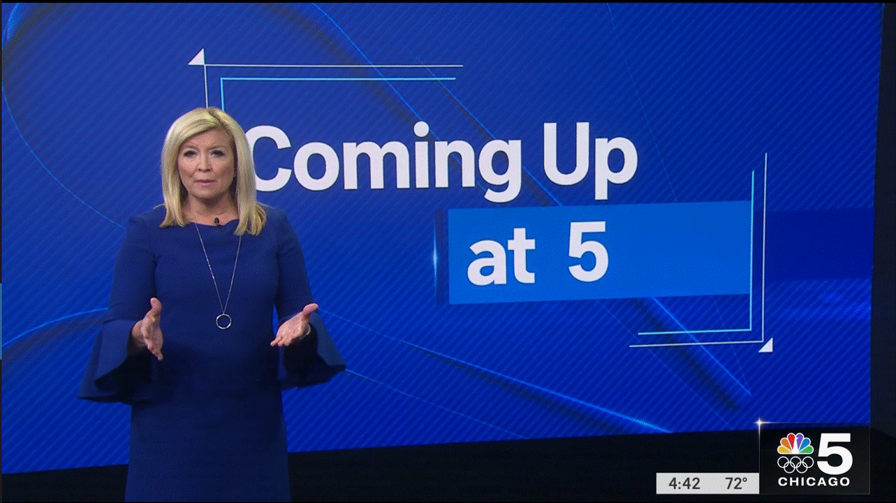
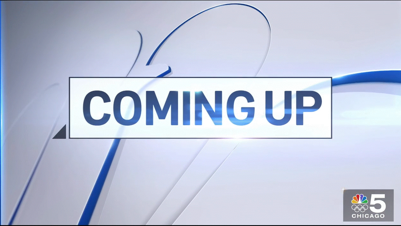
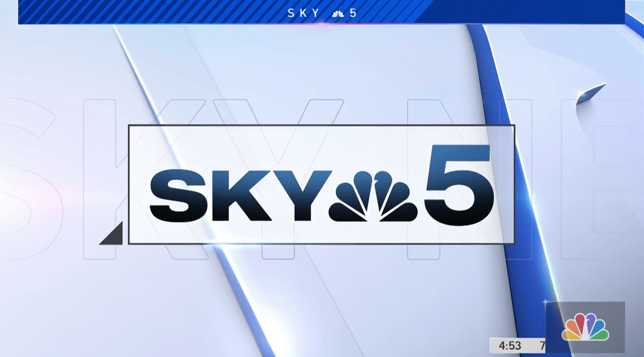
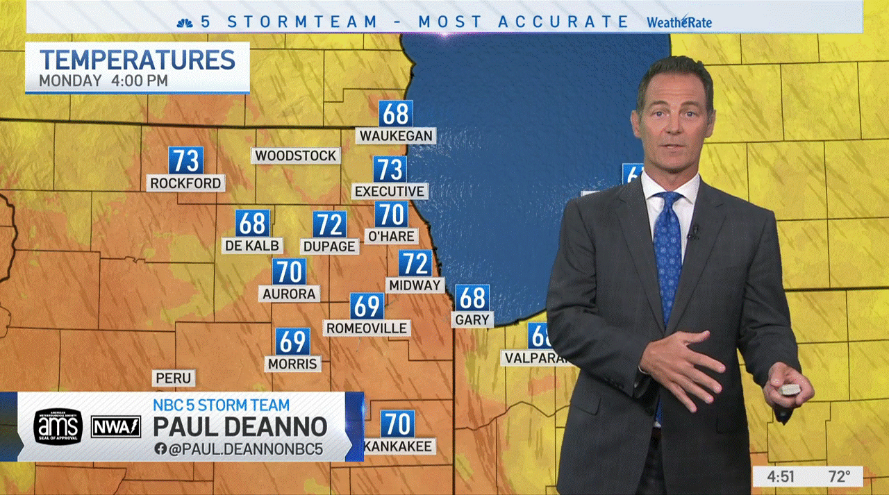
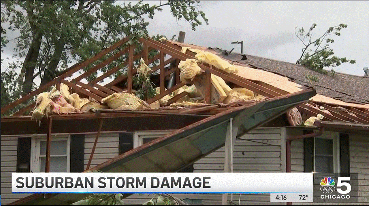
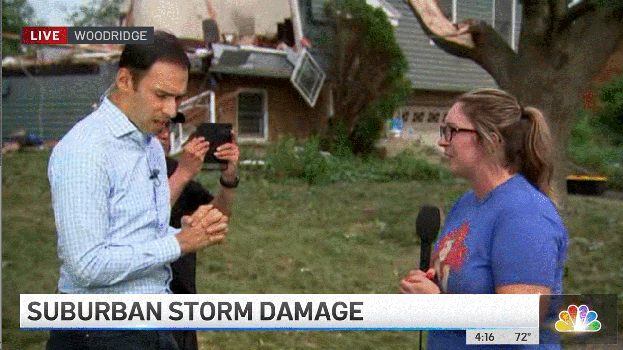
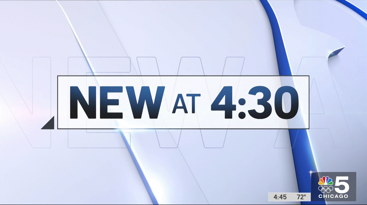
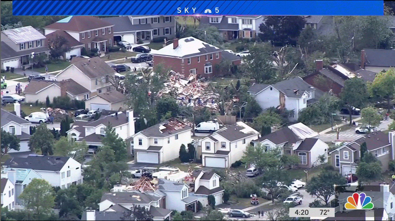
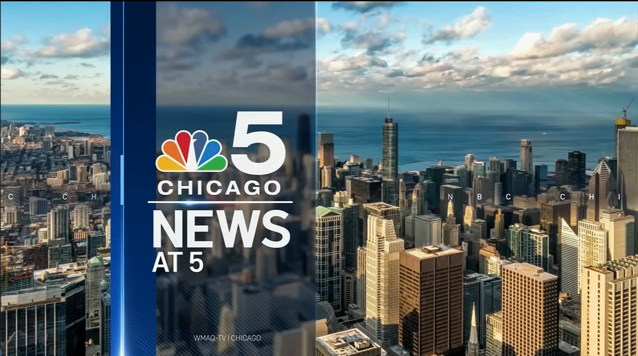
WMAQ has updated its graphics as of their 4pm newscast. Below are a few screenshots. Surprised we're the first ones to change.


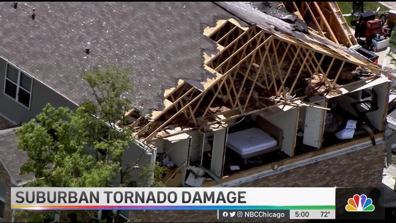 1 point
 -
Sorry but those were not Look S elements - The lower thirds are Look N-era election styled graphics that has been in use in 2018 and 2020 across all O&Os. Here's WRC using it as an example back in January.
 1 point
 -
KTXL sure did use it:1 point
-
At least those stations are getting rid of dead weight.1 point
-
And just like that ...April Moss has been scrubbed from the CBSDetroit.com website1 point
-
NY1 is adding a live weekend version of "Morning on 1" this fall. https://corporate.charter.com/newsroom/spectrum-news-ny1-announces-weekday-and-weekend-anchor-lineups-and-fall-launch-of-live-weekend-news-programming1 point
-
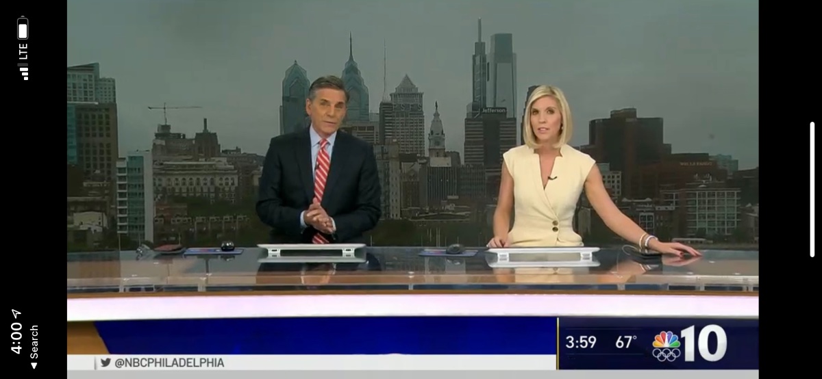
Both anchors are now sitting at the desk as of 4PM today.
 1 point
 -
Ahh..April Moss the latest to add to the list .. I guess CBS was right in not having a newscast on WWJ 62 [when they had no choice but to buy it when it was WGPR TV after WJBK went to FOX]...only a 2.5 minute weathercast and a short sports update at 11pm1 point
-
Because it is not necessary and redundant (the anchors always introduce themselves).1 point
-
What do they have against having a v/o for the opening?1 point
-
This new look cleans up so many of the bulky elements from the 2016 version, so that makes it an automatic upgrade, for me. Better balance of the blue and white elements, while keeping the bare bones structure. And I LOVE the flashes of the peacock colors in certain animations. Not divert the conversation, but I need to take a personal victory lap, here. During the pandemic, I screwed around with some ideas for a new O&O look, and I love that the NBC designers had some similar ideas to me. I didn't share these with anyone, and I had no prior knowledge to what was going to roll out. I kind of predicted the time/temp realignment (pic #1), though I left in the old, full-width social ticker and only slightly modified the 2016 L3s. I also tried out a look that emphasized the use of the peacock rainbow on a white lower third (#2). Anyway...
.thumb.png.5ef38c226cb334281cf5f230947e3688.png)
.thumb.png.2ec5457ba59ae6bfb631b7743d1deff8.png) 1 point
1 point


.thumb.png.3d66a1eeb7ecf5404151f8a77ea7cbfd.png)
.png.cfaa3b7c378c9527aaadf460fbd97bc8.png)
.png.e0ee6e0c8b30c3e40ba6c63d8b179537.png)
This leaderboard is set to Chicago/GMT-05:00